

Plotting Predictive Crime Curves | Andrew Wheeler
source link: https://andrewpwheeler.com/2019/04/15/plotting-predictive-crime-curves/
Go to the source link to view the article. You can view the picture content, updated content and better typesetting reading experience. If the link is broken, please click the button below to view the snapshot at that time.
Plotting Predictive Crime Curves
Writing some notes on this has been in the bucket list for a bit, how to evaluate crime prediction models. A recent paper on knife homicides in London is a good use case scenario for motivation. In short, when you have continuous model predictions, there are a few different graphs I would typically like to see, in place of accuracy tables.
The linked paper does not provide data, so what I do for a similar illustration is grab the lower super output area crime stats from here, and use the 08-17 data to predict homicides in 18-Feb19. I’ve posted the SPSS code I used to do the data munging and graphs here — all the stats could be done in Excel though as well (just involves sorting, cumulative sums, and division). Note this is not quite a replication of the paper, as it includes all cases in the homicide/murder minor crime category, and not just knife crime. There ends up being a total of 147 homicides/murders from 2018 through Feb-2019, so the nature of the task is very similar though, predicting a pretty rare outcome among almost 5,000 lower super output areas (4,831 to be exact).
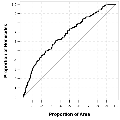
So the first plot I like to make goes like this. Use whatever metric you want based on historical data to rank your areas. So here I used assaults from 08-17. Sort the dataset in descending order based on your prediction. And then calculate the cumulative number of homicides. Then calculate two more columns; the total proportion of homicides your ranking captures given the total proportion of areas.
Easier to show than to say. So for reference your data might look something like below (pretend we have 100 homicides and 1000 areas for a simpler looking table):
 PriorAssault  CurrHom CumHom PropHom PropArea
 1000          1         1      1/100    1/1000
  987          0         1      1/100    2/1000
  962          2         4      4/100    3/1000
  920          1         5      5/100    4/1000
    .          .         .       .        .
    .          .         .       .        .
    .          .         .       .        .
    0          0       100    100/100 1000/1000
You would sort the PriorCrime column, and then calculate CumHom (Cumulative Homicides), PropHom (Proportion of All Homicides) and PropArea (Proportion of All Areas). Then you just plot the PropArea on the X axis, and the PropHom on the Y axis. Here is that plot using the London data.
Paul Ekblom suggests plotting the ROC curve, and I am too lazy now to show it, but it is very similar to the above graph. Basically you can do a weighted ROC curve (so predicting areas with more than 1 homicide get more weight in the graph). (See Mohler and Porter, 2018 for an academic reference to this point.)
Here is the weighted ROC curve that SPSS spits out, I’ve also superimposed the predictions generated via prior homicides. You can see that prior homicides as the predictor is very near the line of equality, suggesting prior homicides are no better than a coin-flip, whereas using all prior assaults does alittle better job, although not great. SPSS gives the area-under-the-curve stat at 0.66 with a standard error of 0.02.
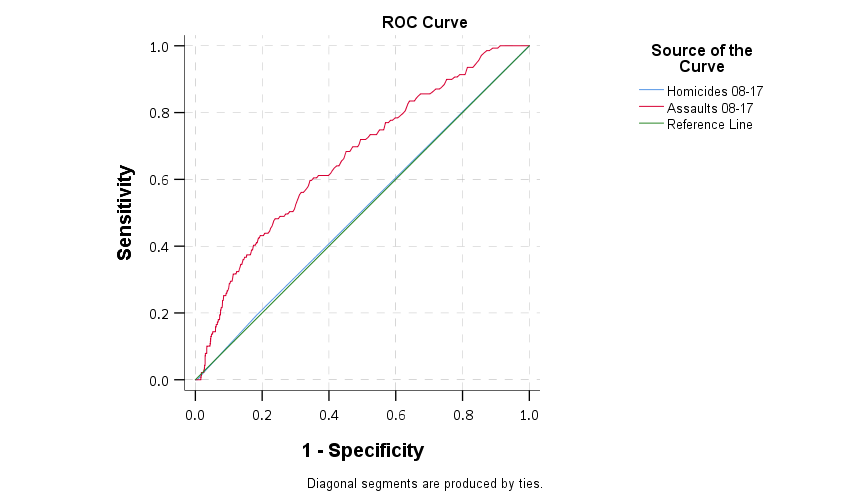
Note that the prediction can be anything, it does not have to be prior crimes. It could be predictions from a regression model (like RTM), see this paper of mine for an example.
So while these do an OK job of showing the overall predictive ability of whatever metric — here they show using assaults are better than random, it isn’t real great evidence that hot spots are the go to strategy. Hot spots policing relies on very targeted enforcement of a small number of areas. The ROC curve shows the entire area. If you need to patrol 1,000 LSOA’s to effectively capture enough crimes to make it worth your while I wouldn’t call that hot spots policing anymore, it is too large.
So another graph you can do is to just plot the cumulative number of crimes you capture versus the total number of areas. Note this is based on the same information as before (using rankings based on assaults), just we are plotting whole numbers instead of proportions. But it drives home the point abit better that you need to go to quite a large number of areas to be able to capture a substantive number of homicides. Here I zoom in the plot to only show the first 800 areas.
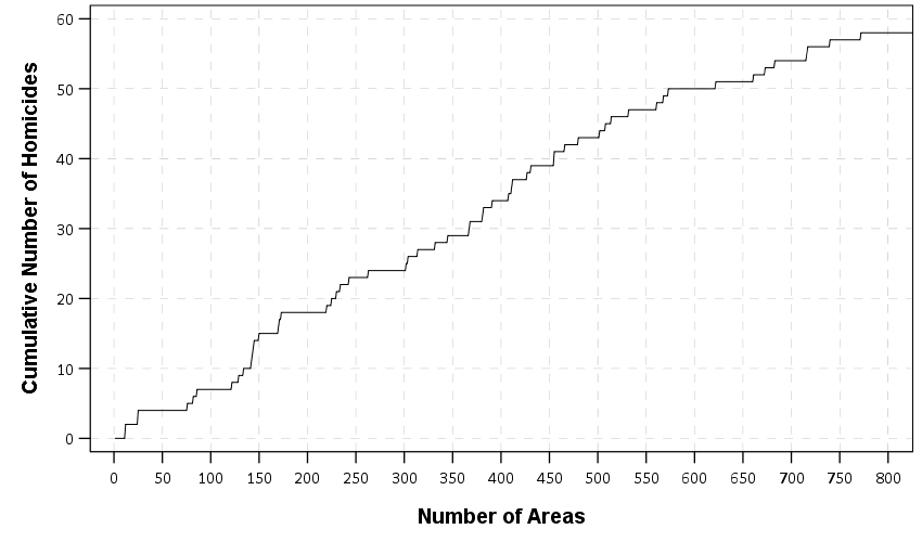
So even though the overall curve shows better than random predictive ability, it is unclear to me if a rare homicide event is effectively concentrated enough to justify hot spots policing. Better than random predictions are not necessarily good enough.
A final metric worth making note of is the Predictive Accuracy Index (PAI). The PAI is often used in evaluating forecast accuracy, see some of the work of Spencer Chainey or Grant Drawve for some examples. The PAI is simply % Crime Captured/% Area, which we have already calculated in our prior graphs. So you want a value much higher than 1.
While those cited examples again use tables with simple cut-offs, you can make a graph like this to show the PAI metric under different numbers of areas, same as the above plots.
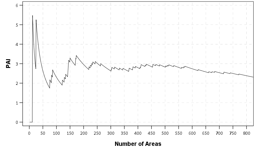
The saw-tooth ends up looking very much like a precision-recall curve, but I haven’t sat down and figured out the equivalence between the two as of yet. It is pretty noisy, but we might have two regimes based on this — target around 30 areas for a PAI of 3-5, or target 150 areas for a PAI of 3. PAI values that low are not something to brag to your grandma about though.
There are other stats like the predictive efficiency index (PAI vs the best possible PAI) and the recapture-rate index that you could do the same types of plots with. But I don’t want to put everyone to sleep.
Recommend
About Joyk
Aggregate valuable and interesting links.
Joyk means Joy of geeK