

Profit per Click: What It Is & Why You Should Track It
source link: https://www.searchenginejournal.com/essential-data-studio-visualizations-paid-search-marketers/316509/?ver=316509X3
Go to the source link to view the article. You can view the picture content, updated content and better typesetting reading experience. If the link is broken, please click the button below to view the snapshot at that time.

How Paid Search Marketers Can Use Google Data Studio: 14 Examples
These 14 data studio visualizations are easy to create and provide clear, high-value data and insights for your clients and leadership teams.
- SHARES
- READS
If you’re looking for digital marketing reporting software that’s both powerful and free, look no further than Google’s Data Studio.
Google’s free visualization and reporting tool has been around since 2016, and has only gotten better over time, rolling out new feature updates and improvements every month.
While Data Studio makes it easy to connect to data sources and automate reporting, you still need to decide which visualizations and information will be most useful for your audience.
Use the examples in this article for chart inspiration and guidance to beat the “blank page syndrome” on an empty Data Studio canvas.
Create for Your Audience
Your clients and leadership teams probably aren’t as familiar with the nuances of paid marketing as you are.
Insights that seem obvious to you can be completely unclear to someone less experienced.
Take extra steps to:
- Spell out acronyms, use headings, and microcopy.
- Define technical words.
- Enhance pre-attentive attributes like color and shape.
- Look for ways to help your clients understand the meaning of the numbers they’re reviewing.
Basic Google Ads Visualizations for Client Reports
Start with these visualizations to easily provide clear, high-value data and insights.
If you’re brand new to Data Studio, check out this beginner’s guide for how to set up your first report so you can easily follow these instructions and recommendations.
1. KPI Scorecards
Scorecards are a staple of most digital marketing reports and dashboards – and for good reason.
They help your clients quickly see the performance of key metrics and KPIs (key performance indicators).
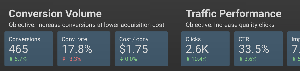
You can create scorecards for almost any metric you want to showcase.
I recommend arranging them in order of importance (KPIs like conversion data toward the beginning, traffic data toward the end).
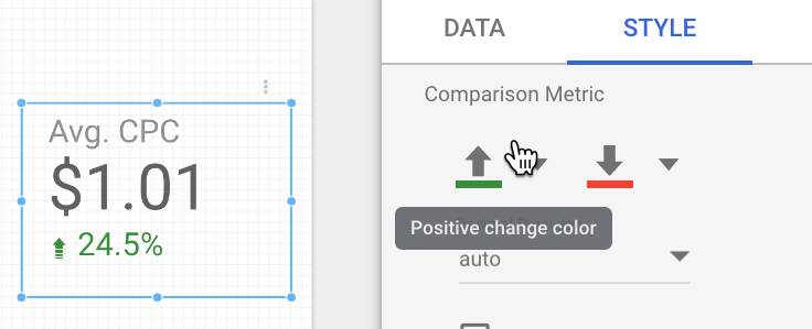
Add comparison metrics, and adjust the color in the Style panel (shown below) so an increase in a metric like CPC doesn’t have a green “up” arrow.
Here’s a quick overview of the metrics and dimensions you need to put this visualization together:
Every business needs a helping hand...or 10.
Hand your unique tasks over to expert freelancers with every kind of skill who can put the finishing touch you need on any kind of project.
How to Create Scorecards
- Data Range Dimension: Month.
- Metric: Use one key metric per scorecard.
- Comparison Data Range: Choose previous period, previous year, or custom.
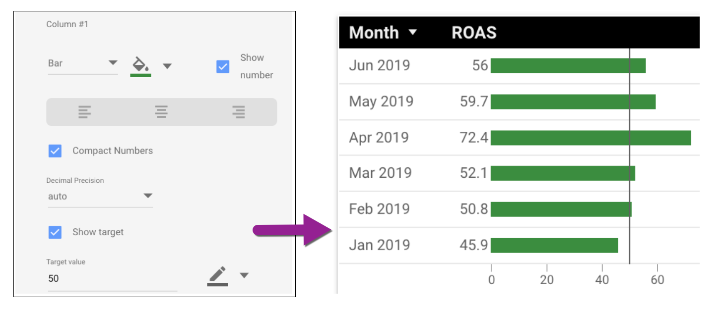
2. Attention-Grabbing Tables
The tables you can build in Data Studio aren’t the bare-bones Excel charts you used to send to clients.
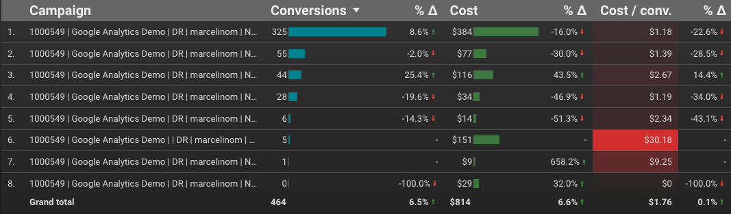
By using built-in features like color, bar charts, heatmaps, time comparisons, and targets, you can quickly draw attention to the most important elements of the table.
You can control each metric’s formatting from the Style panel.
In this example, Column #1 displays both bars and compact numbers, with a target value of 50:
How to Create Tables
- Dimension: Campaigns (shown); Accounts, channels, ad groups or other segments will work
- Metrics: Choose metrics that contribute to the story you’re telling; remove non-essential metrics
3. Charts with Reference Lines
Regular line graphs and area charts are useful on their own, but reference lines go the extra step of showing your audience at a glance whether performance is meeting the goal.
These two charts contain identical performance information, but the use of a reference line helps them tell different stories.
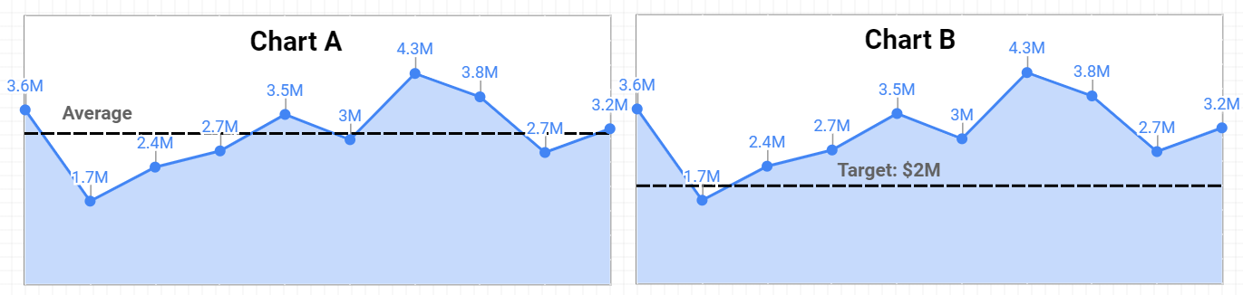
Chart A is using a line based on an average revenue, helping us quickly identify that three of the last four months outperformed the average.
Chart B is using a target reference line with a goal of $2 million.
We immediately see that all but the second month hit the target revenue.
Use reference lines sparingly and strategically to make sure you’re focusing attention where it belongs, rather than distracting your reader with an arbitrarily selected benchmark.
How to Add a Reference Line
- Create chart.
- Go to “Style” panel.
- Choose reference line type (constant value, metric, or parameter).
- Select calculation or value.
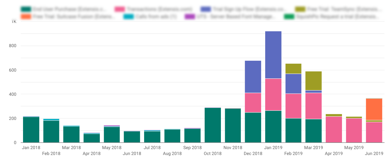
4. Conversion Type Breakout
Some metrics are like Lego blocks – clearly defined, and consistent. A click is a click is a click.
Some metrics are like Play-Doh – defined by the imagination of the user. A conversion is a sale – no wait! Now it’s also a page view.
Don’t let inconsistently defined conversions skew your reports; clearly show which conversion types are contributing to the total.
Here’s a stacked column chart that illustrates the breakout of conversion types over time:
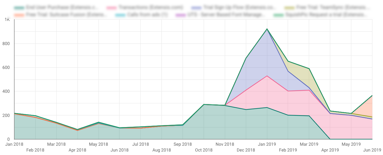
And here’s the same data in a stacked area chart for a different visualization:
How to Create Conversion Type Charts
- Dimension: Month.
- Breakdown Dimension: Segment Conversion Type Name.
- Metric: Conversions.
- Sort: Month.
5. Local Actions – Click Type Breakout
When you’re running location extensions and local search ads, conversions get even more complicated.
Google rolls metrics like website visits and menu views into All Conversions, which can create reporting headaches for marketers.
Clicks on location extensions still accrue cost even if they don’t contribute to standard conversion targets.
How do you demonstrate the value of local actions without inflating your conversion numbers?
My favorite solution is to create a “value add” visualization that shows the breakout of click types.
Clients can easily see that these non-converting clicks are driving phone calls, chats, and other interactions that are important for their business:
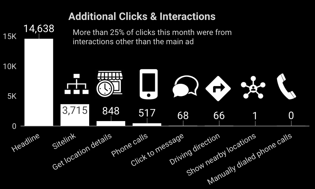
Adding icons is optional, but helps to communicate a variety of activity in what are admittedly confusing names for click types.
How to Create Click Type Breakout Charts
- Dimension: Click Type.
- Metric: Clicks (shown); You can also use All Conv, CPC or Cost metrics.
- Sort: Clicks.
6. Year Over Year Performance – Time Series
With a year like this one, charts comparing past performance are crucial for giving clients and stakeholders the context behind the numbers.
You’ll want to benchmark not just year over year revenue, but other metrics like spend, impression share, ROAS, and more.
In this example report page, the primary YoY revenue chart is aided by including time series charts for spend and ROAS.
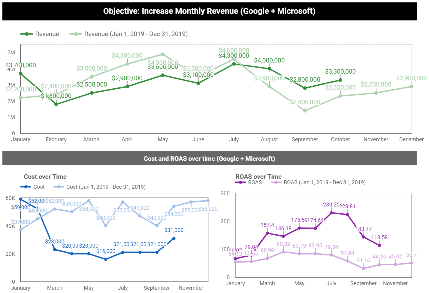
How to Create Year Over Year Performance Charts
- Date range dimension: Date.
- Dimension: Month.
- Metric: Any metric you’d like to compare.
- Set default date range to Advanced (Jan 1 – [today minus one month]).
- Set “compare to” date range to last year (Jan 1 – Dec 31).
Intermediate Google Ads Visualizations for Client Reports
Now that you’ve got the hang of how to prepare these visualizations, let’s look at more advanced examples.
These take a bit more effort to set up, but once you learn the skill you’ll be able to apply it to all your charts and reports.
7. Top Ad Placements
This placement visualization is a client favorite.
Not only does it list the name of the site or channel where the ad appeared; it also allows your clients to click the active URLs so they can review the websites that are serving their ads.
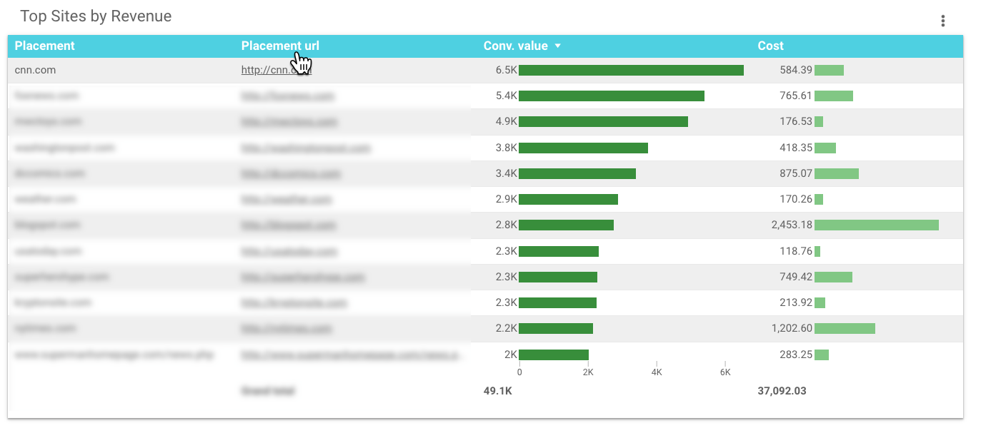
What makes this table complicated?
Data Studio doesn’t have fields for placement data.
To create this chart, you’ll need to export your placement details from Google Ads to Google Sheets, then connect Google Sheets as a new data source in your report.
This tutorial walks you through all the steps, including how to add a data source.
How to Create a Top Ad Placements Chart
- Dimension: Placement.
- Dimension: Placement URL.
- Metrics: Conv. Value & Cost (shown); Just about any metrics can work well here.
- Sort: Conv. Value.
8. YouTube Ads Performance
Clients love to understand and experience how their ads are performing, so this visualization is another favorite.
Rather than a table listing performance data of video titles or ad names, you can let people watch the ad directly from the report:
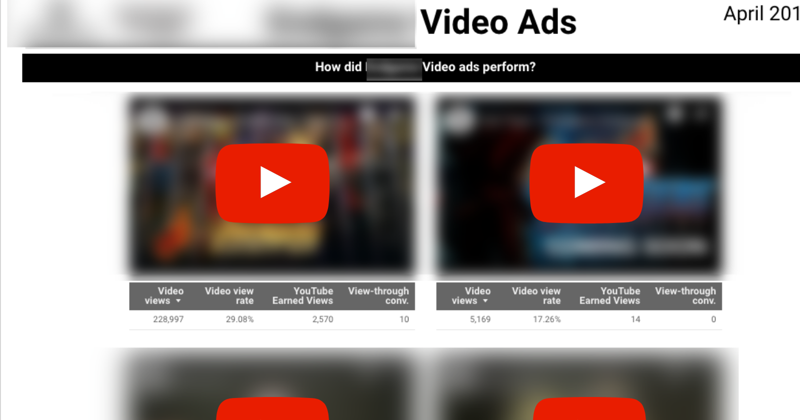
Adding the video is easy; simply embed the YouTube URL.
To recreate the tables so they are each unique to the video, you’ll need to create a filter for each table.

How to Create a YouTube Ads Performance Visualization
- Embed YouTube video.
- Dimension: (none applied; video filter used).
- Metrics: Video views, Video view rate, YouTube earned views, View-thru conversions (shown); Many other.
- YouTube metrics are available, including watch rate.
9. Micro Comparison Bar Charts
Data Studio’s built-in date comparisons are helpful, but limited.
You can compare two periods (such as month over month or year over year), but there’s no way to compare all three.
These micro bar charts solve that problem, making it easy to see the three time periods at a glance:
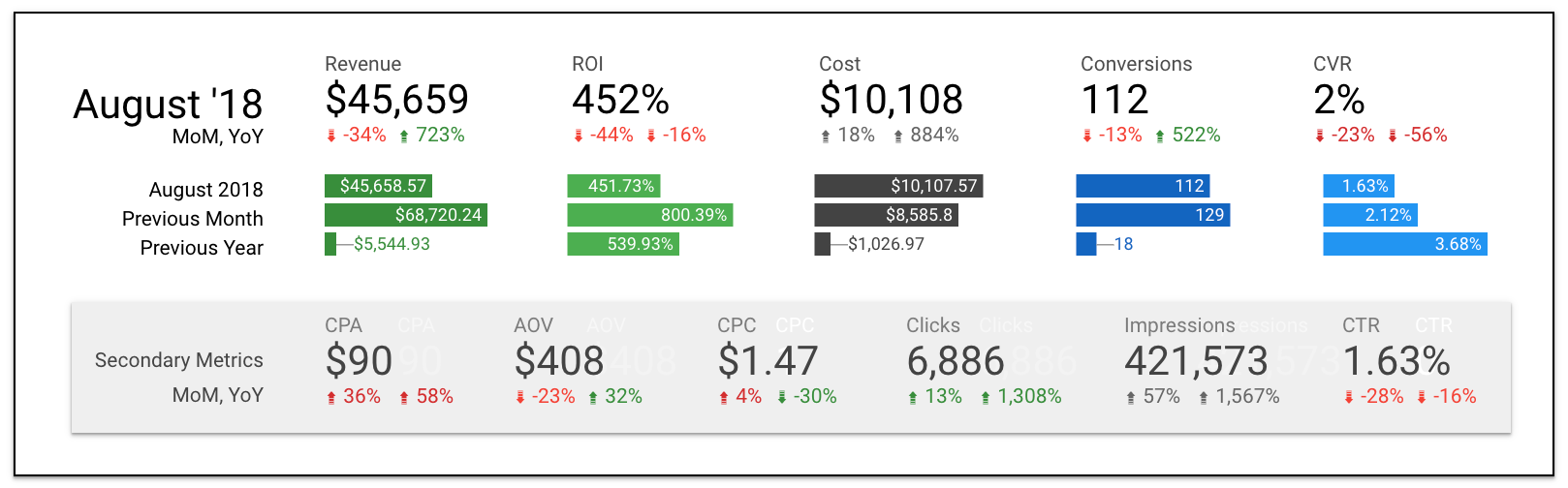
If you’re wondering about the MoM and YoY scorecard comparisons, it’s a little formatting hack explained here.
To create the microbar charts, you essentially need to “stage” the dimensions to only pull select months.
This can be done using Google Sheets as a source, or creating a filter in Data Studio to hard-code months that are displayed.
You can watch the YouTube tutorial on how to create micro bar charts with Google Sheets.
How to Create Micro Bar Charts
- Dimension: Month or Year Month.
- Metrics: Your KPIs, one per chart.
- Sort: Month.
Search Landscape Visualizations for Client Reports
To understand the causes and impact of paid search performance, it helps to examine external factors.
These visualizations provide deeper context by looking at greater trends and activity.
10. Google Trends Data
When this month’s performance is significantly different than last month’s, clients want to know why.
Did something change in the account, or was there a larger trend at play?
Google Trends can help you show the impact of seasonality, news cycles, and other events on your ad performance.
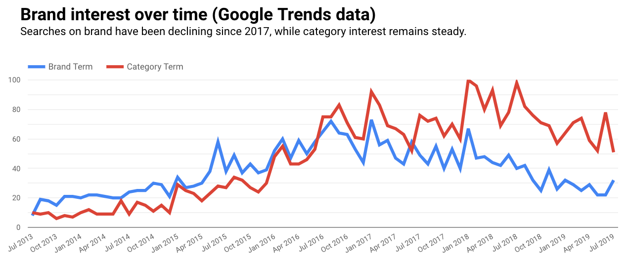
Google Trends doesn’t have a direct connector, but you can download the data to Google Sheets or use workarounds like strategiq.co’s gtrends.app.
How to Create a Google Trends Chart
- Connect your data source.
- Dimension: Year Month.
- Metrics: Brand and Category search terms (shown); Any metrics are fine.
11. Google Analytics Channel Breakout
Even if paid search is your entire focus, it probably isn’t all your client is concerned about.
Including Google Analytics data for reference can be helpful to show the relationship between channels and previous time periods.
This chart shows revenue, revenue per order, and average order value by channel.
It also displays a comparison to the previous month, and makes it easy to see each channel’s contribution to total revenue as a percentage.
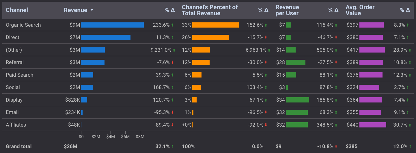
Paid search enjoyed a 40% revenue increase month over month.
But before we congratulate ourselves too much, we can see from this chart that most channels experienced a similar uptick.
A new addition for comparison visualizations is the treemap.
While it doesn’t (yet) display metric values without hovering, it does better show the relationship between larger and smaller contributors.
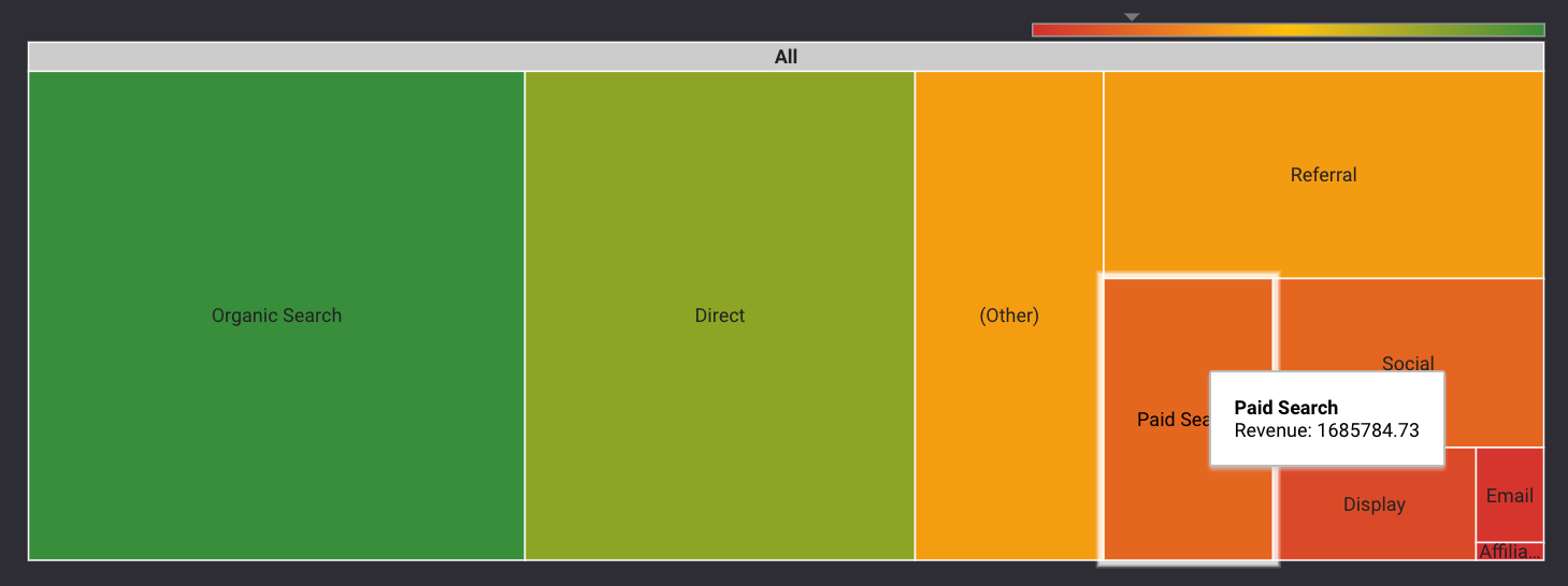
How to Create a Google Analytics Chart (Table or Treemap)
- Use Google Analytics as a data source.
- Dimension: Default Channel Grouping.
- Metrics: Revenue, Revenue as percent of total, Revenue per order, Average Order Value.
- Sort: Revenue.
- Time Comparison (for table): Previous period.
12. Auction Insights Scatter Plot
Of all the visualizations shared in this article, this Auction Insights chart is the most temperamental.
For starters, your company’s domain is represented by a (null) value, and it’s downhill from there.
But if you can get it to work, it’s a nice visual companion to a table that communicates several key competitive metrics at a glance.
We’ve also been able to access detailed competitor data that isn’t available from the interface or downloads.
This chart shows the relationship between impression share, outranking share, and average position of multiple competitors all at once:
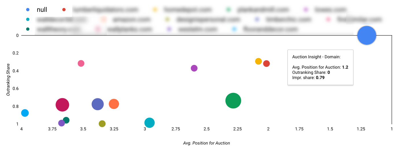 There are other (more stable) ways to create Auction Insights charts, but I find this formatting makes it the easiest to interpret.
How to Create the Auction Insights Chart
- Dimension: Auction Insights Scatter Plot.
- Metric X: Avg. Position for Auction.
- Metric Y: Outranking Share.
- Bubble Size: Impression Share.
- Sort: Avg. Position for Auction (Ascending).
- Note: Chart shown uses Reverse X and Reverse Y Axis, with a minimum X axis value set to 1.
Google Ads Visualizations for Internal Reports
Not all of the Data Studio visualizations you build should be client-facing.
You need your own tools for monitoring and management on a daily basis. And when you’re your own audience, you don’t have to be as fussy about the presentation.
These visualizations are great for internal reporting to help you identify and take action on performance in real-time.
13. Pacing Bullet Charts
The Google Ads interface gives you a lot of useful data, but it doesn’t help you see how you’re pacing against specific targets.
A Data Studio dashboard can show you daily averages, pacing to target, month to date pacing, and more:
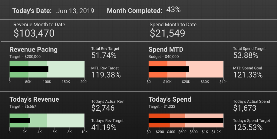
To build this dashboard, you’ll need to create some calculated fields if you’re pulling data directly from Google Ads.
If you’re using Google Sheets for your data source, you can do the calculations there.
Because of current limitations with date ranges, these calculated fields can be complicated.
How to Create This Pacing Dashboard
- Date: Table (Dimension: Day, Date Range: Today).
- Month Completed: Scorecard (Calculated field or Google Sheets).
- Bullet Charts: Based on your goals and targets.
- Additional Scorecards: Calculated fields or Google Sheets.
14. Zoom-In/Zoom-Out Time Series Charts
One of the challenges for paid search marketers is needing to be in the weeds with granular data, without overlooking high-level trends.
If you need to see the big and the small at the same time, you can add multiple snapshots of the same metrics to a dashboard in Data Studio.
This group of time series charts shows cost and conversion value for 30 days, 90 days, and 12 months. The top filter controls the ad group being reviewed:
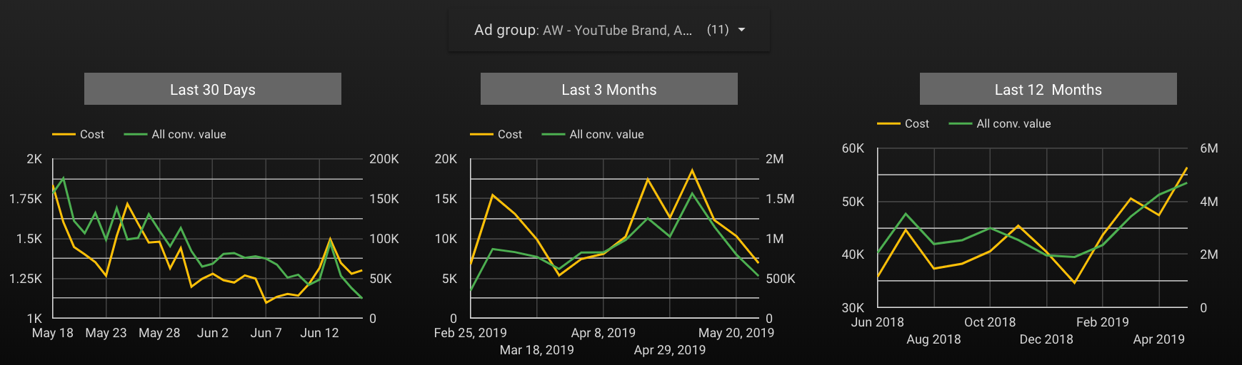
While volume is decreasing in the short term, it’s been steadily increasing over time.
There’s nothing wrong with using a similar layout in a client report, but I suggest offering a curated view to provide a specific answer, rather than including a filter control and putting the burden on your client to dig into the data and discover answers.
How to Create Time Series Ranges
- Dimension: 1=Day, 2=Week, 3=Month.
- Metrics: Cost, All conv value (shown); Any metrics can be used.
Conclusion
Data visualizations help you tell a story your clients can understand and learn from; they aren’t just for decoration or report filler.
The more comfortable you become building meaningful charts and graphs, the better you can interpret data and help others do the same.
More Resources:
Image Credits
Featured Image: Created by author, July 2019
All screenshots taken by author, July 2019 and November 2020
Amy Hebdon
Amy Hebdon is the founder of Paid Search Magic, a paid media agency that helps businesses grow with Google Ads ... [Read full bio]
- Suggested Articles
-
SHARES
-
READS

What is one of the biggest challenges faced by all performance marketing stakeholders – agencies, marketers, brands, investors, and executives?
Consistently and correctly quantifying the value created for the enterprise via marketing initiatives.
To put it succinctly: answering the age-old questions of, “What’s the ROI on our marketing?”
Or, more simply, “What’s working and what isn’t working?”
Do Even the Best Marketing Metrics All Fall Short?
Marketing platforms have historically offered marketers various types of data to support this effort including:
- Advertising cost data (CPC and/or CPM).
- Intermediate performance data (clicks, impressions, etc.).
- Revenue/value data (Conversions/Leads, Conversion Value, Transaction Revenue, etc.).
These base metrics are then combined to form rate metrics (Cost Per Click, Revenue Per Click/Value Per Click, Conversion Rate, etc.), which form the basis of performance evaluation today.
The justification for relying upon these metrics appears sound at first glance – after all, isn’t maximizing revenue a solid strategy?
(After all, what good capitalist is going to say “no” to maximizing revenue?)
And if maximizing revenue/value is good, then doesn’t it follow that Revenue/Value per Click (“RPC”) is a solid directional indicator that the program is performing well?
Mathematically, there are three vectors to increase your RPC:
- Increase the conversion rate of traffic.
- Increase the average order value (“AOV”) or average lead value or
- Decrease the cost per click (either directly, if buying CPC, or indirectly, if buying CPM).
Each of these would seem to be positively correlated with improved business performance.
Isn’t converting people at a higher rate good? Isn’t selling more stuff/driving more leads a good thing? Isn’t reducing your CPCs/CPMs positive?
The answer to each of those questions is a resounding “maybe.”
To understand why it’s important to remember that the overall goal of a business isn’t just to sell more stuff or acquire more customers; it’s to do those things profitably.
While it’s nice to understand how much revenue a given campaign or keyword is driving for the organization, I’ve worked with plenty of organizations with huge revenue numbers that collapsed faster than Anakin Skywalker in “Revenge of the Sith”.
The issue is that even the best of the metrics referenced above (likely Revenue Per Click & Conversion Rate, but arguments can be made for the relative import of all of them) falls well short of what’s required for creating a robust, defensible evaluation of any marketing program or campaign.
To see why, consider the following scenario – which I’ve found working for brands of all sizes (and in all industries) over the years:
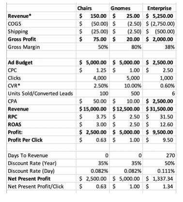
ACME Outdoor Company sells two products: garden gnomes for $25 and lawn chairs for $150.
It costs them $2.50 to manufacture a gnome and $50 to manufacture a chair (they’re of the nice, Adirondack variety). Shipping a gnome costs another $2.50, while shipping a chair costs $25.00.
Now, before factoring in advertising costs, holding costs, agency fees, or interest charges, ACME has a gross profit of $150 + ($50) + ($25) = $75.00 on chairs and $25 + ($2.50) + ($2.50) = $20.00 on gnomes.
(For simplicity, I’m using financial/accounting notation for negatives balances, which calls for negative numbers – such as deductions or expenses – to be shown in parentheses. Thus, ($50) is the same as -$50).
Let’s assume that ACME spends $10,000 per month on advertising for their business (both gnomes + chairs).
Most automated bidding algorithms will try to maximize your conversion value (revenue in this case) or Return on Ad Spend (ROAS) (depending on your bidding strategy) – likely by pushing customers to the higher-revenue chairs vs. lower-dollar gnomes ($150 vs. $25).
But this isn’t always the correct approach, as we’ll see:
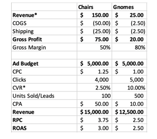
In the above case, it appears (by both RPC and ROAS) that lawn chairs are out-performing the gnomes – driving a ~50% higher RPC, ~20% higher ROAS, and ~20% more revenue on the same spend.
While gnomes convert at a much higher rate (to be expected for a low-dollar item vs. a more expensive one), the logical recommendation from this data is to invest more money into the lawn chairs campaign, right?
Well, not exactly – because this analysis does not include the costs of goods sold (COGS) or shipping costs that ACME incurs in order to produce and distribute their goods.
When those are included, a different picture emerges. To do this, we’re using what I’ve termed Profit Per Click (“PrPC”), which is calculated with the following formula:
PrPC = (Gross Revenue – Costs of Goods Sold – Transaction Costs – Fulfillment Costs)/Clicks
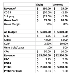
In the above example (and for simplicity), I’ve omitted the transaction costs (i.e., credit card processing fees, PayPal fees, bank transfer fees), which typically represent anywhere from 0.5% to 3% of the total transaction.
As you can see from the above, ACME’s profit per click for chairs is ~37% lower than the profit from gnomes – driven by that item’s significantly higher gross margin (80% vs. 50%).
If ACME were to take the RPC recommendation from above and invest more into lawn chairs, the company could leave up to $5,000 in profit on the table ($10,000 is the max profit for investing 100% budget into gnomes; $5,000 is the max profit for investing 100% budget into lawn chairs).
Yikes.
While many commerce marketers would (rightfully) say that the above analysis is incomplete – especially since many gnome buyers might also buy a lawn chair or vice versa – the underlying principle illustrated still holds and is easily translated into these scenarios.
The beauty of Profit Per Click is that profitability is sufficiently granular (it applies at an outcome level) to enable analysis at all levels of your performance marketing initiatives – from the keyword or creative level to campaign or account level.
This enables marketers to find hidden sources of value while aligning their efforts to the overall organizational goal (namely, more profit).
Likewise, the above scenario also excludes fixed costs (like agency retainers or 3PL monthly fees or sales team salaries, for lead generation businesses vs. direct commerce), all of which are easily incorporated and sufficiently granular.
While profit per click is not included (by default) within a web analytics or digital platform, integrating it is quite simple.
- Via COGS within your product feed (here’s a helpful link) for commerce businesses.
- By uploading cost data within Analytics (more info here).
- By reducing conversion values/adjusting lead values within Ads, based on the relative profitability of those outcomes.
As this discussion shifts toward leads and future revenue, the limitations of Profit Per Click become more apparent. Namely, non-commerce transactions typically have a longer lag between the conversion event and money in the bank.
There’s sales follow-up, proposal submissions, and revisions, contract negotiation, pricing discussion, invoicing, payment terms, and the like.
For many larger B2B deals, the lag between a lead in the door and money in the bank can exceed 6 months – which is an awfully long time to hold inventory (or worse, have shipped inventory and be waiting for a check).
A similar problem emerges for DTC brands or ecommerce transactions, as the initial sale typically represents only a fraction of the customer’s lifetime value (LTV), or 30/60/90-day cash (depending on which model you choose).
In either case, our Profit Per Click (“PrPC”) metric is providing a materially deficient picture of what’s happening, potentially with dire consequences – the DTC graveyard is littered with tombstones of brands who died waiting for LTV to materialize.
This shortcoming also exists with PrPC, which will not capture this critical nuance because it assumes an instantaneous value transfer/immediate revenue recognition.
This can lead to a skewed picture of the business’ situation – and potentially, a cash crunch or lifetime value trap, as the business continues to incur expenses (operating expenses, COGS, salary, interest, etc.) while waiting for the potential revenue.
If we assume that ACME (from above) has a third line of business, Enterprise Sales, where the company sells lawn chairs in bulk to colleges, universities, municipalities and the like, we can see this issue materialize.
For the sake of simplicity (and for easier comparison with direct commerce), I have discounted the conversion rate + revenue per lead to account for non-qualified conversions (leads that do not materialize into actual customers, for whatever reason).
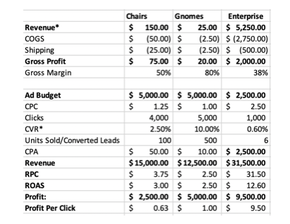
One of the first thing that jumps out is the significantly higher Profit Per Click for the enterprise clients (~9.5x higher than gnomes, ~14x higher than lawn chairs, and more revenue than both lawn chairs + gnomes combined, despite a campaign budget that’s 25% of gnomes and lawn chairs, combined).
From these numbers, it appears that Enterprise offers a substantial opportunity for ACME to increase overall profitability – after all, look at that ROAS!
Over the years, I’ve noticed a similar phenomenon for businesses with similar, bifurcated models (from DTC to SaaS to professional services and consumer goods).
This conclusion is sometimes valid, but sometimes not – with the three factors playing a major role in whether it’s worth it to invest more in marketing the “prima facie“ more profitable enterprise/lead generation business bifurcated:
- The time from lead-to-close.
- The conversion rates on leads to customers.
- The relative volatility of (1) and (2).
As an aside (especially for many smaller businesses), (3) is often completely ignored, despite it being (arguably) the most important.
After all, if you don’t know when to expect cash in the door (or roughly how many leads you’ll close), your operational risks go through the roof.
- How do you know how many units to keep in inventory?
- When you can expect to know if there’s a problem with your sales team?
- How to structure your financing?
- Whether to pull the plug or increase marketing?
These are serious, often existential, questions that far too many businesses ignore, at their own peril.
While this article is primarily about assessing marketing performance, any good marketer ought to be a good businessperson first.
If your current partners aren’t asking these kinds of questions, that’s a red flag that it’s time to find a new partner (or do some education of your in-house team).
Fortunately, we have a tool that can help us assess how we should balance these factors: a net present value calculation.
What Is Net Present Value
Net present value is a method of adjusting future cash flows (positive and negative) based on the time-value of money and risk profile, using a discount rate.
In short, NPV tells us what a potential future cash flow is worth today.
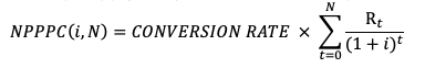
NPV for the (period, cash flow) pairs (t, Rt), where N is the total number of periods is given by the (scary looking, but pretty simple) formula:
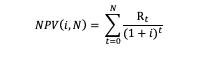
Where Rt = is the net cash flow (inflows less outflows) at each time t and i is the discount rate.
What Is Discount Rate
The discount rate (sometimes called the discounted rate of return) is an interest rate that reflects the opportunity cost (or cost of capital) and risk associated with a given investment.
Cost of Capital: Every capital outlay made by an enterprise is zero-sum – if funds are used for A, they are not available for B (and vice versa).
In short: accessing capital isn’t free for any company – funds must either come from a credit facility (which comes with interest costs, future liquidity risks, and obligations) or from equity (which dilutes ownership, incurs underwriting costs, and potentially poses other risks).
Other Risks: there are other risks involved in any investment decision, above and beyond the cost of capital.
For instance, an investment in marketing today is not guaranteed to yield a lead (or sale) tomorrow.
The timing of cash flows from those deals is often uncertain, as is the ability of an enterprise to fulfill a future order. These risks must be considered alongside the cost of capital when assessing what a potential future cash flow is worth today.
For many companies, the discount rate combines their Weighted Average Cost of Capital (WACC) plus an additional risk premium, based on the nature of the investment (i.e., investing in marketing is riskier than buying a new machine, and thus the marketing investment would have a higher discount rate).
This results in an annual discount rate ranging from ~10% (for large, public companies with robust access to capital) to ~50%+ (for smaller companies and start-ups, with no access to capital).
Finally (and critically), the discount rate is not fixed.
Different rates can be applied to cash flows based on when they occur – so a higher discount rate can be applied to cash flow 6 months from today (which is far less certain to happen) and a lower discount rate applied to a cash flow 30 days from now (which is far more certain).
This robustness makes the discount rate method incredibly valuable for all organizations (and avoid many of the pitfalls of cash multipliers and straight-line LTV calculations).
Applying the NPV Formula to ACME’s Enterprise Business
Since our enterprise transaction is really just a pair of cash flows (an initial outflow at t=0 to pay for advertising and provide the product, followed by a subsequent inflow at a future point when ACME is paid by our customer for the chairs), this calculation is simple.
For the sake of simplicity, I’ve used 270 days (~9 months) from the time the lead is received to the date when funds are deposited. For some businesses, this is actually pretty short; for others, this may seem way too long.
The beauty of an NPV calculation is that it is endlessly flexible – you can adjust this to meet the unique needs of your organization.
Additionally, as my (hypothetical) ACME company is relatively young and small, I’ve selected a discount rate at the high end of the range discussed above of 50%.
While this sounds high, it’s typical for smaller companies with limited access to capital and fledgling operations.
(It is important to remember that many startup companies are financing operations on credit cards with interest rates above 25%; a discount rate must take into account not just this interest rate, but also the fact that the investment is far from guaranteed to produce a return. Conservatively, an investment made using funds borrowed at a 25% interest rate with a 50/50 chance of yielding a return easily justifies a 50% discount rate.)
Thus, for a single lead for ACME Enterprise Lawn Chairs:
At t=0, using a simplified calculation, with the budget ($2,500) divided by the number of leads (6), we incur an expense (cash outflow) of $2,750 (COGS) + $500 (shipping) + $416.67 (advertising) = $3,667.67.
Plugging this into our formula, the NPV of this is:
NPV of Initial Outlay =  = –$3,667.67
Then, at t=270, we receive a cash inflow of $5,250, which represents the payment by our customer for the goods provided.
NPV of Cash Inflow = 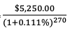 = $3,889.56
Summing these together, we realize a Net Present Profit of ($3,667.67) + $3,889.56 = $221.89 – that’s over $1,360 (86%) less than what a straight-line (revenue minus expense) analysis suggests.
Because there is significantly more risk involved for ACME Corp. on the enterprise deals, as the company is outlaying a significant amount of money immediately (to hold and fulfill orders, plus pay salespeople, attorneys’ fees on contracts, etc.), but not realizing revenues until much later.
Let’s put everything together in order to get a single metric that accounts for the risks, uncertainties, and opportunity costs we’ve discussed and allows us to make an apples-to-apples comparison of our marketing performance for each business line and campaign: Net Present Profit Per Click (“NPPPC”):
NPPPC is calculated by multiplying the output of the above NPV formula by our conversion rate:
When NPPPC is used in place of RPC or ROAS, the enterprise campaign still looks good, but it doesn’t look phenomenal – and intuitively (at least in the minds of many business owners), this is right.
While the revenue numbers from the larger enterprise sales are appealing, the risk associated with realizing them is real and significant.
Accounting for this is absolutely critical for all performance marketers – remember, we should be businesspeople first, marketers second.
The beauty of NPPPC is that it can be incorporated within Google Analytics as a custom metric and it is sufficiently granular that it can be used to compare the performance of different keywords, campaigns, channels, and tactics, all while being defensible and intelligible to all stakeholders within the organization.
This same method can be used to calculate (for instance) the value of a SaaS consumer (each month is a separate cash flow; these can be more or less risky depending on your churn data) or more accurately portray a DTC brand’s financial position than a 30/60/90-day cash multiplier.
Likewise, the NPPPC model can be adjusted to account for different levels of risk with different product lines, customer personas, or service offerings; it is sufficiently granular and endlessly flexible.
Limitations of Profit per Click
While I firmly believe NPPPC is one of the most robust metrics out there for performance marketers, it is still critical that we remember Goodhart’s Law: whenever a metric becomes a target, it ceases to be a good metric.
For instance, if we measure performance by the number of leads generated, we’ll end up optimizing for lead volume while ignoring cost, potentially leading to losing money on every lead – not a good place to be!
While it is objectively good to maximize NPPPC, doing this in isolation can have negative effects (i.e., maximizing NPPPC might result in fewer leads, which limits overall growth of the organization).
It is always a good idea to create metric trios – usually consisting of one granular performance metric (NPPPC), one scale metric (net present profit, or profit, or revenue), and one historical comparison metric (YoY growth target; PoP growth target, % to projection, etc.).
There’s a natural tension between each of these metrics, such that maximizing one likely has a negative impact on the others – helping to ensure that we don’t veer too far in any direction and compromise the overall health and profitability of the organization in the process.
More Resources:
Image Credits
All screenshots taken by author, December 2020
Recommend
About Joyk
Aggregate valuable and interesting links.
Joyk means Joy of geeK