

Building a Theme Switcher in React
source link: https://blog.bitsrc.io/building-a-theme-switcher-in-react-774860f33137
Go to the source link to view the article. You can view the picture content, updated content and better typesetting reading experience. If the link is broken, please click the button below to view the snapshot at that time.
Building a Theme Switcher in React
Composing Themes: Building Composable Theme Switchers in React

This guide expands on our earlier discussions about creating composable themes for React components, focusing on design tokens, theme providers, and context for customizable styling.
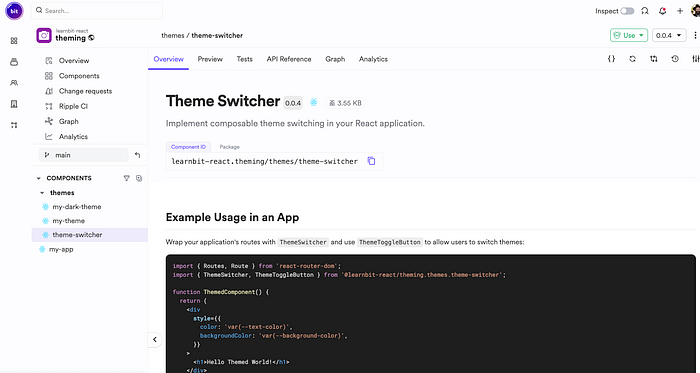
The theme-switcher component hosted in the scope on bit.cloud
Here, we’ll learn to build a composable theme switcher, enabling you to manage theme dependencies and effortlessly override existing theme tokens. This method not only improves accessibility and personalization but also simplifies your theming process.
You can see the deployed app here.
Setting Up the Environment
In our last guide, we created a composable theme component and extended it with a dark theme component.
We’ll get started by initializing a new workspace for our Bit components (replace my-sccount.my-scope with your own bit.cloud account and scope name):
bit new basic --default-scope my-account.my-scope
Next, to continue from where we left off in the previous blog, we’ll fork (copy) the app from the previous example:
bit fork learnbit-react.theming/my-app
The themes are already installed as dependencies in this app. Since we won’t modify them in this guide, there’s no need to import or fork the theme components directly.
Creating the Theme Switcher Component
First, create a React component using Bit’s template for React components:
bit create react themes/theme-switcher
We will use the headless theme-switcher component, which exposes an API to create your own theme-switcher easily. Install it in your workspace:
bit install @teambit/base-react.themes.theme-switcher
We’ll implement the switcher as follows:
// theme-switcher.tsx

import { MyThemeProps, MyTheme } from '@learnbit-react/theming.themes.my-theme';
import { MyDarkTheme } from '@learnbit-react/theming.themes.my-dark-theme';

import {
  ThemeSwitcher as ThemeSwitcherBase,
  ThemeSwitcherProps as BaseProps,
} from '@teambit/base-react.themes.theme-switcher';

// create an array of the themes being composed
export const LightAndDarkThemes = [MyTheme, MyDarkTheme];

export type ThemeSwitcherProps = Omit<BaseProps<MyThemeProps>, 'themes'> & {
  themes?: BaseProps<MyThemeProps>['themes'];
};

export function ThemeSwitcher({
  themes = LightAndDarkThemes,
  ...props
}: ThemeSwitcherProps) {
  return <ThemeSwitcherBase themes={themes} {...props} />;
}
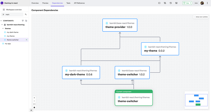
The dependency graph of the newly created theme switcher.
Here, we combine the light and dark themes and pass them to the base theme switcher component, which will handle the switching for us.
The theme switcher component we are creating also exposes a toggle button. This is its implementation:
// theme-toggle-button.tsx

import React from 'react';
import { useNextTheme } from '@teambit/base-react.themes.theme-switcher';

export type ThemeTogglerProps = {} & React.HTMLAttributes<HTMLDivElement>;

export function ThemeToggleButton({
  className,
  children,
  ...rest
}: ThemeTogglerProps) {

// use this hooks exposed from the base theme switcher component to toggle
  const setNextTheme = useNextTheme();

return (
    <div
      role="button"
      className={className}
      onClick={setNextTheme}
      tabIndex={-5}
      onKeyDown={setNextTheme}
      {...rest}
    >
      {children || 'Switch theme'}
    </div>
  );
}
And export it from the index.ts file:
// index.ts

export { ThemeSwitcher } from './theme-switcher.js';
export type { ThemeSwitcherProps } from './theme-switcher.js';

// exporting the toggle button from index allow other component to use it
export { ThemeToggleButton } from './theme-toggle-button.js';
A good component is well-documented and tested, so remember to implement these as well. I will skip the implementation details here, but you can look at the exported version of the theme switcher I created.
Using the Theme Switcher in Your Application
In the app created, we’ll import the ThemeSwitcher and the ThemeToggleButton:
// my-app.tsx

import { Routes, Route } from 'react-router-dom';
import {
  ThemeSwitcher,
  ThemeToggleButton,
} from '@learnbit-react/theming.themes.theme-switcher';

function ThemedComponent() {
  return (
    <div
      style={{
        color: 'var(--text-color)',
        backgroundColor: 'var(--background-color)',
      }}
    >
      <h1>Hello Themed World!</h1>
    </div>
  );
}

// the theme switcher wraps the app and functions as a context component.

export function MyApp() {
  return (
    <ThemeSwitcher>
      <Routes>
        <Route
          path="/"
          element={
            <>
              <ThemeToggleButton
                style={{
                  color: 'var(--text-color)',
                  backgroundColor: 'var(--background-color)',
                }}
              >
                Switch theme
              </ThemeToggleButton>
              <ThemedComponent />
            </>
          }
        />
      </Routes>
    </ThemeSwitcher>
  );
}
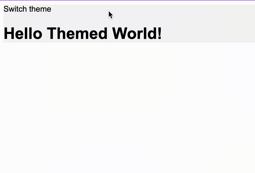
Now we can click on the button to toggle between the themes:
Understanding Design Tokens Overriding
When you switch themes, the design tokens like backgroundColor, textColor, and others have the same names across themes but different values. This means components use these tokens without needing any changes for different themes. Switching themes automatically updates these values across your app, ensuring a seamless transition and consistent application of the new theme's design choices.
Dependency Management of the Theme Switcher
Now that we have all the implementation details set, it’s time to tag the application and the theme switcher with a release version. Run the following command:
bit tag -m "release theme switcher"
And export the components:
bit export
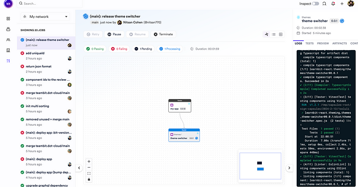
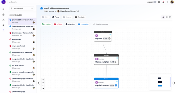
The components will be built on Ripple:
Congrats on your new composable theme switcher!
Notice: The app is configured to deploy to Netlify using the Netlify deployer component. If you wish to deploy your app to Netlify replace the credeintails with yours, otherwise remove this from app pipeline or add a deployer of your own.
In component-based software architecture, every change you make is incremental. For example, if we change the base theme, the change will be reflected and propagated to all of its dependent components:
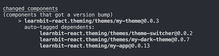
However, if we change an extended theme - the dark theme - for example, the base theme component will not get a version bump, but all the dependants of the dark theme will get one:
Recommend
About Joyk
Aggregate valuable and interesting links.
Joyk means Joy of geeK