

Theming React Components: A Practical Guide
source link: https://blog.bitsrc.io/theming-react-components-a-practical-guide-40cbe202511a
Go to the source link to view the article. You can view the picture content, updated content and better typesetting reading experience. If the link is broken, please click the button below to view the snapshot at that time.
Theming React Components: A Practical Guide
How to create a composable and extensible theme for your React apps

Theming ensures consistency and coherence across your web application’s user interface.
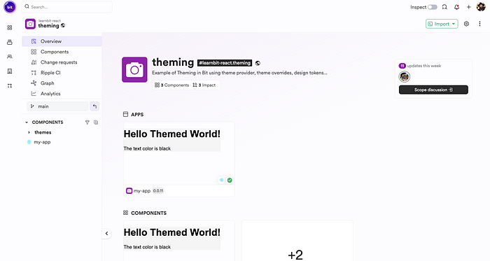
The scope contains the components we will create in this guide: learnbit.react/theming
By implementing a theme, developers can maintain a consistent design throughout their React components, making it easier to manage and update styles. This guide will walk you through creating a unified theme for React components, highlighting the importance of design tokens, theme providers, and context to achieve a dynamic and customizable styling approach.
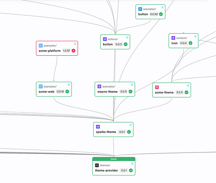
A composable theme provider dependency graph
Creating the Theme Component
The first step is to create a workspace where we can create, maintain, and export the theme component:
bit new basic --default-scope your-org.your-scope
If you have already opened a scope on bit.cloud, replace it with your-org.your-scope
Run the following to create a theme component:
bit create theme themes/my-basic-theme
Here’s the basic structure of the component:
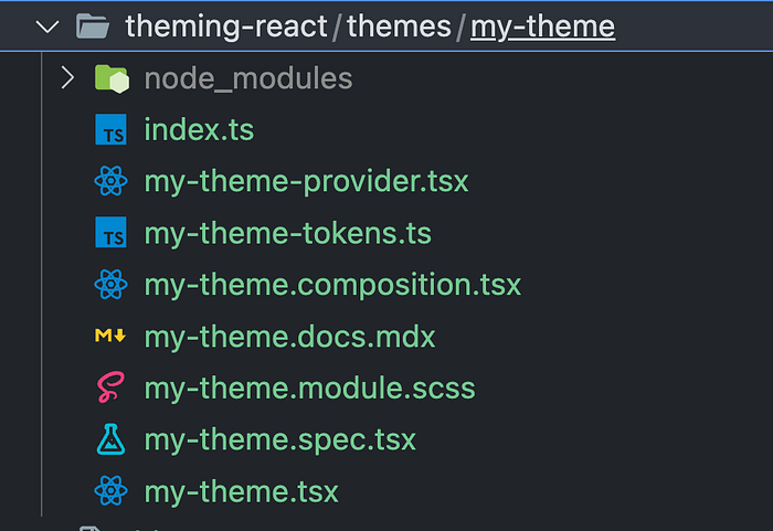
In the following sections, we will learn about the structure of the theme component and how to compose it in your React apps.
Creating Tokens
Design tokens serve as the foundation of a theming system. They are essentially variables that store design-related values, such as colors, font sizes, and spacing. Begin by defining your design tokens with sensible defaults. This ensures consistency across your application and simplifies the theming process.
The design tokens we use are plain JavaScript objects. We leverage Typescript to have the design token fully typed, which will help us extend the theme provider, as you’ll see below.
// my-theme-tokens.ts

/**
 * MyTheme tokens.
 * Include all tokens in this object.
 */
export const myThemeTokens = {
  /**
   * background color. use for primary surfaces across your design.
   */
  backgroundColor: '#f5f5f5',

/**
   * color for general purpose text color. expected to mainly apply
   * on `backgroundColor`
   */
  textColor: 'black',

/**
   * primary brand color. used for primary call to actions.
   * such as buttons, links, etc.
   */
  primaryColor: 'black',

/**
   * color to use for borders.
   */
  borderColor: '#ededed',

/**
   * color for secondary surfaces on the screen such
   * as cards or content outlines.
   */
  surfaceColor: '#ffffff',
};

// create a theme type schema to allow new theme to override
// or implement a different theme variation like dark theme.
// in case tokens are dynamically loaded from a json file, please declare this variable an an interface.
export type MyThemeSchema = typeof myThemeTokens;
Notice how we export the theme schema. It will be handy later when we want to extend the theme component.
Generating a Theme Provider from Tokens
The next step involves creating a theme provider. This provider uses the tokens you’ve defined to generate a theme object. Through a createTheme function, you can transform these tokens into a coherent theme, making it available throughout your component tree.
// my-theme-provider.tsx

import { createTheme } from '@teambit/base-react.themes.theme-provider';
import { MyThemeSchema, myThemeTokens } from './my-theme-tokens.js';

/**
 * creating and declaring the my-theme theme.
 * define the theme schema as a type variable for proper type completions.
 */
export const MyThemeProvider = createTheme<MyThemeSchema>({
  theme: myThemeTokens,
});

/**
 * a react hook for contextual access to design token
 * from components.
 */
export const { useTheme } = MyThemeProvider;
The createThemefunction returns a ThemeProvider that makes all tokens available throughout your app using CSS variables. You can also access the values inside JSX using the useTheme hook. Let’s see how we theme a component both ways.
Injecting CSS Properties with the Theme Provider
The theme provider injects CSS properties into your application, enabling you to use the defined tokens as CSS custom properties. This method ensures that all components have access to the theme, allowing for consistent styling based on the defined tokens.
Let’s create a React app component:
bit create react-app my-app
We will render the ThemedComponent and wrap it with MyTheme on the root route:
import { Routes, Route } from 'react-router-dom';
import { MyTheme } from '@learnbit-react/theming.themes.my-theme';

function ThemedComponent() {
  return (
    <div
      style={{
        color: 'var(--text-color)',
        backgroundColor: 'var(--background-color)',
      }}
    >
      <h1>Hello Themed World!</h1>
    </div>
  );
}

export function MyApp() {
  return (
    <Routes>
      <Route
        path="/"
        element={
          <MyTheme>
            <ThemedComponent />
          </MyTheme>
        }
      />
    </Routes>
  );
}
We used an inline style to access the CSS variables, but you can also access them from any CSS/SCSS file.
Making Style Available Using Context
Utilizing React Context with the theme provider allows theme styles to be accessible across all components JSX. It is usually helpful when you want to render a style conditionally. Here’s a quick example:
import { Routes, Route } from 'react-router-dom';
import { MyTheme, useTheme } from '@learnbit-react/theming.themes.my-theme';

function ThemedComponent() {
  const theme = useTheme();
  return (
    <div
      style={{
        color: 'var(--text-color)',
        backgroundColor: 'var(--background-color)',
      }}
    >
      <h1>Hello Themed World!</h1>
      <p>The text color is {theme.textColor}</p>
    </div>
  );
}

export function MyApp() {
  return (
    <Routes>
      <Route
        path="/"
        element={
          <MyTheme>
            <ThemedComponent />
          </MyTheme>
        }
      />
    </Routes>
  );
}
And here’s how it looks:

In the next section we will extend the theme and change the background color.
Customizing and Extending the Theme
Customization and extension of the theme are straightforward. By leveraging the foundation built with tokens and the theme provider, you can easily introduce variations like a dark mode or adjust the theme to fit brand guidelines. This section will guide you through customizing and extending your theme to accommodate various needs.
Let’s create a dark theme component by forking the existing one:
bit fork themes/my-theme themes/my-dark-theme
Now we can change the background color in the tokens file:
import { MyThemeSchema } from '@learnbit-react/theming.themes.my-theme';
/**
 * MyTheme tokens for Dark Theme.
 * Include all tokens in this object adapted for a dark theme.
 */
export const myDarkThemeTokens: MyThemeSchema = {
  /**
   * Background color. Use for primary surfaces across your design.
   * Darker color for dark theme.
   */
  backgroundColor: '#121212',

/**
   * Color for general purpose text color. Expected to mainly apply
   * on `backgroundColor`. Light color for contrast against dark background.
   */
  textColor: '#e0e0e0',

/**
   * Primary brand color. Used for primary call to actions.
   * Such as buttons, links, etc. Can keep it bright for visibility.
   */
  primaryColor: '#bb86fc',

/**
   * Color to use for borders. Lighter than background but still dark.
   */
  borderColor: '#373737',

/**
   * Color for secondary surfaces on the screen such
   * as cards or content outlines. Slightly lighter than the background.
   */
  surfaceColor: '#1e1e1e',
};

// Update the theme type schema to match the new dark theme tokens
export type MyDarkThemeSchema = typeof myDarkThemeTokens;
Now, add another route for the new theme in our app:
export function MyApp() {
  return (
    <Routes>
      <Route
        path="/"
        element={
          <MyTheme>
            <ThemedComponent />
          </MyTheme>
        }
      />
      <Route
        path="/dark"
        element={
          <MyDarkTheme>
            <ThemedComponent />
          </MyDarkTheme>
        }
      />
    </Routes>
  );
}
The dark theme route.
Obviously, you can use the extended theme in other apps.
Versioning and Exporting the Theme
To release the components so they are available for consumption by others, we first have to tag them with a release version.
bit tag -m "new theme component"
And export it to bit.cloud:
bit export
The components are tested and built on Ripple:
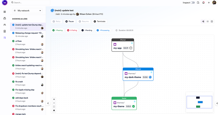
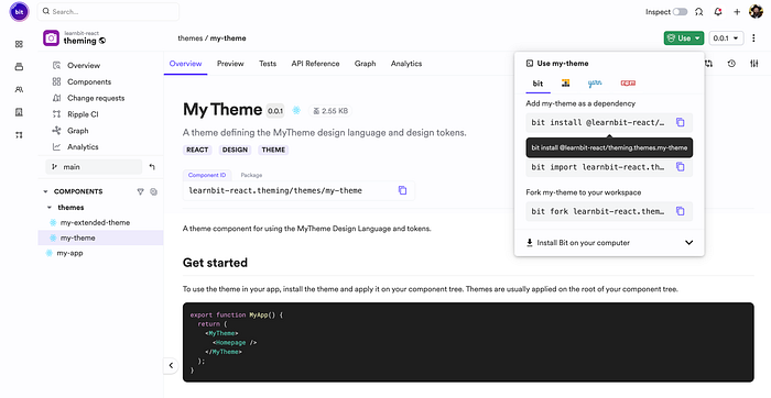
After the build is successful, you can use or maintain the components from any workspace:
Conclusion
In this quick journey, we’ve illustrated the essence of component-based software engineering by creating a composable and reusable React theme component using Bit. This approach not only enhances code reuse and streamlines development processes but also underscores the power of modular design. By constructing a theme component that can be easily shared and integrated across projects, we embody the principles of modern software engineering — promoting efficiency, scalability, and maintainability. Happy coding!
Recommend
About Joyk
Aggregate valuable and interesting links.
Joyk means Joy of geeK