

Product & ux design case study on smart device app | UX Planet
source link: https://uxplanet.org/designing-ux-for-smart-eyeglasses-app-product-interaction-design-8e8afc385d5
Go to the source link to view the article. You can view the picture content, updated content and better typesetting reading experience. If the link is broken, please click the button below to view the snapshot at that time.
Designing UX for smart eyeglasses app (product & interaction design)
ux, industrial design & user interface case study on a smart spectacle & its app design
Brand-Titan Eyeplus, Design & dev time frame: 2.5 Months
Team members: 1 UX, 1 Industrial & 2 Visual designers, One Product Manager, one full-stack developer, and two back-end engineers (Developers are from a Bengaluru-based Dev agency PHTL and Visual designers are from a staffing agency called “Honeycomb”), UX writing was done by Ogilvy Bengaluru.
My role: UX Design Lead. (Research, Finalizing UX, and driving the visual design of the same), Project Date: June 2020
Read overall is a compilation of how the design journey started, What research went through, and what got rejected and remade to reach till what is the final design outcome & impact.
Introduction about Product
What is titan Eyex?
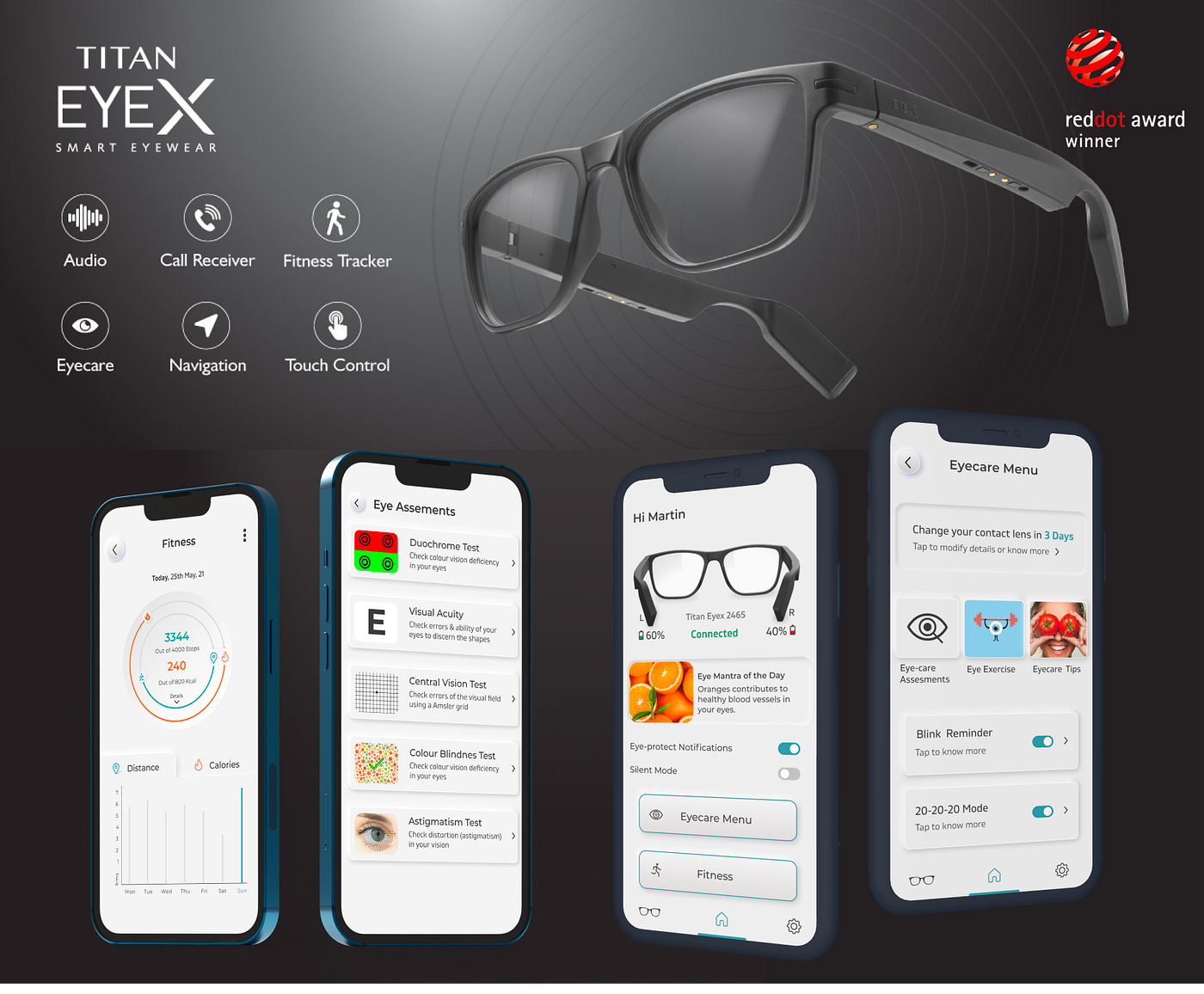
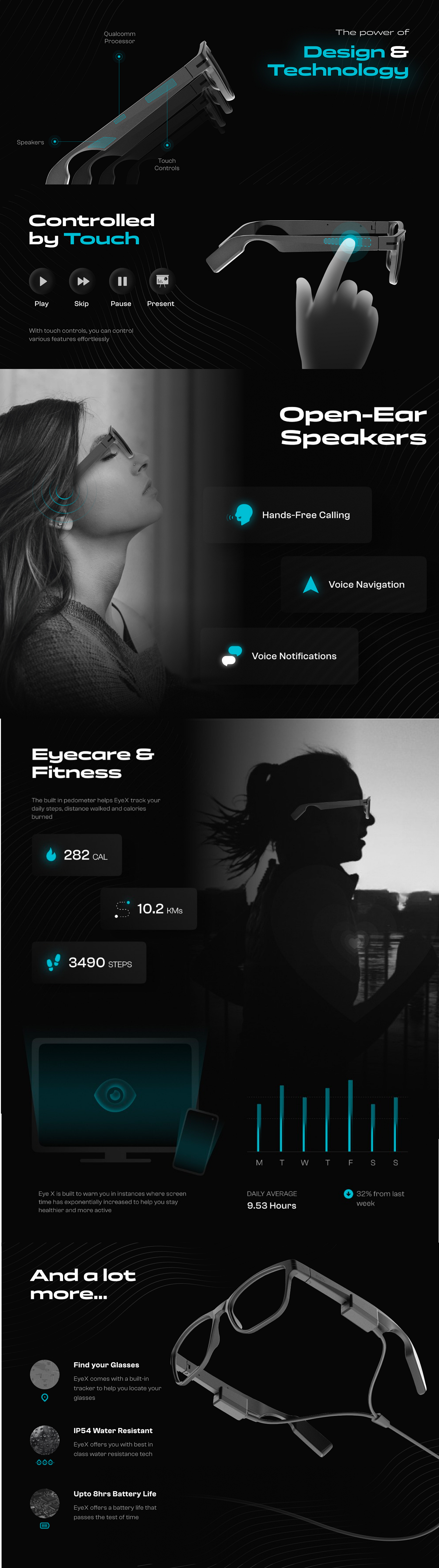
Titan Eyex is a pair of smart glasses manufactured and brought via the best optical brand in India i.e., Titan Eyeplus. It uses open ear technology to transfer sound directly to the inner ear. It also allows you to listen to music, and take phone calls.
The spectacle’s design objective was to be used daily like a normal frame. It's lightweight, Comfortable, and one of the best USPs is that No one can figure out that it's something beyond ordinary specs with a built-in tech.
Furthermore, it also has some more benefits and optional or volunteer features for users such as Fitness functions, eye care assessments, a Presentation controller & phone camera remote.
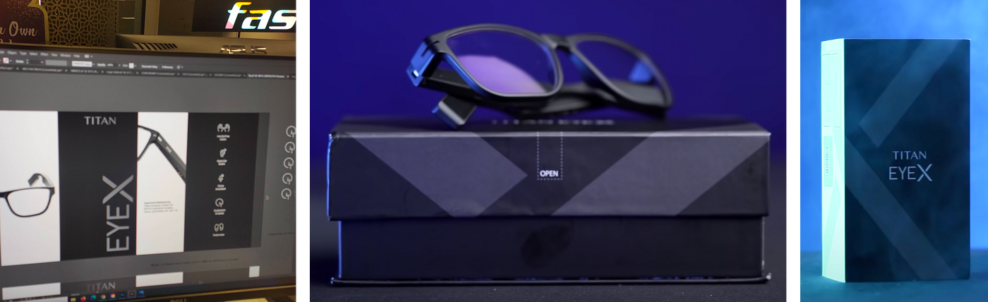
The below creative will show the physical product’s capabilities in terms of technology, features, and details.
Highlights and capabilities of product’s technology. Poster by Ogilvy, Bengaluru for marketing
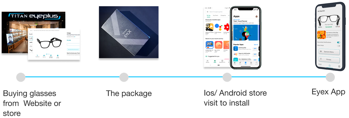
Need & Requirement: Since we had to seek assistance in reviewing our customer journey regarding our existing products, such as smart audio/Video sunglasses. There was a need for a companion app for titan eyex glasses to help our users interact better with the product. Especially to use the new features, some of them have to work only with android and IOS.
Design brief
We worked in a team on glasses and its app, that uses open ear technology to transfer sound to the inner ear. An Eye accessory that allows you to stay connected with your device through sound in a safe way, being aware of what is surrounding you along with other exciting features.
Tasks
We were tasked by the company to build a mobile app with the following agendas.
- Creation of interactive control with certain applications, especially the device app.
- Should give us the ability to control our phones with glasses.
- Should allow us to operate the bonus features like presentation control, fitness features, and phone camera remote
- Eyex should act like an environment for our phone apps, slightly like smartwatches. (We have a history with smartwatches as well)
Our Design process
Primary & Secondary Research: The objective was to figure out the right user needs. The Creation of the right personas, and Insights was also important (User interviews, googling 😅, Competition analysis, etc.). We also have a Customer journey map in our design process but for this particular project, we didn't make it as there was no potential need.
- Defining/ Framing the right problems: Analyzing everything that research has to offer & how to reflect the insights in-app.
- Ideation: Exploration of different possibilities of wireframes & user flows, the right navigation, hierarchy & interactions, etc
- Prototype & Testing: Making a test prototype of the design, looking forward to listing out the flaws, Fallacies, and biased errors.
The brief research phase was about to start, Both primary and secondary research was done simultaneously. We kept on aligning the insights together as a team. Highlights of both are shown below.
Major secondary research
Our Research Objective: To create an efficient ecosystem that provides certain features to the users. Some of it is voluntary such as certain eye care assessments, eye protection notifications & bonus features like fitness functions, presentation support & find my glasses feature. On top of that, A Finely shaped frame To proceed, we required clarity on the following problem statements.
Problem statement 1- The Device was capable of having a set of features. The first challenge was to see, which of these have the most potential and which users would want the most. And it’s also very important to find out what’s possible to do now.
Problem statement 2- since we have a history with optical technology, smartwatches, and accessories with failures that came with some of them. How do we bring the learnings and incorporate them there?
Problem statement 3- how do we incorporate the industrial design learnings we got from one of our immediate previous sub-products:- Fastrack smart audio and video sunglasses.
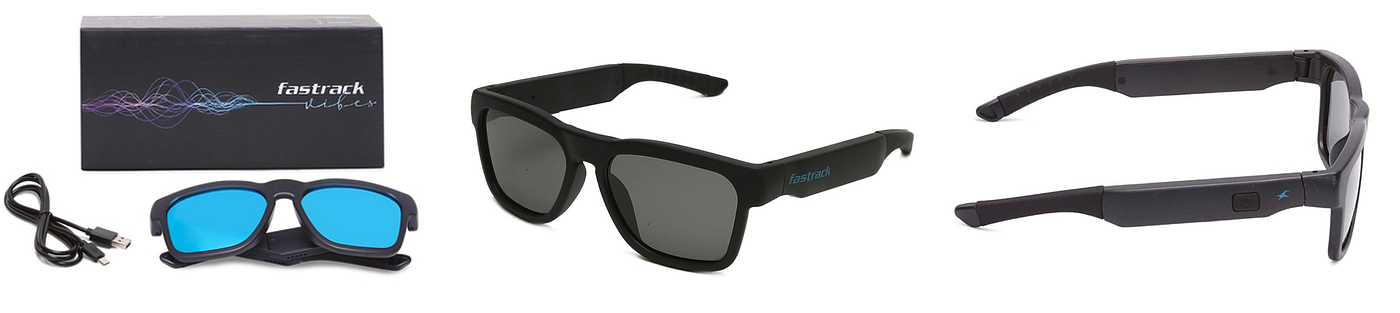
One of the old products: Fastrack Vibes, Audio, and video Sunglasses
Competition and similar products Analysis
We first reviewed all the direct competitors, like Vue, Bose AR glasses, Voxos, etc. But as the market seemed very new and small, we decided to expand our research and planned to come up with something unique. We looked into these three areas in major while researching:
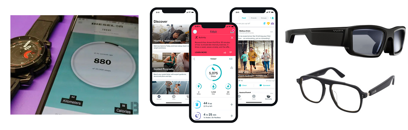
Wearable Accessories: HowdoProducts like Apple Watch, Fitbit & Diesel work with their corresponding app?. We also analyzed, how they manage notifications and features on phones via their apps in detail.
Headphones: Since the major function of the specs was the High-quality audio and communication features,we wanted to find out how other headphones’ companion apps complement the experience. Bose had a strong example that used voice control to connect the headphones to the phones.
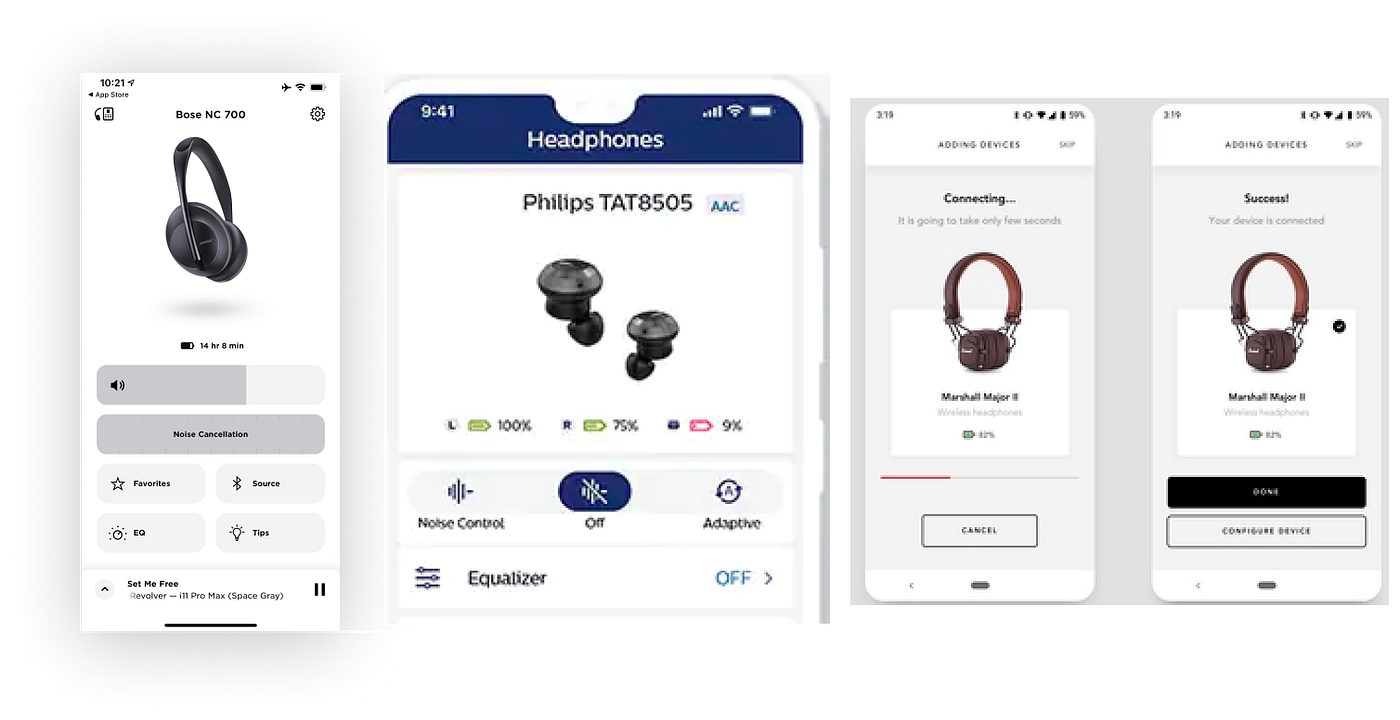
A glimpse of various apps and their connection and usability approach
Device status: To see how people interact and use voice assistants and how you can set up actions for your phone and control tasks.
We want to be inspired and borrow from the best of all of these secondary insights to create an experience that sits in the middle of all of this technology and is truly new and unique to the Market.
We used all of this as a base to find and discover which target users would be best to interview and what kind of things to talk about first, what has to be given priority & most important the takeaways:
- No direct competitors had something like eyex at this price point concerning technology & Build.
- All the other Smart Glasses didn’t have a companion app yet.
Primary research & user interviews (Most initial stage)
How do collaborate between the brand’s vision regarding products with user personas and expectations for the same? Our primary research was finished by this point. Everything started with a set of questionnaires for different potential user groups.
Generic question (For all user groups)
Are you a spectacle user?
Have you used a smart wearable accessory before?
What have you used it for, if yes?
What features do you expect from these or similar smart devices?
Would you like your spectacle to track your fitness parameters such as steps taken or calorie burn etc.?
Would you like to control smartphone music functions with spectacle?
Would you like to use your spectacle as your phone camera remote?
Would you like to use the app for eye care functions such as eye exercise games, Volunteer eye checkup assessments within the app?
Would you like to go through eye checkup assessments such as (color-blind check, Visual acuity test, central vision test, etc) if your app will provide such functions considering the app will introduce you to tests?
Specific Questions after a quick verbal glimpse of the product and potential features.
Since both the temples of glasses have a different battery, also one temple is more intractable so, sometimes there can be a difference in battery levels. Is it going to bother your product experience?
What info do you want to look at first after launching the app & why?
What are your favorite Daily usage apps?
For better eye care wellbeing, the App, as well as spectacle, can remind you to take a break voluntarily if you are continuously on the screen for more than 20 mins. How would you like this feature?
Do you mind scanning through or looking at different eye care tips & exercise daily?
Based on the answers and several interviews with respective insights, We bucketed the user’s insights based on the following:
a. What features do they value more and what exactly less and why?
b. What new feature got suggested and how are they reacted.
c. The misc features linked to the Eyex app: How do they intend to use the features, and with what convenience.
Considering the Design of the spectacle along with the entire UX plan of the app, Here is how we have visually represented it:
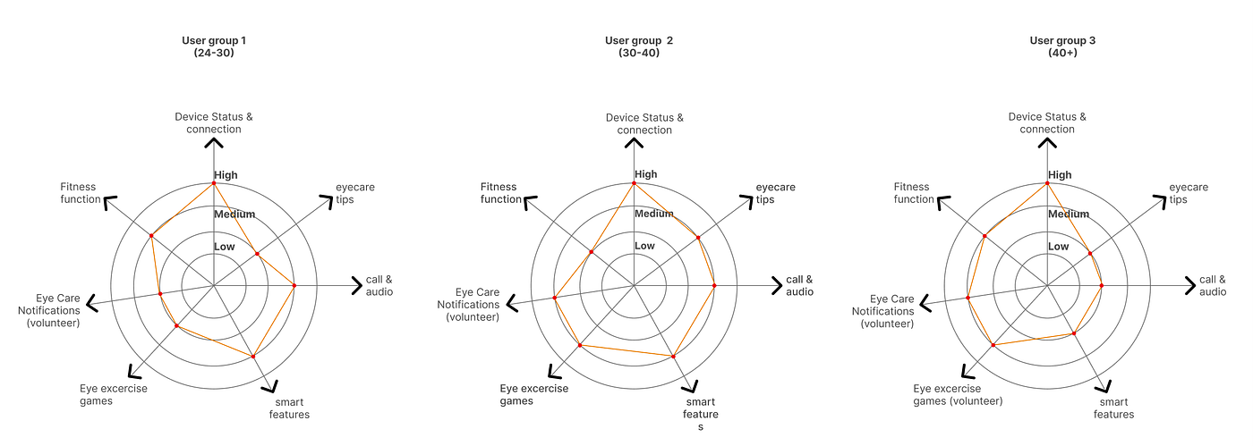
Simplified insights
By this time we doubted our metrics because our personal bias and intuition were to focus on other areas matching with soaring interactions such as music, camera remote, and fitness. But following the metrics, we also covered the potential eye care features. (Also, it was matching well with Titan eyeplus’s newer brand vision, i.e., Eye care first with best in class in Fashion)
Coming up with the right Personas for post-secondary & primary research
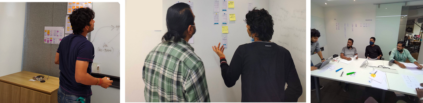
We mapped all the key findings on a wall. We identified patterns and key themes and bought these questions together for spectacle and non-spectacle users to build a user persona. These questions got framed collectively concerning the ergonomics, The App, Functionalities. Also, we had to know what exact audience will be right for the interviews.
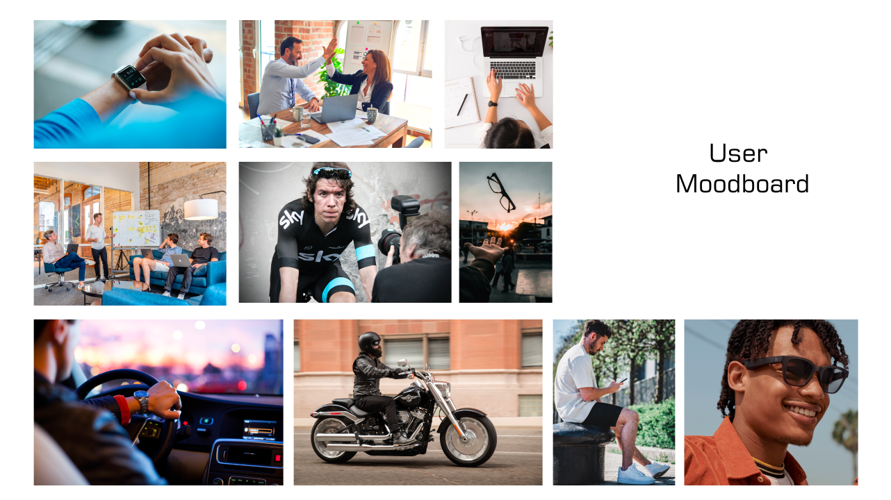
Consumer Mood board made by the Industrial Design team (The design of Physical shape, form & materials, and ergonomics)
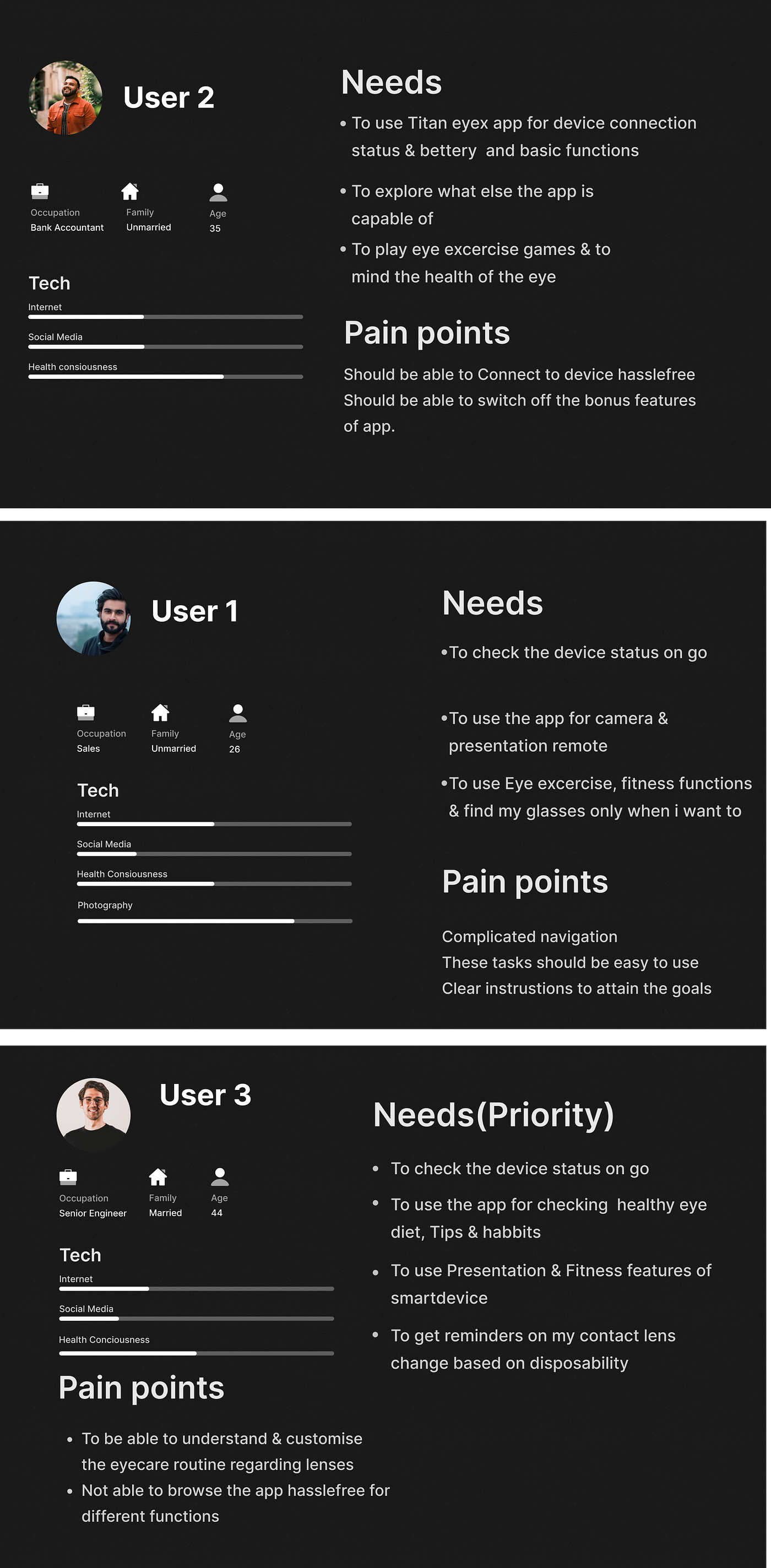
Following are the final personas covering the final aspects of user stories
The users were educated a bit about glasses as it is not a too common smart wearable accessory. We framed different scenarios for these users to get the right & relevant feedback.
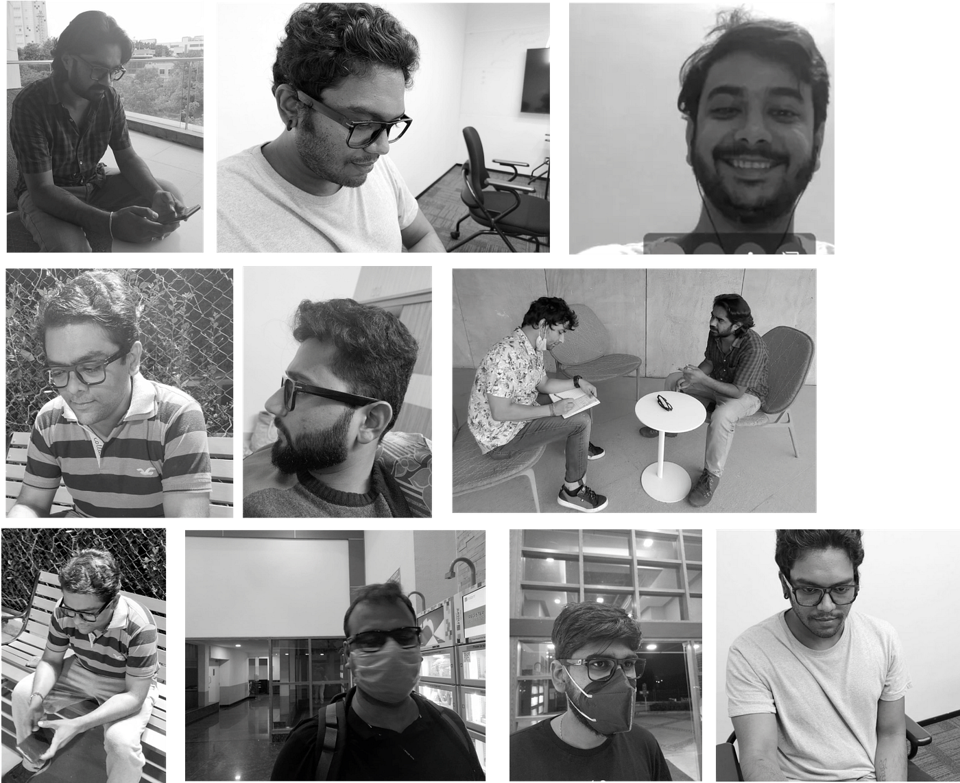
Different sets of user groups reviewed the app while wearing the prototype glasses (Some are caught in the interview while walking or passing by 😅)
Extra Additions to the app based on insights from users and brand stakeholders
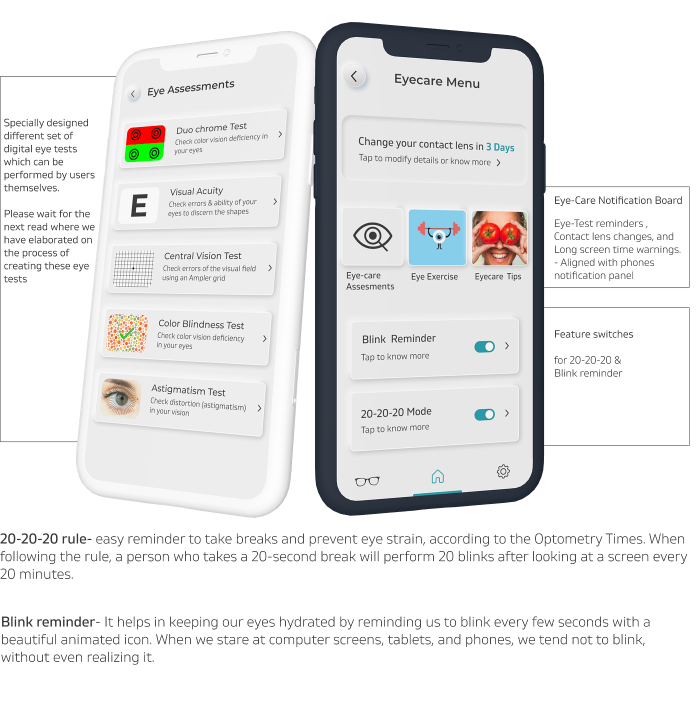
- Eyecare Assessments- This feature was not in the product roadmap earlier. Because of the insights into the user’s expectations regarding volunteer eyecare functions, We designed some certain eye-test modules which are possible while wearing the glasses along with using the phone. We designed the following Eye tests:
Duochrome test
Convergence test
Visual Acuity test
Astigmatism test
Colour blindness test
- Coming up and designing these tests extensively took a month and hence extended our expected timeline by one month. This work was carried out under monitor of our brand’s optometry team and optical head. Since this had a very separate research and design approach, So I will be writing a separate case study on how we designed & implemented wellbeing and eyecare functions into our smart app & device.
8 times re-iterated & final Information architecture with all the insights we had got from both the researches
Customer Journey map on a high level
(IA) focuses on organizing, structuring, and labeling content effectively and sustainably. The goal is to help users find information and complete tasks. The diagram below also depicts User flows on a high level
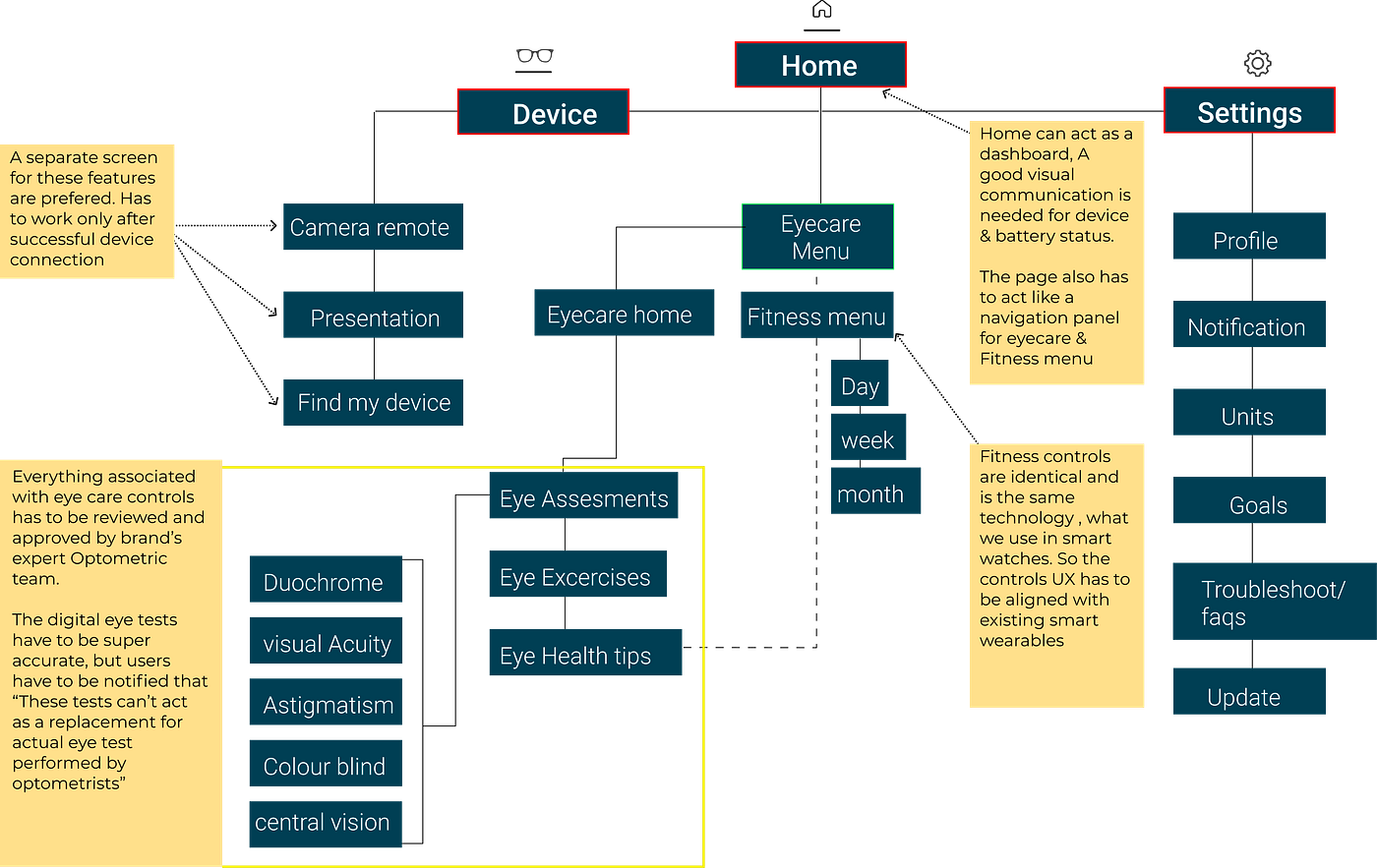
Final Information arch. & Wireframe notes of the app
Final flows before proceeding into UI Design
We were done with low-fidelity screens at this point (Notebook is lost, so can't show the scribbled screens). Also, all the screens were closely analyzed by me along with the product manager and developers. There are these flows in major:
- The device status and connection checker flow- Self-understood (default home and feature page does the job)
- Device additional feature flow- Home> Feature tab > Presentation, camera remote & find my phone> Respective screens.
- Fitness flow- Home > Fitness > fitness dashboard> Detail report on daily, weekly and monthly activities.
- Eye-care flow- Home > Eyecare menu > Eyecare tips, Assessments & enable disable switches (Rest will be explained in detail in the next read)
The Designs
Glasses first
After learnings from existing smart sunglass “Fastrack vibes” concerning the ergonomics, shape, form & materials were already improvised. Apart from that the new design was very sleek, and lightweight and was made considering the Daily usage and rough lifestyle.
The overall design as a product later won the Red dot award in August 2022, under the category of smart products. Which was a very big milestone for the entire team.
Presenting Titan eyex
The App - Visual, Interaction & UI Design details
The color and font palette is a mix of the brand’s color and Ui's accessible colors. We purposely didn't take 100% black and white in our primary use cases as its eye constraining. For type, We paired Montserrat with Gilam to get what seemed to work for us.
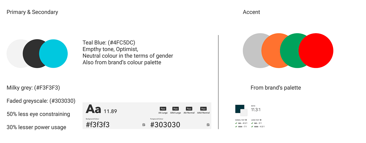
Primary & secondary color Palettes provided by our Visual Designers
Typography
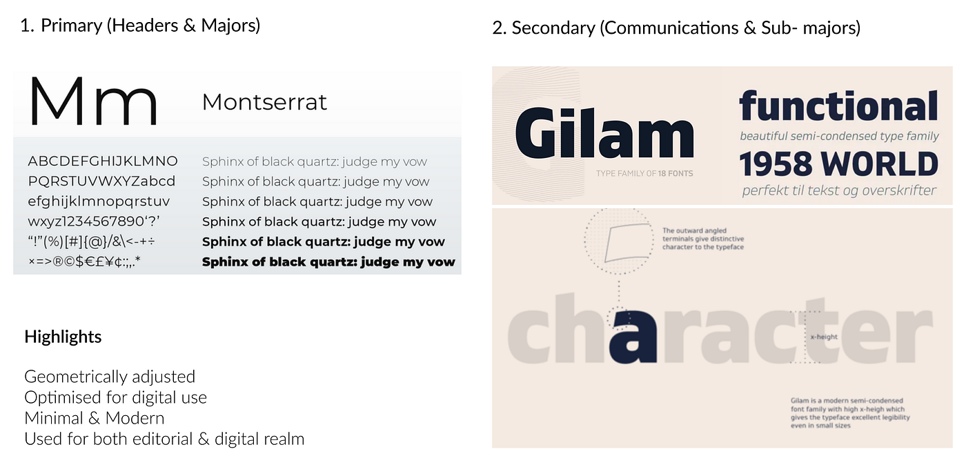
Font palette for the entire app
Custom Library
We didn't choose common libraries like material UI, Ant designs, etc. We took a call of using one open source library where all the components were customized concerning contrast, Blindproff simulations, and dev convenience.
Some major Design Re-iterations post final testing
A still from Titan corporate office, Bengaluru
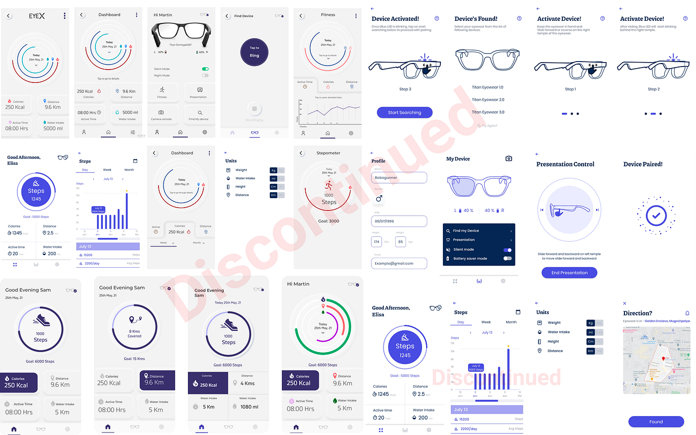
To let the users understand the features better and educate them during the process, we first changed onboarding screens and tried several options for several flows:-
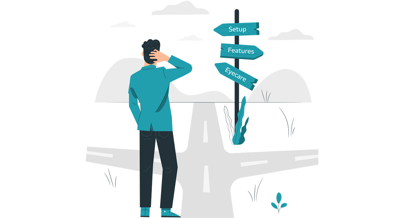
Illustration src: Storyset
Out of several explorations, we noticed that users need extra clarification and communication on how to set up and connect the product to the app or phone. Also, as a team, we were not happy with the visual design of the finalized UX. Mutually, we decided to discontinue the design approach followed (the screens attached below). We decided to re-imagine and explore all the flows in a new manner.
Highlights of what got rejected and why
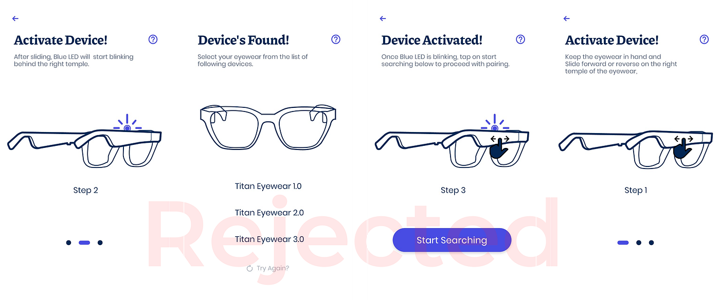
Discontinued and rejected UI approach for onboarding
Final & last addition to the app from the brand
- 20–20–20 rule for eyecare menu (NEW): It was designed by Californian optometrist Jeffrey Anshel as an easy reminder to take breaks and prevent eye strain, according to the Optometry Times. When following the rule, a person who takes a 20-second break will perform 20 blinks after looking at a screen every 20 minutes.
The new dashboard, Fitness page, and pretty much everything Enhanced
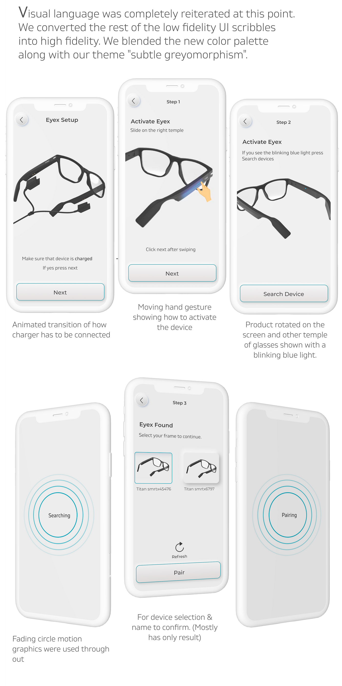
Qthe question was how do we make the onboarding steps and processes so much obvious that there shouldn't be any scope of confusion. At this point, our industrial design knowledge came in handy. Since we were good with 3d, we decided to model the glasses on 3d software (Maxon cinema 4d)and to render them on “Luxion Keyshot” once and for all, We got complete control of the product visual. (this method was also preferable because during this phase industrial designers were busy finalizing the outer material and colors etc. so a photoshoot of the product was not possible). Also, gesture animation was done above the product animation on Adobe After Effects.
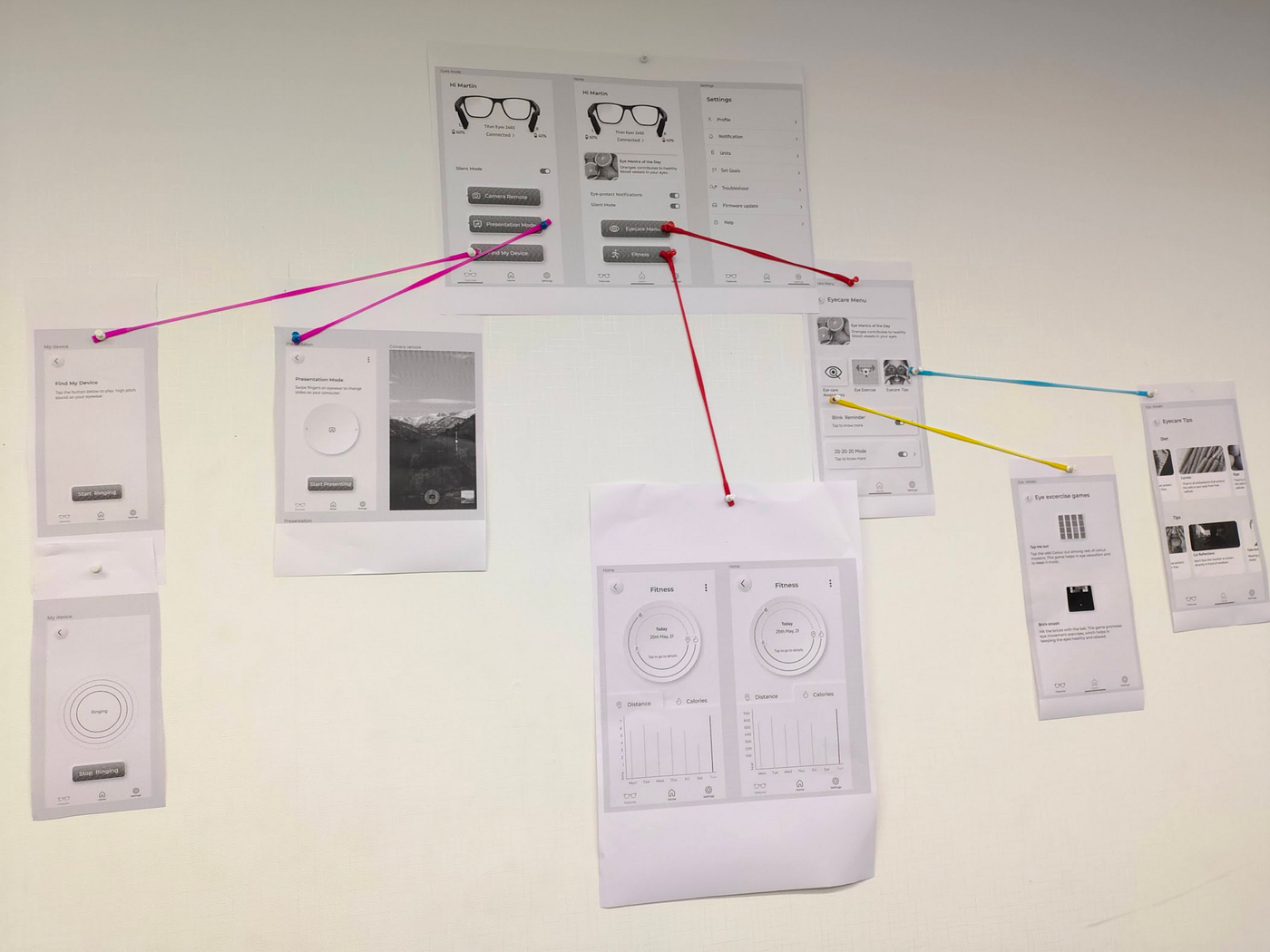
New wireframe printouts are mounted on the wall for people to review
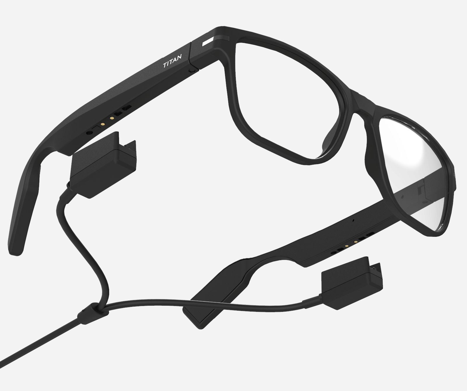
Renders taken for UI, After several attempts, we achieved the supposed looks of the product (used Cinema 4d + luxion Keyshot 3d)
We completely dropped the illustration approach to communication and embraced the beauty of hyperrealism(3d only) after testing the new approach. It was working way better than the rejected approach.
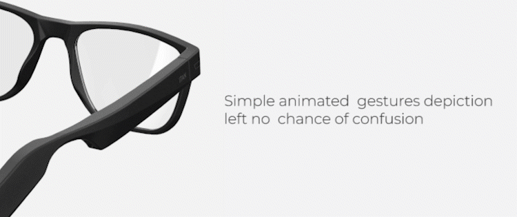
Example: Animated gesture on the app showing how to activate the glasses
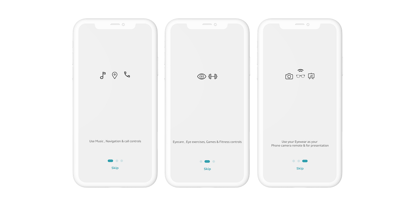
Reiterated & new designs
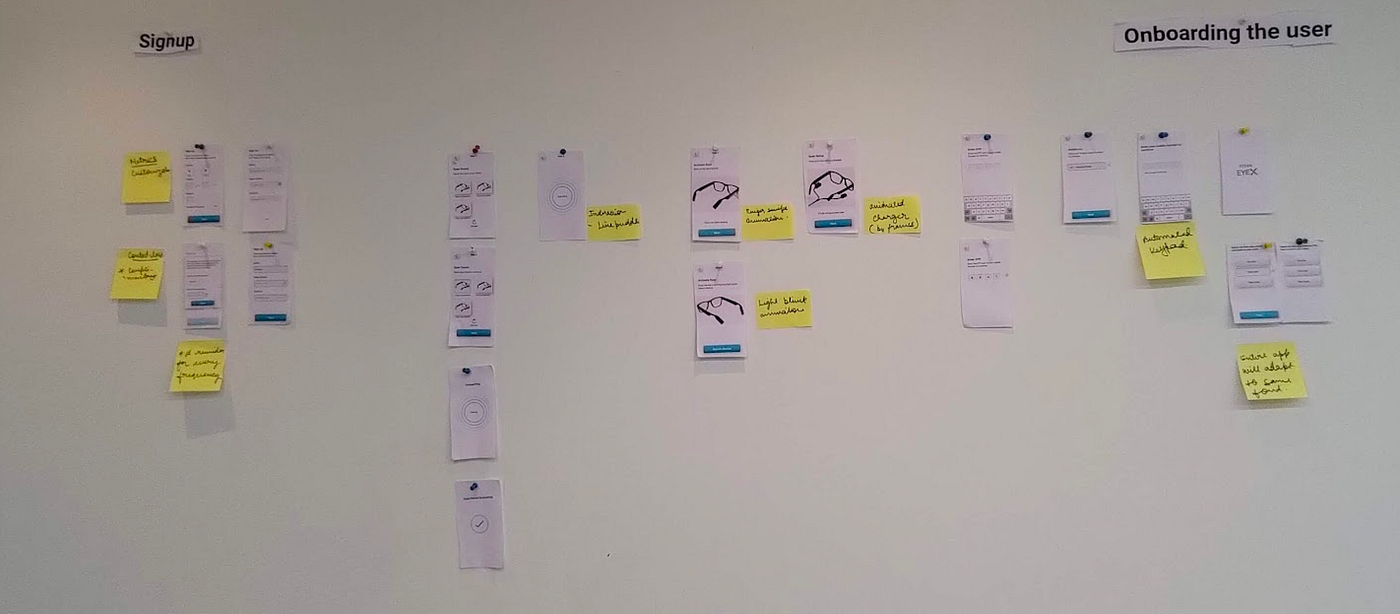
We created the new improvised flow on the same day and tested it with the same set of user
New onboarding Flow UI
Sign up flow
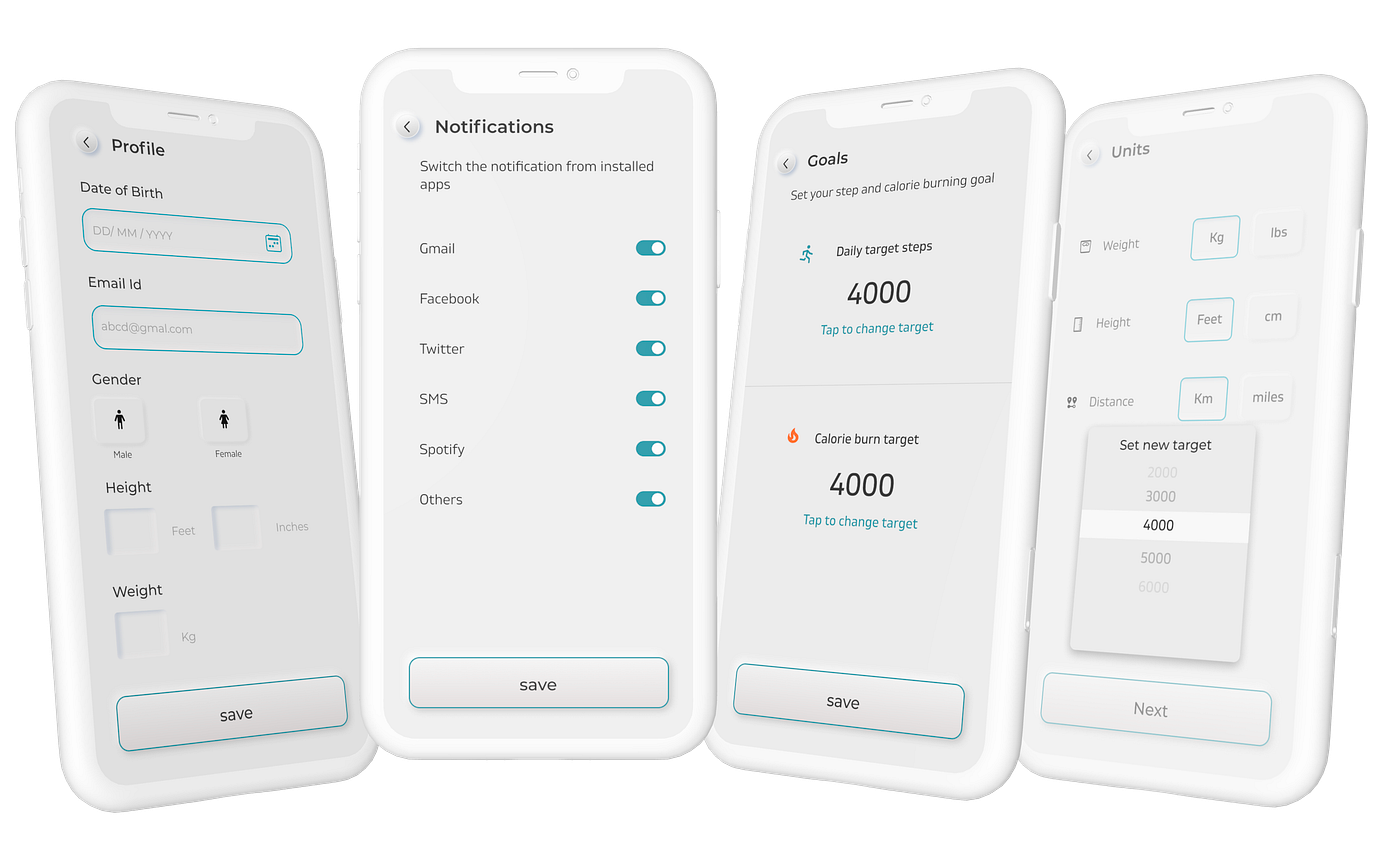
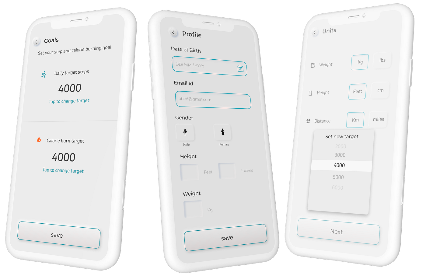
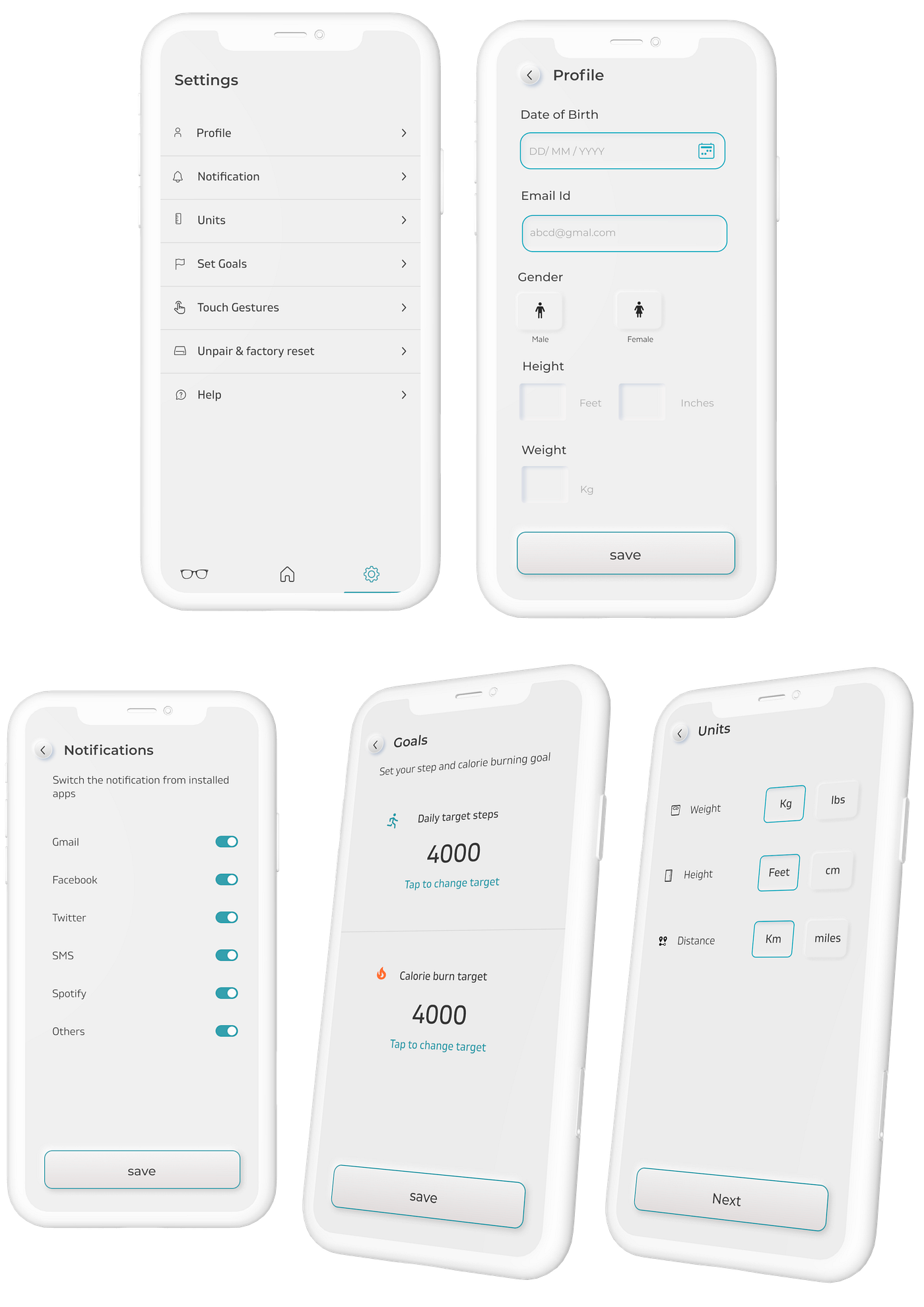
For first-time users, The app starts from a splash screen followed up by Font size selection and phone number input (Which is very important for fitness and find my glasses feature to work). Selection of font size was given users’ convenience based on their eyesight.
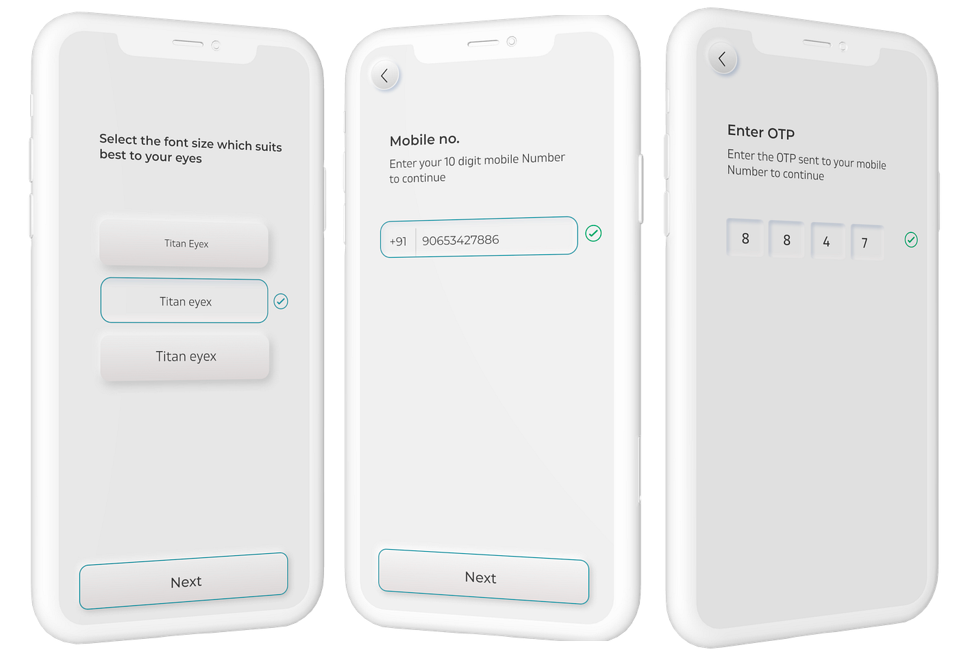
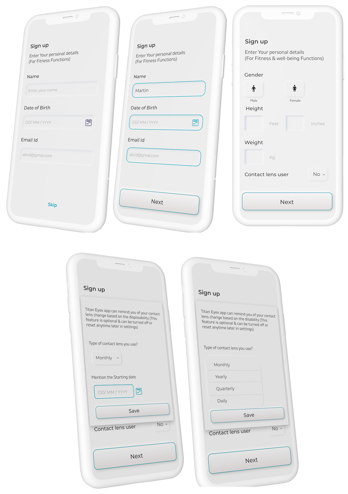
A simple flow starts from phone no. & OTP and proceeds to sign up for other important requirements of the app to function ex- Date of birth, weight, height, etc.
Post signup helping screens for the first-time users
Homepage/ Dashboard
The most important highlight of the homepage is the signifier for the glasses’ battery and connection status. During wireframing, we kept this communication on top. Both the temples had separate batteries (This was a hardware constraint as one temple had touch-enabled tech also along with speakers for interaction and communication with phone and laptop).
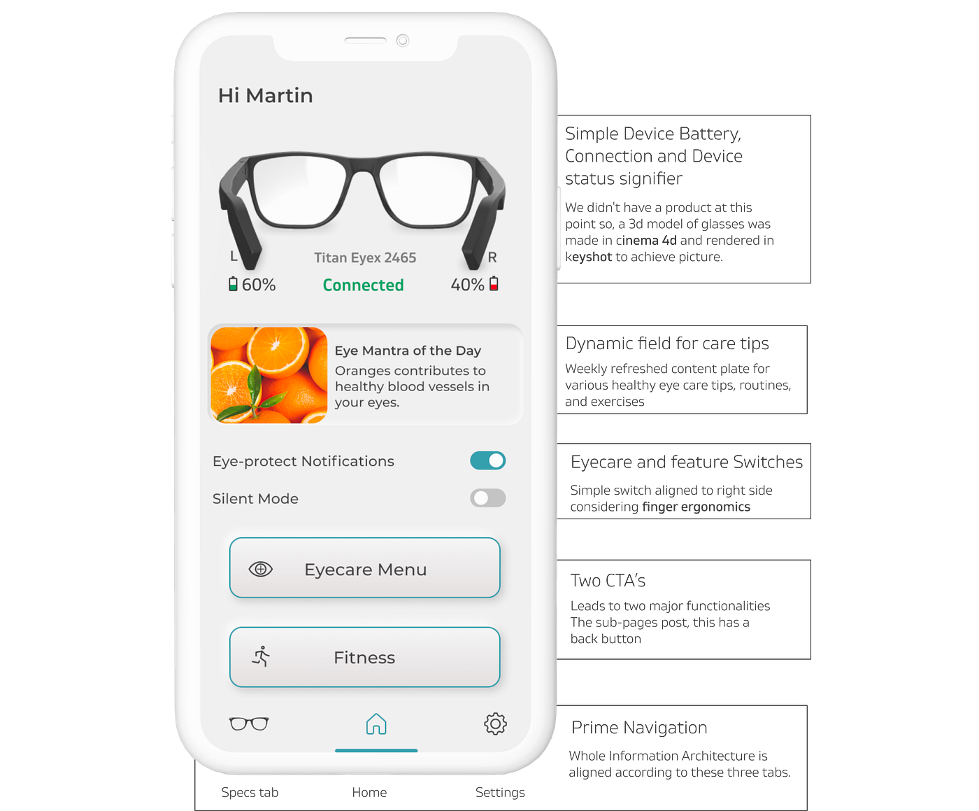
Flow to get the device connected for the first time users
Eyecare Menu
One very major aspect was the eyecare menu, We had a voluntary function of eye check-ups and lens changes weekly, monthly, and quarterly reminders. These options were annoying to a user setting so we gave it a switch to completely silence it. I will be writing a separate read on Eyecare assessments as it's super vast and deeply linked to Opthalmology and optical. digital technology.
Apart from that, there are eye care tips on the app which refreshes monthly and the content is controlled by the brand’s retainer agency Ogilvy Bengaluru. The same is supposed to reflect in the brand’s e-commerce app also at some point.
New Fitness Function (stepometer and Calorie burned signifier)
The technology of this feature was already with the company and was getting used by smartwatches, The tech was modified, Manipulated to fit inside the waterproof temples. So the functions and experience precision are pretty much inspired by the Fastrack reflex.
A pedometer, or step-counter, is a device, usually portable and electronic or electromechanical, that counts each step a person takes by detecting the motion of the person’s hands or hips. in this case, It is getting analyzed by the head movement while wearing glasses.
Since we had information on steps, We calculate the calorie burned using the algorithm set for watches. All the detailed info can be accessed in the fitness section of the app.
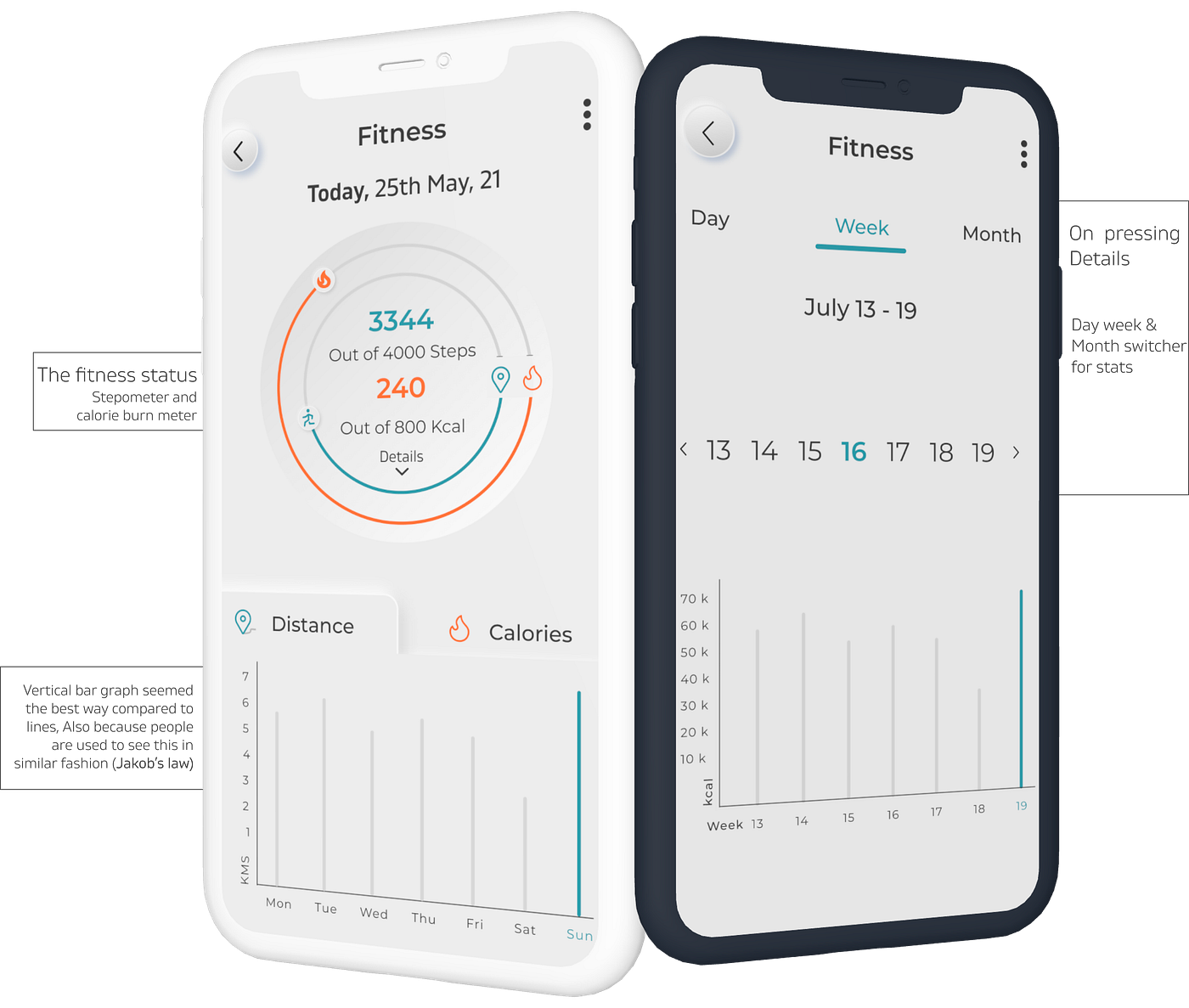
A flow very similar to what users are used to with smartwatches
1st screen is for new users, Rest is part of the settings and linked to fitness for data and metric requirement
2nd screen is for new users, Rest is part of the settings and linked to fitness for data and metric requirement
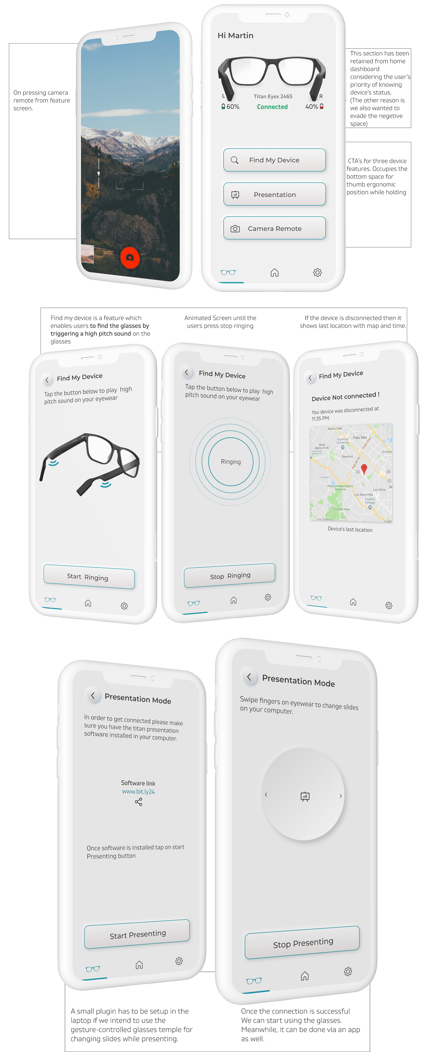
My Device tab — Presentation Mode, Phone camera remote, find my device feature
Settings and Misc
How did we add and implement animations easily?
We used Lottie files for all our animation and motion graphics needs. We designed and animated everything on adobe after effects concerning dimension and Design. On completion, we imported the files using a Lottie plugin on After effects to get an Insertable URL for the animation to work on UI.
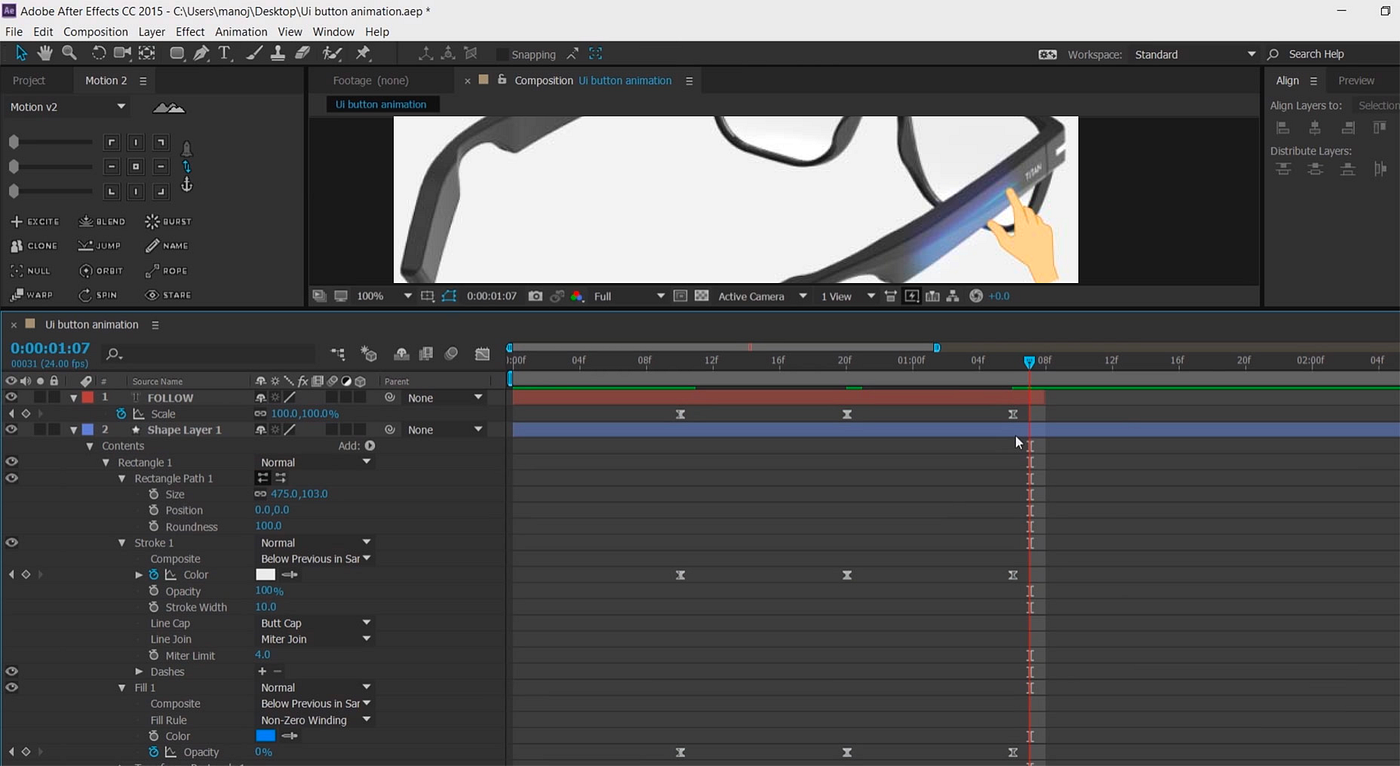
Animation glimpse on After effects before sending them to Lottie
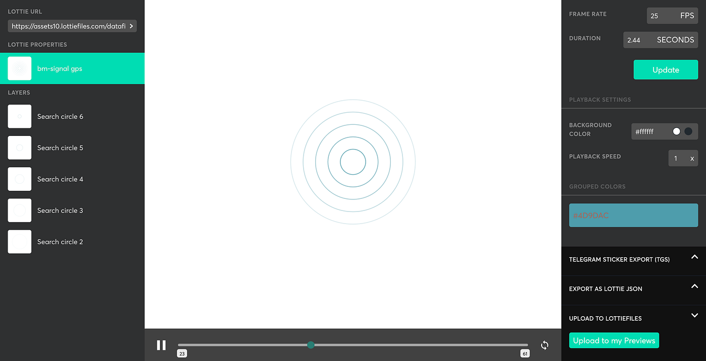
How we made our motion graphics in after effects and used Lottie files to convert them into code
Rejected and discontinued approaches
Sometimes it seems there is an easy way ahead and we can have the easiest desired designs to work but it's important to establish a connection between the company, product vision, and stakeholders. It's okay to roll back and reshuffle things even when your research is solid. Because we as designers do not always have to focus on the user’s behavior and expectation, Sometimes we just have to serve something new, fresh and unexpected.
Bunch of rejected and discontinued approaches
Conclusion
Initially, after a glimpse users expect Glasses that play music… and maybe make calls, or there is a camera in glasses as well. And these are already highly innovative features. With the app, we were giving them, more: too many new features all at once. So our main problem solving which worked was the simplified, clean and communicative designs, It stopped getting overwhelming for the users. They started showing a behavior where they became more interested in exploring different aspects of the app and glasses.
Everything else post-design completion
Well-designed classy packaging by the team
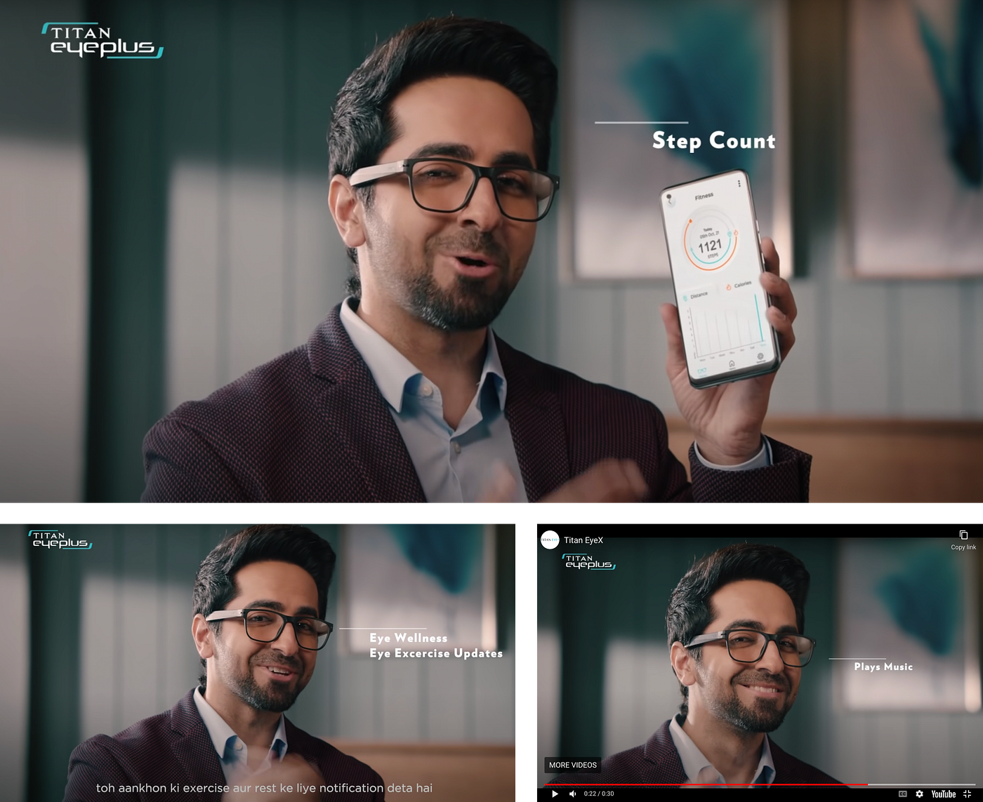
Stills from the TV commercial and YouTube ads. (Ft. Ayushman Khurana as brand ambassador)
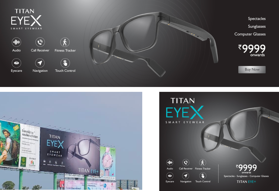
Website banners, offline city hoardings along with paper ad
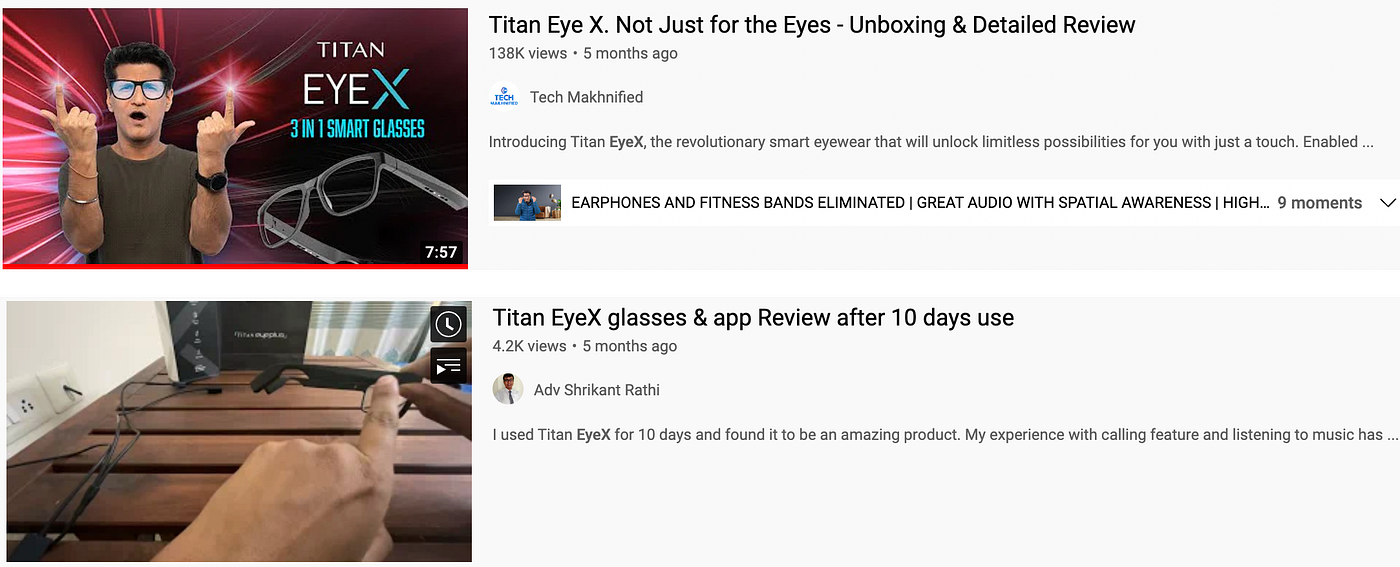
Positive reviews from all the tech channels
Thanks a lot for going through the read. Hope it will give you interesting insights. Feel free to shoot any questions regarding any aspect of design. please give a round of applause below if you liked the project. 🙂
Recommend
-
5
Most of the design case studies in our blog are devoted to creating interfaces, illustrations, and branding for digital products. Today’s case is different: it’s about the design of the branding for a real physical product whose main goal is...
-
19
George Bernard Shaw once said: “There is no sincerer love than the love of food”. Perhaps, that’s one of the reasons why food and cooking is the endless source of inspiration for UX designers. Today’s case study from the Tubik team presents t...
-
9
Mobile UX Design 101: Finding personas In a short time frame like this, we needed to think about the multiple functionalities of every basic exploration method. A hypothetical persona workshop started...
-
9
-
9
Man’s fascination with mountains has been unbroken since time immemorial. Today’s case study tells you the creative story about Lumen Museum, the charming place that gives this fascination a photographic home with breathtaking views and inter...
-
6
The Good Action — A Design Sprint Case StudyAwareness actions on climate change to retain users
-
4
Automating food delivery for working professionals — UX/UI Case studyDesign Brief 📁I was given a design prompt by the design team at Razorpay as a...
-
7
Responses
-
1
Vertech is an industrial automation and information solutions company based out of the U...
-
3
Gigz- An app that helps artists find gigs | UX/UI Case Study
About Joyk
Aggregate valuable and interesting links.
Joyk means Joy of geeK