

Graphic Design Case Study: Creating a Mascot for a Party Game
source link: https://design4users.com/mascot-design-for-party-game/
Go to the source link to view the article. You can view the picture content, updated content and better typesetting reading experience. If the link is broken, please click the button below to view the snapshot at that time.

Most of the design case studies in our blog are devoted to creating interfaces, illustrations, and branding for digital products. Today’s case is different: it’s about the design of the branding for a real physical product whose main goal is entertainment and fun. Welcome to check the design story of how the Tubik Studio designer Marina Solomennikova worked on the logo and mascot design for a fun party game called Dicey.
Project
Dicey is a super cheerful and unpredictable party game for adults. As it often happens, creators came up with something for themselves and then shared it with the world: after getting bored playing the same drinking games over and over, they decided to create a new one—something fresh, exciting, and inclusive. So, they developed a simple concept focused around 4 different card categories: Group Play, Face Off, Wild Card, and Rules. Each category contains hilarious minigames designed to encourage creativity and group interaction. So, the target audience of the game is social drinkers of legal drinking age. It was aimed at groups of 4 or more participants and had to create camaraderie through a one-of-a-kind social gaming experience.
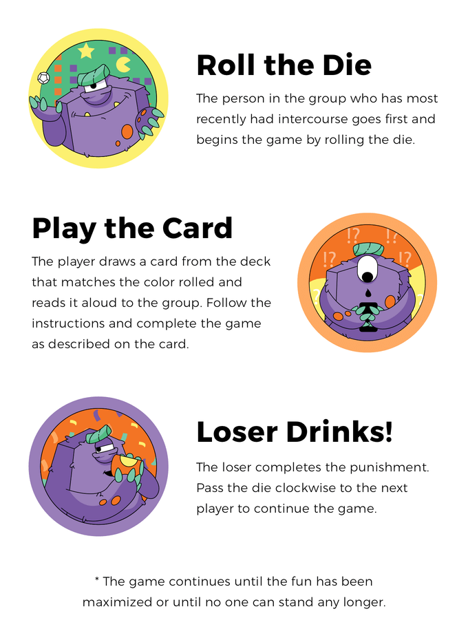
Here’s a quick introduction on how to play:
The task for the designer was to create a logo and a funny character that would catch attention, looked original, created the needed atmosphere and mood. Actually, that was one of the primary reasons for the clients to reach our team: they wanted to build the brand strategy around an illustrated character. As they mentioned in the brief, “the character should be reflective of the game itself—playful, mischievous, and a little bit goofy. Ideally, the character will appear frequently on our social media channels and branded swag.” So, from the start, the designer had to keep in mind that the images obtained as the result of the design process will be used for both print and digital.
The idea of a mascot was totally reasonable for the brand goals. The business practice of successful companies shows that a well-crafted mascot can work even more effectively than product endorsement with the help of a famous person. Mascots can reflect any traits of character, any style needed for product positioning and communicate via a diverse set of visuals. They broaden the horizons of personification. With mascots, designers and marketing specialists can create unexpected and catchy looks or make fantastic characters alive.
Let’s check what we came to.
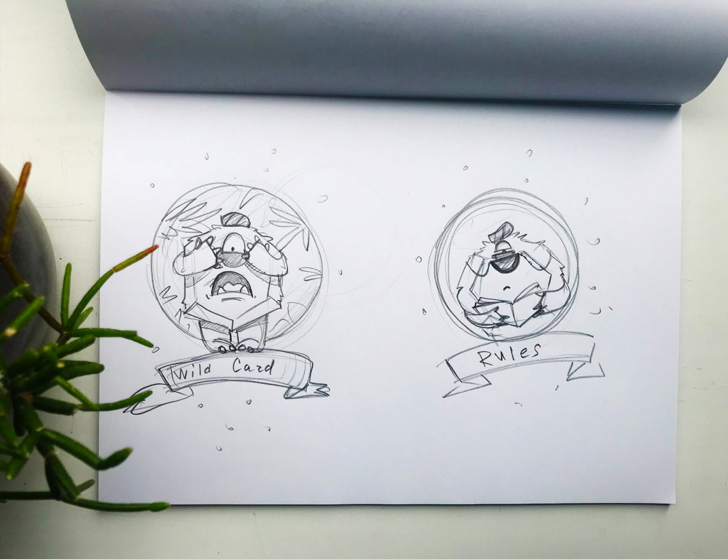
The creative process for this project didn’t get separate parts for logo and mascot character design. Even at the initial stage of pencil sketching, the designers searched for the interaction and composition of both. Below you can see the sketches featuring the stage of the creative process: here the illustrator showed several different stylistic directions for a character and possible style of wordmark to match.

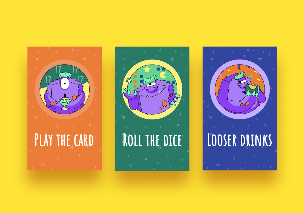
Although all the options were catchy and playful, there wasn’t much discussion about the choice: the variant that transformed a special polygonal dice from the game into the funny character was agreed upon as the best choice. So, the designer moved on to creating a digital version. So, meet Dicey monster, whose motto is “Up to no good”. He is a real symbol of the fun-loving chaos and mischievousness the game brings out.

The wordmark uses smooth lines, it’s elegant and stylish but also playful and friendly. Here it is in black-and-white variants.
As the brand sign was intended for social media graphics as well, the designer offered several color options for banners, avatars, etc.


The concept of the branded stickers looked this way.

Then the designer worked on the stylistics of the play cards. Again, it started with sketches to find the compositions that would reflect the key message.


Useful Case Studies
For those, who are interested to see more practical case studies with creative flows for a logo and identity design, here is the set of them.
AppShack. Logo Design for a Digital Agency
Brand Intro Cartoon for Wedding Dresses Brand
LunnScape. Identity Design for a Landscape Company
Binned. Brand Identity Design for Cleaning Service
Reborn. Identity Design for a Restaurant
Inspora. Brand and UI Design for Virtual Stylist
Andre. Logo and Identity Redesign for Landscape Firm
Originally written for Tubik Blog
Recommend
-
91
A Flock of Hummingbirds: On the Search for the LibreOffice Mascot ...
-
45
Duke, the Java Mascot
-
14
Google shares fun tutorial on making an origami Android mascot [Video]Everyone is looking for indoor activities amid the current situation, and Google is providing one in the form of a video tutorial on how to make an origami Android mascot.
-
11
Creating a community-driven delivery application: UX...
-
7
A UX Case Study on Creating a Studious Environment for Students: Studius!Illustration by Kanako TakashimaDuring our research, one university student said tha...
-
4
Creating and Selling NFTs on OpenSea (UX Case Study)August 20th 2021 new story9
-
6
News Introducing the Kotlin Mascot!
-
9
Case Study: ABUK. Book Covers Graphic Design for Audiobook ApplicationIt seems that within the last half-century the world has witnessed one of the most dynamic stages of its progress, especially in the sphere of technolog...
-
4
UX Design Case Study: Creating a more organized experience on InstagramThis case study aimed at creating a more organized experience for Instagram users.This case study is a part of the...
-
9
Graphic Design Case Study: Identity and Packaging for Garden Center “To plant a garden is to believe in tomorrow,” Audrey Hepburn once said, and whatever...
About Joyk
Aggregate valuable and interesting links.
Joyk means Joy of geeK