

A Flock of Hummingbirds: On the Search for the LibreOffice Mascot - LibreOffice...
source link: https://design.blog.documentfoundation.org/2017/09/28/libreoffice-mascot/
Go to the source link to view the article. You can view the picture content, updated content and better typesetting reading experience. If the link is broken, please click the button below to view the snapshot at that time.
A Flock of Hummingbirds: On the Search for the LibreOffice Mascot
tl;dr: Please vote on the LibreOffice Mascot until Oct/08th at https://survey.documentfoundation.org/665628 (survey expired)
Additional to the unique branding of LibreOffice today, we want to introduce an alternative to TDF’s trademarked logo/icon elements that can be used by the community with minimal restrictions. And as an open source project we involve the community in the process and asked for design proposals. The response was overwhelming; we got a great number of submissions ranging from aquarelle paintings to elaborated rebranding strategies. You are amazing!
The mascot should be used as a local community logo without TDF brand inside. It needs to be a cute and adaptable for various purpose. So the input was filtered based on
|
|
|
|
|
(compare) |
|
|
|
Big thanks to all contributors, and sorry if your proposal has not made it into the next round.
The remaining 63 images were equalized for a fair voting. That means all submissions are sized equally, got a white background (if possible), in case of various poses one was selected, and textual distractions have been removed.
Now it’s time to vote. The images are presented in a randomized order, and your task is to either press the left thumb-up button when you like a design or the right thumb-down if you don’t want it as our mascot.
https://survey.documentfoundation.org/665628
After this voting phase we will do a final election. The seven proposals with the highest agreement in the voting will get it into the selection, at this step done by the members of The Document Foundation. Would you like to become a member?
PS: Voting phase will end this Sunday, Oct/08th.
-
Alan 28th September 2017
Dear, as soon as they started the contest, I asked if the mascot could be designed on paper:
Alan:
“Can do in paper and afterwards scan it?
Thank you”
Answer:
The LibreOffice Design Team:
“Sure, no limitation to your creativity.”(Second comment of this link: https://design.blog.documentfoundation.org/2017/06/28/competition-libreoffice-mascot/ )
I told my girlfriend about the matter and she sent the following proposals:
https://imgur.com/a/zAOkQ
https://imgur.com/a/5DSks
https://imgur.com/a/SqGCQ
https://imgur.com/a/GEHSr
https://imgur.com/a/xk68QNone of them are available to vote. It is understandable, there are as many great proposals as the plagiarism to Firefox with an otter, the beautiful … terrifying orange ball and other drawings that I do not know how to describe (because I do not know what demons they are), that there would be no room for other competitors.
However, I have noticed that ALL proposals were made with computer tools. If so, my girlfriend’s drawings were not disqualified for being ugly or not identifying LibreOffice, but for being handmade.
If they were only interested in having digital drawings, they would have told me when I asked, so I did not waste anyone’s time.
Luck for the rest of the contestants (except for the terrifying orange ball, that’s horrible). -
-
-
-
-
TomQuartz 6th October 2017
What I do not understand is how that submission made it past your screening process in the first place.
Look again. It is not very mascotable by your own rules (many details with all the edges and shadows), also because it is not very distinctive from other logos (you yourself brought up Kiki, to which this bears more than a fleeting similarity)You want to anonymise the selection process for users, but did not do so during your own screening? You know exactly who that artist is, and are obviously biased (“honorable”) towards him.
How is that not a problem for you?And what for the love of Bernoulli is a “sanity check” for personal preference?
So, someone clicks through your list and likes only one design. And you go kick them out? For what? A peculiar taste?I would love to know exactly by what methods any selection here was and will be done, because to me as a statistician in social sciences, this all sounds like a purely arbitrary process of eliminating unwelcome opinions, in this particular context.
-
Heiko Tietze 6th October 2017
@TomQuartz It’s not rocket science what we do and there are no exact statistics and methods defined ad-hoc. What I was thinking about is to look for patterns, something like only one submission is upvoted repeatedly. As you said, this wouldn’t be a good approach. While this pattern _was_ visible at a certain time such a sanity check isn’t perfectly clear, meaning the ~100 upvoters also agreed with a few other. So maybe those people just like the idea (think about cultural differences).
Actually we never forbid to advertise the own work, and it sounds strange if we’d do so.
In the end everything depends on the numbers of participants and that’s why I write in past tense. Meanwhile we have 25k participants and any try to cheat is just noise. -
TomQuartz 7th October 2017
Dear Heiko,
Tyson has himself 7300 followers on Twitter. That would make up just under a quarter of your votes.
Add in to that 4000 views of that very submission on DeviantArt.
On Tumblr, he received 2100 comments on the picture. Heaven knows how many people saw it and upvoted him for that.
We have no means of telling how many of these people are identical, so there are between 4000 and 13000 people who received a link to the vote through him alone.
What is the idea of an anonymisation if you allow participants to post their work elsewhere?
“Noise”? I think there is a huge bias at work here. Tyson has the ability to reach far more people than for instance my daughter, who has some 20 friends. How is allowing people to advertise their work in any way fair?
Why would it be strange to tell them they will be disqualified if they publish their work before the publication of the results? Other competitions do that a lot.So, forgive me for my utter confusion. I think you should, for the future, consult the community on rules BEFORE opening submissions, to avoid further confusion and grievances.
As for “rocket science”. No, it is social science. I do it for a living, as a consultant for market researchers. And they all originally have approaches like you:
Promising “sanity checks”, which are not something done in social sciences by that name to begin with , then admitting to not doing them at all, but just having thought about it.
And what remains in the end is inactivity instead of the only rational thing:
Doing the whole thing over again and admitting slip-ups, for the sake of quality management.
How could this mess be repaired at this time? Simple: an open vote on all submissions, without prior screening. The audience is pretty capable of narrowing the field down to a final selection of three to seven, among which the client then has the last say.This would be the fair and logical thing to do. Damage to your face would be minimal, but the gain would be winning back the trust of your audience again.
Just a free bit of advice.
-
-
-
Billy Bob 28th September 2017
The problem is the artist posted lot of artworks of his submitted mascot alongside the post about voting for his design so his followers are very aware of what it looks likes. Since Schwarze_Katze exposed the artist’s name, I’ll give you his posts if you want to see them yourself.
Also, is there anything preventing me from voting again? I took noticed that after finishing the survey the first time around, I could take it again and there doesn’t seem to be anything stopping my votes from counting again.
-
-
-
-
Schwarze_Katze 29th September 2017
Voy a decir tres cosas: 1.- Decir que alguien es de cierta nacionalidad no es racismo, en todo caso el racista eres tu por pensar que todos los alemanes son racistas; 2.- No estoy criticando a Tyson Tan por su talento sino por el proselitismo, porque si esta permitida una campaña electoral no ganara el mejor sino el mas popular, y si anda pidiendo votos es porque el mismo Tyson no tendra confianza en si mismo; y 3.- Ten dignidad y no seas arrastrado. Que lo sigas en Twitter no significa que tengas que ser su vasallo.
-
-
-
-
abhayvir 30th September 2017
Why not create a separate gallery of every submitted design so that at the least people would know that their respective submission was part of the consideration. I’m surprised that out of a few I submitted those ones which are not as good are in the final voting list. And with so many ideas for just a Hummingbird, I really don’t know why to even vote. Wasnt the contest about Mascot idea and not design. Nevertheless, will look forward to the results. Good luck to all the shortlisted ones.
-
Kyle Kung 1st October 2017
While I understand there’s an unfair advantage for Tyson’s work due to his following, I personally am okay with it since at the end of the day, his design is very professional. His concept was very good. Even though my entry in amongst the 63 for voting, I couldn’t down vote his and some others because I personally think they’re better than mine. Don’t see it from your perspective ppl, try looking from the companies perspective; they’re looking for a company mascot with good concepts. If Tyson’s work wins, it means that he worked hard to gain his following to allow his work to be voted by his followers in the first place. I’m pretty sure if we had the same following, we would do the same as Tyson and promote our own work.
-
Alex V.Sharp 1st October 2017
Well that was a bummer; Malcolm didn’t even make the finals.
Guess cartoony gazelles with glasses just aren’t as popular as birds… ¯\_(ツ)_/¯To be honest though, I am rather disappointed by the end selection. I was ready for my submission not to make it to the finals (if it was even in the pool? Dunno) since there were probably much better entries, but most of the finalists aren’t even strictly “Mascots” but logo designs — that’s a completely different creation criteria. Don’t wanna sound biased either, but the quality and originality of some of them is… debatable, to say the least.
Oh well; still made a likeable character.
https://imgur.com/Ppydv7U-
Andres 2nd October 2017
Your gacelle is much better than many of the proposals of the survey, as is the bee from one the earlier comments. I agree with you, I don’t know what’s going on with the criteria used to choose them, since way too many look like brand logos, and not exactly mascots (like Tux, Konqi, Heckert, etc do). Mine didn’t even got to be part of the survey even though it didn’t broke any rule as far as I am aware (I know mine wouldn’t have won though, since in the survey are many proposals better than mine), and was much more a “mascot” than some of the **many** hummingbirds and other critters without personality. I know I may sound bitter or something commenting all this; I guess I’m just bummed out of not even having a chance of getting voted on.
PS: btw, here it’s my proposal! https://imgur.com/a/NdqK0
-
-
Crys 2nd October 2017
I’m not concerned about artists making publicity for their work; let’s be honest, the Internet works this way.
What annoys me is a) the fact that you can vote multiple times
and b) that so many good entries didn’t make it.
Somehow it feels like the chance of a fair choice was taken away due to this two facts. Like 3 or 4 good designs were paired up with so-so designs to make sure only those 3 or 4 designs will make it to the final vote.
Also, I’m confused about most of the designs as well: many aren’t mascots but logos and I’ve spotted some potential copyrighted material as well.
Well, I guess you know what you are doing.
After all, what I say here won’t change anything but I felt like I should voice my concerns, especially about the possibility to vote more than once.
However, good luck to everyone who was chosen! -
Chase Vernon 3rd October 2017
There are some great designs here, and yes, mine did make it to voting. I am a little frustrated that many of the design qualifications weren’t listed before the voting stage, especially the “cuteness” one. I designed for a more traditional mascot, but would’ve spent my design time differently had I known cuteness was a consideration.
Also, do you know if votes can be filtered by IP address that the vote originated from? At the moment, it looks like I can repeatedly vote for my own design, which isn’t a fair vote.
-
abraziv_whiskey 3rd October 2017
https://survey.documentfoundation.org/upload/surveys/665628/images/20170728_HOSZEKI_the freedom fighters- hummingbird.png
Sorry, guys, but what is it? We had little discussion at linux.org.ru and decided that it’s:
a. dolphin who rape the ball
b. owl lying on the right side tail to the viewer
c. some sort of crap with intertwined human bodies, reminiscent of an orgy
d. penguin with a dragon crest on the face of the red-haired boy
e. hummingbird with obesity and some kind of ball (propably, little owl)Undoubtedly, this is the favorite of the race.
-
Florian Effenberger 3rd October 2017
Let me jump in here. :-) First of all, thank you very much to everyone who sent in their proposals. We appreciate and value every contribution and know how much time it takes to come up with good designs. We are thankful for so many ideas – many, many more than we actually expected, so thank you very much for that!
For us, it’s the first time to run such a contest on a large scale, but we felt that the community mascot deserves as much community inclusion as possible. There’s a couple of things to keep in mind before the final selection, and of course, everyone’s preference is different. Let me assure you that nobody was excluded on purpose – TDF stands for an open, transparent and meritocratic approach in all we are doing.
As said, we are extremely pleased with so many design proposals shared and didn’t expect the contest to be such an overwhelming success. We will reach out to all applicants via e-mail before our annual LibreOffice Conference starts next week and are keen to find out what the final results will be.
-
Néstor Díaz 3rd October 2017
First of all, I am grateful to TDF for what you do and what you stand for.
I claim, and you agree with your post, you don’t know how to organize this kind of contest. You are doing it wrong, design requeriments were not apporiatelly stated, any number of designs per person is not right, pre-selection is wrong and voting method is wrong.
I would like to let you know that just in case the TDF wants to take another direction before nobody cares about the LibreOffice mascot.
Cheers
-
-
Marcos 3rd October 2017
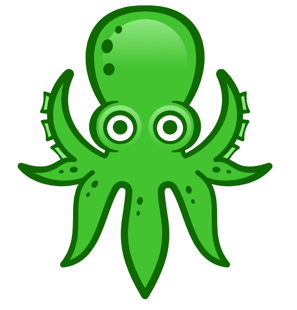
I just knew about the contest today, unfortunately. I would have loved to participate with some ideas! Even more because I found most of the selected designs to be surprisingly weak and embarrassing. There are some decent and very “mascotable” options there, but the bad ones so awful that I got concerned. So many poorly drawn birds, forgettable and soulless logos and even some random uninspired animesque characters (seriously!?)… Honestly, I would feel embarrassed to use a software with some of these “mascots”.
Now I just hope the octopus wins (https://survey.documentfoundation.org/upload/surveys/665628/images/20170630_kyledawney_seamusseptopus.png). At least it’s friendly and has some identity.
-
-
Néstor Díaz 4th October 2017
I am told by other means (not officially by TDF) that is because the TDF logo appears in the design.
The conquest asked for a mascot which in my proposal is obviously the Cuckatoo, the other elements are to show off how well integrates with TDF style and versality, like using the doc as a perch. I could have designed the bird using a mouse or messing with an abacus, as I said in my proposal email, …
Anyway, the point that “clear distinction to the TDF logo” appears post-conquest, so is pretty unfair to me at least.Hope I had given some light to you, although real answer should come from TDF.
-
-
JK 4th October 2017
I think the cockatoo is pretty amazing too (and I’m rooting for one of the designs that made the cut). The problem in my estimation is that the TDF logo does seem to have been integrated into ND’s design; his two-color rendition clearly shows that his intention was the integration of the mascot with the logo (or it at least appears that way).
It’s a shame because he knocked it out of the park. While, as I said, I’m rooting for one of the designs that made the cut, I wouldn’t have been upset if ND’s design won.
-
-
-
-
Néstor Díaz 6th October 2017
Tampoco quiero ganar ni el premio, creo que después de la que se ha montado es imposible que la cacatúa gane. Ya tiene la licencia CC0 con lo que ahí está para el que la quiera usar.
Lo que quiero es lo que es justo y que TDF sea consecuente con su visión de transparencia y comunidad puesto que todavía no han informado a la comunidad porqué este diseño quedó fuera.
Hay reglas que se pueden “dar por hecho” en un concurso, como que el diseño no tenga manchas de café, pero esta regla: “clear distinction to the TDF logo” parece puesta a propósito para dejar fuera la cacatúa y nadie podría adivinar esta condición para el concurso.
I do not want to win or the prize anymore, after what has happened is impossible the cuckatoo will ever win. It is CC0 already so anybody can use it.
What I want is what is just and TDF should be consequent with their vision of transparency and community as they haven’t explained to the community why this design is out.
There are some contest rules that can be implied, like do not submit your design with coffee stains. But this rule “clear distinction to the TDF logo” looks like something made up just to leave the bird out of voting and is something nobody could ever guess as a pre-condition.
-
-
-
-
Elias Silveira 6th October 2017
Hello! Most friends asked me why my proposal didn’t appear in the survey.
So I asked if they saw this: “clear distinction to the TDF logo”
It came as a complete surprise. Everyone said “We don’t believe it! We totally disagree with this!! What they (TDF) see as problem, we see as amazing soluction!! This could be used without any information about TDF or LibreOffice name and even then it would be recognized as the LibreOffice mascot.” They referred to it…https://www.flickr.com/photos/elias_ilustracao_design/37499535612/in/datetaken-public/ and https://www.flickr.com/photos/elias_ilustracao_design/36820984274/in/datetaken-public/
I do not want to complain. It is not even my intention. But I had no choice, they wanted me to ask you about it.
What do you think about that? -
Elias Silveira 6th October 2017
Hi Nestor, how you doing?
I feel you are very frustrated with the result of the proposals selection. You’re not alone. That makes two of us. I just don’t understand where you want to go with this? Yeah! I love Walt Disney and It is my best reference for drawing cartoon. I don’t need use this images, I know to draw. I just use it as reference. Have you ever heard about the use of references in illustration? I hope so.
Please check my portfolio
https://www.flickr.com/photos/elias_ilustracao_design/albums and
https://www.facebook.com/pg/eliassilveirailustrador/photos/?ref=page_internal and
https://www.facebook.com/pg/eliassilveirailustrador/videos/?ref=page_internal and
https://www.facebook.com/photo.php?fbid=1006519326061689&set=pb.100001108936121.-2207520000.1507308736.&type=3&theater
Here there my proposal in SVG file, It’s all yours to do whatever you want with it. https://www.dropbox.com/sh/rikybudvfwkbt9y/AABk99xjKM3VCpntxPjrAYMXa?dl=0
Cheers -
Who cares about a mascot 9th October 2017
I think it’s silly that TDF is paying Heiko to do this instead of focus on modernizing the GUI. Why dance around the big problem? It only gets bigger that way. Meanwhile literally no one cares about a mascot. Does Inkscape have one? Does Debian? Does VLC? What happens to the Libreoffice Icon now? Brand recognition gets diluted on an already obscure software. You guys are getting too comfortable at TDF now that Collabora is leading development. I’ll start donating again when I see real progress on the UI.
-
Taxiz 14th October 2017
The decision about having a mascot has been made, people have participated in the survey, and the survey is now closed. It’s a little late to cry about it.
I’ve read these stories in multiple medias in different countries so no matter what one has to say about the use of a mascot, this survey gave LibreOffice lots of positive publicity. As long as a mascot never-ever become the Clippy/Office assistant as in Microsoft Office (what a horror story!), then this is a fun thing! Would love to see the mascot in supertuxcart.
Agreed that the LibreOffice user interface could need a refreshing, but it’s not relevant. It’s possible to do multiple things at once, one thing does not exclude the other. And when you do refresh the GUI, please don’t copy Microsoft as their GUI is actually ugly and have lots of bad usability. It’s just what people have became used to so they no longer see what’s wrong with it. Please do something unique and better then them!-
Marcos 14th October 2017
“And when you do refresh the GUI, please don’t copy Microsoft as their GUI is actually ugly and have lots of bad usability. It’s just what people have became used to so they no longer see what’s wrong with it. Please do something unique and better then them!”
So true! MS Office GUI has many problems.
I just can’t stand MS Office “ribbons”, and I would be very disappointed if LO headed this way. What a terrible idea! It takes a lot of screen space for less functions (that it fails hard to sort by context) and it’s just not as customizable as the traditional toolbars, that I can easily add/remove tools, resize and replace the way I want. The “File” menu also became a mess in the more recent MS Office versions as well. Oh, and I really dislike the way MS Word handles “styles”.
Well, the list could go on and on, but that’s not the place for that :)
-
Recommend
About Joyk
Aggregate valuable and interesting links.
Joyk means Joy of geeK