

Google's 2017 gadget collection - The Verge
source link: https://www.theverge.com/2017/10/6/16426932/googles-2017-gadget-collection-photos
Go to the source link to view the article. You can view the picture content, updated content and better typesetting reading experience. If the link is broken, please click the button below to view the snapshot at that time.
/cdn.vox-cdn.com/uploads/chorus_image/image/57022855/jbareham_171004_2006_photo_lede_04.0.jpg)
Google's 2017 gadget collection
A photographic portfolio featuring the company's new products
AboutAbout five years ago, a popular line was “Google is getting better at design faster than Apple is getting better at web services,” and I think that’s reached an inflection point. The overall design of Android and Google’s web-based platforms seems to have jumped ahead leaps and bounds over the last few years. The adoption of Material Design moved Google from being famous for user-testing different shades of blue before before deciding which one to pick, to seemingly becoming happy for developers to choose any color or shade of blue they liked (as long as it was a blue plucked from the approved style guide).
This dictatorial approach has undoubtedly made a difference. Though it’s not to everyone’s taste, Google’s visual design language for software certainly fits together nicely, like digital Lego: it’s bright, clean, and playful.
But applying that same confident design language to actual materials has been a much heavier lift. Hardware is hard, and it’s a challenge made even harder by the fact that Google immediately lost its home field advantage on the web when it decided to make phones — a market dominated by Apple’s masterful design.
Though it’s certainly possible to find fault with the design of some of Apple’s products, it’s hard to argue that there is any company consistently better at manufacturing — at least in terms of product build quality and supply chain economics. If Google is going to be taken seriously as a hardware manufacturer, and have any chance of going head-to-head with Apple, it is not only going to have define a strong, concise design language for all of its products, it’s going to have to be able to reliably build, deliver, and support them, too.
On October 4th, Google unveiled its 2017 suite of products — the second-generation Pixel phones and Daydream View headset — along with some new additions: the Google Home Mini and Google Home Max speakers, the Pixel Buds headphones, the Clips camera, and the brand-new Pixelbook.
We spent some time with these new products to garner our first impressions prior to this week’s event. Not all were final versions of the designs that will ship, and not all were fully working models, but nevertheless, it gave us the opportunity to have a hands-on and assess the design of possibly the most important hardware products Google has released to date.
While it’s clear that Google may not yet be fully fluent in the language of hardware design, it has certainly developed a very impressive vocabulary. It is one infused with a sense of whimsy and fun that’s reminiscent of the early iMac designs. (That’s ironic when you consider the rather highbrow minimalism that permeates so many Apple products today.)
:no_upscale()/cdn.vox-cdn.com/uploads/chorus_asset/file/9378989/jbareham_170922_2006_0447.jpg)
PIXEL 2 AND PIXEL 2 XL SMARTPHONES
II spent the entire photo shoot referring to the two color schemes of the Pixel 2 XL as “Stormtrooper” black and white, and “Vader” black. The intersection of the almost-matte aluminum with the high-gloss glass seems to come right out of the Star Wars design playbook. However, the addition of an orange power button to the black-and-white XL certainly adds a sense of whimsy to the overall design. As Dieter wrote, “It’s like a Stormtrooper who secretly wears crazy underpants.” Other than that, the design of these phones is clean, uncluttered, and inherently functional — some may even say boring — but this simplicity really appeals to me. It’s as if the phone fades into the background once you start using it, which I think is kind of the point.
:no_upscale()/cdn.vox-cdn.com/uploads/chorus_asset/file/9378973/jbareham_170921_2006_0152.jpg)
:no_upscale()/cdn.vox-cdn.com/uploads/chorus_asset/file/9393795/jbareham_170921_2006_0124.jpg)
:no_upscale()/cdn.vox-cdn.com/uploads/chorus_asset/file/9397013/jbareham_170921_2006_0091.jpg)
2016 Pixel XL (left) 2017 Pixel 2 XL (right).
:no_upscale()/cdn.vox-cdn.com/uploads/chorus_asset/file/9397027/jbareham_170921_2006_0215.jpg)
2017 Pixel 2 XL (left) 2016 Pixel XL (right).
:no_upscale()/cdn.vox-cdn.com/uploads/chorus_asset/file/9393837/jbareham_170922_2006_0397.jpg)


:no_upscale()/cdn.vox-cdn.com/uploads/chorus_asset/file/9393903/jbareham_170921_2006_0301.jpg)
PIXELBOOK
I still regularly use my original Chromebook Pixel. I really like the 3:2 aspect ratio of the screen; the sharp, squarish corners of the body; and the general industrial-like build quality. However, the abysmal battery life and ridiculous weight have meant this Chromebook was in dire need of an upgrade.
So here is the 2017 Pixelbook. It still has the same 3:2 aspect ratio screen, but the corners of the body are now a little more rounded, and the screen also folds flat to act as a tablet, which is a very welcome update. The brutish industrial aesthetic of the original Chromebook Pixel has been somewhat softened by the pale, blue-white glass, which is inlaid into the back of the screen, and an "advanced silicone" (which looks like glass) that flanks the glass trackpad, where it successfully acts as a palm rest. It ties the design of the Pixelbook to the new Pixel 2 and Pixel XL 2 phones. The only sore spot are the giant bezels around the screen, which are decidedly passé in 2017.
The jury’s out as to whether there’s a sizable market for a $1,000 Chromebook, but it’s certainly true that the Pixelbook is a beautiful piece of hardware. Some people may find that to be enough of a reason to buy one.
:no_upscale()/cdn.vox-cdn.com/uploads/chorus_asset/file/9393913/jbareham_170921_2006_0308.jpg)
:no_upscale()/cdn.vox-cdn.com/uploads/chorus_asset/file/9393917/jbareham_170921_2006_0316.jpg)
:no_upscale()/cdn.vox-cdn.com/uploads/chorus_asset/file/9393927/jbareham_170921_2006_0323.jpg)
:no_upscale()/cdn.vox-cdn.com/uploads/chorus_asset/file/9393931/jbareham_170921_2006_0384.jpg)
:no_upscale()/cdn.vox-cdn.com/uploads/chorus_asset/file/9393939/jbareham_170921_2006_0418.jpg)
:no_upscale()/cdn.vox-cdn.com/uploads/chorus_asset/file/9393967/jbareham_170921_2006_0508.jpg)
:no_upscale()/cdn.vox-cdn.com/uploads/chorus_asset/file/9393949/jbareham_170921_2006_0470.jpg)
:no_upscale()/cdn.vox-cdn.com/uploads/chorus_asset/file/9393953/jbareham_170921_2006_0464.jpg)
:no_upscale()/cdn.vox-cdn.com/uploads/chorus_asset/file/9393975/jbareham_170921_2006_0544.jpg)
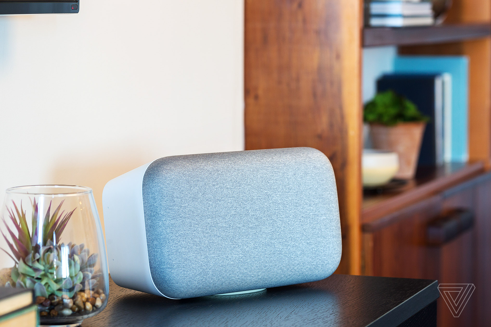
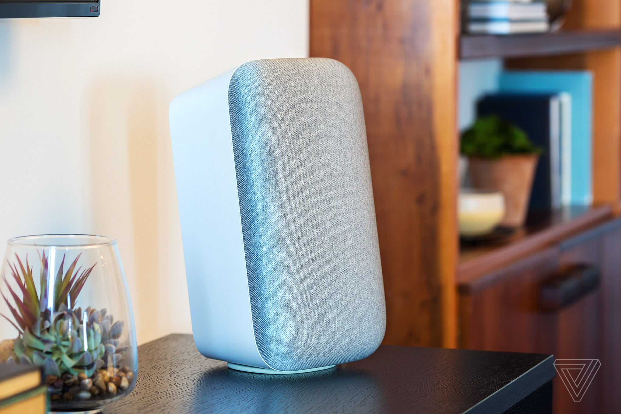
GOOGLE HOME MAX
The first thing that you should know about the Google Home Max is that it’s pretty big. The second thing you should know is that it’s fairly heavy. The third thing you should know is that it doesn’t seem to share much of its design aesthetic with the current Google Home... because it’s big and heavy. In fact, I think the Google Home Max is more reminiscent of the iconic Apple iPod Hi-Fi from 2006. Not so much because of how it looks (it doesn’t completely look like it), but more from its physical presence. The most understated part of the design is the magnetic pad that attaches to the bottom or the side of the speaker, depending on whether you prefer it standing upright (if you have two) or laying horizontal. The overall design is very simple and straightforward. I just hope it sounds good.
:no_upscale()/cdn.vox-cdn.com/uploads/chorus_asset/file/9379107/jbareham_170922_2006_0044.jpg)
:no_upscale()/cdn.vox-cdn.com/uploads/chorus_asset/file/9397455/jbareham_170921_2006_0554.jpg)
:no_upscale()/cdn.vox-cdn.com/uploads/chorus_asset/file/9397467/jbareham_170921_2006_0002.jpg)
:no_upscale()/cdn.vox-cdn.com/uploads/chorus_asset/file/9397477/jbareham_170921_2006_0007.jpg)
:no_upscale()/cdn.vox-cdn.com/uploads/chorus_asset/file/9397483/jbareham_170921_2006_0013.jpg)
:no_upscale()/cdn.vox-cdn.com/uploads/chorus_asset/file/9379091/jbareham_170922_2006_0277.jpg)
GOOGLE HOME MINI
The Google Home Mini is, as its name suggests, fairly diminutive and fits neatly into the average hand. The finish is tactile: the speaker cloth wraps around the top two-thirds of the device and gives it the appearance of a rather sophisticated pin cushion. The bottom of the speaker is similar to the same hard plastic used in the Home Max. Regardless of the color of the cloth (“chalk,” “charcoal,” or “coral”) all the bases came in the same coral finish. If I had to come up with one word to describe the design of the Home Mini, that word would be “friendly.”
:no_upscale()/cdn.vox-cdn.com/uploads/chorus_asset/file/9379101/jbareham_170922_2006_0283.jpg)
:no_upscale()/cdn.vox-cdn.com/uploads/chorus_asset/file/9397561/jbareham_170922_2006_0300.jpg)
:no_upscale()/cdn.vox-cdn.com/uploads/chorus_asset/file/9397639/jbareham_170922_2006_0303.jpg)
:no_upscale()/cdn.vox-cdn.com/uploads/chorus_asset/file/9379113/jbareham_170922_2006_0308.jpg)
:no_upscale()/cdn.vox-cdn.com/uploads/chorus_asset/file/9380953/jbareham_170922_2006_0566.jpg)
GOOGLE CLIPS
The Clips camera is definitely cute — which I found somewhat ironic considering that there are some potentially creepy aspects to this new device. Nevertheless, there is something undeniably toy-like about the Clips design, almost as if it had been designed and developed by Playmobil. And I mean that as a compliment. The front is clean and white, and the back is green and almost minty fresh. The entire device fits snugly into its rubberized cover with a clip on the back to help the camera stand up or be clipped onto something, like clothing. Yup, creepy but cute.
:no_upscale()/cdn.vox-cdn.com/uploads/chorus_asset/file/9380943/jbareham_170922_2006_0371.jpg)
:no_upscale()/cdn.vox-cdn.com/uploads/chorus_asset/file/9397779/jbareham_170922_2006_0395.jpg)
:no_upscale()/cdn.vox-cdn.com/uploads/chorus_asset/file/9397783/jbareham_170922_2006_0343.jpg)
:no_upscale()/cdn.vox-cdn.com/uploads/chorus_asset/file/9380957/jbareham_170922_2006_1181.jpg)
:no_upscale()/cdn.vox-cdn.com/uploads/chorus_asset/file/9381111/jbareham_170922_2006_0804.jpg)
:no_upscale()/cdn.vox-cdn.com/uploads/chorus_asset/file/9399463/jbareham_170922_2006_0572_01.jpg)
:no_upscale()/cdn.vox-cdn.com/uploads/chorus_asset/file/9399479/jbareham_170922_2006_0570_01.jpg)
:no_upscale()/cdn.vox-cdn.com/uploads/chorus_asset/file/9379001/jbareham_170922_2006_1082.jpg)
PIXEL BUDS
I would suggest that, in purely aesthetic terms (they weren’t working production models when we photographed them), the Pixel Buds are possibly the weakest link in the new Google hardware lineup. Whereas the clean, toy-like design of the Clips makes it somewhat endearing, that same kind of approach doesn’t really work for the Buds. It makes them seem rather cheap, which at $159 they are most certainly not — especially when compared to Apple’s AirPods, which are the same price and a lot more sophisticated. I photographed the light blue / gray option. Maybe the dark blue or black versions will look slightly better in the light of day.
:no_upscale()/cdn.vox-cdn.com/uploads/chorus_asset/file/9379021/jbareham_170922_2006_0610.jpg)
:no_upscale()/cdn.vox-cdn.com/uploads/chorus_asset/file/9397917/jbareham_170922_2006_0615.jpg)
:no_upscale()/cdn.vox-cdn.com/uploads/chorus_asset/file/9379009/jbareham_170922_2006_1005.jpg)
:no_upscale()/cdn.vox-cdn.com/uploads/chorus_asset/file/9379029/jbareham_170922_2006_0960.jpg)
:no_upscale()/cdn.vox-cdn.com/uploads/chorus_asset/file/9379023/jbareham_170922_2006_0992.jpg)
:no_upscale()/cdn.vox-cdn.com/uploads/chorus_asset/file/9379015/jbareham_170922_2006_1038.jpg)
:no_upscale()/cdn.vox-cdn.com/uploads/chorus_asset/file/9379017/jbareham_170922_2006_1066.jpg)
:no_upscale()/cdn.vox-cdn.com/uploads/chorus_asset/file/9382909/jbareham_170922_2006_0896.jpg)
GOOGLE DAYDREAM VIEW
Like the Pixel 2 and Pixel 2 XL, this new Google Daydream View headset is just an updated version of the device introduced last year. From a design perspective, there are only a few cosmetic changes: the burgundy color option is now a salmon pink called “coral,” and the overall texture of the covering material is much smoother and slightly shiny and far less fluffy. Somewhat surprisingly, I think the Daydream View, which costs $99, has a rather more sophisticated feel than its price suggests.
:no_upscale()/cdn.vox-cdn.com/uploads/chorus_asset/file/9382871/jbareham_170922_2006_0925.jpg)
:no_upscale()/cdn.vox-cdn.com/uploads/chorus_asset/file/9382891/jbareham_170922_2006_0872.jpg)
:no_upscale()/cdn.vox-cdn.com/uploads/chorus_asset/file/9397945/jbareham_170922_2006_0908.jpg)
:no_upscale()/cdn.vox-cdn.com/uploads/chorus_asset/file/9382893/jbareham_170922_2006_0883.jpg)
:no_upscale()/cdn.vox-cdn.com/uploads/chorus_asset/file/9382895/jbareham_170922_2006_0875.jpg)
:no_upscale()/cdn.vox-cdn.com/uploads/chorus_asset/file/9378913/jbareham_170921_2006_0051.jpg)
Recommend
About Joyk
Aggregate valuable and interesting links.
Joyk means Joy of geeK