

Blogging Brilliance: The 30 Best Fonts for Blogs
source link: https://www.designyourway.net/blog/best-fonts-for-blogs/
Go to the source link to view the article. You can view the picture content, updated content and better typesetting reading experience. If the link is broken, please click the button below to view the snapshot at that time.
Blogging Brilliance: The 30 Best Fonts for Blogs

Picture this: You’re strolling through a digital forest where every tree is a blog, each leaf a post. Suddenly, you stop. One tree catches your eye, not for its height but the unique shape of its leaves – it’s the font that makes you linger. Now imagine your blog having that same magnetic pull.
In the illuminated world of blogging, typefaces aren’t just cogs in the wheel; they are the chariots of expression.
Typography weaves the emotion and tone of your content, enhances legibility, and ensures your words don’t just whisper; they resonate with authority. You want your audience to slide through sentences with the ease of a professional skater on ice.
In unlocking the secrets to the best fonts for blogs, you’re stepping into a realm where readability, web-safe fonts, and user experience merge, crafting an unforgettable journey for your readers.
We’ll dive into the nitty-gritty: from typography in web design to peachy font pairings that spell ‘welcome’ in every curve.
By the end, expect to be armed with the know-how to make each blog post not just read but felt. Essential? Absolutely. Because in the nuanced world of online presence, the font you choose is the whisper of your brand’s soul.
The Best Fonts for Blogs
| Font Name | Readability | Style | Versatility | Load Time |
|---|---|---|---|---|
| Roboto | High | Modern, Clean | Very versatile | Fast |
| Open Sans | High | Neutral, Humanist | Highly versatile | Fast |
| Lato | High | Warm, Friendly | Good adaptability | Fast |
| Montserrat | High | Geometric, Stylish | Good for headings & text | Moderate |
| Merriweather | High | Traditional, Warm | Great for body text | Moderate |
| Nunito | High | Rounded, Soft | Good for web & mobile | Fast |
| Oswald | Moderate | Condensed, Sleek | Suited for headings | Fast |
| Playfair Display | Moderate | Elegant, Classic | Best for editorial sites | Moderate |
| Lora | High | Warm, Well-balanced | Great for body text | Moderate |
| Amiri | High | Traditional, Serif | Suited for Arabic script | Moderate to Slow |
| Raleway | High | Clean, Stylish | Good for headers & logos | Moderate |
| Source Sans Pro | High | Professional | Very versatile | Fast |
| Poppins | High | Geometric, Modern | Good for web & print | Moderate |
| Ubuntu | High | Contemporary | Good for display & body | Fast |
| PT Sans | High | Humanist, Open | Versatile for web content | Fast |
| Arvo | Moderate | Slab Serif, Strong | Better for print | Moderate to Slow |
| Exo 2 | Moderate | Futuristic, Unique | Suited for headings | Moderate |
| Mukta | High | Clean, Versatile | Versatile for web content | Fast |
| Teko | Moderate | Wide, Industrial | Suited for headings | Fast |
| Dosis | High | Soft, Modern | Good for web & UI | Fast |
| Fira Sans | High | Wide, Professional | Versatile for digital use | Fast |
| Sofia Pro | Moderate | Elegant, Friendly | Suited for branding | Moderate to Slow |
| Museo Sans | High | Stylish, Readable | Great for web & print | Slow |
| Futura PT | Moderate | Classic, Geometric | Suited for display | Moderate to Slow |
| Semplicita Pro | Moderate | Minimalistic | Good for modern aesthetics | Slow |
| Filson Pro | High | Functional, Warm | Web and editorial content | Slow |
| Freight Sans | High | Warm, Humanist | Good for print & web | Slow |
| Baskerville PT | High | Classic, Timeless | Suited for body text | Moderate |
Top Google Fonts for Bloggers
Popular and Versatile Choices
Alright, let’s dive into the world of Google Fonts. Imagine this as your go-to boutique for the best fonts for blogs. There’s something for everyone here, whether you’re all about that sleek, modern vibe or something more classic and time-honored.
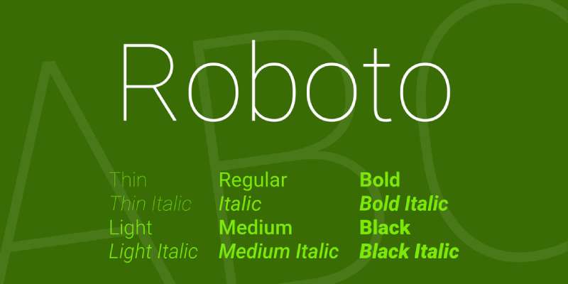
This is your everyday hero. It’s like that favorite pair of jeans – comfortable, reliable, and fits just right no matter the occasion. It’s versatile, which makes it perfect for a range of blog styles.
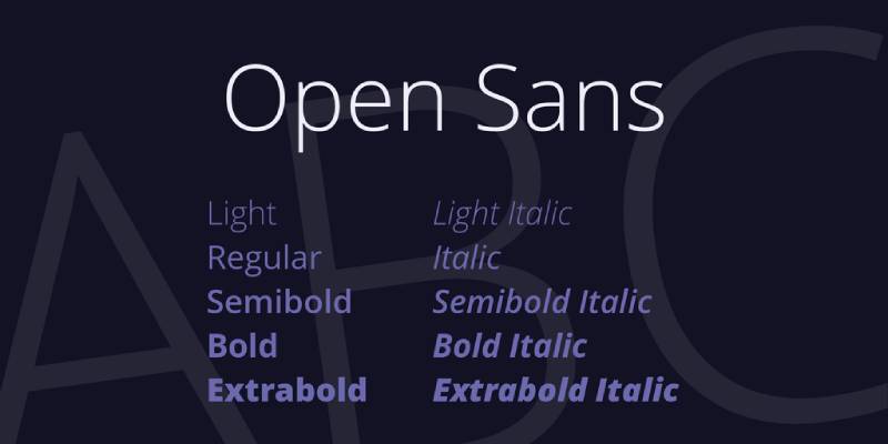
Think of Open Sans as your friendly neighbor. Approachable, clean, and incredibly easy to read. Ideal for blogs that prioritize clarity and simplicity.
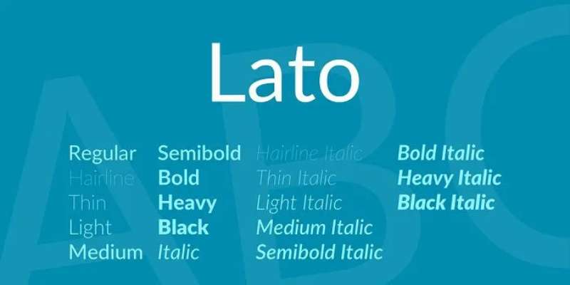
Lato brings a bit of warmth to the table. It’s semi-rounded and balanced – excellent for blogs that want to strike a friendly yet professional tone.
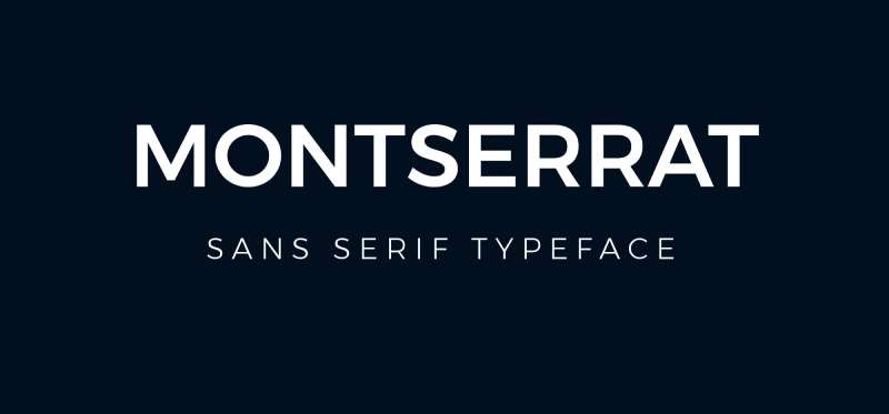
Now, if you want to make a statement, Montserrat is your font. It’s edgy, modern, and perfect for blogs that want to stand out.

For a touch of elegance and tradition, Merriweather is a great pick. It’s a serif font that reads beautifully on screens.

Soft, rounded, and super easy on the eyes. It’s like a cozy chat over coffee.
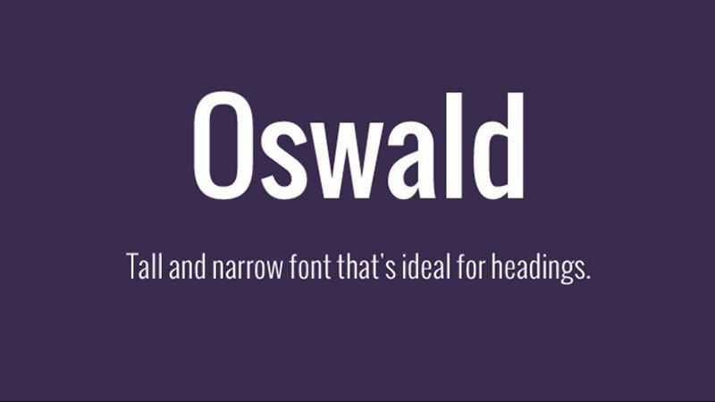
Tall, dark, and handsome – Oswald is great for headers and making a strong impression.

This one’s all about the drama and flair, perfect for more artistic or fashion-focused blogs.
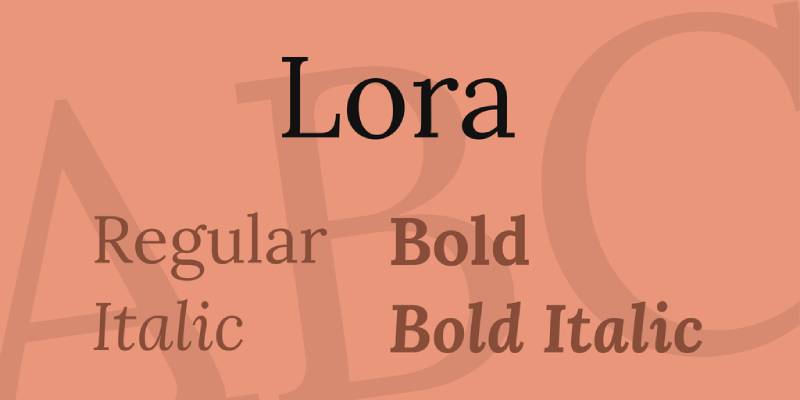
Lora is like that smart, sophisticated friend. It’s great for a blog that wants to keep things classy yet readable.

Inspired by traditional Arabic calligraphy, Amiri is for blogs that want to add an exotic touch.
And there are more gems like Raleway, Source Sans Pro, Poppins, Ubuntu, PT Sans, Arvo, Exo 2, Mukta, Teko, and Dosis. Each one brings its unique flavor to the table, making sure your blog’s personality shines through.
Top Adobe Fonts for Bloggers
Adobe Fonts, it’s like the high-end boutique of typography for your blog. Here, we find fonts that add a dash of elegance, a sprinkle of uniqueness, and a whole lot of personality. Let’s explore some of these fonts, each a strong contender for the title of best fonts for blogs.
Diverse and Elegant Selections
Adobe Fonts isn’t just a collection; it’s a celebration of diversity and sophistication in typography. Each font here has its charm and character, ready to transform your blog into a visual treat.
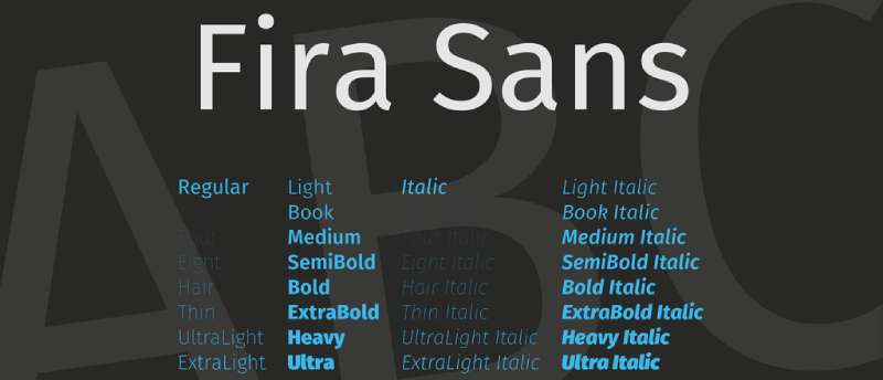
Picture this: sleek, modern, and super versatile. Fira Sans is like that smart casual outfit you can wear anywhere. Great for blogs that want to look sharp but not too formal.
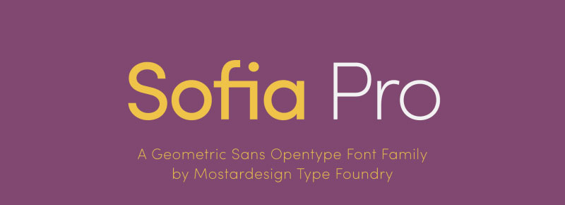
Here’s a font with a friendly face. Sofia Pro is approachable and warm, perfect for blogs that want to feel personal and inviting.

Museo Sans is a bit like that friend who’s always cool under pressure. It’s reliable, straightforward, and reads well in longer texts. A solid choice for any blog.

Want to go retro? Futura PT throws it back with style. It’s got those geometric shapes and a bit of a 20th-century vibe. Great for blogs with a creative or vintage twist.

Clean lines, simple forms. Semplicita Pro is all about clarity and ease. Ideal for minimalist blogs that want to keep things neat and tidy.
And the list continues with Filson Pro, Freight Sans, Ingra, Faricy New, and Baskerville PT. Each one brings a unique flavor to the table, from the modern and chic to the classic and timeless.
Understanding Font Types
Serif vs. Sans-Serif Fonts
Ever wondered why some blogs feel more formal, while others are super chill and casual? A lot of that vibe comes from their font choice. Let’s break it down.
Serif Fonts are like the classic literature of fonts. They have these little feet at the end of their letters. Think of Times New Roman. It’s all about tradition and trustworthiness. Perfect for blogs that want to ooze credibility and a timeless feel. But here’s the catch: while they’re great for print, they can be a bit trickier to read on screens, especially smaller ones.
Then there’s Sans-Serif Fonts. Sans means without, so no little feet here. Clean, modern, and straightforward. Fonts like Arial or Helvetica fit this bill. They’re super easy on the eyes when reading on your phone or laptop. That’s why they’re often called the best fonts for blogs focusing on a sleek, contemporary look.
Characteristics and Visual Appeal
- Serif Fonts: They bring an air of sophistication. Great for long reads or blogs that cover serious topics.
- Sans-Serif Fonts: They’re all about being easy and breezy. Ideal for more casual, light-hearted blogs or anything heavy on visuals.
Typical Applications and Associations
- Serif: Often used in traditional publishing. Think books, newspapers, academic journals.
- Sans-Serif: The go-to for tech companies, modern startups, and basically most of the internet, including blogs that need to look fresh and readable.
Criteria for Choosing the Right Font
Choosing the right font for your blog is like picking the perfect outfit for a first date. You want to make a great impression, right? Let’s dive into what makes a font the perfect fit for your blog.
Readability and Screen Compatibility
First things first, if your readers have to squint, you’re losing them. A font that’s easy to read is key. But here’s the thing: what reads well on paper might not work on a screen. For blogs, screen compatibility is a big deal. So, go for fonts that are clear and legible, even on smaller screens. Fonts like Roboto or Open Sans are stars in this arena.
Pro Tip: Test your fonts on different devices. What looks good on a desktop might be a hot mess on a mobile phone.
Font Personality and Blog Theme
Your font’s gotta match your blog’s vibe. Is your blog serious and professional? Maybe a classic serif like Merriweather. Or are you more about fun and creativity? Then something like Montserrat could be your jam. Think of your font as your blog’s voice. It’s gotta tell your story the way you want it to be told.
Remember: Your font sets the tone. A mismatch can send mixed signals to your readers.
Combining Different Fonts for Cohesive Design
Mixing fonts can be tricky, but when done right, it’s pure magic. A good rule of thumb: pair a serif with a sans-serif. It’s like wine and cheese – they just complement each other. But don’t go overboard. Too many fonts can be overwhelming.
Hint: Stick to two fonts, max. One for your headers, another for your body text.
Optimal Font Size and Mobile Device Compatibility
Size matters, especially when we’re talking fonts. Too small, and it’s a strain on the eyes. Too big, and your readers are scrolling for days. Aim for a sweet spot where your text is comfy to read. And don’t forget about mobile users. With more people reading blogs on their phones, your font needs to be mobile-friendly.
Practical Tips for Implementing Fonts in Blog Design
Alright, let’s get real about using fonts in your blog. You’ve got your best fonts for blogs, but how do you actually make them work? It’s not just about picking pretty fonts; it’s about making them sing on your page.
Limiting the Number of Fonts Used
First up, less is more. Stick to two fonts, max. Why? Because you don’t want to overwhelm your readers. Think of it as a conversation between two voices – one for your headings and another for your body text. This keeps things clean and cohesive.
Ensuring Contrast Between Different Fonts
Contrast is key. If your header font is bold and loud, let your body font be the calm, collected one. It’s all about balance. You want your headers to pop and your body text to be comfortable to read. This contrast guides the reader’s eye smoothly through your content.
Guidelines for Font Pairing
Font pairing is like matchmaking. You want two fonts that complement each other but still stand out on their own. A good rule of thumb? Pair a serif with a sans-serif. They usually balance each other out nicely. Think of it as the yin and yang of blog typography.
Adding Fonts to Your Blogging Platform
Now, onto the techy part – actually getting those fonts onto your blog.
Step-by-Step Guide for WordPress Users
If you’re using WordPress, adding new fonts is a breeze. You can use plugins or add custom CSS. Here’s a quick run-through:
- Plugins like Easy Google Fonts make it super simple. Just install, pick your fonts, and assign them to different elements of your site.
- For custom CSS, head over to the ‘Customize’ section of your theme and add your CSS code. This is where you get to be specific about where and how your fonts show up.
Utilizing Google Fonts in Web Design
Google Fonts are a dream for web designers. They’re free, easy to use, and can be embedded directly into your site’s code. Here’s how to do it:
- Head to the Google Fonts website.
- Pick your font and grab the embed code.
- Add this code to your website’s HTML, and voila! Your chosen font is now part of your blog’s style.
FAQ On The Best Fonts For Blogs
What’s the deal with fonts making a blog more engaging?
It’s like this: Choose the right font, and it’s a game-changer. It sets the mood, keeps eyes glued, and—bam!—your words transform from mere text to an experience. Imagine, readable typefaces aren’t just visual treats; they’re your silent ally in visitor retention.
Can you just throw any font on your blog?
Oh no, let’s not roll dice here. It’s about balance—typography in web design, web-safe fonts, all syncing with your voice. Each font’s got its vibe. Like ingredients in your grandma’s secret recipe, the wrong mix could spoil the broth, I mean, your blog’s appeal.
Does font choice affect the time spent on a blog?
Absolutely, it does! We’re talking about the power of readability—the secret sauce. Fonts that are easy on the eyes invite readers to linger, savor, and stick around for seconds. It’s those legible fonts on screens that turn skimmers into readers, into followers.
How important are font sizes and spacing?
Optimal font size for readability? Critical. Just like Silly String isn’t fun in a hurricane, text crammed together or microscopic fonts just won’t cut it. Think comfort—readable typefaces with ample kerning and tracking give your words room to breathe and the audience room to appreciate.
What fonts do pro designers swear by for blogs?
Talk design, and the love for Serif and Sans-serif fonts is no secret; timeless classics paired with modern minimalists, they’re like cheese and wine. Yet, expand your horizon—venture beyond. With Google Fonts as your palette, font pairing becomes an artful endeavor.
How many different fonts should a blog use?
The magic number? Keep it tight—font pairing at two or three max. Think duet, not karaoke night. Too many fonts and you’re in a visual cacophony, straining the reader’s brain and eyes. Kind of the opposite of what you want, huh?
What’s the buzz about mobile-friendly fonts for blogs?
Listen, “mobile-first” ain’t just a buzzword, it’s the law of the land—digital land, I mean. In a world hooked to smartphones, choosing mobile-friendly text is non-negotiable. Your font’s gotta look sharp on every device, or, well, what’s the point?
How do you pick the right font for your blog’s tone?
It’s all vibes and feels. Serious content? Maybe a no-nonsense Serif. Something light? A Sans-serif could be your ticket. Fonts echo your message’s soul. Font style and mood—get that sweet spot where form cuddles up with function, and you’re golden.
Any tips for ensuring web font performance?
Size matters—file size, to be exact. Bulky fonts slow down sites like molasses. Optimize those web font performances: host fonts locally when you can, and prioritize speed just as much as styles. Web font performance isn’t just the cherry on top; it’s the whole sundae.
Are there any accessibility considerations for blog fonts?
Oh, big time. Fonts aren’t just pretty faces; they’re vital for inclusivity. Embrace standards like WCAG and aim for accessibility in design. This way, everyone—yes, every single person—gets to enjoy your masterpiece. Because what’s the point if not everyone can read it?
Conclusion
So we’ve danced around the campfire of pixels and code, haven’t we? We’ve unlocked the chest that holds the sacred scripts—the best fonts for blogs—each a key to a new kingdom in the digital realm. Where every stroke of the letter tells a story, every curve invites curiosity, and space between lines whispers for attention.
Let’s wrap this up. Remember:
- Typography: It’s more than just font selection; it’s about setting the stage.
- Readability: If they can’t scan it, they won’t stay. Clarity is king.
- Consistency: A harmonious flow keeps them anchored; mix, but don’t muddle.
- Performance: Speed trumps looks. Heavy fonts are out; optimized ones, in.
- Accessibility: Keep your digital doors open to all. It’s good karma and better for business.
As the sun sets on this guide, may every word you set forth in the digital world carry the weight of your purpose, the clarity of your intent, and the beauty of a well-chosen font. Now, go forth and typeset your legacy!
If you enjoyed reading this article on the best fonts for blogs, you should check out these articles also:
Renowned for his expertise in logo design and visual branding, Bogdan has developed a multitude of logos for various clients.
His skills extend to creating posters, vector illustrations, business cards, and brochures. Additionally, Bogdan's UI kits were featured on marketplaces like Visual Hierarchy and UI8.
Recommend
About Joyk
Aggregate valuable and interesting links.
Joyk means Joy of geeK