

How to make a CSS-only hamburger menu
source link: https://threkk.medium.com/how-to-make-a-css-only-hamburger-menu-f7ad41e13399
Go to the source link to view the article. You can view the picture content, updated content and better typesetting reading experience. If the link is broken, please click the button below to view the snapshot at that time.
How to make a CSS-only hamburger menu
Recently I was doing some small modifications to my site, when I rediscovered the hamburger menu I made for it. It is not very special, just a menu that, once you go into a small resolution, it will compress itself into a hidden vertical menu that you can show or hide by pushing a button. The interesting part of it is that it is made only using HTML and CSS.
I remember when I was making it that I could not find a full example on the internet about how to accomplish this, and that it implied a lot of trial and error to achieve the desired result. So, I extracted the code of the menu and turned it into a simplified example.
The requisites
When I started this project, I had a few requisites that it must fulfil:
- It could only use HTML and CSS, including interactions (obviously).
- It has to be the same menu, not having two different menus and displaying only one.
- In case the CSS fails to load, it should be at least functional.
The process
The project has the following steps:
- Make a list of links.
- Make the list of links look nice on big screens.
- Make the list of links look nice on small screens.
- Make the list of links on small screen collapsable.
Starting point, a list of links
A menu is, at the end, a list of links used for navigation, so we start with that:
<nav>
    <!-- Always visible items in the nav bar -->
    <ul>
        <li>
            <a href="https://threkk.com">threkk.com</a>
        </li>
    </ul>
    <!-- The collapsable menu -->
    <ul>
        <li><a href='https://mastodon.social/@threkk'>Mastodon</a></li>
        <li><a href='https://twitter.com/threkk'>Twitter</a></li>
        <li><a href='https://github.com/threkk'>Github</a></li>
    </ul>
</nav>
This list is basically all the HTML we will use for the whole menu, the rest will be CSS magic.
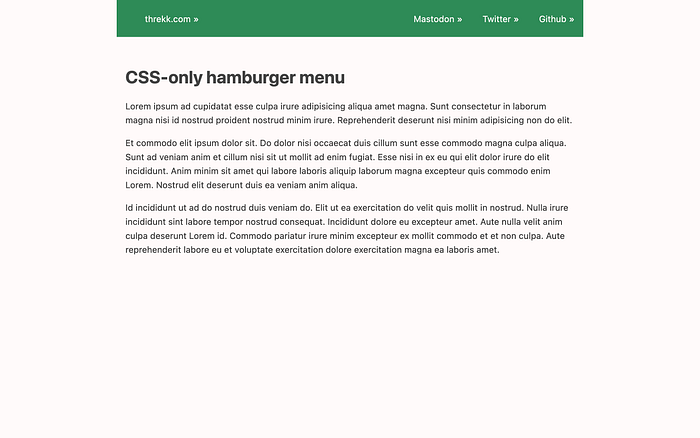
Making the list look nice on big screens
This part is straightforward, with a bit of CSS we are set. It is up to you to decide what looks nice:
nav {
    background-color: SeaGreen;
    color: snow;
    display: flex;
    justify-content: space-between;
}
nav ul {
    /* Make the markers disappear */
    list-style-type: none;
}
nav ul li {
    /* Puts the elements in a single line */
    display: inline-flex;
    margin: 0.3em 1em;
}
We are done with this part, and we will not make any changes in this part.
For the full CSS, check the links at the end of the article.
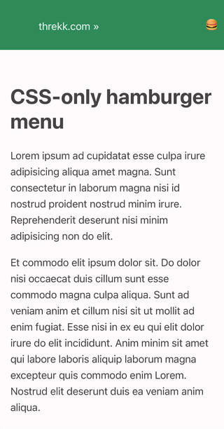
Making the list look nice on small screens
Using media queries, we restrict the following rules to only small resolutions. You can play around with the value used depending on if, for instance, you want to consider tablets “small devices”.
@media (max-width: 576px) {
    nav {
        flex-direction: row;
        flex-wrap: wrap;
        margin-left: 0;
        margin-right: 0;
    }
    /* Because we are in mobile mode, we want to display it as a
       vertical list */
    nav ul {
        display: block;
    }
    /* We have two lists: the first one are the always visibile items
       in the menu bar. The second one is the one that will be hidden */
    nav ul:last-child {
        width: 100%;
        flex-basis: 100%;
    }
    nav ul li {
        margin-bottom: 0;
        width: 100%;
        text-align: right;
        padding: 0.5em;
    }
}
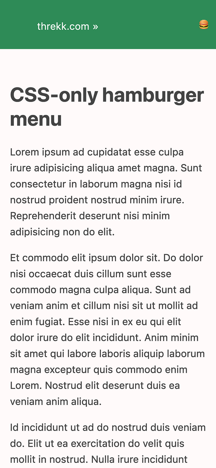
It IS a hamburger menu.
Making the list of links on small screen collapsable.
Finally, the interesting part. All the magic is here: given a checkbox, if it is not marked, the adjacent list is not displayed.
input[type='checkbox']:not(:checked)+ul {
    display: none;
}
First, we add a checkbox with a label to our HTML.
<nav>
    <!-- Always visible items in the nav bar -->
    <ul>
        <li>
            <a href="https://threkk.com">threkk.com</a>
        </li>
    </ul>
    <!-- The hamburger menu -->
    <label for='menu' tabindex="0">
        🍔
    </label>
    <input id='menu' type='checkbox' />
    <!-- The collapsable menu -->
    <ul>
        <li><a href='https://mastodon.social/@threkk'>Mastodon</a></li>
        <li><a href='https://twitter.com/threkk'>Twitter</a></li>
        <li><a href='https://github.com/threkk'>Github</a></li>
    </ul>
</nav>
The checkbox and the label will be hidden on big screens, and their value will be irrelevant.
nav input[type='checkbox'], nav label {
    display: none;
}
But in small resolutions, we display the label while keeping the checkbox hidden for aesthetic purposes.
/* Stlying the menu icon, the checkbox stays hidden */
nav label {
    text-align: right;
    display: block;
    padding: 0.5em;
    line-height: 1.6em;
    align-self: center;
}
There is room for improvement by adding some animations.
Et voilà. That is all. You can see the full example in action here, and you can check the full source code on GitHub.
Recommend
About Joyk
Aggregate valuable and interesting links.
Joyk means Joy of geeK