

Why big-tech NPS Design is no good?
source link: https://uxplanet.org/why-big-tech-nps-design-is-no-good-f29363297077
Go to the source link to view the article. You can view the picture content, updated content and better typesetting reading experience. If the link is broken, please click the button below to view the snapshot at that time.

Why big-tech NPS Design is no good?
Terrible design for marketing and support purposes
It is honestly disappointing to see that NPS or any kind of experience scoring system is so poorly designed by the big tech companies. I am writing this article to highlight the scoring system of four products in the order of worst to best. I hope that it would give other product folks a place to see the best practices when designing an experience to collect ratings from people and make it fun for them to interact with the interface.
Hubspot
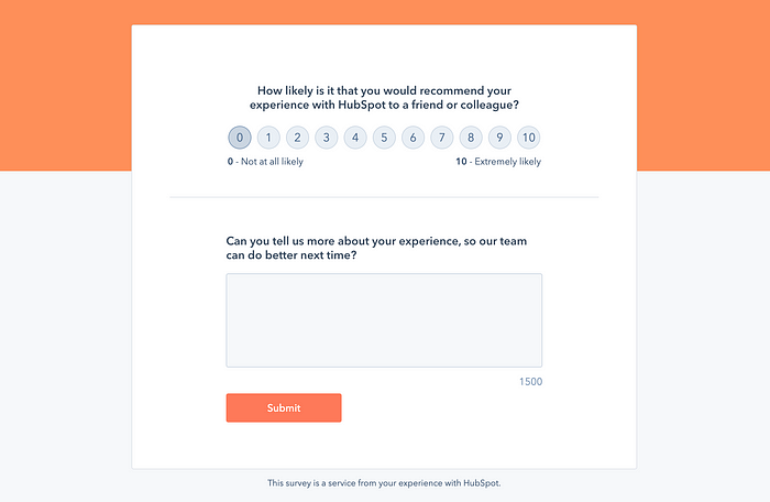
Starting from the baseline, Hubspot offers an NPS collection form that is not intuitive for the users to interact with. Here are a few reasons why…
- When there is a large scale of 0 to 10, people usually go for the middle five ratings because that is the safest option of all. The only way out of this issue is to keep a binary rating.
- Users don’t get feedback on which rating corresponds to which emotion or what does a rating of 6 mean to Hubspot? It simply tells us that zero corresponds to “Not at all likely” and ten corresponds to “Extremely likely”.
- The only way I can see how my rating affects Hubspot is by reading its question below, which changes its wording based on the rating. Not the best experience, but at least they inform the user that they have 1500 character limit to fill in their responses.
- The form itself gives off a feeling of being extremely boring and corporate. Designing something dull for a rather uninteresting activity is not the best design strategy. I would argue that it should be the other way around. Design should be stimulating when the activity is boring.
(Transfer)Wise
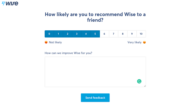
Wise does it a bit better than Hubspot in two aspects —
- The selected rating fills the past blocks too. This indicates the user to only change their rating to a higher number than a lower number although both the lower and higher number options are available because of the fill, users are likely to fill in the unselected numbers. Clever.
- There is an angry 😡 to love 😍 emoji on the sides of the spectrum that helps the user to associate 0 to bad/angry and 10 to happy/excellent rating.
Where Wise misses —
- It has multiple issues, the same as the ones in the Hubspot rating interface.
- It feedback form’s description question doesn’t show the word or character count.
AmazonPay
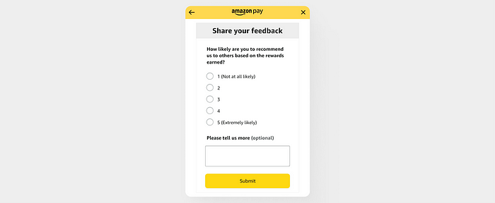
AmazonPay like its original e-commerce product is extraordinarily simple. They are nothing fancy about it. The feedback misses emojis, doesn’t have a character count, and the scale is vertically placed using five radio buttons. Similar to Wise and Hubspot, only the start and end rating displays the meaning label. But the best about this scale is that it is trimmed down to just 5 levels, and is mighty small even though is placed in a vertical alignment.
Another amazing thing about the form design is that the long answer question is marked as “Optional” which other products fail to highlight.
Cons —
- It could have used 2x emojis to make the interface more playful
- The filling of the rating scale is a good way to show the increase and decrease of the scale. Wise has done it in the best way.
- There is no character count for the multi-line input field.
YouTube
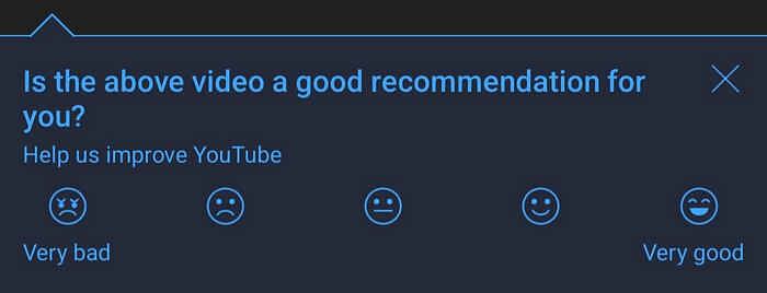
When compared to all others, I found YouTube to be nailing the experience to the most elevated degree. Here are four good things about this way of designing any rating system —
- It contains emojis. To better highlight the rating, we can use the actual colorful emoticons too. But there is a risk of making the others look disabled, so it is not recommended to do that.
- The rating scale is trimmed down to just five levels. This is better than showing a long line of ten ratings any day.
- The implementation is also lo-fi and doesn’t take a significant time away from the developer's sprint time.
- YouTube’s rating system can be plugged anywhere across its product, be it web or mobile, without sacrificing any legibility.
- The design is simple and it doesn’t have any additional elements like a multi-line input field.
My two articles on NPS design may be of interest if you’re looking for more information —
Sprint Design Exercise: NPS for Mobile
In this write-up, I decided to do a sprint to design an NPS experience for a user base that is in their teenage years…
That’s the end of this short yet hopefully insightful read. Thanks for making it to the end. I hope you gained something from it.
👨🏻💻 Join my content verse or slide into my DMs on LinkedIn, Twitter,Figma, Dribbble, and Substack. 💭 Comment your thoughts and feedback, or start a conversation!
Recommend
About Joyk
Aggregate valuable and interesting links.
Joyk means Joy of geeK