

Captivating Design of the Mercury Fintech App
source link: https://uxplanet.org/captivating-design-of-the-mercury-fintech-app-d472bc0288bb
Go to the source link to view the article. You can view the picture content, updated content and better typesetting reading experience. If the link is broken, please click the button below to view the snapshot at that time.
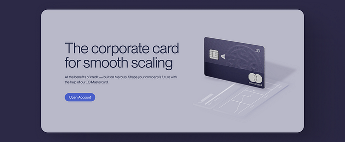
The first fold of Mercury’s Credit Card Page
Captivating Design of the Mercury Fintech App
How Mercury’s website uses subtle tricks to explain its features
Mercury is a fintech company operating in the US. It’s like any other neo-bank that can support the banking needs of startups without the hassle of dealing with stringent banking rules and restrictions. Having worked in the fintech industry for a short while, I know that explaining all of the features that your banking app can do to a mixed audience is challenging. Fintech Credit Cards and all of their functions are particularly difficult to explain smoothly. But it looks like Mercury has done it well.
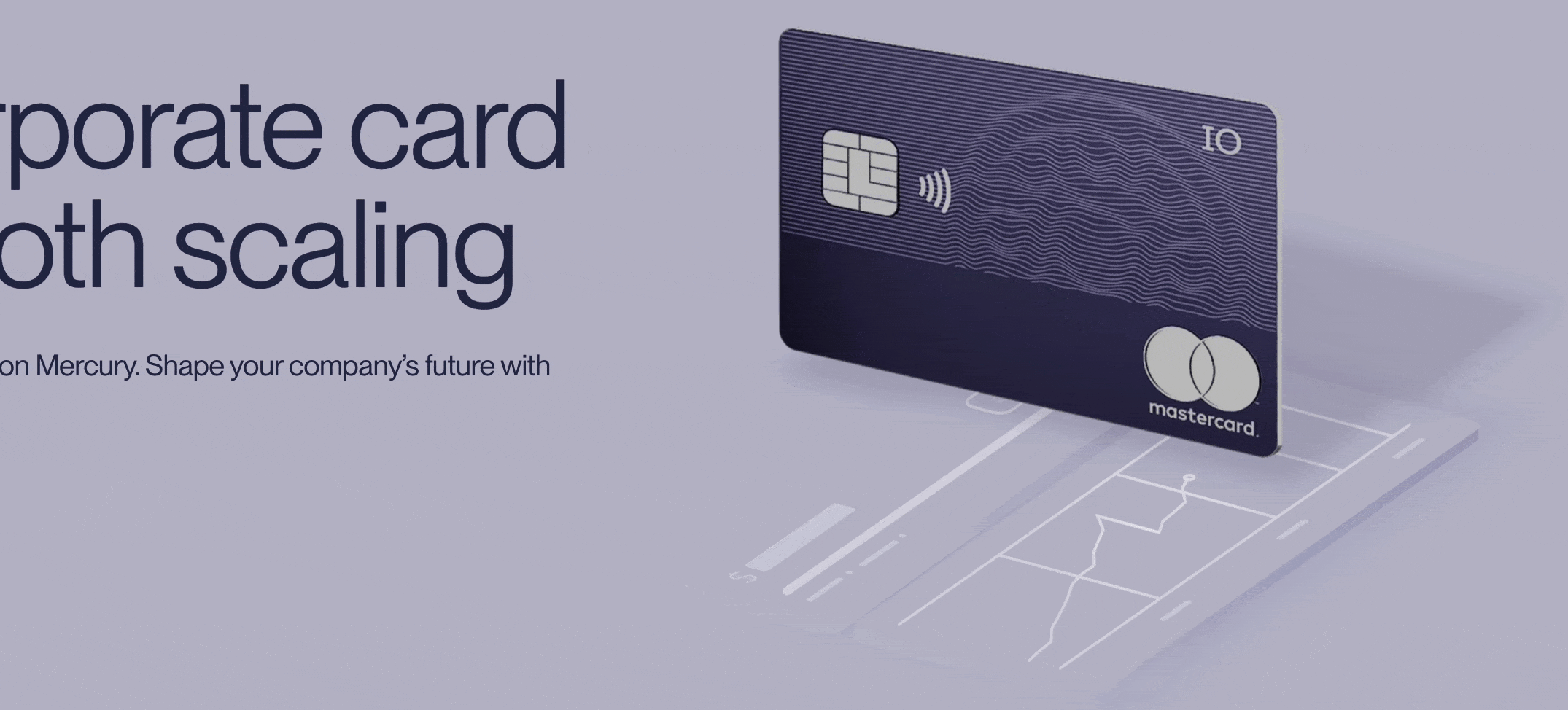
Mercury’s Credit Card Animation
Mercury uses morphing animation and subtle signs to explain all of its card’s functions within four scrolls as you can see above.
Shimmer & Wingardium Leviosa
levitating card
The first fold of the website uses a levitating card with a subtle shimmer shining through the card indicating the card is metallic premium. Also, the monotone Mastercard logo gives away the metallic nature of the card. Shimmer is the easiest technique to give a premium look to an object. In this case, it helps the UI to match with the real world and informs the user about the card’s build material & quality.
Match between the system and the real world
The design should speak the users’ language. Use words, phrases, and concepts familiar to the user, rather than internal jargon. Follow real-world conventions, making information appear in a natural and logical order.
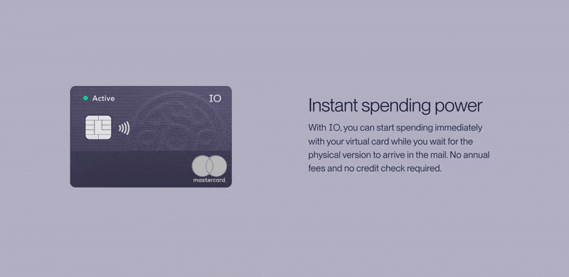
Green Active Signal
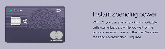
Instant spending power
As we scroll, a small “Active” symbol appears on the left-hand top corner indicating to the user that their card will get instantly activated in the app. Although it is not immediately clear, the supporting text besides helps clear things up. The team is talking about a virtual card that gets activated before the physical card arrives via snail mail.
Tilt & Reveal
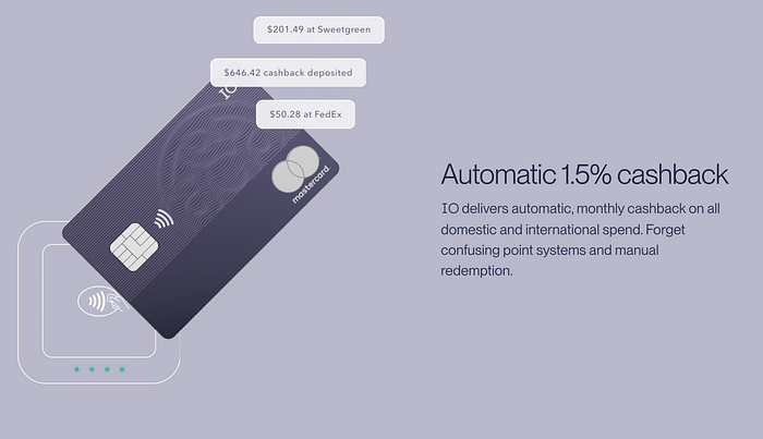
Automatic 1.5% cashback
The card then tilts slights towards the top right to reveal cashback received by three companies and a contactless payment surface in the background. This time I didn’t even have to read the text on the right to make sense of the motion and information revealed. It’s clear as the sky.
Swivel & Duplicate
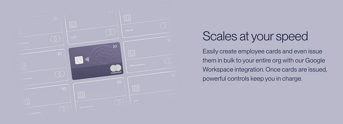
Scales at your speed
Next is a smooth swivel and duplicate animation that works like a charm to reveal a bunch of cards laid in the background in a wireframe blueprint visual style. What might that mean? To be honest, even though the animation was great, I think the micro-copy should change to “Bulk issue card” or something similar to inform users what the animation is indicating. Also, an alternate version of this would be metallic cards raining but it probably would have been too much 😂.
Scale down & Reveal
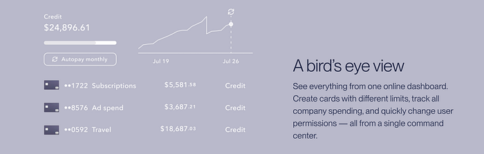
A bird’s eye view
The last scrolls reveal a bunch of analytics that the card is capable of processing for its credit cards using the scale-down and move-in from the bottom “reveal” animation. Similar to the cashback fold, the animation in this fold was self-explanatory and reduces the need to read the supporting text. I wish the others followed this pattern as well. But then again, this is a fresh approach to explaining all of the card’s features using fluid motion and concise micro-copy.
Tech & Design
After testing the animations back and forth, it is worth noting that the animation works in both the down and backup directions, which is quite cool and thought through. Mercury’s website is probably using the Rive app, Lottie, or Framer for animations. Also, throughout the page, Mercury has smartly kept all the background elements in wireframe form to keep the focus on the filled object which is the credit card. Bravo 👏.
That’s the end of this short yet hopefully insightful read. Thanks for making it to the end. I hope you gained something from it.
👨🏻💻 Join my content verse or slide into my DMs on LinkedIn, Twitter,Figma, Dribbble, and Substack. 💭 Comment your thoughts and feedback, or start a conversation!
Recommend
About Joyk
Aggregate valuable and interesting links.
Joyk means Joy of geeK