

Challenge 011–Article Preview Component🚀
source link: https://uxplanet.org/challenge-011-article-preview-component-e439b286849e
Go to the source link to view the article. You can view the picture content, updated content and better typesetting reading experience. If the link is broken, please click the button below to view the snapshot at that time.
Challenge 011–Article Preview Component🚀
Welcome Back!!
Suppose you are a first-time visitor Welcome! 🤩 First and foremost, let’s begin this with a small introduction to today’s article.👇
As some might know, I pivoted to UI development a few weeks back and started to do challenges using HTML and CSS. These Frontend Mentor Challenges have been done using Pure CSS. 👇
- Challenge 01:- NFT Preview Card Component
- Challenge 02 :- Sigle Price Grid Component
- Challenge 03 :- Huddle Landing Page with single introductory Section
- Challenge 04 :- Clipboard Landing Page
- Challenge 05 :- 3- Column-Preview Card Component
- Challenge 06 :- Product Preview Card Component
- Challenge 07 :- Sunnyside Agency Landing Page
- Challenge 08 :- Stats Preview Card Component
- Challenge 09 :- QR Code Component
- Challenge 010 :- Testimonials Grid Section
With Thaaaat…..Let’s get into our Today’s Challenge.
As for today’s challenge, we will be doing a Junior challenge from Front End Mentor. 👉Challenge 011– Article Preview Component
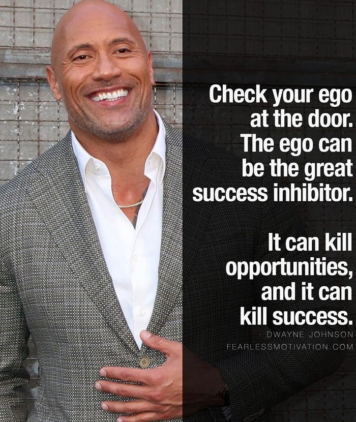
As always, let’s begin the challenge with a motivational quote.👇 (This is one of the quotes that helps me to keep moving, I am sharing this with you with the hope that it’ll help you all as well to keep on moving forward)
Check your ego at the door.The ego can be the greast success inhibitor.It can kill opportunities & it can kill success.
~ Dwayne Johnson ~
Before beginning, let me highlight a small note (as always):-
For some of you, this might be a challenge that you can do with your eyes closed, for some of you this might be a challenge that you learn a new thing and for some of you this might be the beginner step for CSS. So this article is for anyone from pro to beginner who loves to learn and sharpen their skills.🤓 With that…..
LET THE CHALLENGE BEGIN
🔸 Challenge Name:-
🔸 Description:-
Your challenge is to build out this landing page from the designs provided in the starter code. Your users should be able to:
- View the optimal layout for the page depending on their device’s screen size
🔸 Tools:-
HTML, CSS & Figma
STEP 01 — Begin With the blueprint (HTML)🚀
First and Foremost, we will do a sketch/blueprint of the card component using HTML. Afterwards, we’ll make the look and feel of the Article Preview Component according to the Design.
🔴 STEP 1.1 ➡ Basic structure of HTML
<!DOCTYPE html>
<html lang="en">

<!-- Head Section-->
    <head>
      <meta charset="UTF-8">
      <meta http-equiv="X-UA-Compatible" content="IE=edge">
      <meta name="viewport" content="width=device-width, initial-
       scale=1.0">
      <title> Article Preview Component</title>
    </head>
    <!-- Body Section-->
    <body>
    </body></html>
🔴 STEP 1.2 ➡ Create the main structure for the Article Preview Component
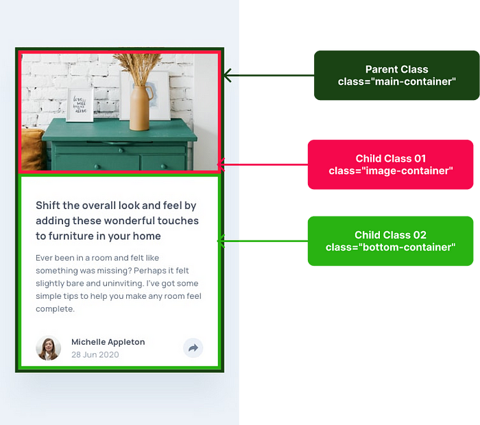
<div class="main-container">   <div class="image-container"></div>
   <div class="bottom-container"></div></div>
🔴 STEP 1.3 ➡ Create the structure for each section
01) Layout the Image Section (Child 01)
<div class="image-container"></div>
01) Layout the Content Section (Child 02)
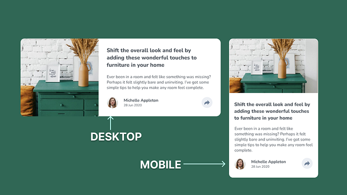
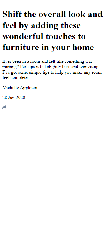
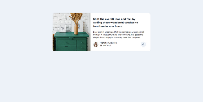
<div class="bottom-container">   <h1 class="heading">
    Shift the overall look and feel by adding these wonderful
    touches to furniture in your home
  </h1>  <p class="paragraph">
    Ever been in a room and felt like something was missing? Perhaps
    it felt slightly bare and uninviting. I’ve got some simple tips
    to help you make any room feel complete.
  </p>  <div class="link">    <div class="user">
       <div class="person"></div>
       <div class="info">
         <p class="name">
          Michelle Appleton
         </p>
         <p class="date">
         28 Jun 2020
         </p>
      </div>
   </div> <div class="share">
    <a href="">
     <img src="./images/icon-share.svg" alt="share icon">
    </a>
 </div>  </div></div>
— — And with that, we have done with the blueprint. It’s time for us to check the output of our blueprint.👀👇 — —
— — HMMM, I am not a fan of this. It looks ugly.🤮 But rather than wasting our time on complaining, shall we get into work and make it more appealing — —
STEP 02 — Time to make it more appealing (CSS)🚀
Here we start the styling for the mobile view first, and then we’ll adjust the styling for the larger screens using media queries.
🔴 Step 2.1 ➡ First and foremost let us start by Linking The External Style Sheet to the HTML file
<head>
  <meta charset="UTF-8">
  <meta http-equiv="X-UA-Compatible" content="IE=edge">
  <meta name="viewport" content="width=device-width, initial
  scale=1.0">

<link rel="stylesheet" href="styles.css">

<title> Article Preview Component </title>
</head>
🔴Step 2.2 ➡ Import fonts to the external style sheet
So as you can see in the Design, we used a font called ‘Nunito Sans’. Therefore what we can first do is, go to google font, search for ‘Nunito Sans’ font, click on the relevant font weights we need, and then get the import link.
@import url('https://fonts.googleapis.com/css2?family=Nunito+Sans:wght@400;600;700;800;900&display=swap');🔴Step 2.3 ➡ Use root: to declare the colours we are using
:root {   --white:#ffffff;
   --lightgrey:#9FABB2;
   --darkgrey:#4E555D;
   --greyishwhite:#ECEFF4;
   --lightblue: #EDF2F8;}
For a thorough explanation of :root check out Challenge No 002, where I descriptively walked you through why and what we use :root.
🔴Step 2.4 ➡ Include the Styling for the Universal Selector
Now let me begin with a small note🔊:- Since I have descriptively walked you through the universal selector in previous challenges (001, 002, 003, 004,005,006) as well as in the CSS article, I won’t be explaining the universal selector, and why we use it again.
*, a{  text-decoration: none;
  font-family: 'Nunito Sans', sans-serif;
  font-size: 15px;
  margin: 0px;
  text-decoration: none;}
🔴Step 2.5 ➡ Include the background colour for the full page
As you can see there is a light blue colour background effect for the full page
body { background-color: var(--lightblue);}🔴Step 2.6 ➡ Let us get into styling the Parent Container
.main-container {   max-width: 330px;
   min-height: 500px;
   width:100%;
   background-color: var(--white);
   border-radius: 14px;
   margin-left: auto;
   margin-right: auto;
   margin-top: 40px;}
🔴Step 2.7 ➡ Let us get into styling the Image Container (Child 01)
.image-container {   background-image: url("./images/drawers.jpg");
   background-position: top center;
   background-repeat: no-repeat;
   background-size: cover;
   border-top-left-radius: 14px;
   border-top-right-radius: 14px;
   height:200px;}
🔴Step 2.8 ➡ Let us get into styling the Bottom Container (Child 02)
.bottom-container { padding: 30px 20px 30px 20px}.heading { color: var(--darkgrey);
font-size: 18px;
font-weight:900;}.paragraph { font-size: 15;
font-weight: 400;
margin-top: 20px;}.link { align-items: center;
display: flex;
justify-content: space-between;
flex-direction: row;
margin-top: 20px;}.person { background-image: url("./images/avatar-michelle.jpg");
background-position: top center;
background-repeat: no-repeat;
background-size: cover;
width:40px;
height: 40px;
border-radius: 50px;}.user { display: flex;
flex-direction: row;
align-items: center;}.info { margin-left: 10px;}.info .name{ font-weight: 700;}.share { width: 40px;
height: 40px;
border-radius: 50px;
background-color: var(--lightblue);
display: flex;
align-items: center;
justify-content: center;}.share img a{ width:20px;
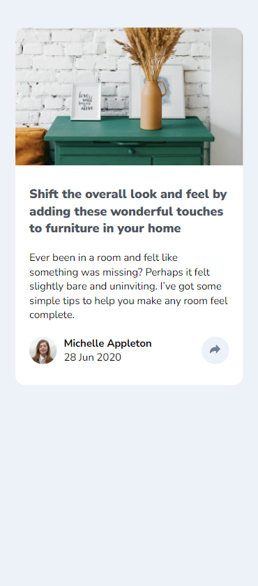
height:17px;}— — LET’S SEE THE OUTCOME IN MOBILE VIEW💣. TADAAA..🤩 — —
STEP 03 — Time to make responsive for all the screens (Media Query)🚀
Since we have done in a mobile-first approach, we have done our basic styling for the mobile view. Now it’s time to use the media query and make it responsive for the larger size screens.
Once you include the styles for the media query, those styles will override the basic style accordingly for larger screens.
🟡Step 3.1 ➡ Let us Complete by adjusting the styles for screens which are greater than 768px
@media screen and (min-width:768px){ .main-container {
   max-width: 740px;
   max-height: 290px;
   min-height: 10px;
   display: flex;
   flex-direction: row;
   margin-top: 100px;}.image-container {
   width:287px;
   height: 287px;
   border-bottom-left-radius: 14px;
   border-bottom-right-radius: 0px;
   border-top-left-radius: 14px;
   border-top-right-radius: 0px;}.bottom-container {
   max-width: 400px;}.heading {
  font-size: 20px;
  max-width: 350px;}}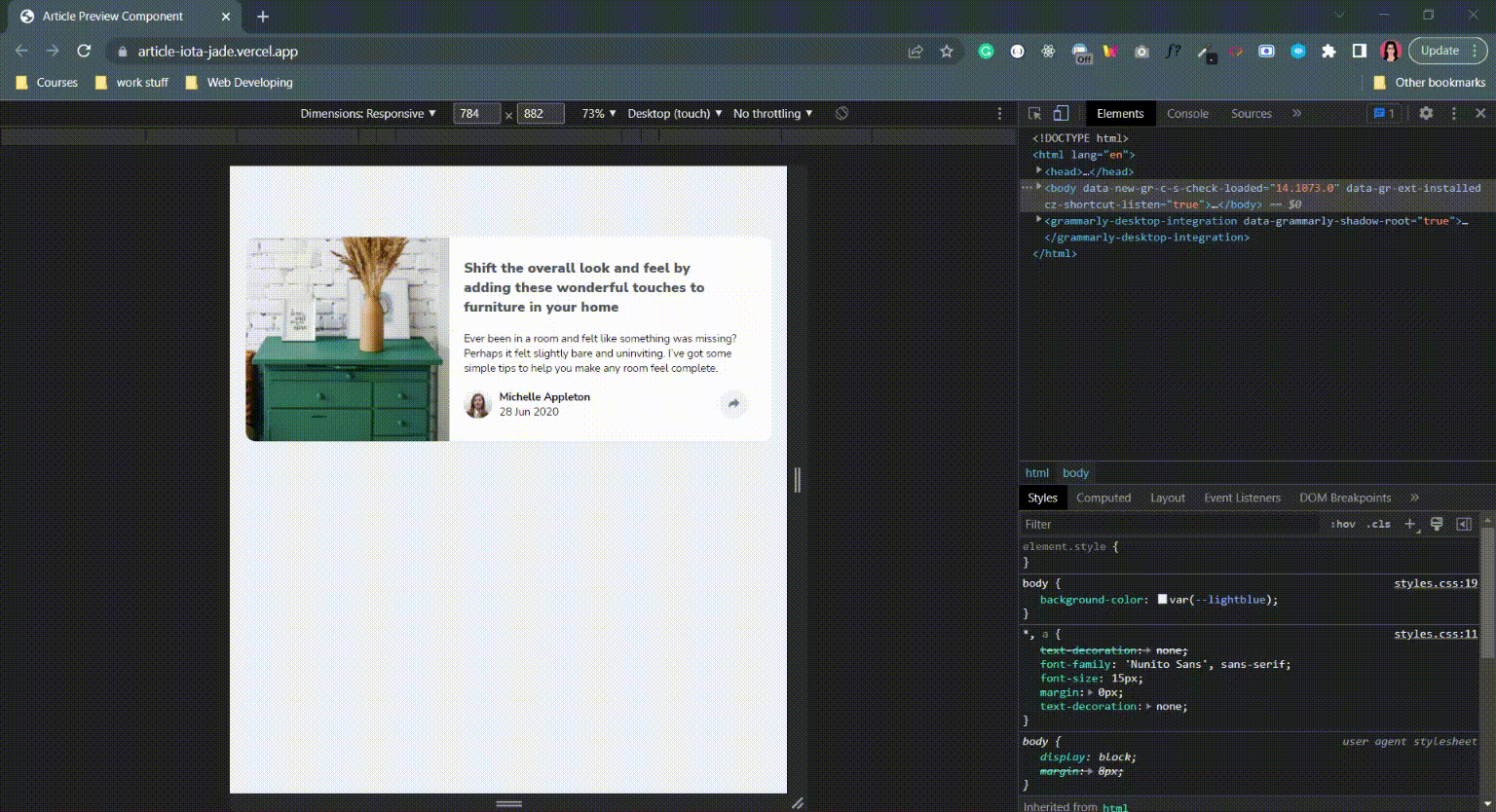
Final Thought
As we have done with the challenge, I’ll end this article with the hope that you have gained and learned something. Thank You for checking this out.
Now your time has arrived to give a try to this challenge. Trust me you would love the process.
If you are interested in gaining more knowledge, sharpening your skillset or need a small reminder, check out the following articles.👇🧠
Vessel of Knowledge in CSS https://medium.com/@nknuranathunga/vessel-of-knowledge-in-grid-1272764725a2
Understanding flexbox to make things easy:- https://levelup.gitconnected.com/understanding-flexbox-to-make-things-easy-adf90891ff25
Understanding Flexbox to make things easy 👏
If you are not willing to learn, no one can help you. If you are determined to learn no one can stop you
Learn the fundamentals of CSS within a few minutes:- https://bootcamp.uxdesign.cc/beginners-guide-to-css-9bc8298985c0
Beginner’s guide to HTML:-https://uxplanet.org/beginners-guide-to-html-and-css-letss-start-off-with-html-3d7ffd035182
If you like this give one or more claps and feel free to leave your thoughts and feedback in the comment section.
Thank you for checking this out and feel free to checkout my other articles by clicking the following link 👇
Nathasha - Medium
Read writing from Nathasha on Medium. UI/UX Engineer👩💻 Instead, more of who am I, let me tell you what I believe…
🔸Follow me on Twitter👀: @NathashaR97🔸
Recommend
About Joyk
Aggregate valuable and interesting links.
Joyk means Joy of geeK