

Buttons in UI Design: Four Common Styles
source link: https://uxplanet.org/buttons-in-ui-design-four-common-styles-f6bd02468388
Go to the source link to view the article. You can view the picture content, updated content and better typesetting reading experience. If the link is broken, please click the button below to view the snapshot at that time.
Buttons in UI Design: Four Common Styles
Button is perhaps the most common functional element in modern graphical user interfaces. Despite its popularity and relevant simplicity, this UI object might be tricky to design.
This article will review the aesthetics of 4 different types of a button and the context for using them. Note we will discuss only the canonical kind of button (aka simple button) and won’t cover toggle buttons or radio buttons.
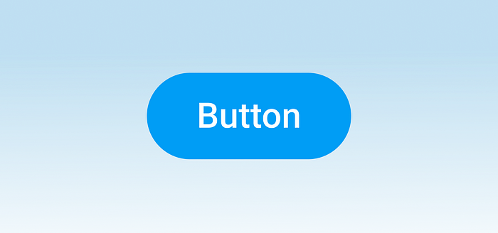
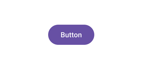
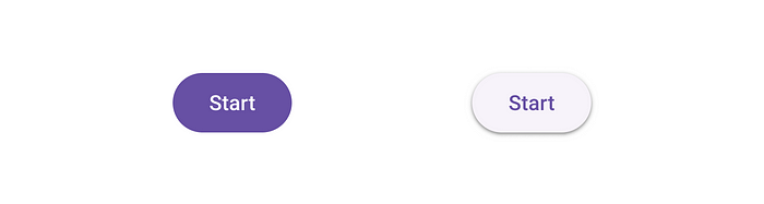
1. Solid button
A solid button is a button with a solid fill. Most of the time, designers use contrasting color so that solid button naturally grabs a lot of attention. It makes this button a good option for the primary call to action.
When to use
Use a solid button when you want to prompt a user to complete a particular action. For example, this button type will be suitable for “Sign up ” or “Buy” actions on landing pages.
Things to remember
Convey button state. Users should understand the button’s current state just by looking at it. For example, the disabled state should have a different visual style than an active state.

Use right button shape. Regarding shape, there are two popular options — square and round corners. Buttons with rounded corners indeed look nicer to the human eye (we naturally tend to avoid objects with sharp edges).

But ultimately, the styling of your button should be selected according to the style of your application. It means that if all your UI elements have a square shape, buttons shouldn’t be an exception.
Visual consistency is key to creating good user experience.
Provide visual feedback. It is vital to provide visual feedback on interaction. Subtle on-hover (for desktop) and on-click animation will act as acknowledgment for the user.
Use shadows to create 3D effect. Shadows create an effect of elevation — a button will look like a three dimensional object. Shadows can also reinforce the visual feedback — it’s possible to change the Z-depth to imitate the sense of movement of the button on tap. But similar to the button shape, the use of shadows should be dictated by your visual design. If you use drop shadow, ensure you carry that style to all your button types.
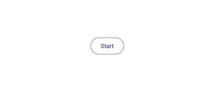
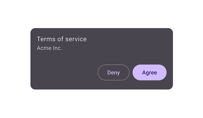
2. Ghost button
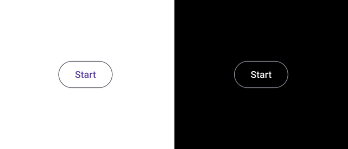
A ghost button, also known as a hollow button, is a button without a fill. Only the outline of the button is visible.
When to use
The ghost button is good for a secondary call to action button. A primary call to action button will guide the user to the action we want them to take, while the secondary button provides a reasonable alternative.
The ghost button can also be a good option for user interfaces where we don’t want to distract the user. Since a ghost button naturally has less visual weight, it attracts less attention than a solid button, making UI less busy.
Last but not least, ghost buttons are visually versatile buttons, meaning that they can work well on different types of backgrounds. And it makes the ghost button good for both dark and light themes.
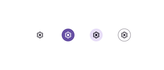
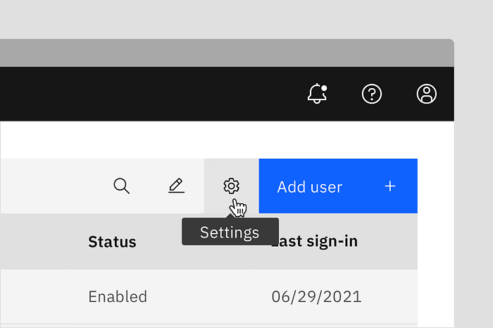
3. Icon-only button
As the name suggests, an icon-only button is a button that has no label; it is represented only by the icon.
When to use
Because the icon-only button doesn’t take up a lot of space, it can be a good option for menus and system bars.

Icon-only buttons work well when you need to present a lot of actions but don’t want, for some reason, to make them stacked on top of each other.
Things to remember
Ensure that the meaning of icon is clear to users. The meaning of the icon should be crystal clear to users. Users who don’t understand the icon’s meaning tend to avoid interacting with it. That’s why many designers say that “the best icon is a text label.”
Show tooltip. If you design a desktop app, consider adding a tooltip for the icon-only button. Users should be able to hover over the element and see what it does.
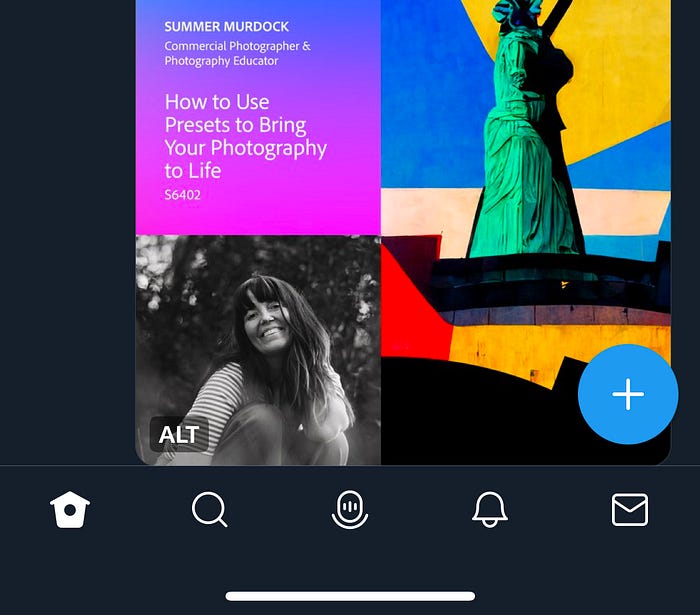
4. Floating action button (FAB)
A floating action button (FAB) is a type of button popularised by Google Material Design. FAB is an icon-only button designed with subtle shadow and typically located at the bottom right corner of the screen.

When to use
Since FAB is a relatively compact button, it typically serves as the primary action for mobile apps. FAB is typically used for one action. For example, the Twitter mobile app uses FAB to create a tweet.
It’s possible to use FAB on a desktop too, but there is no need for that because we have enough screen estate.
Things to remember
Ensure that icon meaning is crystal clear to all groups of users. Since FAB typically represents a primary call to action, it’s even more important to use clear icons. All groups of users should understand the meaning of the icon. Usability testing that I’ve conducted shows that when users don’t understand the meaning of the FAB icon, they don’t interact with it, which can be a critical problem for your app.
FAB is only for one action. Google says that when pressed, FAB may contain more related actions. But most of the time, it is better to avoid doing that because it will make the UI look more complex. Instead, it’s better to stick to a simple approach — once the user clicks/taps on FAB, they should trigger the primary action.
FAB doesn’t necessarily have to be a perfect circle. It’s possible to use more visually interesting forms for FAB, such as oval.

Want To Learn UX?
Try Interaction Design Foundation. It offers online design courses that cover the entire spectrum of UX design, from foundational to advanced level. As a UX Planet reader, you get 25% off your first year of membership with the IxDF.
UX Courses
Online, self-paced UX Courses created by design experts. Join over 135,220 students in the world's largest design…
This post contains affiliate link(s)
Recommend
About Joyk
Aggregate valuable and interesting links.
Joyk means Joy of geeK