

Classify your User Interactions into; Obvious, Easy and Possible
source link: https://blog.willgrant.org/2022/06/27/classify-interactions-obvious-easy-possible.html
Go to the source link to view the article. You can view the picture content, updated content and better typesetting reading experience. If the link is broken, please click the button below to view the snapshot at that time.
Classify your User Interactions into; Obvious, Easy and Possible
Jun 27, 2022
While we strive to make our products as intuitive and familiar as possible, there will always be “advanced” options and rarely-used features. Giving users choice and control over their experience will naturally lead to features that are used less frequently or settings that only a small percentage of users will change.
To help decide where (and how prominently) a control or interaction should be placed, it’s useful to classify interactions into one of three types:
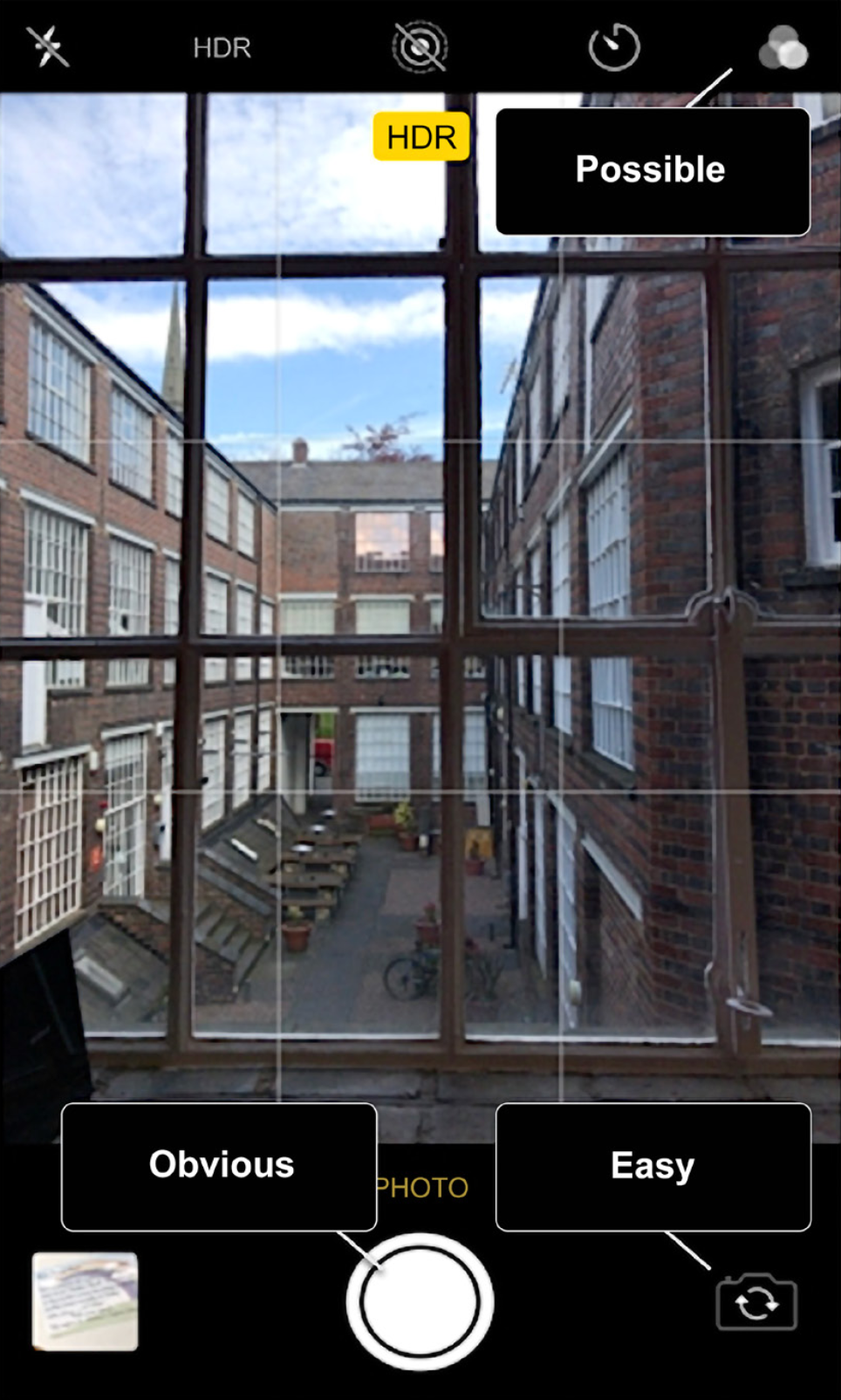
Obvious: Obvious interactions are the core function of an app, for example, the shutter button on a camera app or the new event button on a calendar app. They’re the functions that users will likely perform every time they use your product and their controls should be visible and intuitive. Hiding these away — either accidentally or intentionally — does still happen and it’s often a cause of massive frustration for users and the failure of new products.
Easy: Easy interactions are the hardest to classify and often we’ll only get these right after several rounds of iteration and user feedback. For example, an easy interaction could be switching between the front-facing and rear-facing lens in a camera app, or editing an existing event in a calendar app. The controls should be easily found, perhaps in a menu or as a secondary-level item in the main controls. They’re the toughest to get right because they’re used too frequently to be tucked away, but they are not used every time, which means designers will often de-prioritize them too heavily.
Possible: Interactions we classify as possible are rarely used and they are often advanced features. They need to be discoverable, but they shouldn’t be given the same prominence as obvious or easy interactions. For example, it is possible to adjust the white balance or auto-focus on a camera app, or make an event recurring on a calendar app. These advanced controls can be tucked further away, as the majority of users will not need to see their UI cluttered with them.
As a visual example, the iOS camera UI balances these three classes of interaction well:
These decisions are vital to the success of your UI and therefore the UX and product as a whole.
Start early - at the prototyping or wireframe stage.
Test often - looking at what users are doing and how they are discovering features and settings.
Iterate quickly - make changes and get them shipped and tested as fast as you can. Only then will you get the balance - between obvious, easy, and possible - correct for your product and your users.
This is an extract from the second edition of my Amazon best-selling UX book, 101 UX Principles: available to buy now.
Recommend
-
87
wallabag wallabag is a web application allowing you to save web pages for later reading. Click, save and read it when you want. It extracts content so that you won't be distracted by pop-ups and cie. You can install it on your own...
-
45
README.md Visual Recognition with Core ML Classify images with Watson Visual Recognition and
-
38
Derrick Higgins of American Family Insurance presented a talk, “ Classify all the Things (with multi...
-
113
PHP Class to classify NSFW content via the PixLab Machine Vision APIs - symisc/pixlab-php-nsfw
-
3
How Micro Interactions have become an essential part of great products.The world of User Experience design is growing fast, everyone wants their user to have the best experience. There are many ways to improve the user exp...
-
5
Obvious and possible software innovations nobody does Posted in tools by Scott Locklin on April 1, 2021 There are a number of things t...
-
8
-
1
A Designer’s Guide to Documenting Accessibility & User Interactions This is the article version of a talk I presented on March 16 at axe-con...
-
1
Designing user management for machine-to-machine interactions Machines are users, too, and you will have to treat them like users to ensure that the...
-
4
Affordances 101 – What You Can Learn About User Interactions
About Joyk
Aggregate valuable and interesting links.
Joyk means Joy of geeK