

A Designer’s Guide to Documenting Accessibility & User Interactions
source link: https://stephaniewalter.design/blog/a-designers-guide-to-documenting-accessibility-user-interactions/?ref=sidebar
Go to the source link to view the article. You can view the picture content, updated content and better typesetting reading experience. If the link is broken, please click the button below to view the snapshot at that time.
A Designer’s Guide to Documenting Accessibility & User Interactions
This is the article version of a talk I presented on March 16 at axe-con. The link to the video will be available soon and added to that article.
Accessibility is unfortunately still an afterthought on many projects. User interaction and accessibility requirements are poorly documented, at best. Or forgotten, when handing over designs to developer teams. And fixing it later costs a LOT more than building it right to begin with. Great documentation helps teams implement accessibility requirements the right way. I will tell you why, what and how designers can document different aspects of accessibility and user interactions requirements, to build better more inclusive products.
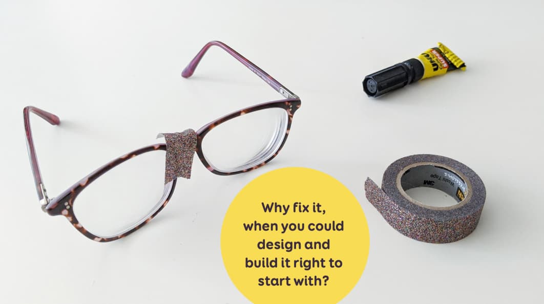
Why fix it later, when you could do it right to start with?
A lot of sites were not designed and developed with accessibility needs in mind. As designers, a lot of us think that “accessibility is the job of the developer team”. Accessibility becomes an afterthought for a lot of projects. Companies launch inaccessible tools, sites, services.
Eventually, someone will complain about this. Maybe the site even gets sued. It circles back to the team. And now they have “fix” the accessibility issues. But, it’s often too late. When the site was not designed, developed with accessibility in mind, it’s harder to correct. And way more expensive as well. A little bit like in this picture: they end up putting duct tape on broken glasses.
My question is: why fix it, when you could design and build it right to start with?
This is why we need to bring accessibility awareness earlier on in the project. Good guidelines and documentation can help us achieve that. They can help identify and fix accessibility issues, earlier in the project. Accessibility becomes part of the “project normal design and development phases“. It’s not an afterthought anymore.
Who should document accessibility?
Accessibility documentation is a team effort. Product and Project Managers can define and document accessibility requirements at project level. Do we target AA or AAA for example? Also, they can make accessibility part of the Definition of Done if you work in an agile environment.
Developers & Accessibility experts document the technical implementation. Things like correct markup, ARIA roles, landmarks, …
Testers and QA (quality assurance) teams define and document accessibility test cases: how are we going to test this?
Designers design and also document how it works and what it looks like. They also document navigation, the “hidden” interactions and what assistive technologies should announce.
How and Where should I document accessibility?
Determine the best format with the team
My number one advice: if you want documentation to be useful and used, ask the team about what would work for them. There are many different formats that you could use to document. Here are a few idea:
- Jira tickets used as documentation / research repository
- Confluence pages (or whatever knowledge base tool you use)
- Separate documentation in a word doc, excel sheet
- Miro board (mockups + docs)
- Figma comments
For me, it’s all about the best format for YOUR team. This has to be an open discussion.
Bring accessibility annotations to mockups and design documentation
Let’s talk about my team. After all, the goal of this article (and talk) is to share what I do. So that you can get inspired and find your own way. We use Sketch and my developers have access to the Sketch mockups.
People don’t like to read specs and backlogs. But they might (yes might) look at my design files. We have a Design System Sketch file with a dartboard (page) for each component. I put design annotations directly on the component mockups. Each component has its own detailed page, with states, how it works, etc.
I created some symbols for annotations that I can re-use across pages.

On the left: an example of a component with different states. In the middle: my component symbols. On the right, the annotations at page level.
I then re-use my components to build different pages. Sometimes, I also have annotations directly on a second mockup at page level as well.
Hot tip: make sure the annotation style is different from the page style. This is why mine are magenta. I want to avoid developers implementing the annotations as part of the product by mistake. And, yes, I saw this happen before.
While researching for this talk, I stumbled upon Karen Hawkins “Accessibility Annotation Examples“. I find this format interesting as well. She puts the mockup on the left of the page, with little numbers on certain areas. On the right, she has detailed documentation for each number. The design annotations are in dark. And the accessibility requirements are in red, with a little (AR) prefix.
Get my Sketch annotation template
A few of you asked me if they can get my Sketch file for those symbols. So here you go:
Download Sketch Annotation Symbols
Documentation is no substitute for communication
There are different styles and ways to document. Come up with your own and test what works for YOUR team. But remember one thing: Documentation is NOT a substitute for talking to people!!!!
It’s still important to present the documentation in person if you can. In our team, we have weekly meetings. Developers show demos. I show and discuss such documentation and specifications.
It is usually a discussion then, with the team, on what is possible, what is not, how we might implement those, etc.
What exactly can or should designers document?
I’ve shared the “how” and “where” should be documented. Let’s dig further into actual examples: What exactly can or should designers document?
My “accessibility design documentation matrix”
There are many things designers can document on accessibility. While preparing this talk, I tried to list and organise them. I used a 2 axes matrix.
On the horizontal axis, I ordered them from “things that I, as a designer, can document on my own”. To “things I will need a developer or accessibility expert’s help to document”. In the middle, I put what I want content people (SEO, UX writers) to help me with.
On the vertical axis, I split the graph in 3 areas:
- things that I usually document at component level,
- at page level,
- across different pages.
I also have 4 categories: Visual design, Interaction, Wayfinding and “Announced Content and Markup”.
This is a very “personal” way of ordering things. It is based on my own areas of expertise.
This is not set in stone. If you map the same things with your team, the mapping will be different. It depends on a lot of factors, including level of accessibility expertise for designers and dev team. The type of project might also change this. A single page app will not have the same needs and levels of page/component as a blog for example.
It is an interesting exercise to do with the team to see how confident and comfortable people are documenting things
Let’s check into detail each element of that matrix.
Documenting Color Palette for accessibility
Let’s start with Visual design. The first thing designers can document are the colors and the color palette. If you need help creating palettes, check Tips to Create an Accessible and Contrasted Color Palette.
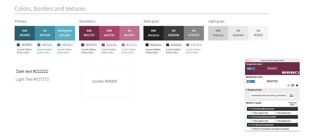
Here is an example of how I used to document this. For each color in the palette, I match it with a white background. And documented if it passes the AA or AAA contrast ratio check for regular or big text. This is a start, but sometimes I need more granularity.
When I need something more complicated, I use a color matrix tool like this one.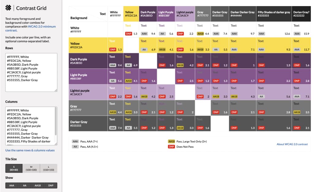 Here we have the same colors on the horizontal and vertical axis. The intersection of both shows their color ratio when paired together . This helps me know if I can pair those 2 colors together for different ratios: 3:1 4:5,… For example: I should not use that yellow as text on which background, but I can pair it as text for darker grey. I can then put this matrix in the project, to let other designers know color combinations they can and should not use.
Not all designers might be familiar with the ratios, AA / AAA meaning and small vs big text concept. You still need to explain this somewhere. Or put some links to external sources. You could use Geri’s WCAG for Designers documentation or the accessguide page on contrasts. For more tools check “Color accessibility: tools and resources to help you design inclusive products“.
Interactions states and statuses
Let’s talk about interactions. For interactive components, the first thing I try to document is the different states.
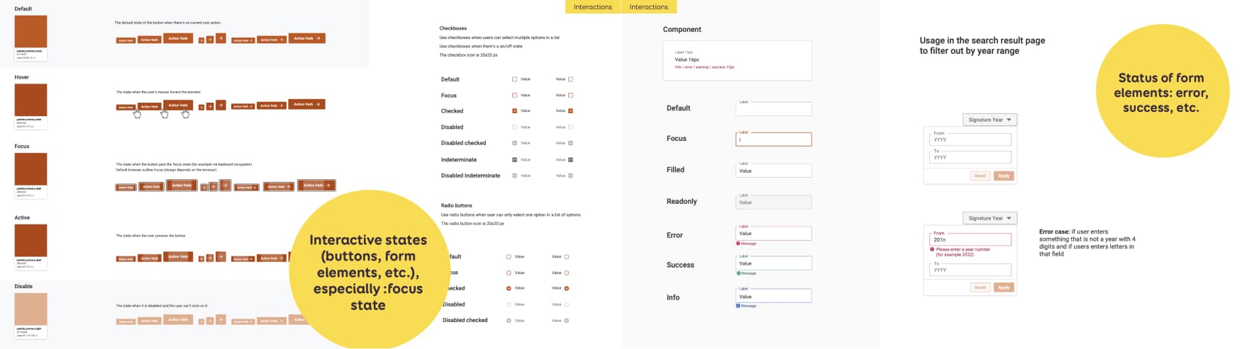 In my example I document different button states: default, hover, focus, active, disabled. You could also have extra “non” HTML official states like “loading”. For checkboxes I have: default, focus, checked, disabled, disabled checked, indeterminate, disabled indeterminate. This is done at component level.
For form inputs, at component level, I have some generic classics: default, focus, filled, read only (or disabled)
But I could have some extra statuses, for example:
- Error
- Success
- Information
For those, I don’t just use color, but also some text and icons (so that the color is not the only way to convey information)
At page level, where the component is used, I often need to specify more clearly. On the right, I have an example of a year input used in a filter. I document:
- What triggers the error (= error case)
- What the exact message (copy) should be.
Focus order in form elements
Some people will navigate forms using the tabulation key. For this, I can document the focus order. 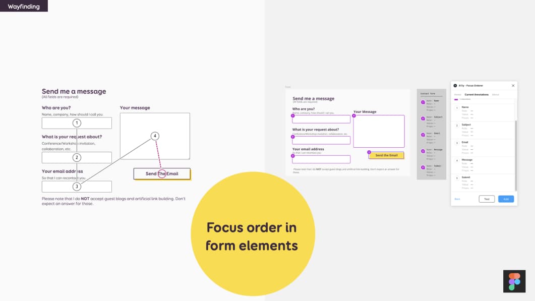 In my example here, I have a 2 columns form. And I documented how the user should go through left column first:
- Who are you
- What is your request about
- Your email address
Then the users goes on the right side:
- Your message
- Submit
I document this with little annotation numbers on the form fields. And arrows to show the order (which is my example on the left)
If you are using Figma, the team at Microsoft created a plugin: A11y Focus order, that will help you with that. This is the example on the right. You can select the elements then give them a number in the plugin. And you can reorder them as well
More form accessibility documentation that experts can help with
There are more things you can document for form accessibility. But this might require a little bit more help from experts / devs.
Some of those are:
- What is the Correct HTML5 type?
- Is this field supposed to have
autocomplete,autofill, etc. (attributes) Legendsand field grouping markup- Default focused elements when page opens
Interaction flow for mouse and keyboard input
For complex components with many interactions, I build “interaction flows”. This documents how these components should work, when there are different interactions. Let’s start with mouse interaction.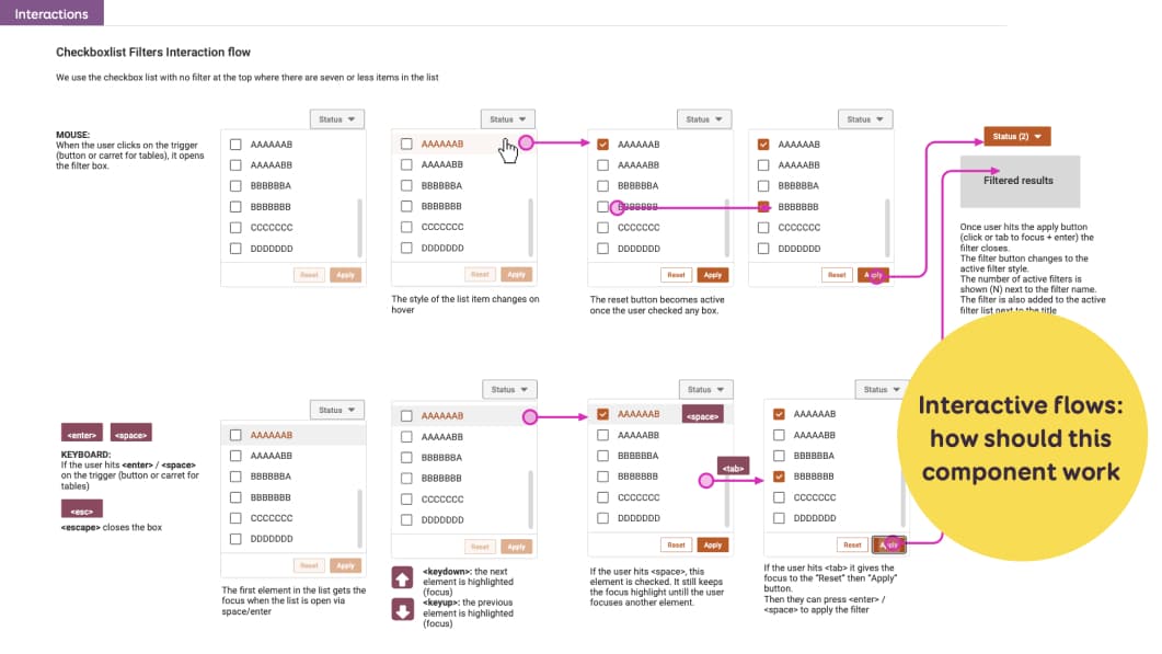 In this example, I have a filter with checkboxes. I documented step by step what happens when a user:
- Opens the filter,
- Hovers an element,
- Checks filter box,
- Hits the apply button, etc.
On top of mouse interaction, I also document keyboard interaction. So I end up with a similar flow, that will also show keyboard navigation in this component:
- How to open the component (enter/space), close it (esc)
- How to navigate across the elements (up/down key)
- How to check a box
If the component has some keyboard shortcuts (mine don’t), this would be a nice place to document that as well.
Alternatives for complex gestures
Providing alternatives for complex gestures is an accessibility and usability best practice. An example of this is the “swipe right” to archive feature in gmail.
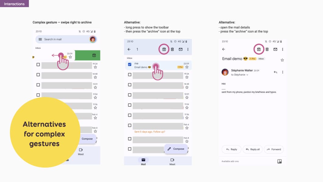 If I were to document alternatives for gmail, I could do something like this. I would document the complex gesture with a mockup that shows the swipe right to archive.
Then I would document alternatives:
- A long press on the mail to show the toolbar, then press the archive icon
- Open the mail, then press the icon at the top
Image alternatives and assistive technologies (screen reader) announcements
If there are images or icons in the mockups, designers can document what the assistive technology should announce.
In my example on the left, I have a cooking recipe site with an image of a slice of pizza at the top.
 I use the annotation technique to document the alternative text for this image:
- A number on the image
- The alternative detailed documentation on the right
I also have 3 buttons: save, share, rate. Each has an icon and a label
In my annotations, I explain that the screen reader should NOT announce anything for the icons. Otherwise it would be annoying to have twice the same information.
I am not sure here how the developers will implement the icons. So I prefer not to document exactly if this should be an empty alt, a role=presentation, … I could also discuss with them. Then update the documentation to reflect how this would be implemented.
In this second example on the right, my icon buttons do not have visible labels. So I need a screen reader to announce those.
I again use the annotation to document that:
- the first is “view graph”
- and the second “view table”
With the help of my dev team I could bring this one step further. They can add documentation for some ARIA states (selected, etc).
Announced content order
I can also document the announced content order. This is interesting when the order might be different from the HTML flow.
 In this example I have a medium and a small version of a cooking recipe “thumbnail” component. In both cases, I want the title to be announced first, before the categories (number 2). This is why it’s in a big bold font in my design. This visually conveys the hierarchy. So this gets number 1 with my annotation technique. I also want the save button to be announced last. It is visually at the top on the mobile version to gain some space. But it needs to be announced last, like in the medium version. So it gets order number 4.
How would you implement this then? Marie Guillaumet, accessibility expert at Access42, explained to me:
“Even if the title visually appears after the categories, in the HTML code, you need to put it before. This way the screen reader will read the title, then the categories. Then you use CSS to invert the order visually in the component”.
Documenting links
Sometimes the “clickable” part of an element might not be obvious. Especially when they wrap a whole component.
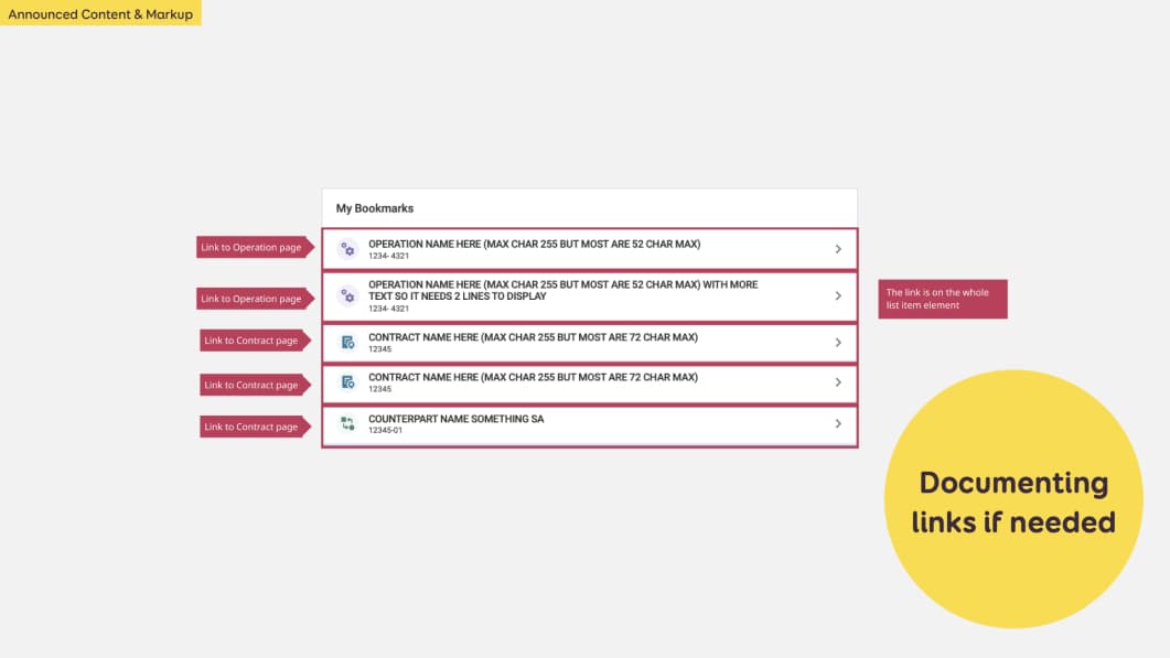 In this example, we have a tile with 5 list items. Each has an icon, a title, a number and an arrow. Dev teams might ask “where should I put the link, is it on the title or the whole element???”
I can document this directly with annotations as well. Or I can put that info in a Jira ticket.
Extra content for assistive technologies
Sometimes, screen reader users need some extra information.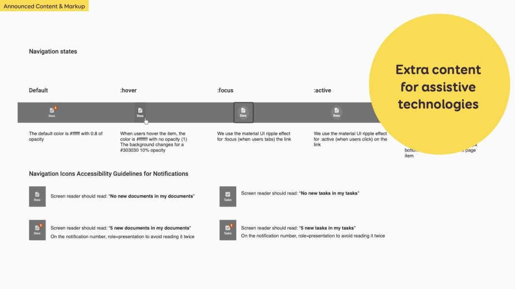 In this example, if I have a notification badge with a number of items. Just announcing the number might be confusing. I can document how this should be announced for different scenarios:
- No new documents in my documents (if there is no notification)
- 5 new documents in my documents (in case I have 5)
- No new tasks in my tasks
- 5 new tasks in my tasks (in case I have 5)
HTML title of the page
The examples until now were mostly documentation at component level. There are more things you can document at page level.
Starting with the HTML title of the page for example.
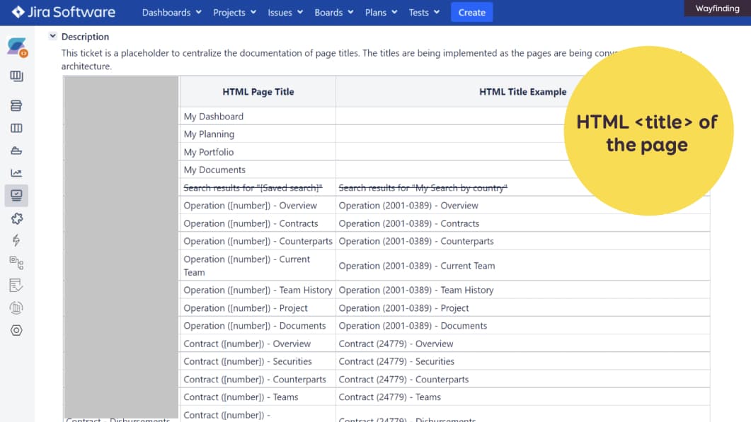
Example of a table in Jira, where we document the HTML Page Title structure and an example for each.
It is displayed in browser tabs. It is also announced by screen readers. This helps users know where there are and what they can expect to find on that page. For those, we use a Jira ticket (because we don’t have confluence ^^). You could also document this in mockups .
HTML headings in the page
Proper HTML headings is another important aspect of accessibility: H1, H2, etc. I can do 2 things:
- I can use heading level as annotations on the mockups
- I also name my styles with the proper heading level so that others designers can re-use them.
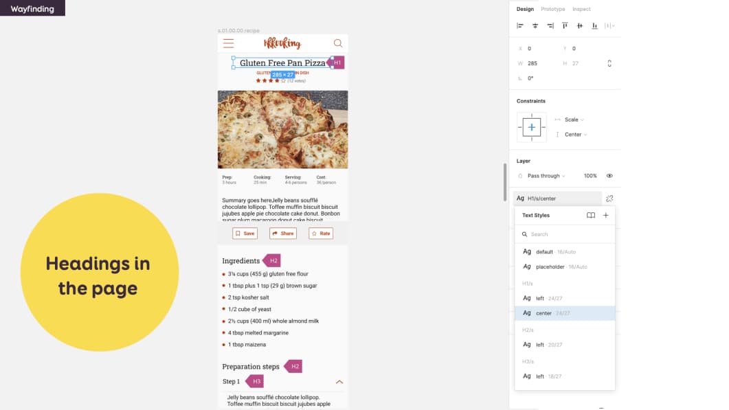
In this example I documented a H1 for the title of the recipe, then H2 for Ingredients and Preparation Steps, etc.
This is the sort of thing that you could also document with content people. Sometimes you need a heading level but this would mess up SEO. For those cases, you can use the aria-levels (and a p tag). Check with your devs. If you want an example, check the code of my “let’s get in touch” footer. The title is visually the same as H2, but this makes no sense for SEO. So it got a role=”heading” and “aria-level=2” instead.
Focus order at page level
I mentioned focus order in forms. Focus order is also something you can document at page level.
 This example is from a Figma template by the Fluent Design System team of Microsoft. They provide a Figma kit to help you with such annotations.
The mockup is in the background. On top of it, you have small annotations. With the corresponding documentation of their focus order on the right. In this case, after the user navigates through the top navigation and first “site header”, they enter the main content. They start with the left sidebar, then a “return” link; and finally to the right part of the content.
Zoom behavior
For complex responsive pages, you could also document the “zoom” behavior. I’ll be honest with you.
Since I often provide responsive web design guidelines, I never went into THAT level of details for websites. I ask developer teams to NOT block the zoom behavior (and height). And we test our sites with different resolution and browser zoom levels.
But I think this can be really useful for native apps.
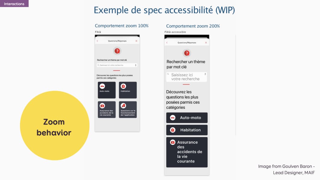
This is an example for Goulven Baron at Maif. He documented how the mobile view behaves at 100% on the left and at 200% zoom.
Landmarks and more documentation with help from Developers & Accessibility Experts
Those were mostly design documentation. For many of the examples, you could collaborate with developers and accessibility experts to add even extra information to that documentation such as:
- Correct HTML semantic elements
- ARIA Roles
- ARIA states and properties
With the help of accessibility experts, designers can also document ARIA landmarks. Those areas help screen reader users orientation on the page.
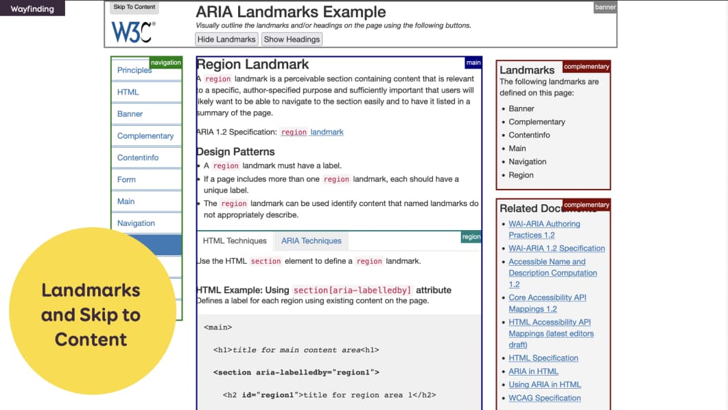
This is an example of the ARIA landmarks website, documenting landmarks areas with colored annotations. Inception anyone?
Designers can also document the “skip to content” links. Those are links that are “invisible” by default but are visible on focus. They are also announced by screen readers. They let users screen readers skip directly to the main content of the page.
You can document:
- where the link is,
- what does it look like when it’s focused,
- where it will send the user.
Reduced motion and play/pause buttons
One aspect of design that is quite tricky to document is animations and transitions. There are accessibility best practices for those as well. Some animations and transitions can trigger motion sickness to some users. I’m one of those by the way.
You can use the prefers-reduced-motion media query to provide an alternative version for people who prefer less motion. If you want to learn more about the topic, check the section “Building Accessible and Inclusive Animations” of my talk on CSS animations and UX.
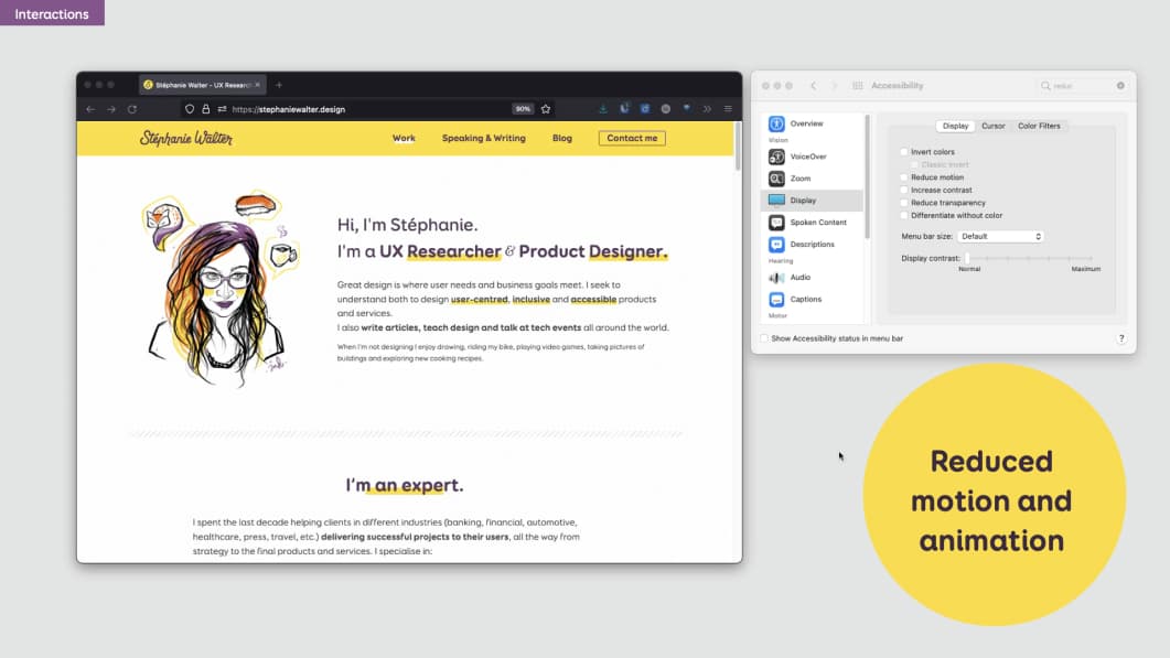
How do you document this? Well…Animations are often something that is built in direct collaboration and fine tuned in the browser.
For those sorts of things, I think you need to have a discussion with the dev team directly.
Also, don’t forget to have some play/pause buttons in your interface, if you have videos and sliders. Let the users control those!
User flow to document interaction between pages
One last level of documentation is “interactions across pages”.
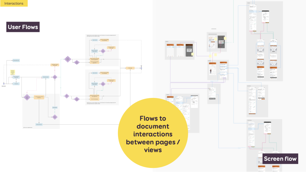
User flows (on the left) are kind of “step by step” boxes and arrow graphs that document how someone accomplishes a task. They list pages, views, branchings, … They are usually built at the beginning of the project to help plan those pages and flows.
Screen flows (on the right) are kind of the same. But instead of boxes for pages, I put the real interface mockups. I build those at the end, once we went through usability testing, refinement and have mockups. Both help the dev team understand how the user will navigate across the whole interface.
Such documentation can help with accessibility to plan:
- Transitions between pages. Especially in single page applications or mobile apps.
- Alerts or messages that might appear and stay on top of the page even if users got to another one.
- Multiple steps flow where you might have session lengths. But avoid limiting form sessions length if you can.
Access to external documentation for captions, transcripts, etc.
Finally, there are things you can’t document in design files. For those, I often provide links to external sources.
Such examples are
- Caption for videos. You can provide a link to the plain text transcript and / or a link to the .srt file
- HTML/text resources for Audio transcripts (for podcasts for example)
- A list of links/CTAs with the anchors. “Click here” links are horrible for accessibility AND for usability. You want to avoid that. Often content people (SEO, UX writers) will provide a whole list of such links with the actual URL, the anchor, the title, etc.
What are the benefits of such documentation?
I gave you plenty of examples of what to document. The final question now is: what are the benefits of such documentation?
Why should we do it and how do I convince my team to invest time in design documentation for accessibility? Well, a few reasons…
It benefits myself, as designer
The first benefit of documenting accessibility is for myself, as a designer. It helps me learn more about accessibility. To document such things, I had to learn about it.. So documenting helps me keep up to date and understand more accessibility needs and requirements.
It forces me to think about different interactions, beyond the “static” pixels I am working on. Documenting is a nice mental effort that forces me to take a step back and ask myself:
- How will someone interact with this with a mouse?
- A keyboard?
- How will it work on touch?
- What will a screen reader announce for that? Etc.
Sometimes, I am too deep into the pixel details of something. I don’t notice that this will not work, once people interact with it.
This helps me see that, and rethink a whole new solution if needed.
It benefits the designer- developer relationship
Design documentation helps avoid some misinterpretations. Of course this doesn’t mean that you don’t need to talk to your devs, or don’t need to present your mockups. Sometimes there are months between the moment I designed and presented something to the dev team and the moment that Jira ticket arrives in their backlog. Having a solid base of documentation helps remember and restart the conversation.
It also helps bring consistency to future pages and interactions. If interactions and accessibility are documented for one component, then similar components should work the same way. And trust me, my developers hold me accountable. Sometimes they will come and ask me “Stef, this is almost the same thing, why is this working differently?” And they are right to ask.
It benefits current and future fellow designers
It’s a good onboarding tool for new members, especially if they don’t know about accessibility. They get examples of what is expected from them. Often, they will ask a lot of questions. And will learn about accessibility from that kind of documentation as well.
Prior documentation also helps set standards as to what is expected for the next designs. This again helps bring consistency when the design team grows.
It benefits everyone else in the team
Such documentation helps start conversations about accessibility within the company. It encourages them to dig further and learn about that topic as well. And helps make sure accessibility is NOT an afterthought anymore!
In conclusion…
I share with you a lot of things you can document as a designer to help push accessibility forward.
The goal was to give you some examples. But I will be honest, I don’t always have the time to document all of that in design mockups. I would say: pick your battles. If time is limited, document the things where there might be the biggest issues and misunderstandings
The important thing is teamwork. Even if you don’t document everything, communication is the most important aspect here. With the other designers, with the dev team, with the testers. So that we can push accessibility forward together for everyone. And make it part of the projects from the start.
And yes, it is a BIG, long, demanding job.
Resources and links
Links in the slides
More links to help you build and document better accessible designs:
Recommend
-
50
Welcome to your complete guide to documenting Python code. Whether you’re documenting a small script or a large project, whether you’re a beginner or seasoned Pythonista, this guide will cover everything you need to know....
-
3
How Micro Interactions have become an essential part of great products.The world of User Experience design is growing fast, everyone wants their user to have the best experience. There are many ways to improve the user exp...
-
1
-
8
-
3
The UX/UI designer’s guide to user-centered design
-
3
Documenting user flows with our clientsHow Overflow helps us create and document multiple flows for our projects — and keep them up-to-date.
-
5
Classify your User Interactions into; Obvious, Easy and Possible Jun 27, 2022 While we strive to make our products as intuitive and familiar as possible, there...
-
1
Designing user management for machine-to-machine interactions Machines are users, too, and you will have to treat them like users to ensure that the...
-
4
Affordances 101 – What You Can Learn About User Interactions
-
6
About Joyk
Aggregate valuable and interesting links.
Joyk means Joy of geeK