

Micro Interactions in User Experience | UX Planet
source link: https://uxplanet.org/how-micro-interactions-have-become-an-essential-part-of-great-products-2ac8e02b5f2
Go to the source link to view the article. You can view the picture content, updated content and better typesetting reading experience. If the link is broken, please click the button below to view the snapshot at that time.
How Micro Interactions have become an essential part of great products.
The world of User Experience design is growing fast, everyone wants their user to have the best experience. There are many ways to improve the user experience, including defining personas, well-structured information architecture and thoughtful written content. However, after defining high-level structure, smaller interaction design details is the one which thrills the user.
We as consumers, see and interact with these micro-interactions on a daily basis even without knowing.
What are micro-interactions?
Micro-interactions are small, preferably functional animations that support the user by giving visual feedback and displaying changes more clearly.
With micro-interactions, it’s possible to explain a lot without using a word.
Micro Interactions contain a large number of digital elements, but not every element is part of a micro-interaction. Static elements that are always present on the screen are not micro-interactions because they do not have a distinct trigger. Additionally, flows composed of multiple actions are not micro-interactions. There are two types of micro-interactions User Triggered and System triggered.
Examples for Micro Interactions
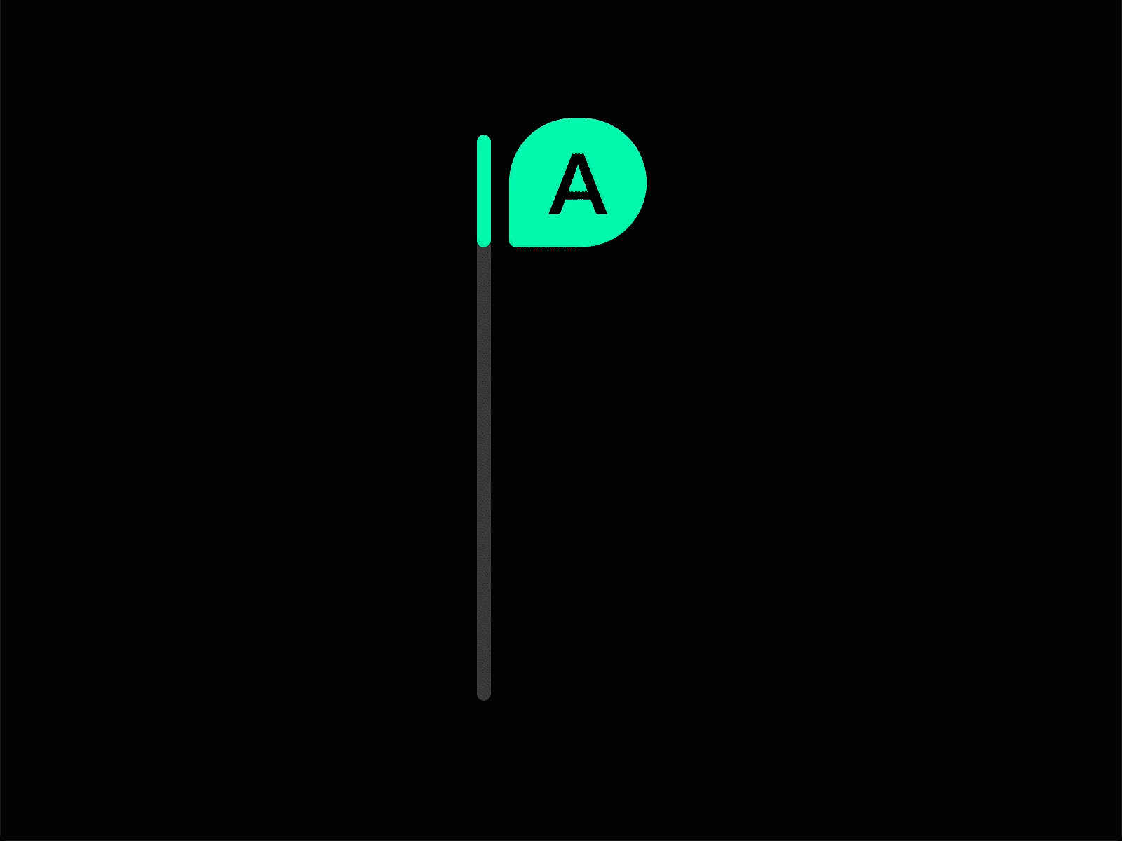
1. Scrollbar
Gives visual feedback to the user changing location within a page (User triggered)
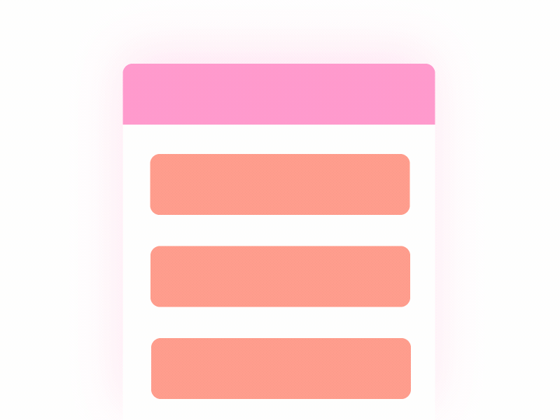
2. Pull-to-refresh animation
Gives visual feedback to a user action (User triggered)
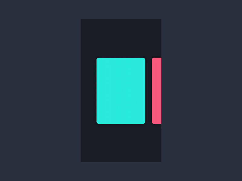
3. Swipe animation
Gives visual feedback that a user has swiped an element (User triggered)
4. Digital alarm
Gives auditory (and visual) feedback to time condition being met (System triggered)

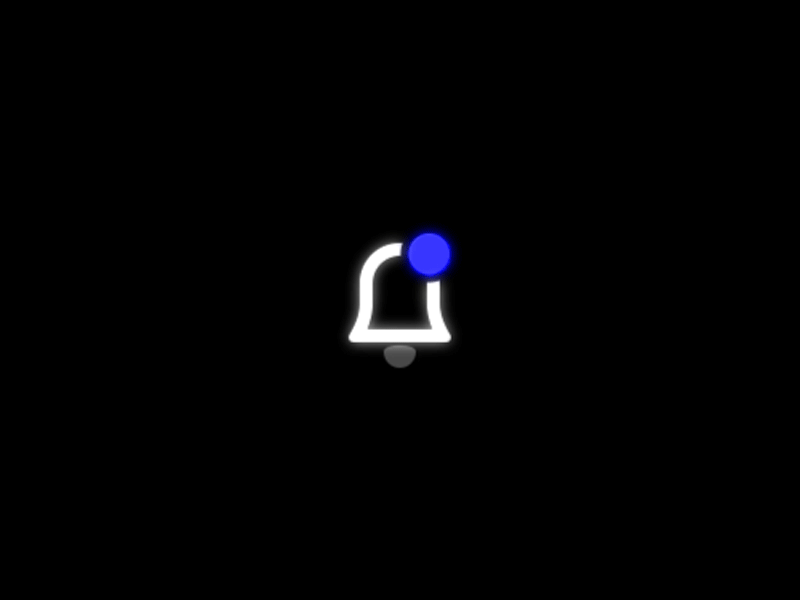
5. Notification
Provides the user with feedback that a new notification has arrived (System triggered)
Motion for Emotion :)
It’s important to keep in mind that animated elements take up space. Therefore it is necessary to make them count. That means animation must be used only when it compliments a functionality rather than to impress the audience or to add just a visual appeal.
But be careful, by using too many animations you will only flatten the hierarchy. It will tone down the message you are trying to communicate.
Here are some clever ways to use animation.
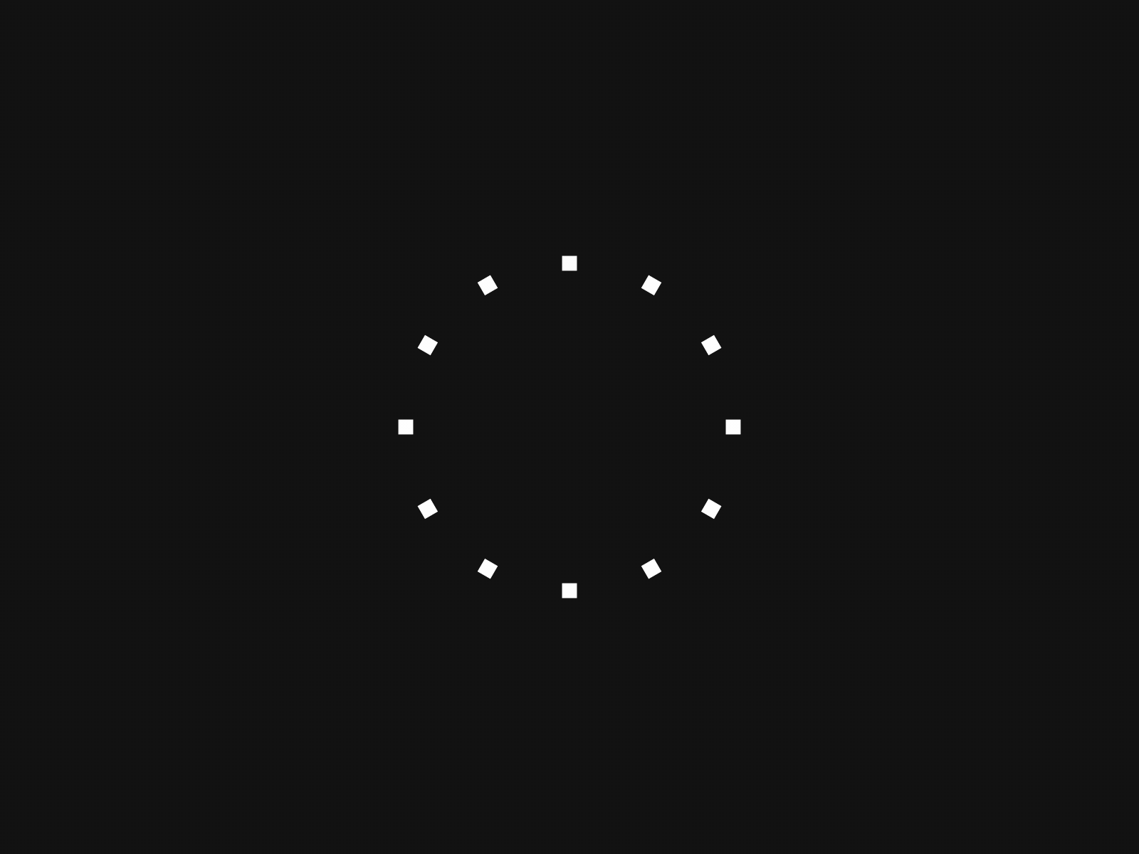
1. Take the boredom out of a loading screen
Users are willing to wait just two seconds for a website or app to load — any second of delay can cause many to leave for faster resources. Animated loading screens can be used to keep users entertained and engaged as they wait for content to appear on a site or app.
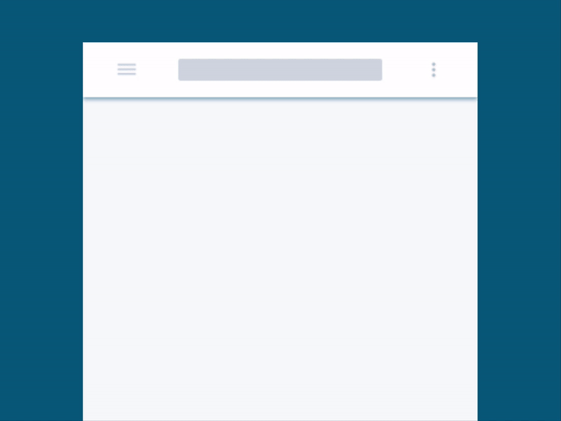
2. Give users a clue
Designers can use animation to provide users with context on what they can do on the site or app. For instance, making a list of notifications slide up as they appear on the screen — instead of simply making them appear suddenly — tells users they can slide up if they want to see more.
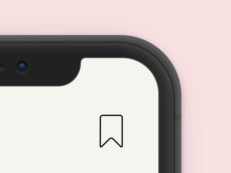
3.Provide real-time visual feedback
To prevent confusion, designers can incorporate animated elements that provide instant visual feedback for every action they take on the app or website. For instance, a button may be made to change colors or light up when clicked or pressed.
Micro Interaction Design Best Practices
As we have defined and described uses of micro-interactions and given an example of how they improve the user experience, let’s discuss the best practices for creating micro-interactions.
Identify and Understand the User’s Problem
The golden rule in user experience design is to uncover and understand user problems — it’s no different for micro-interactions. The best way to understand what the user needs is to conduct surveys or interviews or observe behaviour through user research.
Keep Microinteractions Natural
The goal is to bridge the gap between the user and a product in ways that feel intuitive and natural, so avoid strange animations that take too long to load or may distract the user. Instead, create designs that seamlessly flow with the product.
Test and Iterate Findings from Users
Even experienced designers rarely get designs completely right on the first try. That’s why using a process of user testing and iterative design is a simple way to reduce usability flaws before the product launch.
During the user testing phase, micro-interactions are tested and analyzed for usability and revised during the next design phase. This process is repeated until usability issues and pain points are corrected.
Clarify change and context
Especially with small screens and flat design, it’s an art to show all the necessary information. Because of this we sometimes hide elements. For instance, to clarify how to navigate, micro-animations can be the solution.
Take a hamburger-menu. If it expands without animation, it’s a lot less clear where it comes from. An animation supplies context, making sure the user doesn’t get lost.
Recommend
About Joyk
Aggregate valuable and interesting links.
Joyk means Joy of geeK