

Making registration seamless — A UI/UX Case Study
source link: https://uxplanet.org/redesigning-the-registration-form-to-increase-the-completion-rate-of-the-registration-funnel-a-a72f480e54ed
Go to the source link to view the article. You can view the picture content, updated content and better typesetting reading experience. If the link is broken, please click the button below to view the snapshot at that time.
Making registration seamless — A UI/UX Case Study
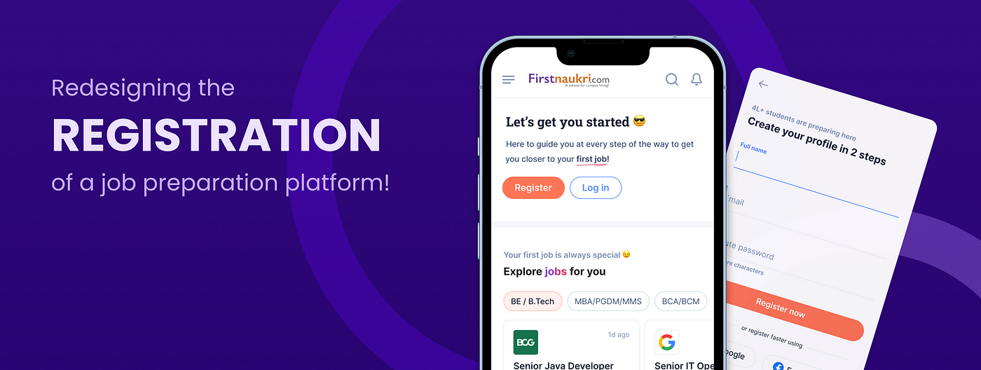
In this article, I’ll go over my approach and important lessons from re-designing the registration process, which is followed by profile building, for Firstnaukri.com, a Naukri.com subsidiary that serves as a job preparation and job placement platform for freshers.
My role : UI/UX Design
Duration : 6 Weeks
Collaborators: 1 Product Manager & 1 Mentor
So what makes Registration so important? 🤔
Registration is important for a job portal not only from a business standpoint of acquiring more users, but it also helps the user speed up their job search process. They can search for jobs that match their qualifications, apply with a single click, and, in the case of Firstnaukri, which is also a job preparation site, they can receive personalised services that are relevant to them at the time.
So, from both viewpoints, it’s critical that the registration process be in place, and that the user understands the value of registering to the platform, because registration is, after all, a user-initiated action.
About Firstnaukri.com and what constitutes it’s registration process?
Firstnaukri.com is a job preparation and placement platform for recent college graduates. It offers a variety of resources, such as a resume maker, interview questions and answers, career articles, and many other features, as well as assistance in applying for jobs and internships.
The previous registration process at Firstnaukri included a sign up page followed by some mandatory and non-mandatory information — which made the entire registration form 15 pages long.
Education and personal information were collected under the mandatory category because relevant content is shown to the user based on these details. All other 9 profile completion fields, such as work experience, internships, certifications, and more, were non-mandatory details.
The registration form for Firtsnaukri was made up of all of the above.
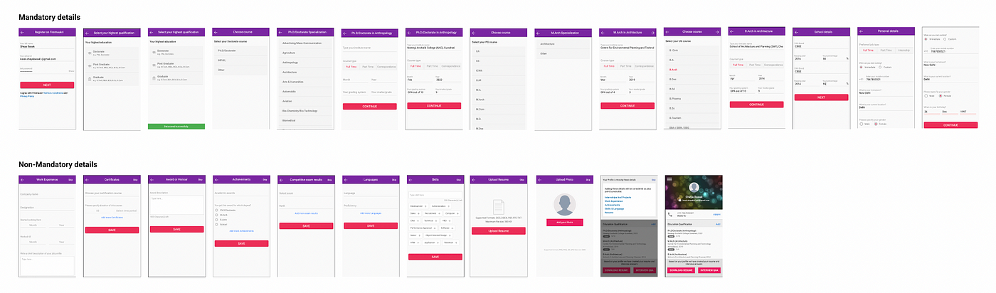
Screenshots from the old registration form
Of course, looking at the registration form, one would think it needs a major revamp, but is it simply a UI refresh?
More than just UI enhancements, various other factors must be considered, including design changes and product changes. Additionally, the registration form must be revamped with the ultimate goal of increasing conversion rate in mind.
Here’s a rundown of some of the biggest issues with this registration flow
- There are 15 pages in total, which seems like a lot for the user to fill out, and there is a high likelihood of drop off.
- There is a lack of optimised field interactions via suggester handling, field grouping, and progressive disclosure.
- There is no clear distinction between mandatory and non-mandatory sections
- There is no guidance through the copy at any point
- There is no connection to the point at which the user enters the registration form.
Before we get into the specifics of how this project was approached. Let’s look at the data so we know exactly what we want to achieve with this redesign.
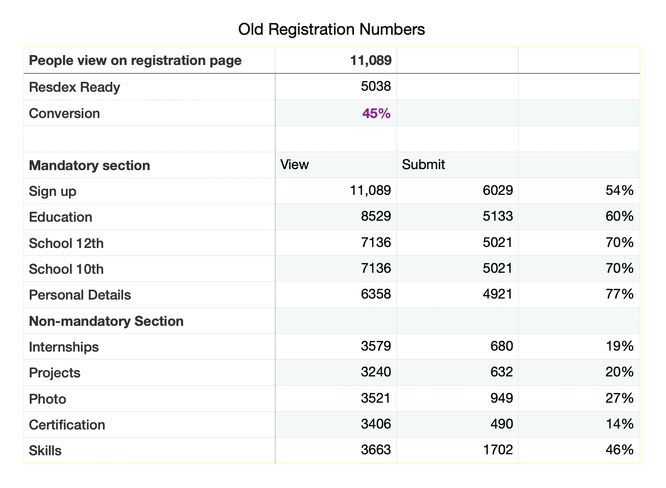
According to the data, the conversion rate is 45%, and with the new registration, we hope to surpass that figure, as well as increase the fill rate of the non-mandatory sections.
And that’s the goal!
So let’s get started! 🚀
Here’s an overview of the steps taken in the process
- Analysing current registration flow
- Understanding the registration flows in the market
- Understanding pros and cons for various aproaches
- Building a field interaction library
- Building the new and optimised registration flow
Step 1 — Analyzing the current registration flow and reading best practises
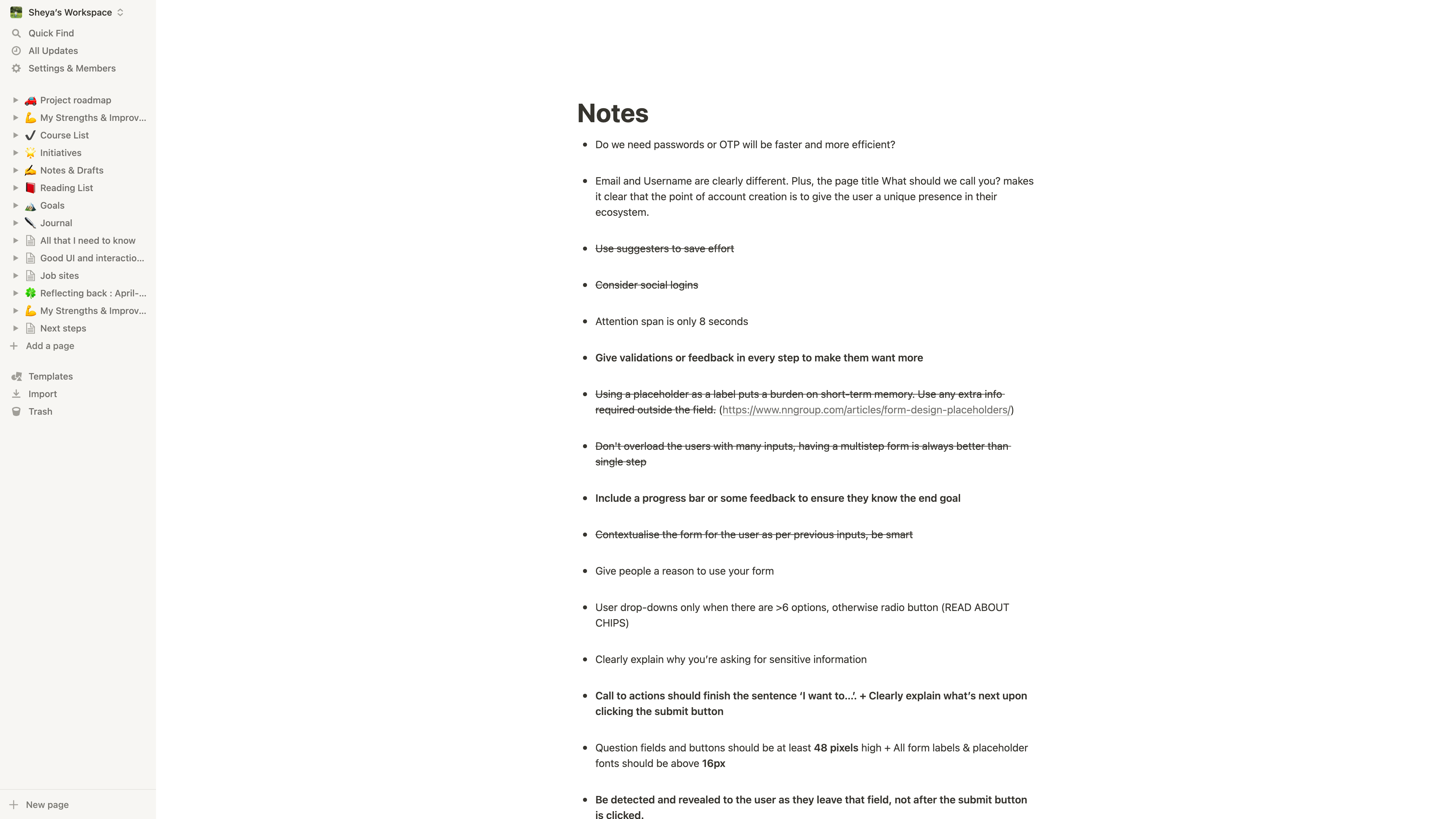
There are numerous excellent articles that discuss the best practises for designing a registration form.
It is a good idea to go over the best practises and case studies that are relevant to your project to gain more insights.
I’ve included a list of some of the wonderful articles that I read and found to be quite useful in my research at the end of this case study.
While going through the best practises, I witnessed the old registration process several times and up close. I also asked those around me to go through the registration process, and I observed and recorded their reactions.
This exercise helped me understand what I needed to work on, and I made a list of everything I believed should be there based on my research and observations.
Step 2 — Market study to understand the various registration flows out there
In this step, I went through the registration process for various apps and websites in order to learn what’s going on in the market and see if there’s any new approaches that could be considered.
The apps that our target audience uses were one thing we kept in mind. Many college students use dating apps, which require lengthy registration forms and the creation of a profile. As a result, I went through a few of them, noting the distinct approaches that each of them took.
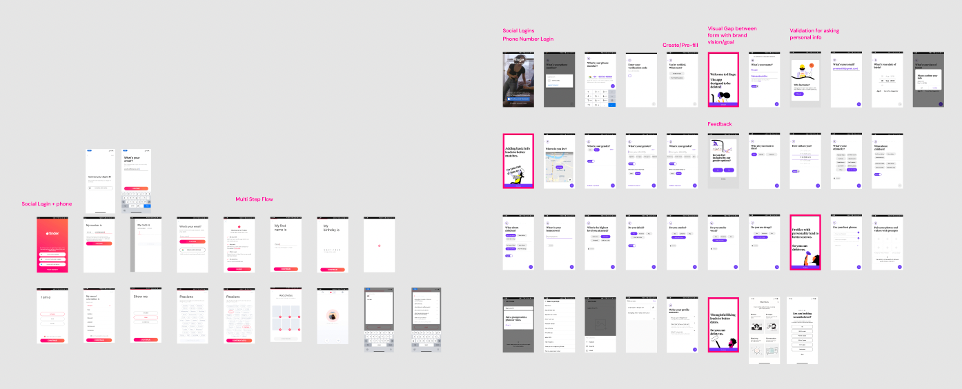
A small picture of a very big picture depicting market study
Step 3— Understanding pros and cons for various aproaches
From step 2, I noticed that different apps and websites created registration forms in different ways. I did some more study and examined the various approaches, which included:
- One page with all fields approach
- One field on a page — Multi Step Form
- Multiple fields on a page — Multi Step Form
- Chatbot approach
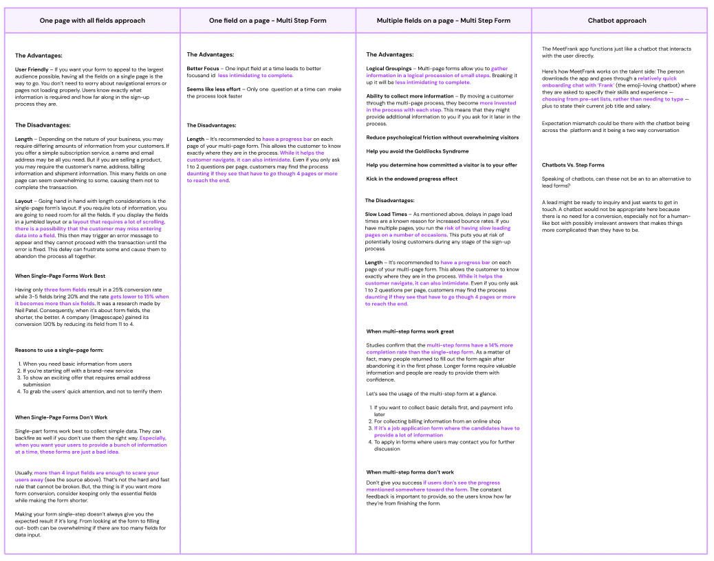
This comparison was carried out in order to determine the best technique for our registration.
Here’s what the above table’s conclusion was:
- One page with all fields approach: Because we have so many questions, a single page with all fields would be far too long for the user to even consider filling it out.
- One field on a page — Multi Step Form: Many apps use this type of form since it reduces cognitive load and appears to be less work, but because we have numerous questions, the number of pages for this strategy would also be too long for the user to complete out.
- Multiple fields on a page — Multi Step Form: This seems to be the best option for our situation. It will allow us to arrange comparable material on one page into a single category, ensuring that the total number of pages does not exceed the limit.
- Chatbot approach — This is also a great approach; registrations appear to be a conversation here, but integrating a chatbot would be a significant change given the time constraints. The chatbot would be a separate project entirely.
So the multiple fields on the page approach was clearly the most feasible at this point, and that’s what we settled on!
Step 4 — Building a field interaction library
After the form’s approach had been finalised, it was time to examine each individual field’s purpose and interaction.
What are the default, focus, error, and completion states going to be like? How will the interaction take place? What kind of field are we going to have? Which input field should be used when? What will happen when selected chiclets interact? How will multi-select operate? All this and so much more had to be considered
Oof! Doesn’t that sound like a daunting task? 😝
To be honest, I followed this super-organized strategy that made creating the rest of the registration flow a breeze.
I created a Field Interaction Library
The best thing about this library is that it contains documentation for all of the input fields used across the platform. It’s simple to find all of the fields, and the developer afterwards thanked me too for making his life easier as well 😉
I knew all the fields that needed to be filled out because we already had a registration system in place. I began by going through the library in that order.
Field Interaction Library for reference
Step 5 — Building the new and optimised registration flow
All that was left was to organise the fields into mandatory and non-mandatory portions after the Field Interaction Library was in place.
So, in the previous registration flow, all of the fields were pushed into the non-mandatory section, except for the mandatory education and basic personal details sections, and it was designed in such a way that the user had to go through all of the non-mandatory sections one by one and skip it on their own if they didn’t want to fill it out.
The approach described above had two fundamental flaws:
- The registration process was made overly long by requiring the user to complete all nine non-mandatory sections
- If the user has no work experience, sending them to the work experience page and asking them to fill it out would merely waste more time, and the user may abandon the process
We want to make the registration process quick and seamless!
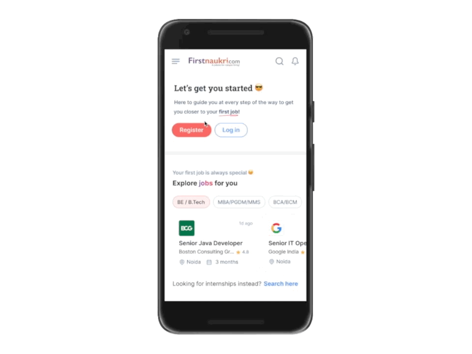
The user who has expressed an interest in registering on a career preparation site has arrived with the intention of filling out the registration form.
So we took some data and looked at which fields the users are filling out the most.
Users were mostly filling out only three of the nine non-mandatory items being asked, according to our findings: internships, projects, and certifications.
So now we knew exactly what questions to ask the user during the registration process.
Apart from these three, it was decided to also request the profile photo. This was from a product standpoint, as we want users on the platform to have profile images.
The key goal was to make the registration procedure as simple and quick as feasible once these grouping and sectioning judgements were made.
It was time to put them in place and work on page interactions, such as when to show a step indication, what type of step indicator to show, and when to show a transition screen, among other things.
I began by designing high-fidelity wireframes and discussing the processes with the team’s other designers. We kept pushing forward with frequent feedback and knew what to include and what not to include.
Here comes the interesting part,
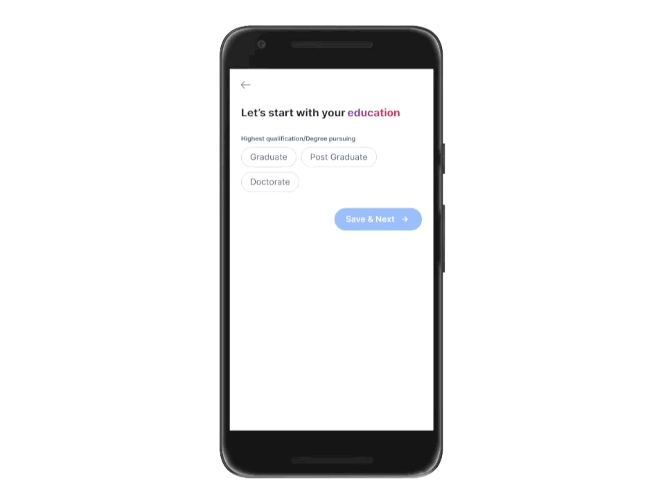
For educational details, I had attempted two alternative techniques. We collect all of your educational information from the most recent to the tenth grade. Education was a large component that needed to be filled out. The following were the two different approaches that were tried:
1st approach — Single page approach
On a single page, all of one’s different levels of schooling were placed one on top of the other.
For example, if the user is a graduate, the page will begin with graduation information. Once the user has completed this area, he can tap on done, and the following section of class 12th information will appear. The 10th will open after the 12th. All of this takes place on a single page.
Here’s an example of how it worked-
The education information page became too long in this method, giving the appearance that the entire form was too long, but stacking the details one below the other made more logical sense.
2nd approach — Multi page approach
Education questions were asked on separate pages in this method.
If the user is a graduate, for example, graduation information will be requested on the first page, followed by class 12th and 10th grades on following pages.
Here’s a quick prototype of how it worked
The page length was brief in this manner, so it felt like you were moving quickly, but the logic of distributing simply education information across numerous pages didn’t seem correct.
We conducted an internal vote to determine which technique to choose, but the results were exactly 50–50.
Finally, we employed both approaches and conducted A/B testing when we launched. With A/B testing, it was evident that option 2 was superior, as the single-page strategy resulted in higher drop-offs.
Overall, I learned a lot from this experiment.
How can we not talk about the copy!
The copy was an important part of the registration process. Overall, Firstnaukri’s objective is to keep the product’s tone friendly and confident in order to connect with the target audience
While doing so, I made a list of numerous entry points on the registration page so that I could see how the copy on the first registration will alter depending on where the user is coming from.
This will only improve the user experience by demonstrating direct reliability from where the user is arriving on the registration route. Here’s a look at what it looked like at first.
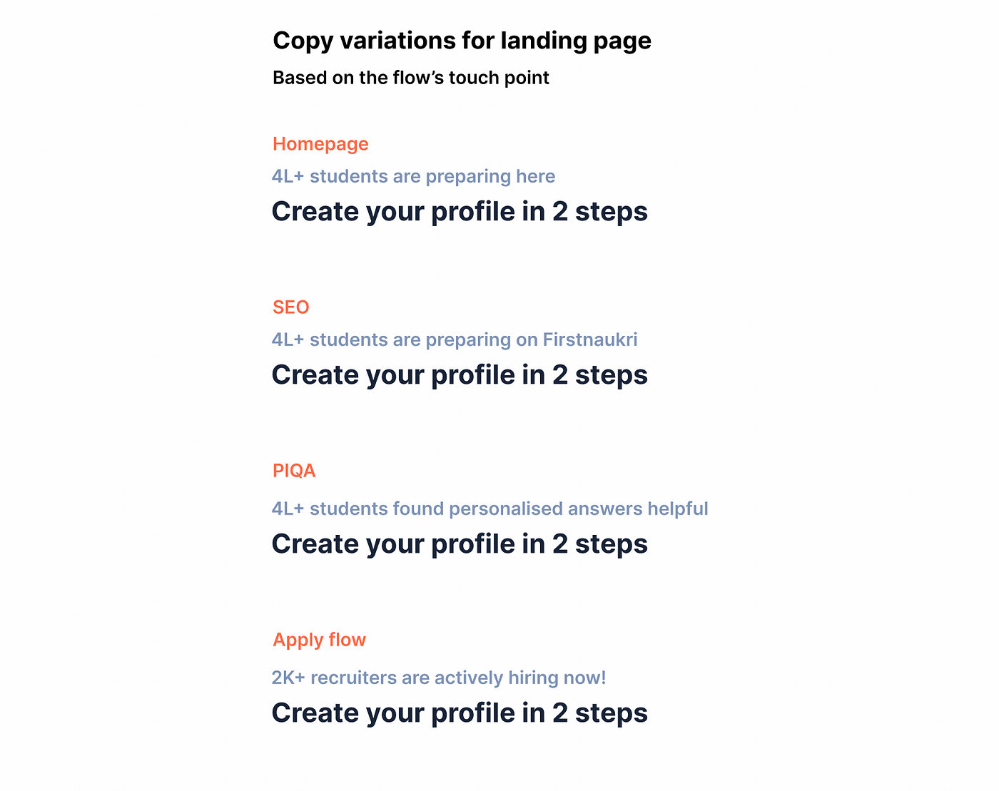
The Section title for each page was also checked to make sure the headings were interesting. Because this is a career preparation tool, it was critical to strike a balance between being too friemdly and professional in the text. It was also looked at whether there was a clear distinction between mandatory and non-mandatory elements, as well as whether there was continuing advice through copy.
Now from all the copy it is very evident that we highlighted the fact that the registration was 2 steps.
These two steps are essentially the required details —education and basic personal information.
The user was led through all of the non-mandatory fields in the prior registration flow. The importance of including these fields was never communicated.
This time, we took a different strategy. On one page, we displayed all of the optional information, emphasising the importance of including them.
Instead of being obliged to add something, the user can now add what they want. We gradually encouraged the user to fill in these details through the copy.
So, with that out of the way, let’s take a look at the final prototype!
All of the above decisions, as well as many others, were made with the goal of ensuring a smooth registration process. So, was it successful?
Let’s find out! 👇
Impact 📊
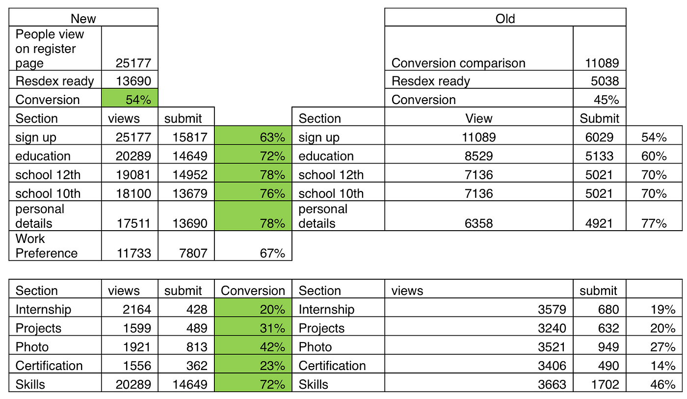
We did see a significant improvement in conversion, which increased from 45 percent to 54 percent. Other sections had a considerable boost in fill rate as well!
Check it out live 🤩
Check out the registration flow live by opening this link below on your mobile device to get a firsthand experience.
Firstnaukri Registration Experience
Next Steps
Now that the registration is live, it is critical to determine what the next steps are for this. Tracking the registration form in greater detail will be required to improvise it further. Details like these would be required:
- Page level drop offs
- The amount of time spent on each page and field.
- Use of error tracking to check the error fields
- The number of times the Skip to Homepage button has been clicked and more
Next, I made a list of some long-term plans as well as some quick fixes; here are a few examples to give you an idea of how it looks!
Long term plan
- Identify the courses, grading system based on college
- Board-wise check what is more relevant. Percentage or Marks in class 10th and 12th
- Check the percentage of users who require class 10th details , see which recruiters are needing this detail, only ask the details to relevant candidates
Quick fixes
- Error state on blur without submitting. The form
- Key skills interaction (Suggestions will not show what is already selected)
- Progressive bottom sheet
4. List of passing year and no co relation between college and school… and more
Time to retrospect!
From creating a field interaction library to the registration form, this project provided a wealth of learning opportunities, but here are a few highlights:
- I learned the fundamentals of form design and how user psychology affects each stage
- Another important lesson was to avoid overloading your users with irrelevant information. Maintain focus and keep the onboarding process brief and simple
- Short forms perform better than long forms
As promised, here is a list of some excellent articles that aided me in this endeavour. I hope you find them useful as well! 😉
And… That’s a wrap!
I hope you guys found this case study useful and informative. Feel free to hit me up if you have any questions. I would be more than happy to have a chat with you 😃
Recommend
About Joyk
Aggregate valuable and interesting links.
Joyk means Joy of geeK