

通过编写计算器学习ArkUI组件之四
source link: https://os.51cto.com/article/704202.html
Go to the source link to view the article. You can view the picture content, updated content and better typesetting reading experience. If the link is broken, please click the button below to view the snapshot at that time.


3.8 Text组件
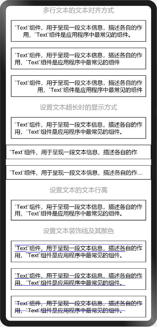
在前面的小节中无论是自定义按钮还是组件示例中都用了Text组件,用于呈现一段文本信息,描述各自的作用,Text组件是应用程序中最常见的组件。
@Entry
@Component
struct TextExample {
  build() {
    Column({space: 15}) {
      Text('多行文本的文本对齐方式').fontSize(16).fontColor('#999')
      Text('`Text`组件,用于呈现一段文本信息,描述各自的作用,`Text`组件是应用程序中最常见的组件。')
        .fontSize(14).textAlign(TextAlign.Center).border({width: 1}).padding(8)
      Text('`Text`组件,用于呈现一段文本信息,描述各自的作用,`Text`组件是应用程序中最常见的组件')
        .fontSize(14).textAlign(TextAlign.Start).border({width: 1}).padding(8)
      Text('`Text`组件,用于呈现一段文本信息,描述各自的作用,`Text`组件是应用程序中最常见的组件')
        .fontSize(14).textAlign(TextAlign.End).border({width: 1}).padding(8)
      Text('设置文本超长时的显示方式').fontSize(16).fontColor('#999')
      Text('`Text`组件,用于呈现一段文本信息,描述各自的作用,`Text`组件是应用程序中最常见的组件。')
        .fontSize(14).textOverflow({overflow: TextOverflow.None})
        .border({width: 1}).padding(8)
      Text('`Text`组件,用于呈现一段文本信息,描述各自的作用,`Text`组件是应用程序中最常见的组件。')
        .fontSize(14).textOverflow({overflow: TextOverflow.Clip})
        .maxLines(1).border({width: 1}).padding(8)
      Text('`Text`组件,用于呈现一段文本信息,描述各自的作用,`Text`组件是应用程序中最常见的组件。')
        .fontSize(14).textOverflow({overflow: TextOverflow.Ellipsis})
        .maxLines(1).border({width: 1}).padding(8)
      Text('设置文本的文本行高').fontSize(16).fontColor('#999')
      Text('`Text`组件,用于呈现一段文本信息,描述各自的作用,`Text`组件是应用程序中最常见的组件。')
        .fontSize(14).lineHeight(16).border({width: 1}).padding(8)
      Text('设置文本装饰线及其颜色').fontSize(16).fontColor('#999')
      Text('`Text`组件,用于呈现一段文本信息,描述各自的作用,`Text`组件是应用程序中最常见的组件。')
        .fontSize(14).decoration({type: TextDecorationType.Overline, color: Color.Blue})
        .border({width: 1}).padding(8)
      Text('`Text`组件,用于呈现一段文本信息,描述各自的作用,`Text`组件是应用程序中最常见的组件。')
        .fontSize(14).decoration({type: TextDecorationType.Underline, color: Color.Blue})
        .border({width: 1}).padding(8)
      Text('`Text`组件,用于呈现一段文本信息,描述各自的作用,`Text`组件是应用程序中最常见的组件。')
        .fontSize(14).decoration({type: TextDecorationType.LineThrough, color: Color.Blue})
        .border({width: 1}).padding(8)
    }
    .width('100%')
    .height('100%')
  }
}
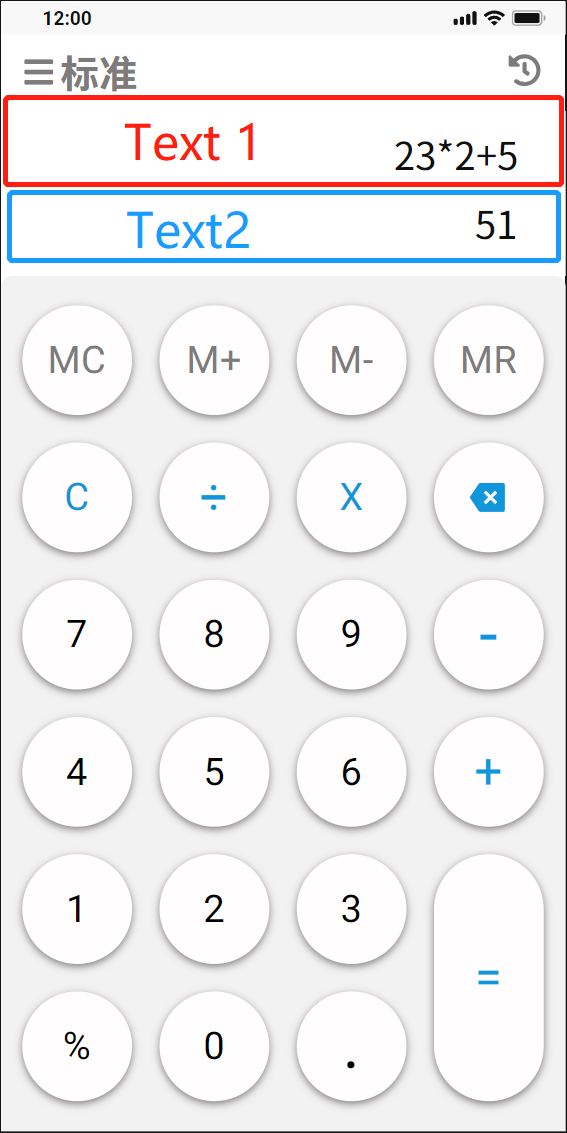
3.9 标准计算器显示区
在实战标准计算器设计中,显示区域是上下两个Text组件,居上Text显示点击功能按钮区的录入信息,居下Text显示计算结果。
  // 回显及结果显示区
      Flex({direction: FlexDirection.Column}) {
        Text('23+24+5').fontSize(24).fontColor('#999999')
          .textAlign(TextAlign.End)
          .width('100%')
          .height(60)
          .alignSelf(ItemAlign.Center)
          .padding({left: 10, right: 10})
        Text('52').fontSize(28).fontColor('#444444')
          .textAlign(TextAlign.End)
          .width('100%')
          .height(60)
          .alignSelf(ItemAlign.Center)
          .padding({left: 10, right: 10})
      }
      .width('100%')
      .height(120)
      .backgroundColor('#FFFFFF')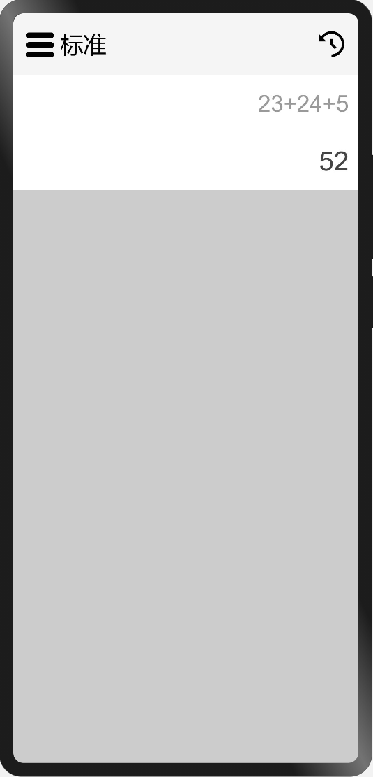
3.10 使用Column、Row容器组件、Button组件实现功能按钮区
使用前面已经掌握的Column容器组件、Row容器组件以及Button组件实现功能按钮区,代码如下:
  // 功能按钮、符号按钮、数字按钮
      Flex({direction: FlexDirection.Column, justifyContent: FlexAlign.Center, alignItems: ItemAlign.Center}) {
        Column({space: 20}) {
          Row({space: 20}) {
            Button('MC', {type: ButtonType.Circle})
              .width(64).height(64)
              .fontSize(20).fontColor('#7D7B7B').fontWeight(FontWeight.Bold)
              .backgroundColor('#FFFDFD')
              .borderRadius(32)
              .shadow({radius: 16, color: 0x7D7B7B, offsetX: 0, offsetY: 2})
            Button('M+', {type: ButtonType.Circle})
              .width(64).height(64)
              .fontSize(20).fontColor('#7D7B7B').fontWeight(FontWeight.Bold)
              .backgroundColor('#FFFDFD')
              .borderRadius(32)
              .shadow({radius: 16, color: 0x7D7B7B, offsetX: 0, offsetY: 2})
            Button('M-', {type: ButtonType.Circle})
              .width(64).height(64)
              .fontSize(20).fontColor('#7D7B7B').fontWeight(FontWeight.Bold)
              .backgroundColor('#FFFDFD')
              .borderRadius(32)
              .shadow({radius: 16, color: 0x7D7B7B, offsetX: 0, offsetY: 2})
            Button('MR', {type: ButtonType.Circle})
              .width(64).height(64)
              .fontSize(20).fontColor('#7D7B7B').fontWeight(FontWeight.Bold)
              .backgroundColor('#FFFDFD')
              .borderRadius(32)
              .shadow({radius: 16, color: 0x7D7B7B, offsetX: 0, offsetY: 2})
          }
          Row({space: 20}) {
            Button('C', {type: ButtonType.Circle})
              .width(64).height(64)
              .fontSize(20).fontColor(0x1296DB).fontWeight(FontWeight.Bold)
              .backgroundColor('#FFFDFD')
              .borderRadius(32)
              .shadow({radius: 16, color: 0x7D7B7B, offsetX: 0, offsetY: 2})
            Button('÷', {type: ButtonType.Circle})
              .width(64).height(64)
              .fontSize(32).fontColor(0x1296DB).fontWeight(FontWeight.Bold)
              .backgroundColor('#FFFDFD')
              .borderRadius(32)
              .shadow({radius: 16, color: 0x7D7B7B, offsetX: 0, offsetY: 2})
            Button('×', {type: ButtonType.Circle})
              .width(64).height(64)
              .fontSize(32).fontColor(0x1296DB).fontWeight(FontWeight.Bold)
              .backgroundColor('#FFFDFD')
              .borderRadius(32)
              .shadow({radius: 16, color: 0x7D7B7B, offsetX: 0, offsetY: 2})
            Button('⇐', {type: ButtonType.Circle})
              .width(64).height(64)
              .fontSize(32).fontColor(0x1296DB).fontWeight(FontWeight.Bold)
              .backgroundColor('#FFFDFD')
              .borderRadius(32)
              .shadow({radius: 16, color: 0x7D7B7B, offsetX: 0, offsetY: 2})
          }
          Row({space: 20}) {
            Button('7', {type: ButtonType.Circle})
              .width(64).height(64)
              .fontSize(20).fontColor('#000').fontWeight(FontWeight.Bold)
              .backgroundColor('#FFFDFD')
              .borderRadius(32)
              .shadow({radius: 16, color: 0x7D7B7B, offsetX: 0, offsetY: 2})
            Button('8', {type: ButtonType.Circle})
              .width(64).height(64)
              .fontSize(20).fontColor('#000').fontWeight(FontWeight.Bold)
              .backgroundColor('#FFFDFD')
              .borderRadius(32)
              .shadow({radius: 16, color: 0x7D7B7B, offsetX: 0, offsetY: 2})
            Button('9', {type: ButtonType.Circle})
              .width(64).height(64)
              .fontSize(20).fontColor('#000').fontWeight(FontWeight.Bold)
              .backgroundColor('#FFFDFD')
              .borderRadius(32)
              .shadow({radius: 16, color: 0x7D7B7B, offsetX: 0, offsetY: 2})
            Button('-', {type: ButtonType.Circle})
              .width(64).height(64)
              .fontSize(32).fontColor(0x1296DB).fontWeight(FontWeight.Bold)
              .backgroundColor('#FFFDFD')
              .borderRadius(32)
              .shadow({radius: 16, color: 0x7D7B7B, offsetX: 0, offsetY: 2})
          }
          Row({space: 20}) {
            Button('4', {type: ButtonType.Circle})
              .width(64).height(64)
              .fontSize(20).fontColor('#000').fontWeight(FontWeight.Bold)
              .backgroundColor('#FFFDFD')
              .borderRadius(32)
              .shadow({radius: 16, color: 0x7D7B7B, offsetX: 0, offsetY: 2})
            Button('5', {type: ButtonType.Circle})
              .width(64).height(64)
              .fontSize(20).fontColor('#000').fontWeight(FontWeight.Bold)
              .backgroundColor('#FFFDFD')
              .borderRadius(32)
              .shadow({radius: 16, color: 0x7D7B7B, offsetX: 0, offsetY: 2})
            Button('6', {type: ButtonType.Circle})
              .width(64).height(64)
              .fontSize(20).fontColor('#000').fontWeight(FontWeight.Bold)
              .backgroundColor('#FFFDFD')
              .borderRadius(32)
              .shadow({radius: 16, color: 0x7D7B7B, offsetX: 0, offsetY: 2})
            Button('+', {type: ButtonType.Circle})
              .width(64).height(64)
              .fontSize(32).fontColor('#1296DB').fontWeight(FontWeight.Bold)
              .backgroundColor('#FFFDFD')
              .borderRadius(32)
              .shadow({radius: 16, color: 0x7D7B7B, offsetX: 0, offsetY: 2})
          }
          Row({space: 20}) {
            Column({space: 20}) {
              Row({space: 20}) {
                Button('1', {type: ButtonType.Circle})
                  .width(64).height(64)
                  .fontSize(20).fontColor('#000').fontWeight(FontWeight.Bold)
                  .backgroundColor('#FFFDFD')
                  .borderRadius(32)
                  .shadow({radius: 16, color: 0x7D7B7B, offsetX: 0, offsetY: 2})
                Button('2', {type: ButtonType.Circle})
                  .width(64).height(64)
                  .fontSize(20).fontColor('#000').fontWeight(FontWeight.Bold)
                  .backgroundColor('#FFFDFD')
                  .borderRadius(32)
                  .shadow({radius: 16, color: 0x7D7B7B, offsetX: 0, offsetY: 2})
                Button('3', {type: ButtonType.Circle})
                  .width(64).height(64)
                  .fontSize(20).fontColor('#000').fontWeight(FontWeight.Bold)
                  .backgroundColor('#FFFDFD')
                  .borderRadius(32)
                  .shadow({radius: 16, color: 0x7D7B7B, offsetX: 0, offsetY: 2})
              }
              Row({space: 20}) {
                Button('%', {type: ButtonType.Circle})
                  .width(64).height(64)
                  .fontSize(20).fontColor('#000').fontWeight(FontWeight.Bold)
                  .backgroundColor('#FFFDFD')
                  .borderRadius(32)
                  .shadow({radius: 16, color: 0x7D7B7B, offsetX: 0, offsetY: 2})
                Button('0', {type: ButtonType.Circle})
                  .width(64).height(64)
                  .fontSize(20).fontColor('#000').fontWeight(FontWeight.Bold)
                  .backgroundColor('#FFFDFD')
                  .borderRadius(32)
                  .shadow({radius: 16, color: 0x7D7B7B, offsetX: 0, offsetY: 2})
                Button('.', {type: ButtonType.Circle})
                  .width(64).height(64)
                  .fontSize(32).fontColor('#000').fontWeight(FontWeight.Bold)
                  .backgroundColor('#FFFDFD')
                  .borderRadius(32)
                  .shadow({radius: 16, color: 0x7D7B7B, offsetX: 0, offsetY: 2})
              }
            }
            Column({space: 20}) {
              Button('=', {type: ButtonType.Capsule})
                .width(64).height(148)
                .fontSize(32).fontColor(0x1296DB).fontWeight(FontWeight.Bold)
                .backgroundColor('#FFFDFD')
                .borderRadius(32)
                .shadow({radius: 16, color: 0x7D7B7B, offsetX: 0, offsetY: 2})
            }.margin({left: -20})
          }
        }
        .padding({left: 20})
      }
      .width('100%')
      .borderRadius(8)
      .backgroundColor('#F2F2F2')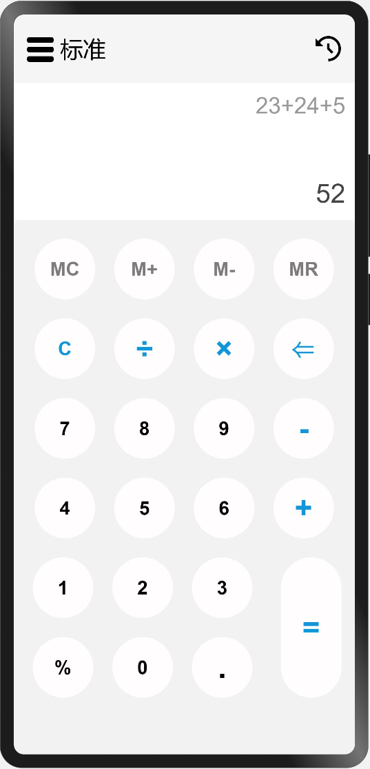
是不是看起来代码很多,每个Button除了内容,及个别颜色和字体大小不一样之外,其他的都是一样的呢?可以思考以下,如何抽出公用的自定义Button组件,根据传参不同显示不同的按钮,这部分会在后面的小节中分享。学习之初先是多用,用熟了,才是灵活使用。
在实现功能按钮区的时候,我给Column容器组件添加了padding({left: 20})这个属性,其代表什么含义?解决了什么问题?你还有没有其他的方法?
本节先对Text文本组件的用法做了简单介绍,然后通过之前小节中学习的Column、Row、Button组件实现了标准计算器的功能按钮区。下一小节将带你一起实现标准计算器的计算功能和计算历史留存。

Recommend
-
5
想了解更多内容,请访问:
-
3
想了解更多内容,请访问:
-
10
ArkUI(ETS) 自定义图片查看组件-51CTO.COM OpenHarmony - ArkUI(ETS) 自定义图片查看组件 作者:王国菊 2022-05-26 14:50:15 今日分享的组件由subsampling-scale-image-view+swipe...
-
10
鸿蒙开发ArkUI优秀实践—Rating组件-51CTO.COM 鸿蒙开发ArkUI优秀实践—Rating组件 作者:鸿蒙开发之南拳北腿 2022-06-30 13:56:05 本节讲解评分条组件Rating的两种基本使用方法:用作...
-
8
4、组件介绍组件包含了UI布局,组件属性定义,组件默认值,组件代码有详细说明,可以直接看代码@Component export struct StreamerButton { // 旋转角度 @State private angle:number = 0; // 旋转速度...
-
5
想了解更多关于开源的内容,请访问:...
-
10
想了解更多关于开源的内容,请访问:...
-
2
OpenHarmony - 基于 ArkUI(JS)实现图案解锁组件(一) 推荐 原创 作者:杨尚晓 Ope...
-
9
HarmonyOS - 基于ArkUI(ETS) 实现心电图组件 作者:杨尚晓 2022-10-24 14:49:54 绘制这个心电图没有用到重绘机制,动画效果是每次绘制的时候覆盖在原有的波形线上的,但是这样会比重绘整个画布性能更好一些。
-
5
自制一款ArkUI组件-应用文件管理器(一) 作者:FFH_PETSJ 2023-02-24 16:08:09 在涉及应用内部存储的开发时,常常翻阅手机自带的文件管理检查。正好在学习文件管理的接口,想着实现一个第三方组件用于当前应用的...
About Joyk
Aggregate valuable and interesting links.
Joyk means Joy of geeK