

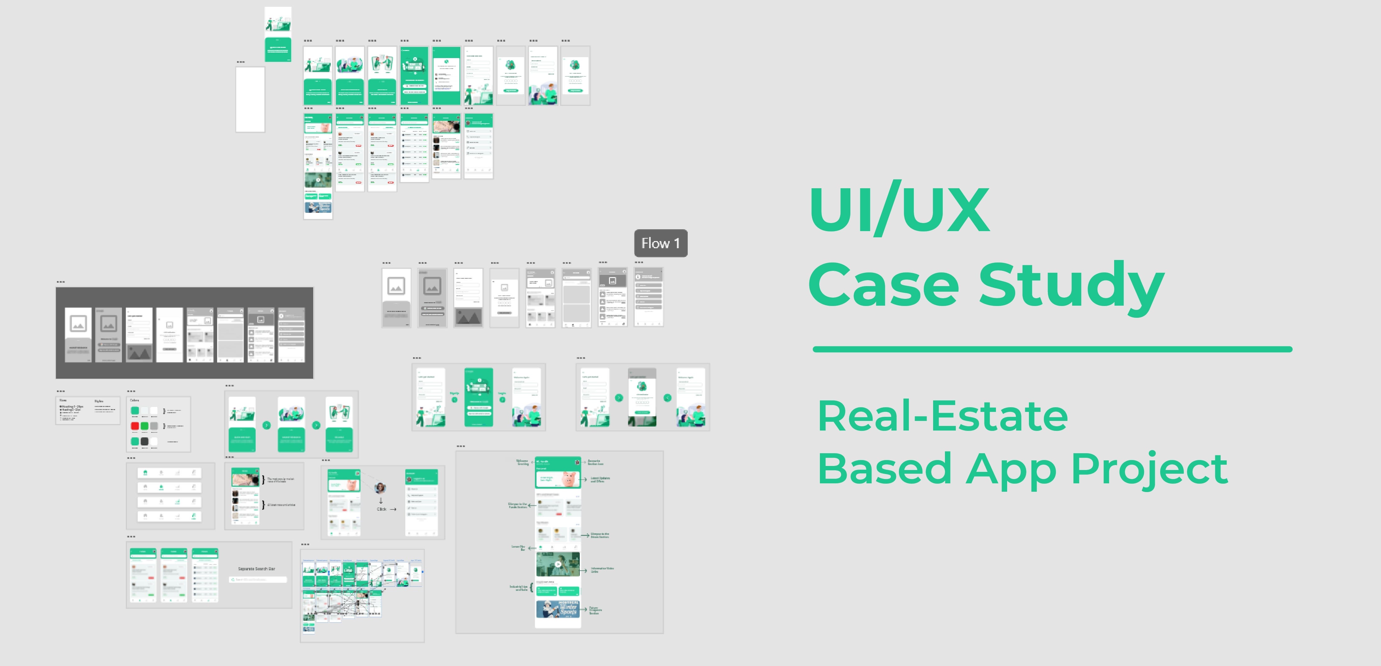
UI/UX Case Study
source link: https://blog.prototypr.io/ui-ux-case-study-590938bd2809
Go to the source link to view the article. You can view the picture content, updated content and better typesetting reading experience. If the link is broken, please click the button below to view the snapshot at that time.
UI/UX Case Study
Overview
This is a UI/UX case study of a real estate-based trading app. As the app is still in development, the whole concept and idea behind it cannot be revealed yet. However, the key focus here is to get inside my head and understand how I began my research and integrated the entire idea through design.
Methods Used: UX Research, Feature Analysis and Grouping, Wireframing, UI Design and Prototyping
Tools Used: Adobe XD, Illustrator
Artboard Size (Aspect Ratio): 412 X 847 (18.5 : 9)
UX Research
I had the challenge of designing a full-fledged application on my own. And as the right way states, I exercised a user-centered approach towards a creative and modernistic design. I was a little confused about which groups of users to interact with because the application they’re trying to develop is the first in the segment.
Accordingly, I conducted some small interviews with users of comparable applications to learn how much they believe that this type of application is needed and what challenges they are struggling with while using other similar platforms.
I also looked into diverse trading platforms on my own, such as CRED, COIN DCX go, ET money, and tried to perform some competitor analysis to see what mistakes they were making in their designs so that I could avoid them.
Key Takeaways:
- I realized that the majority of users will use this application regularly, thus the design should be easy enough to understand unlike some of the previously known apps.
- Since it’s a brand-new platform for users to connect with, it should provide instructions or explanations on what the app is all about.
- The most significant piece should be an easily accessible lower navigation bar that listed all of the key features.
Feature Analysis And Grouping:
I scheduled a group exercise with some of my team members, and we brainstormed the app’s most significant features. Then I gathered all of the features in one spot and began comparing one feature to the next, eventually identifying the most important features and keeping the rest aside.
I created groups and their further subgroups and systematically outlined all of the features before moving on to the wireframing phase.

Wireframing:
To get the most out of my ideas, I started with wireframing on paper. Personally, it is a smart design technique as it allows you to experiment with your ideas and you can try out a range of designs for each screen and choose the best one. Later on, this makes digital wireframing a lot easier.

Now comes the actual digital wireframing. As previously said, I attempted to make the design minimalistic and accessible while still keeping up with current design trends and technology.
User Interaction Design:
This is the portion that I enjoy the most. It is the most creative part. So I opened Adobe XD and began bringing the wireframes to life. First and foremost, I’ll go through the app’s major design aspects.
Primary Design Elements:
Font: Montserrat
It’s a modern sans serif font with 18 styles and 9 weights. Because of its incredibly polished and gorgeous geometrical simplicity, it’s an adaptable typeface that matches every sort of mood. This can be used with a wide range of typefaces, including :
- Montserrat with Montserrat
- Montserrat with Open Sans
- Montserrat withCrimson Text
The mood was light, user-friendly, and engaging to the audience. As a result, throughout the entire app, I picked Montserrat coupled with itself. It also flawlessly follows contemporary design trends, which is always a bonus.

Color:
Most of the areas in the app are designed with tones of green.
The concept was that when people think of green, the first thing that comes to mind is growth, which is exactly what the app is about. Second, the greenish tint has another benefit: it gives off a very healthy and fresh feeling, which draws the target audience’s attention.
Involvement with money (green) and other financial considerations is another clear cause. For the text and enhancing reasons, the green is contrasted with pure white and shades of black.

The Screens:
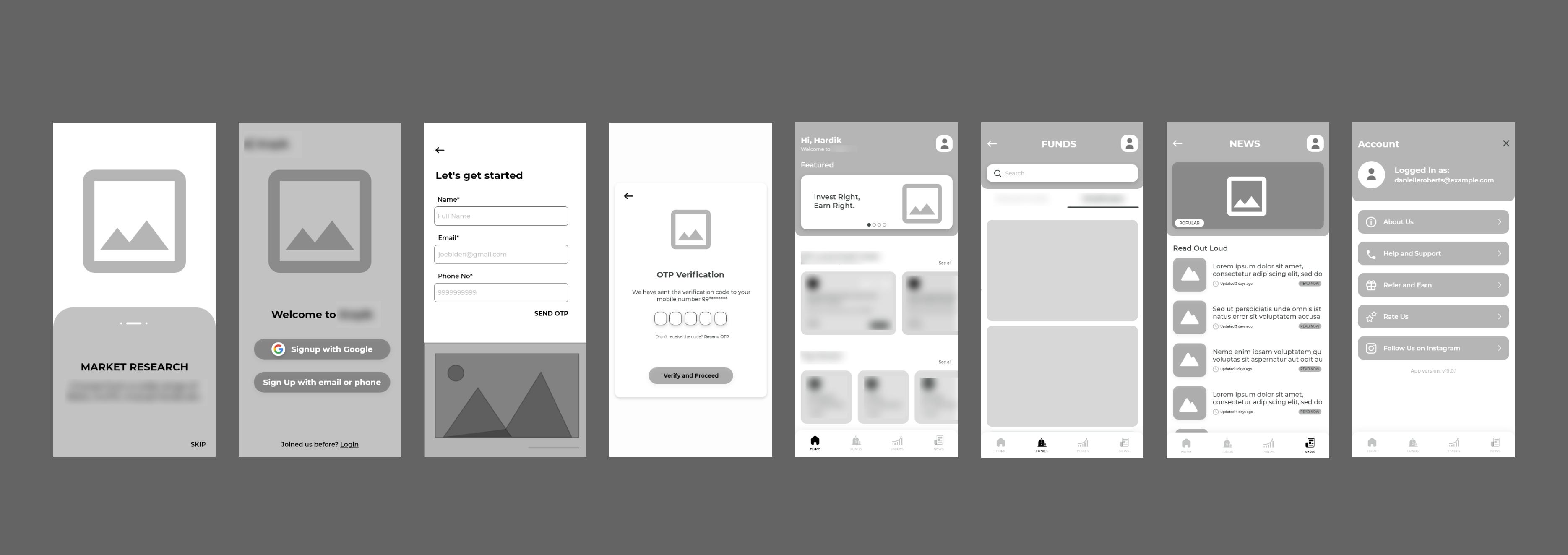
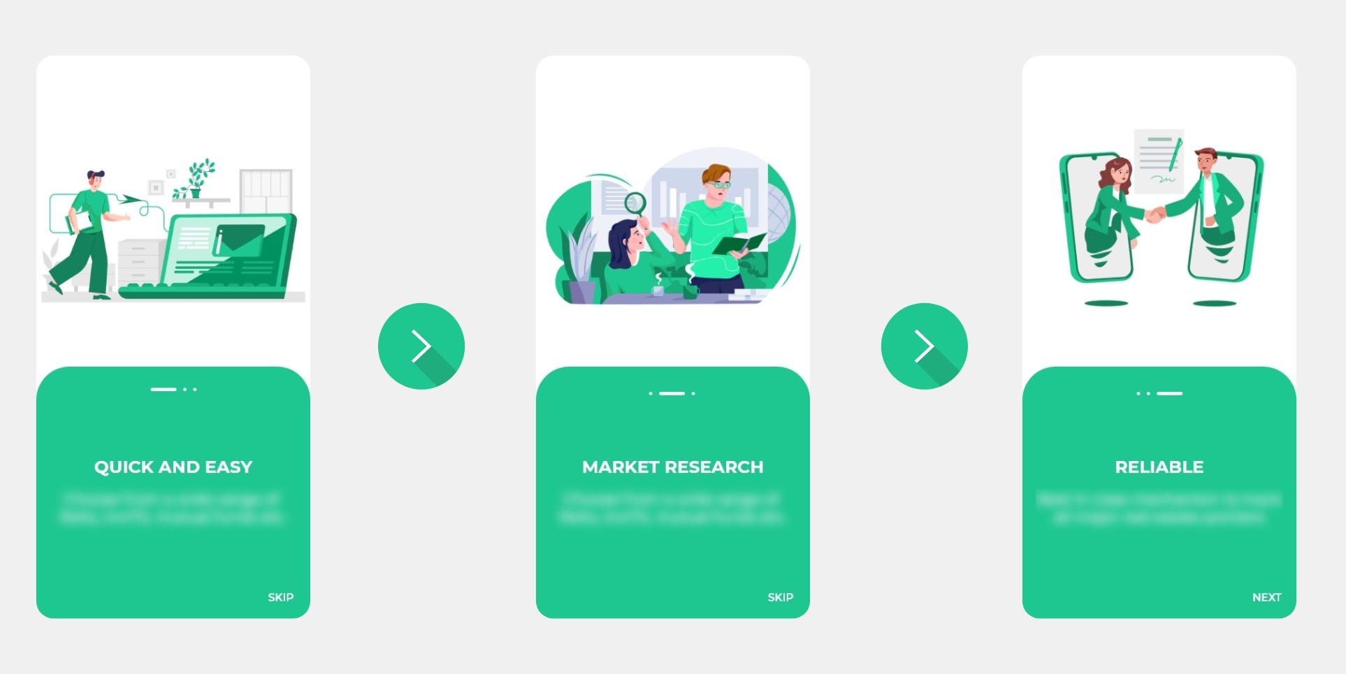
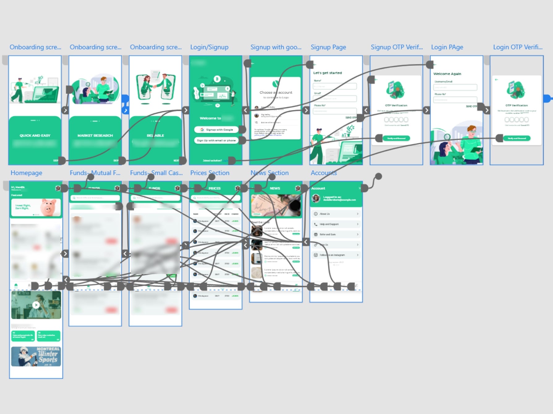
First Onboarding screens:
The onboarding screens were created in such a manner that the user gets a decent idea of what the platform is all about while maintaining a seamless user flow to the login panels.
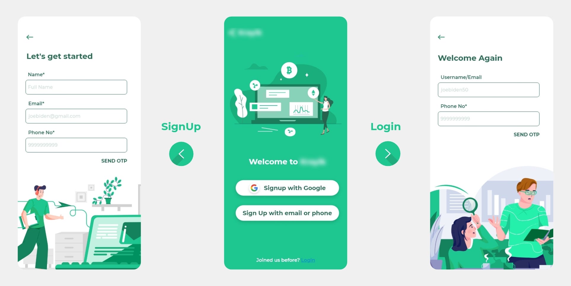
Login and SignUp:
The Login and SignUp screens, as recommended by the owners, are created in such a way that they connect with the audience in a friendly manner and present them with a range of signup possibilities, allowing them to enter in whatever way they desire.
The OTP Section:
If the user SignUp using his phone number or login into an existing account, he must enter the OTP as shown.
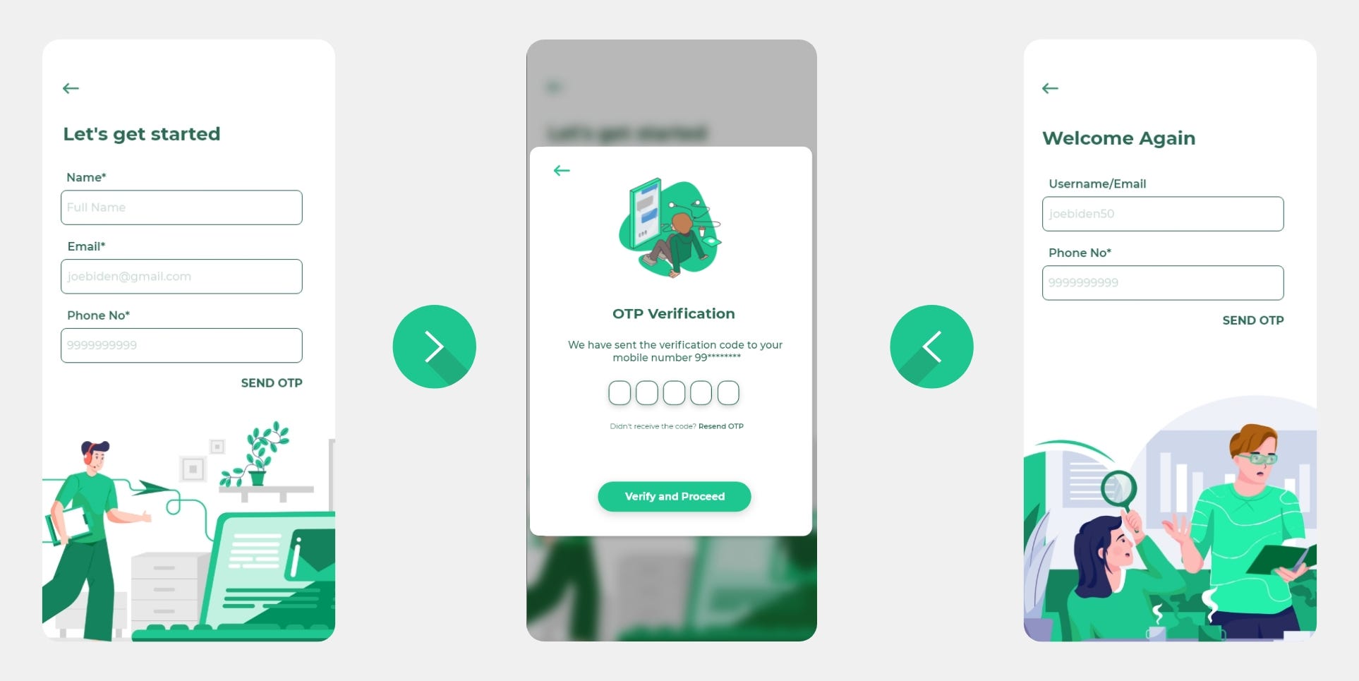
Note: Now on, I'll walk you through some key design considerations, but I won't expose every feature just yet due to corporate regulations.
The Homepage:
The home page is a long scrollable screen that provides access to all of the app’s features.
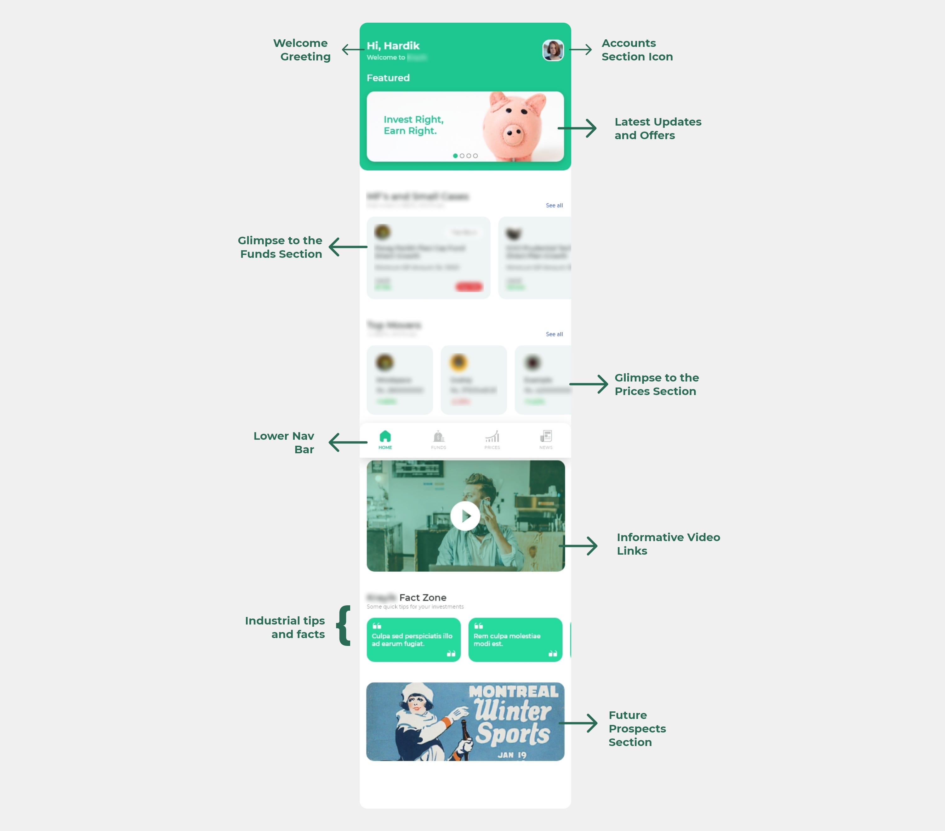
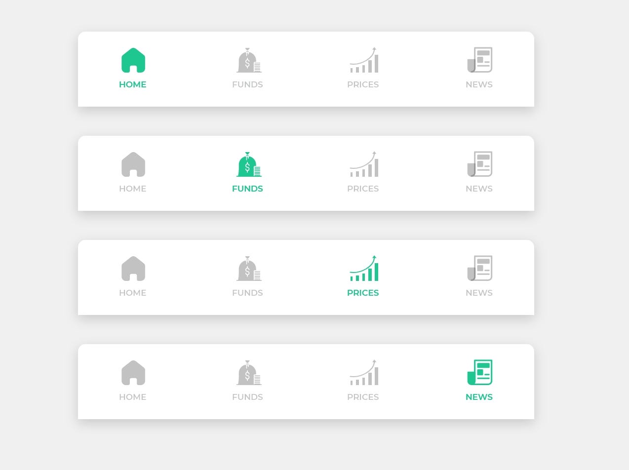
The Lower Navigation Bar:
This navigation is provided on each page of the app to allow the user to seamlessly transition from one page to the next.
The Funds and the Prices section:
These sections are designed to provide the most up-to-date market information possible.
I’ve included a separate search bar to each page of this area so that people can quickly find what they’re looking for among the many possibilities available.
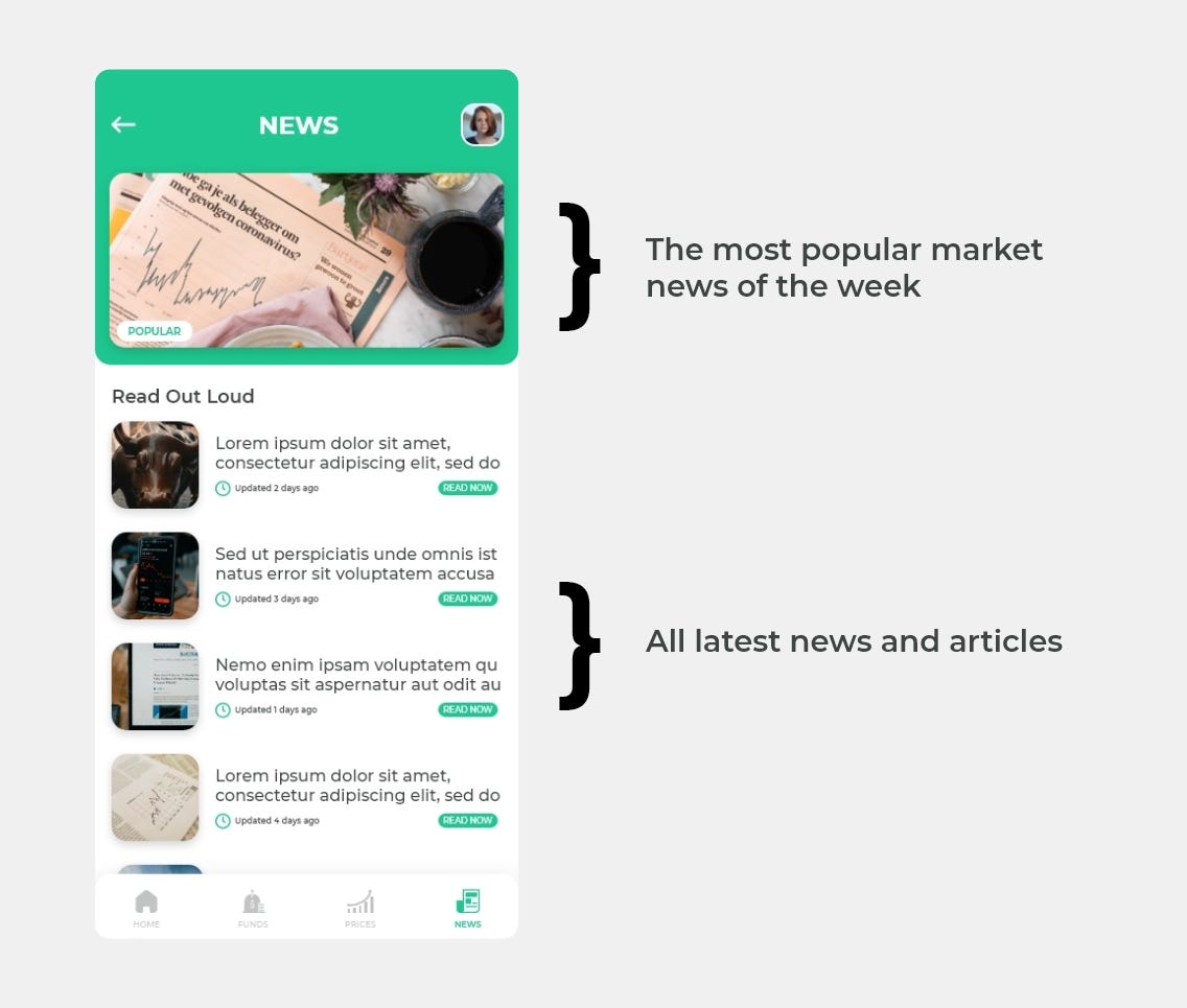
The News Section:
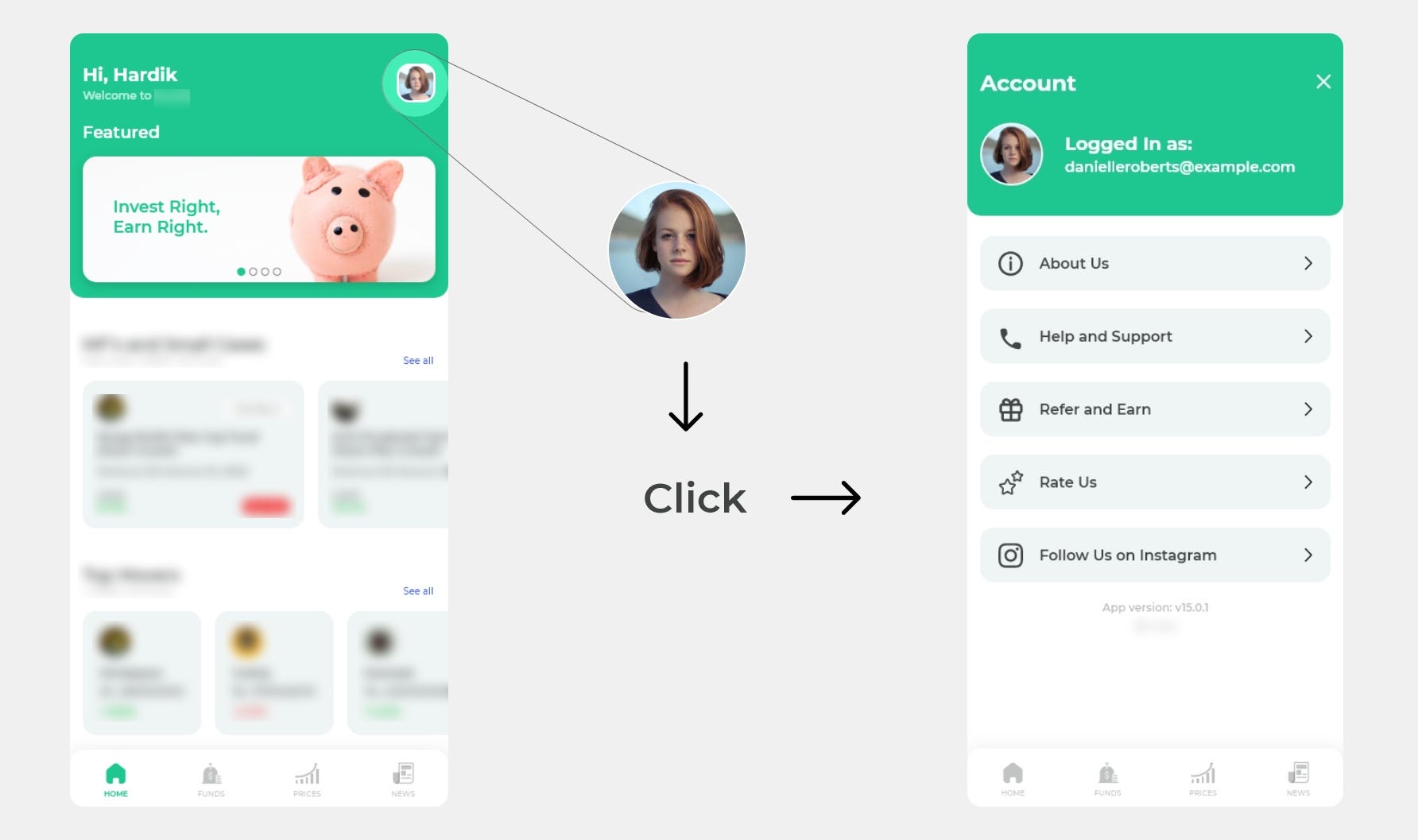
The Accounts section:
This part has all of the company’s information, as well as assistance and support sections and a separate rewards drawer where you can refer and earn.
Every page consists of an account icon, making it incredibly accessible from anywhere.
The Prototype: Soon after the development is completed, the prototype video will be released.
Recommend
About Joyk
Aggregate valuable and interesting links.
Joyk means Joy of geeK