

A cross-platform selector/picker component for React Native
source link: https://reactnativeexample.com/a-cross-platform-selector-picker-component-for-react-native/
Go to the source link to view the article. You can view the picture content, updated content and better typesetting reading experience. If the link is broken, please click the button below to view the snapshot at that time.
A cross-platform selector/picker component for React Native
react-native-modal-selector-searchable
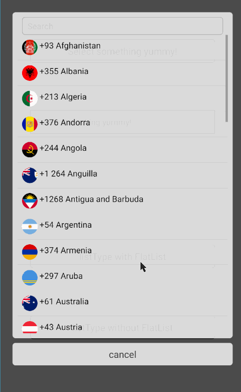
A cross-platform (iOS / Android), selector/picker component for React Native that is highly customizable and supports sections.
Search functionality has been added to this fork repository
Install
npm i react-native-modal-selector-searchable --save
Usage
You can either use this component in its default mode, as a wrapper around your existing component or provide a custom component (where you need to control opening of the modal yourself). In default mode a customizable button is rendered.
See SampleApp for an example how to use this component.
import ModalSelector from 'react-native-modal-selector-searchable'
class SampleApp extends Component {
constructor(props) {
super(props);
this.state = {
textInputValue: ''
}
}
render() {
let index = 0;
const data = [
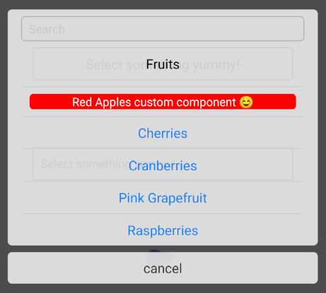
{ key: index++, section: true, label: 'Fruits' },
{ key: index++, label: 'Red Apples' },
{ key: index++, label: 'Cherries' },
{ key: index++, label: 'Cranberries', accessibilityLabel: 'Tap here for cranberries' },
// etc...
// Can also add additional custom keys which are passed to the onChange callback
{ key: index++, label: 'Vegetable', customKey: 'Not a fruit' }
];
return (
<View style={{flex:1, justifyContent:'space-around', padding:50}}>
// Default mode
<ModalSelector
data={data}
initValue="Select something yummy!"
onChange={(option)=>{ alert(`${option.label} (${option.key}) nom nom nom`) }} />
// Wrapper
<ModalSelector
data={data}
initValue="Select something yummy!"
supportedOrientations={['landscape']}
accessible={true}
scrollViewAccessibilityLabel={'Scrollable options'}
cancelButtonAccessibilityLabel={'Cancel Button'}
onChange={(option)=>{ this.setState({textInputValue:option.label})}}>
<TextInput
style={{borderWidth:1, borderColor:'#ccc', padding:10, height:30}}
editable={false}
placeholder="Select something yummy!"
value={this.state.textInputValue} />
</ModalSelector>
// Custom component
<ModalSelector
data={data}
ref={selector => { this.selector = selector; }}
customSelector={<Switch onValueChange={() => this.selector.open()} />}
/>
</View>
);
}
}
Data Format
The selector accepts a specific format of data:
[{ key: 5, label: 'Red Apples' }]
Optionally provide a component key which overrides the default label text. Optionally provide a unique testID for each item:
[{
  key: 5,
  label: 'Red Apples',
  // The next keys are optional --
  component: <View style={{backgroundColor: 'red'}}><Text style={{color: 'white'}}>Red Apples custom component ☺</Text></View>,
  testID: '5-red-apples'
}]
If your data has a specific format, you can define extractors of data, example:
this.setState({data: [{ id: 5, name: 'Red Apples' }]});

return (
  <ModalSelector
    data={this.state.data}
    keyExtractor= {item => item.id}
    labelExtractor= {item => item.name}
  />
);
Props
Prop
Type
Optional
Default
Description
data
array
No
[]
array of objects with a unique key and label to select in the modal. Optional component overrides label text. Optional unique testID for each item.
search
bool
Yes
true
Control the search box visibility
hideSectionOnSearch
bool
Yes
false
Hide the caption of related matched items
caseSensitiveSearch
bool
Yes
false
Sensitive mode on search
frozenSearch
bool
Yes
false
Preserve initial modal size on search
fullHeight
bool
Yes
false
Keep the modal size to the maximum regardless of the listed items
onSearchFilterer
function
Yes
(searchText, data) => filteredData
Custom search filterer function.
onChange
function
Yes
() => {}
callback function, when the users has selected an option
onChangeSearch
function
Yes
(searchData) => {}
Callback function, when the users has typed in search box
onModalOpen
function
Yes
() => {}
callback function, when modal is opening
onModalClose
function
Yes
(item) => {}
callback function, when modal is closing. Returns the selected item.
onCancel
function
Yes
() => {}
callback function, when clicking the cancel button
keyExtractor
function
Yes
(data) => data.key
extract the key from the data item
labelExtractor
function
Yes
(data) => data.label
extract the label from the data item
componentExtractor
function
Yes
(data) => data.component
extract the component from the data item
visible
bool
Yes
false
control open/close state of modal
closeOnChange
bool
Yes
true
control if modal closes on select
initValue
string
Yes
Select me!
text that is initially shown on the button
cancelText
string
Yes
cancel
text of the cancel button
searchText
string
Yes
search
text of the search placeholder
disabled
bool
Yes
false
true disables opening of the modal
supportedOrientations
['portrait', 'landscape']
Yes
both
orientations the modal supports
keyboardShouldPersistTaps
string / bool
Yes
always
passed to underlying ScrollView
listType
string
Yes
SCROLLVIEW
scroller type: SCROLLVIEW or FLATLIST
animationType
string
Yes
slide
type of animation to be used to show the modal. Must be one of none, slide or fade.
style
object
Yes
style definitions for the root element
childrenContainerStyle
object
Yes
{}
style definitions for the children container view
touchableStyle
object
Yes
{}
style definitions for the touchable element
touchableActiveOpacity
number
Yes
0.2
opacity for the touchable element on touch
selectStyle
object
Yes
{}
style definitions for the select element (available in default mode only!). NOTE: Due to breaking changes in React Native, RN < 0.39.0 should pass flex:1 explicitly to selectStyle as a prop.
selectTextStyle
object
Yes
{}
style definitions for the select element (available in default mode only!)
overlayStyle
object
Yes
{ flex: 1, padding: '5%', justifyContent: 'center', backgroundColor: 'rgba(0,0,0,0.7)' }
style definitions for the overlay background element. RN <= 0.41 should override this with pixel value for padding.
sectionStyle
object
Yes
{}
style definitions for the section element
sectionTextStyle
object
Yes
{}
style definitions for the select text element
selectedItemTextStyle
object
Yes
{}
style definitions for the currently selected text element
optionStyle
object
Yes
{}
style definitions for the option element
optionTextStyle
object
Yes
{}
style definitions for the option text element
optionContainerStyle
object
Yes
{}
style definitions for the option container element
cancelStyle
object
Yes
{}
style definitions for the cancel element
cancelTextStyle
object
Yes
{}
style definitions for the cancel text element
initValueTextStyle
object
Yes
{}
style definitions for the initValue text element
cancelContainerStyle
object
Yes
{}
style definitions for the cancel container
searchStyle
object
Yes
{}
Style definitions for the search view element
searchTextStyle
object
Yes
{}
Style definitions for the search text element
backdropPressToClose
bool
Yes
false
true makes the modal close when the overlay is pressed
passThruProps
object
Yes
{}
props to pass through to the container View and each option TouchableOpacity (e.g. testID for testing)
selectTextPassThruProps
object
Yes
{}
props to pass through to the select text component
optionTextPassThruProps
object
Yes
{}
props to pass through to the options text components in the modal
cancelTextPassThruProps
object
Yes
{}
props to pass through to the cancel text components in the modal
scrollViewPassThruProps
object
Yes
{}
props to pass through to the internal ScrollView
openButtonContainerAccessible
bool
Yes
false
true enables accessibility for the open button container. Note: if false be sure to define accessibility props directly in the wrapped component.
listItemAccessible
bool
Yes
false
true enables accessibility for data items. Note: data items should have an accessibilityLabel property if this is enabled
cancelButtonAccessible
bool
Yes
false
true enables accessibility for cancel button.
scrollViewAccessible
bool
Yes
false
true enables accessibility for the scroll view. Only enable this if you don't want to interact with individual data items.
scrollViewAccessibilityLabel
string
Yes
undefined
Accessibility label for the modal ScrollView
cancelButtonAccessibilityLabel
string
Yes
undefined
Accessibility label for the cancel button
modalOpenerHitSlop
object
Yes
{}
How far touch can stray away from touchable that opens modal (RN docs)
customSelector
node
Yes
undefined
Render a custom node instead of the built-in select box.
selectedKey
any
Yes
''
Key of the item to be initially selected
enableShortPress
bool
Yes
true
enables short press. This is regular touch behavior.
enableLongPress
bool
Yes
false
enables long press. When true, onModalOpen returns {longPress: true}
optionsTestIDPrefix
string
Yes
'default'
This prefixes each selectable option's testID prop if no testID keys are provided in props.data array objects. Default for each option's testID: 'default-<optionLabel>'
Methods
getSelectedItem(): get current selected item, updated by onChange event.
GitHub
https://github.com/hepter/react-native-modal-selector-searchable
Alarm clock functionality for react native ios and android
Fully customizable & Beautiful State View for React Native
You might also like...
Subscribe to React Native Example for Android and iOS
Get the latest posts delivered right to your inbox
Recommend
About Joyk
Aggregate valuable and interesting links.
Joyk means Joy of geeK