

Responsive Images: Different Techniques and Tactics
source link: https://blog.bitsrc.io/responsive-images-different-techniques-and-tactics-6045a1fa7ea2
Go to the source link to view the article. You can view the picture content, updated content and better typesetting reading experience. If the link is broken, please click the button below to view the snapshot at that time.
Implementing Responsive Images
As mentioned earlier, there are several ways to implement responsive images, and it’s important to know the best ways to implement them to get the maximum from your effort.
By default, there are several excellent tags and attributes like img, picture, sizeand srcset provided by HTML for image rendering in web development. Now, I will show you how to implement the above-discussed methods using those tags and attributes in no time.
1. Device Pixel-Based Method
Before going deeper, let me tell you about high-density displays. Modern flagship mobile devices such as Samsung Galaxy S10 have Density Displays of 4x, whereas some economy models may have low-density displays.
If we push to load a high-density image in a low-density display, it will result in a very poor user experience and a waste of resources. So, we’ll use different images for various device pixel-ratios.
In the below example, we have considered two images. The small-kitten.jpg with 320×240 pixels and large-kitten.jpg with 640×480 pixels, making the latter one suitable for high-resolution displays. (x descriptor shows the expected device pixel-ratio)
<img
   srcset="small-kitten.jpg 1x, large-kitten.jpg 2x"
   src="small-kitten.jpg"
   alt="A cute kitten"
/>
If users’ device resolution is above 640x480 pixels, large-kitten.jpg will be rendered, and if not, small-kitten.jpg image will be rendered. Most importantly, the users with low res devices will not feel any delay in image loading time, while users who have high res devices will not feel any issue in image quality.
2. Fluid-Image Method
This method is focused on using the same image with different sizes rather than using different images.
For example, we can implement simple fluid-images by giving image size in relative ratios rather than giving precise pixel values. The most common method used is max-width:100%.
<img
   src=”black-dog.jpg”
   style=”max-width: 100%;
   height: auto;”
   alt=”Black dog image”
>
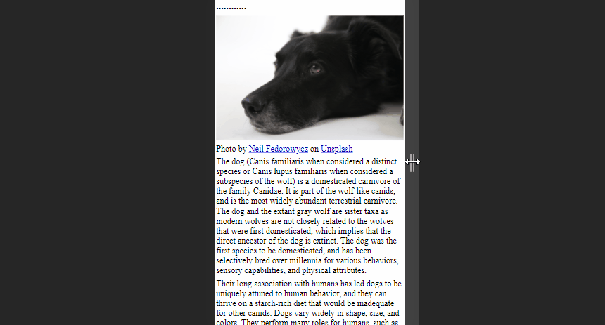
As you can see above image is free to scale and fit the browser window size. This method will be ideal for occasions where there are large images as article headers.
Furthermore, there is an advanced method with fluid-images to compute the dimensions using the image’s width and the page’s overall width.
As an example, consider a web page with 1200px wide and an image with 500px wide. Then the calculation of how much the image takes up on the page will be as follows:
width of the image = image width/page width(500/1200) x 100 = 41.66%
Then we can use this value as shown in the below code snippet. It will enable the image to always keep scaled with the size of the web page.
<img
   src=”black-dog.jpg”
   style=”float: right;
   width: 41.66%;”
   alt=”Black dog image”
>
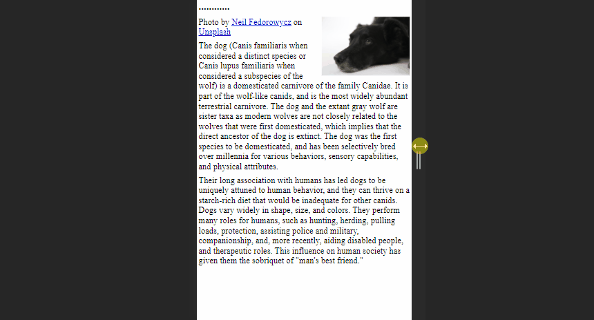
However, this calculation might cause some issues when the viewport is too large or too small.
We can overcome this issue by adding max and min values for image width in pixels to mark upper and lower bounds.
<img
   src=”black-dog.jpg”
   style=” width: 41.66%;
   max-width: 500px;”
   alt=”Black dog image”
>
3. Art Direction Method
The main idea behind Art Direction is to display different images based on the screen sizes of the device. We can address this issue by switching to picture tag instead of using img tag since it allows to provide images in multiple ratios or multiple focus points when viewed on different devices.
A simple code snippet like the below can obtain the above result. Here we provide values for 2 different attributes inside <source> element; media and srcsetdefining image size and sources respectively.
<picture>
 <source media=”(min-width: 650px)” srcset=”kitten-stretching.png”>
 <source media=”(min-width: 465px)” srcset=”kitten-sitting.png”>

<img src=”kitten-curled.png” alt=”A cute kitten”>
</picture>
In the above example, If the screen size is greater than 560px browser will show the images from the first image, and if the screen size is greater than 465px and below 650px browser will use the second image.
You’ll notice the regular <img> tag as the final nested tag of the <picture> element, which is crucial to make this code snippet work. It will be used as a replacement when conditions in the media query are not matching and as a backup on browsers that do not support the <picture> element.
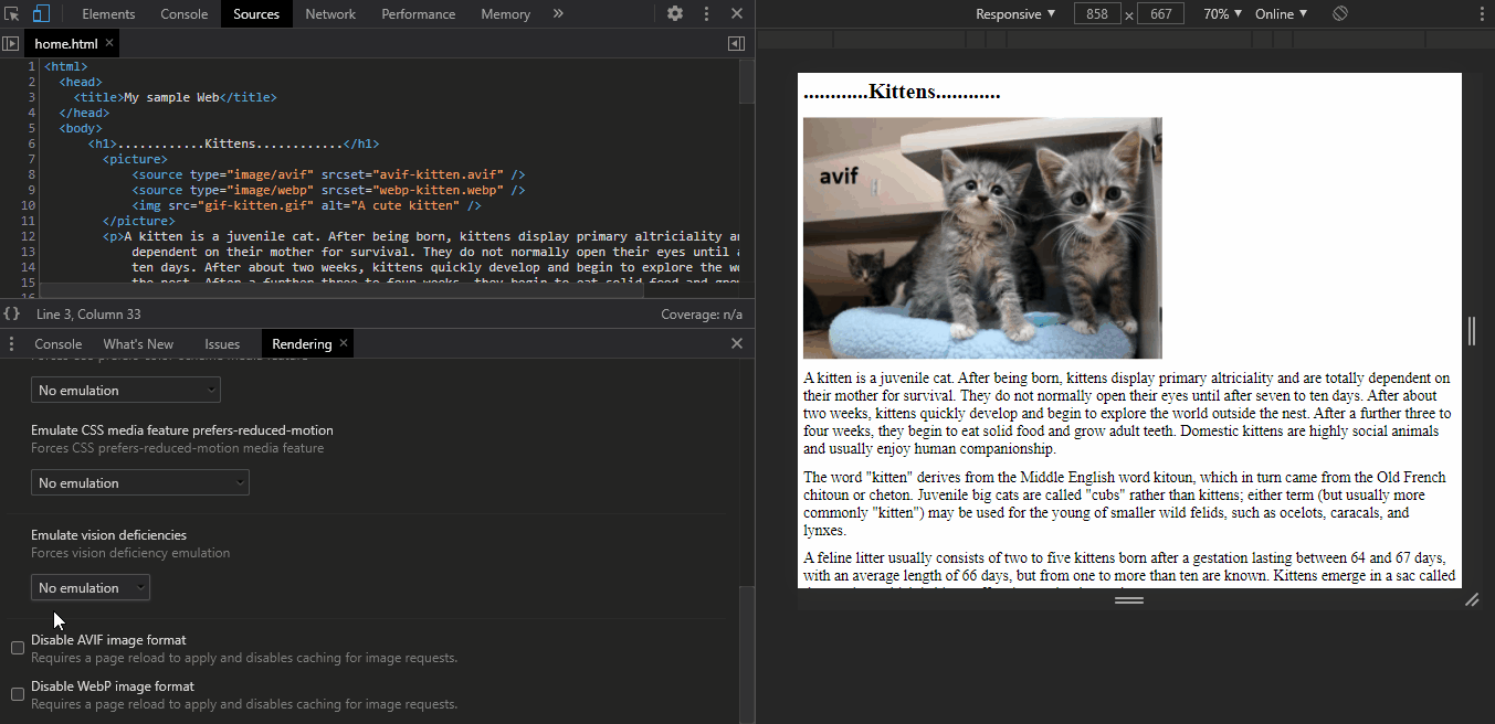
4. Image Type-Switching Method
With the rapid development of technologies, different types of modern image types like avif, webpare introduced day by day. Although these image types provide a high user experience, there are some browsers that don’t support those image types yet.
So, we can use type switching to address such situations by changing the image format.
For example, the below code contains 2 modern image types and gif image. First, the browser will try avif format, and if that fails, it will try webp format. If the browser does not support both of these, it will use png image.
<picture>
   <source type="image/avif" srcset="avif-kitten.svg" />
   <source type="image/webp" srcset="webp-kitten.webp" />
   <img src="kitten.gif" alt="A cute kitten" />
</picture>
You can also use chrome DevTools to emulate this to see how your image will look like when the browser isn't supporting the modern image types.
Recommend
About Joyk
Aggregate valuable and interesting links.
Joyk means Joy of geeK