

Create an Instagram Post Clone with the AWS Amplify Admin UI, React, and Chakra...
source link: https://acloudguru.com/blog/engineering/create-an-instagram-post-clone-with-the-aws-amplify-admin-ui-react-and-chakra-ui
Go to the source link to view the article. You can view the picture content, updated content and better typesetting reading experience. If the link is broken, please click the button below to view the snapshot at that time.
What is the Amplify Admin UI?
In this tutorial, we’ll be using the AWS Amplify Admin UI to create a backend for an Instagram card clone. The Amplify Admin UI launched at Re:Invent in 2020, and it allows you to use a visual interface to create data for an application. It also creates a CMS on top of your data models, so you don’t need to create forms initially to get some sample data created, nor do you need to create a separate admin app for content moderators. In addition, it allows you to test out your data models before deploying them to the cloud — you can even do this without having an AWS account if you want! Then you can deploy to the cloud with just a few clicks.
For the frontend, we’ll be using React and Chakra UI, which is an awesome component library that we’ll use for making our app look good.
Here’s a picture of the final product:
Also, if you enjoy learning via video more than written tutorials, here’s a YouTube version of this project!
Create the data model
First, let’s create a schema for our data. You can access the Admin UI via this link. When we do this, we’re creating a backend that utilizes AWS Amplify DataStore. This automatically enables your data to be both online and offline, which is especially handy for mobile developers!
On the home page, click “Get started” under “Create an app backend”.
Then, choose “data” and “Blank schema” on the next page.
Click the add button, then “add model”.
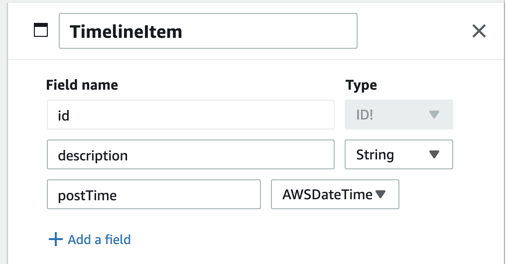
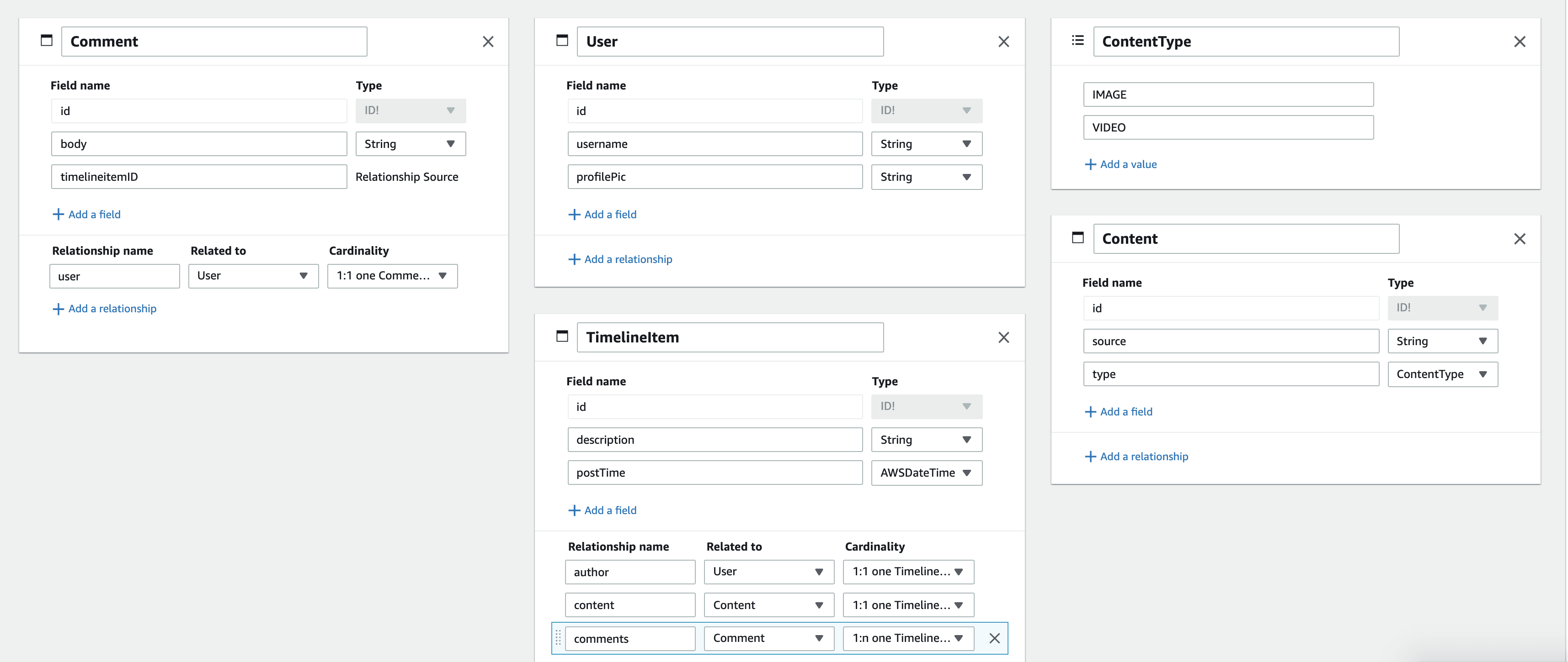
The first model we’ll create will be a TimeLine item. This will have a description, which will be a String, and a postTime which will be an AWSDateTime.
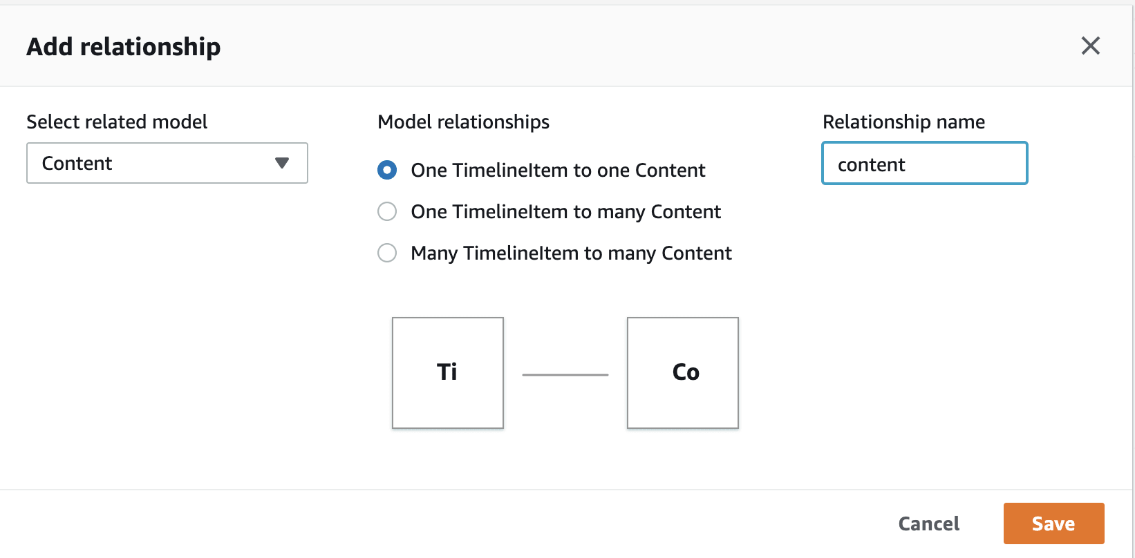
This will have a 1:1 relationship with the content, so each TimelineItem will have one Content instance associated with it that stores the actual link to the video or image.
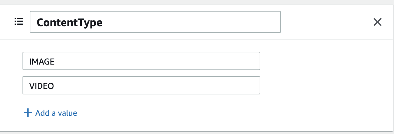
Before we create that, we’ll create an Enum. This will have the values IMAGE and VIDEO — we’ll store on the Content what type of content the TimelineItem will render. Click the add button again, but this time select Enum. Then add the two possible values!
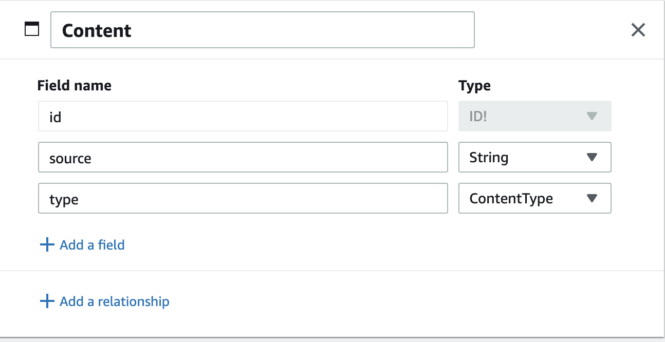
Now, we’ll create our Content model — click add again and select add model. This model will have source which is a string that will link to the image or video content. Then there will be a type which will be the ContentType enum — it should show up in the dropdown if you scroll to the bottom!
Now, we’ll create a relationship between the TimelineItem and Content. Under the TimelineItem, click “add a relationship”. Then, select the Content model and select “one TimelineItem to one Content”. You can also change the relationship name – I normally set mine to all lowercase.
Now, add two more models. Comment and User. Comment will have a body which is a String and then User will have a username and a profilePic both of which are strings.
In a full, production app you would probably add a relationship from the User to a user from your authentication provider.
Then we’ll add relationships. Add a 1:1 relationship to the Comment model for User, 1:1 relationship to the TimelineItem model for User — I changed this name to “author”, and then a 1:n to TimelineItem to Comments.
The final schema should look like this:
Deploy your App
Now, we’ll move to deploying our backend schema. If you click on the test link on the top right, you’ll be given instructions for testing your schema out locally — this means that you can write an initial version of your backend without creating an AWS account or having any chance to be billed for anything. That being said, for this tutorial, I want to skip directly to the deploy tab so that we get the CMS feature.
Go to the deploy page, where you’ll be instructed to either create an AWS account or sign in to an existing one.
On the next page, choose a name for your app like “Instacard” and then choose an AWS region. It’ll take a few minutes for your app to deploy. Once it does, click the “Backend environments” tab and then “Open admin UI”. On this page, you’ll be able to update your deployed data, add authentication, and manage your content.
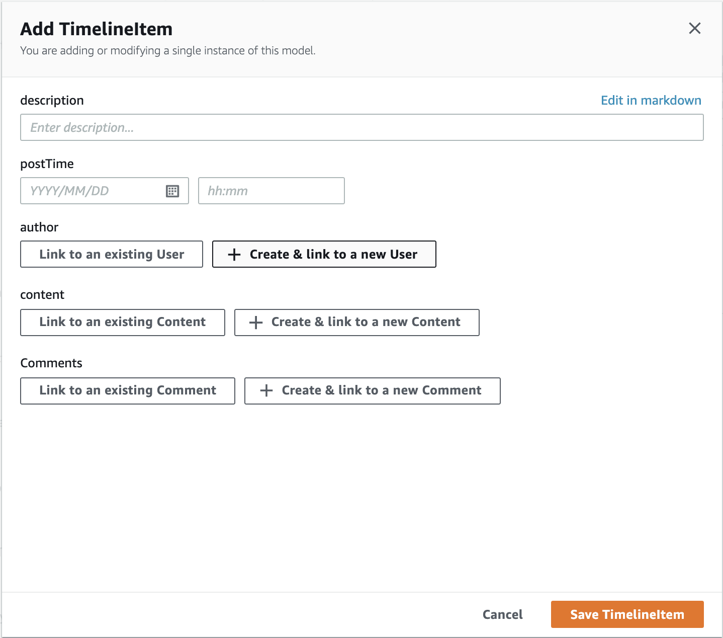
Add Data via the CMS
Within the Admin UI, head to the content tab. You’ll be able to create data within here for the app. Create a couple instances of each model and connect the data together. We’ll use this as our test data for the Instacard project! You can start from the TimelineItem and then create your associated User, Content, and Comments. For the images, use a link to an image from anywhere you want, I like the ones on Unsplash.
Create a React App
Now our backend is good to go! We can start working on our frontend. We’ll create a React app first:
$ npx create-react-app instacard
Once you’ve gotten that created, move into your project. We’ll need to install the AWS Amplify JavaScript library and TypeScript for the DataStore models, and then Chakra UI and all its dependencies.
$ cd instacard
$ npm i aws-amplify typescript
$ npm i @chakra-ui/react @emotion/react@^11 @emotion/styled@^11 framer-motion@^4 @chakra-ui/icons
If you don’t have the Amplify CLI installed, run the following:
$ curl -sL https://aws-amplify.github.io/amplify-cli/install | bash && $SHELL
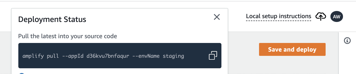
Then, we’ll need to run amplify pull to pull your app into the local project. If you go back to the Admin UI and click the local setup instructions link on the top right, you’ll get a command. Go ahead and run that.
$ amplify pull --appId your-app-id --envName staging
Amplify follows a Git-like push/pull model. If you create changes via the Admin UI, you can run amplify pull to get them locally as well. If you change things locally, run amplify push to deploy those changes.
We’ll also need to configure Amplify for our project. Open up your src/index.js file and add the following:
import Amplify from 'aws-amplify'
import awsconfig from './aws-exports'

Amplify.configure(awsconfig)
We’ll be creating three main component files, let’s go ahead and make them.
$ touch src/{Timeline.js,Card.js,CommentList.js}
We’ll also set up the ChakraProvider in the root component.
// App.js
import { ChakraProvider } from '@chakra-ui/react'

export default function App () {
  return (
    <ChakraProvider>
      <div />
    </ChakraProvider>
  )
}
Create the Timeline Component
The first component we’ll write is the timeline component. First, we’ll pull all of our TimelineItems from DataStore. This will look pretty similar to any other API call you would make on initial render in React, except for the DataStore.query() instead of a fetch or axios call. DataStore.query() with the TimelineItem as the argument will get all of the TimelineItems from datastore.
// Timeline.js
import { useState, useEffect } from 'react'
import { DataStore } from '@aws-amplify/datastore'

import { TimelineItem } from './models'

export function Timeline () {
  const [timeline, setTimeline] = useState([])

  useEffect(() => {
    const getTimeline = async () => {
      const timelineData = await DataStore.query(TimelineItem)
      setTimeline(timelineData)
    }

    getTimeline()
  }, [])

  return(
    <div />
  )
}
Now, we’ll also add our UI code, we’ll import the Container from Chakra which will center our content on the page. We’ll also use React’s children pattern to pass child elements. The direct child of this component will be a function, so we’ll loop through each TimelineItem and call that function which will render other React components!
// Timeline.js
import { useState, useEffect } from 'react'
import { DataStore } from '@aws-amplify/datastore'
+ import { Container } from '@chakra-ui/react'

import { TimelineItem } from './models'

+ export function Timeline ({ children }) {
  const [timeline, setTimeline] = useState([])

  useEffect(() => {
    const getTimeline = async () => {
      const timelineData = await DataStore.query(TimelineItem)
      setTimeline(timelineData)
    }

    getTimeline()
  }, [])

  return (
+    <Container>
+      {timeline.map(post => children({ post }))}
+    </Container>
  )
}
Create the Card Component
Now, we’ll create a Card component. I’ll go ahead and import everything I’m going to eventually need from Chakra just so I don’t need to keep coming back to the imports.
// Card.js
import { Box, Image, Flex, Avatar, Text, Spacer, IconButton } from '@chakra-ui/react'
import { ChatIcon, AddIcon, EmailIcon } from '@chakra-ui/icons'
Then, I’ll create my starter component. This component will start off with a box that renders “Hello!”. It’ll eventually take child elements, but let’s first wire up our <Timeline> component to render a <Card /> for each TimelineItem.
export function Card ({ children }) {
  return (
    <Box maxW='lg' borderWidth='1px' borderRadius='md' overflow='hidden' m={5}>
      <h1>Hello!</h1>
    </Box>
  )
}
Now, we’ll go back to our <App > component and render our timeline of cards! I’ll need to import the necessary components, and then inside the <Timeline> instance, we’ll add a function that returns a <Card> instance. The .map in the timeline will loop through all the posts and run this function to render a <Card> for each post!
//App.js
import { ChakraProvider } from '@chakra-ui/react'

import { Timeline } from './Timeline'
import { Card } from './Card'

export default function App () {
  return (
    <ChakraProvider>
      <Timeline>
        {({ post }) => (
          <Card key={post.id}></Card>
        )}
      </Timeline>
    </ChakraProvider>
  )
}
Now that we have “Hello!” showing up in a box for each TimelineItem we can proceed to render the actual card data. Each <Card> will have a Header, a Main, and a Footer. These will all be components, but we’ll create them and export them under the Card component since we’ll use them all in tandem. First, let’s create the <Card.Header />. This will need to take the author of the post, so we’ll take that as a prop. Then we’ll render more Chakra Box and Flex components for aligning the items properly. We’ll also use the Avatar component to render the picture if there is one. We won’t actually create the menu dropdown in this tutorial, so we’ll just add three dots as a placeholder.
// Card.js
Card.Header = function ({ author }) {
  return (
    <Box p={2}>
      <Flex>
        <Box d='flex' alignItems='center'>
          <Avatar name={author.username} src={author.profilePic} />
          <Box ml={2}>
            <Text fontWeight='bold' fontSize='sm'>
              {author.username}
            </Text>
          </Box>
        </Box>
        <Spacer />
        <Box p={2}>
          …
        </Box>
      </Flex>
    </Box>
  )
}
Then, we’ll create the <Card.Main> component which will render the video or image that the post contains. We’ll add a conditional for the type of content, and then render it.
Card.Main = function ({ content }) {
  let cardContent
  if (content.type === 'VIDEO') {
    cardContent = (
      <video controls>
        <source src={content.source} />
      </video>
    )
  } else {
    cardContent = <Image src={content.source} />
  }
  return (
    <Box>
      {cardContent}
    </Box>
  )
}
Finally, the card footer will have three buttons that are just for display purposes in this tutorial. Then, we’ll add the caption below the image. We’ll also leave a slot for the comments, which will be a child component.
Card.Footer = function ({ author, description, children }) {
  return (
    <Box ml={3}>
      <Box>
        <IconButton icon={<AddIcon />} variant='ghost' />
        <IconButton icon={<ChatIcon />} variant='ghost' />
        <IconButton icon={<EmailIcon />} variant='ghost' />
      </Box>
      <Box mt={3}>
        <Text>
          <Text as='b'>{author.username} </Text>{description}
        </Text>
      </Box>
      <Box>
        {children}
      </Box>
      <Box mt={1} mb={2}>
        <Text fontSize='xs' color='gray.500'>
          2 HOURS AGO
        </Text>
      </Box>
    </Box>
  )
}
Create the Comment Component
Now, we’ll create our last component, which will render out all of the Comments! This will be similar to the Timeline component, but we only want to query for the Comments that belong to that post. So, we’ll filter the Comments based on the id of the post they belong to. DataStore.query() takes an optional second argument which specifies the conditions for the query.
import { useEffect, useState } from 'react'
import { DataStore } from '@aws-amplify/datastore'
import { Box, Text } from '@chakra-ui/react'

import { Comment } from './models'

export function CommentList ({ postId }) {
  const [comments, setComments] = useState([])
  useEffect(() => {
    const getComments = async () => {
      const postComments = await DataStore.query(Comment, p => p.timelineitemID === postId)
      setComments(postComments)
    }
    getComments()
  }, [])
  return (
    <Box>
      {comments.map(comment => (
        <Text key={comment.id}>
          <Text key={comment.id}>
            <Text as='b'>{comment.user.username} </Text>
            {comment.body}
          </Text>
        </Text>
      ))}
    </Box>
  )
}
Now, we’ll go back to the <App> component to render all of these parts of the card!
import { ChakraProvider } from '@chakra-ui/react'

import { Timeline } from './Timeline'
import { Card } from './Card'
import { CommentList } from './CommentList'
import { CommentForm } from './CommentForm'

export default function App () {
  return (
    <ChakraProvider>
      <Timeline>
        {({ post }) => (
          <Card post={post} key={post.id}>
            <Card.Header author={post.author} />
            <Card.Main content={post.content} />
            <Card.Footer
              author={post.author}
              description={post.description}
            >
              <CommentList postId={post.id} />
            </Card.Footer>
            <CommentForm />
          </Card>
        )}
      </Timeline>
    </ChakraProvider>
  )
}
Amazing! Now our Instacard is complete!
Conclusion
To recap, we created a schema for an Instagram post via the AWS Amplify Admin UI. Then we used its CMS to create content for our application and then displayed the timeline data in a React app using Chakra UI for styling. AWS Amplify’s Admin UI enables rapid backend development so that developers can focus on their frontend and business logic. We didn’t talk about authentication or authorization in this tutorial, but you can enable them via the visual Admin UI interface as well.
Recommend
About Joyk
Aggregate valuable and interesting links.
Joyk means Joy of geeK