

UI trends for 2077
source link: https://uxdesign.cc/ui-trends-for-2077-5ed729d8e981
Go to the source link to view the article. You can view the picture content, updated content and better typesetting reading experience. If the link is broken, please click the button below to view the snapshot at that time.

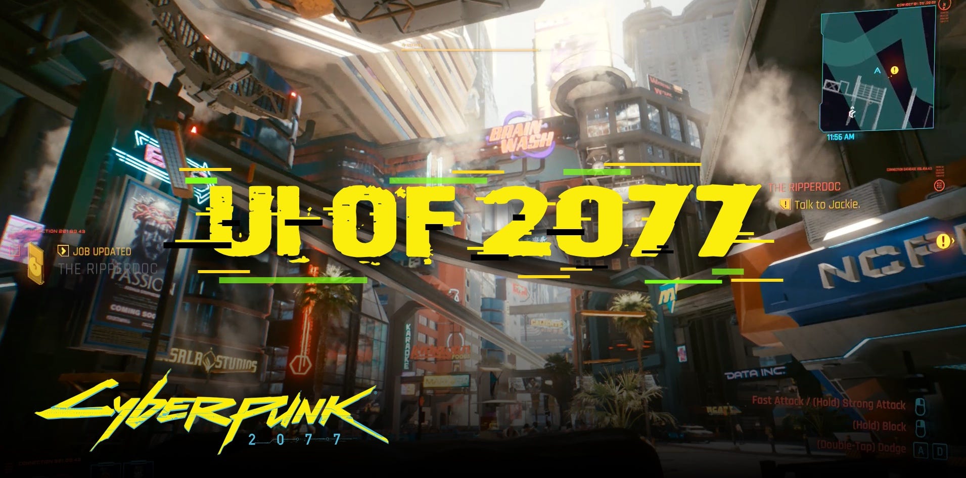
As a designer, when playing a video game that has user interfaces inside of it, I can’t help but to think about how they’re made and how they fit the lore and time of the game. So whenever a game has a computer in it, that you can interact with, I sit down and play around with it.
Hello, 2077!
Cyberpunk 2077 has inspired me to take a look at the interfaces in the year 2077, and what I think would be the directions UI’s will take. But before we start going theoretical, here’s a super brief analysis of the in-game UI’s. There’s more but I want to focus on just two elements here.

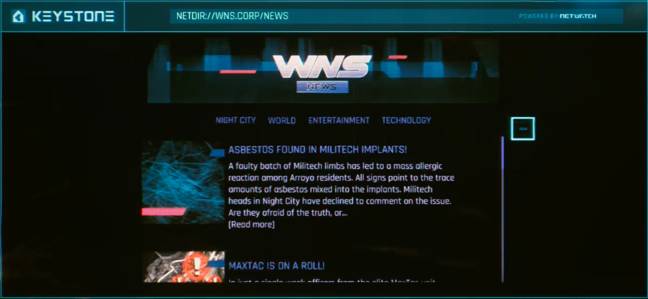
The 2077 internet
Apparently, the internet in 2077 is a homage to the late ’90s. I remember making my first website back in 1998 and the websites seen on computers in Cyberpunk are following the exact same design patterns. That means navigation that was made to fit a 640x480 px, CRT 4:3 display.

Nearly all websites from that era had a horizontal, very visual header spanning all the way across. Then below they rocked horizontal, full-width navigation, leaving the rest of the space for the content. Mostly one-column.
So I was surprised to see the exact same thing in 2077 on displays that were definitely a lot wider. I’m not going to mention the uneven spacing, and an overall sloppy look of these websites, because it may actually be part of the lore as well.

Toggle much?
The other thing is that the in-game UI’s have some pretty obvious patterns put on their heads. Take a look at this in-game toggle. In most modern UI’s nowadays when a toggle is on the left side it means it’s off. Move it to the right and it’s on. This in-game screen actually had me guessing what to do :)
Because here turning off means moving the toggle to the right. Very unintuitive.

The future?
But why are screens so ubiquitous in the future? Especially given the fact that even now, many different input methods are in their early (but growing) stages. Let’s go through them one by one. Especially as I believe that by 2077 most of them would be even more refined and polished. So a need for a bitmap screen showing a traditional UI may not be that high in the future.
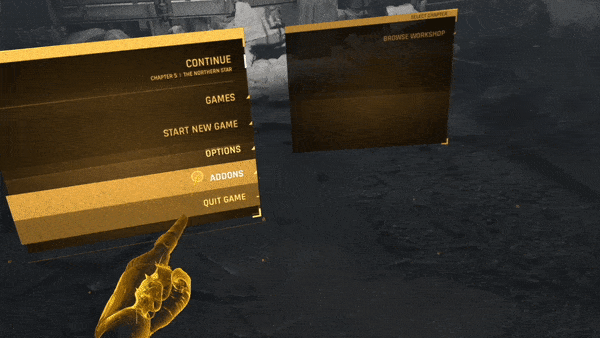
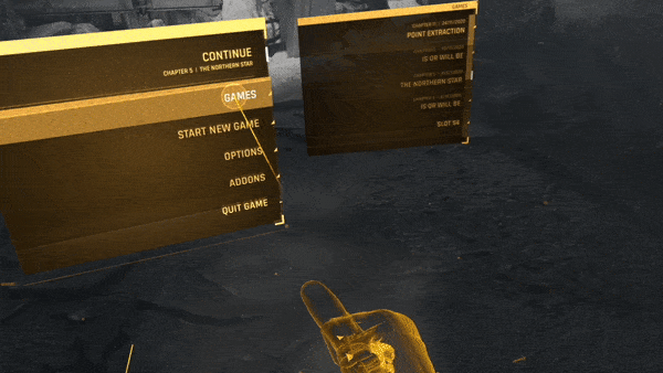
Let’s assume a version of the future that still uses visual UI’s for interaction. Most sci-fi movies usually portray them as holographic, semi-transparent objects that we can manipulate with our hands. Of course, most of the reasoning behind this portrayal is due to the fact that it simply looks cool in a movie. Some Glassmorphism is also present in them to show the hierarchy of objects in a 3d space.

The future is not accessible
But what’s most apparent is that nearly no futuristic UI considers any accessibility. The interfaces usually don’t have enough figure-to-background contrast, the controls are hard to understand and there are not enough visual cues to guide the user.
But let’s look at how we’d interact with those UI’s.
Virtual reality
VR still has many problems, but the quality of those interfaces made one of the biggest leaps in UI’s in history. They went from barely usable, nausea induced novelties, to something that can actually work. Even if some of the implications of shutting off from the world completely are a little scary, I cannot be unimpressed by it.
There are two main types of controller-based VR interactions:
- Simulated touch version
- Aim and click (this also can be done without controllers on some headsets)
Simulated touch
Most controllers enable you to simulate making a fist with an option to leave your index finger pointing out. You can then use that “virtual” finger to tap on the floating menus in 3D space. The controller often adds a bit of haptic feedback on touch, so it feels a bit more natural than “touching air”.
Aim and click
Aim and click assumes a beam that emmanates from one or both controllers with hit-scanning dot at the end. You simply move the beam to align the dot in the right place and then press the trigger on the controller to activate a button.
This option can also be done with just your hands being tracked with headset cameras. Hand movement is tracked in a similar way, and you use a pinch gesture to click on where the target dot is.
How to improve?
The main problems with VR currently have all to do with haptics and visual quality. The lenses and displays are still not perfect (often to bring the cost down) so there are screen-door effects, pixellating and blurry parts to be expected from time to time.
But headsets and displays are getting better every year, so this is definitely something to be expected in 2077.
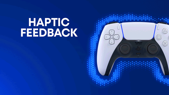
Another thing is better haptic simulations. Most controllers simply vibrate on touch, and while it “kind of” works, it’s a suboptimal solution. One revolution in this area is already here with the PS5 DualSense controller, so by 2077, I imagine it would be refined to be indistinguishable from real touch.

Augmented Reality
AR, or mixed-reality is simply adding 3d objects on top of our existing world. They can be interacted with the same way, but we don’t shut ourselves off from the world, only add things to it. Same principles as in VR apply to the actual interaction and potential UI patterns. If we’re to interact with objects, the UI should likely resemble the patterns we have and successfuly use right now. Back and forward buttons, progress indicators, sliders and more.
The Microsoft Hololens has been a prime example of this, but while really impressive, it’s far from being mobile and lightweight.
We’re still waiting on Apple’s AR glasses, but the technology is definitely improving with better processing, Lidar sensors and more.

Authentication
Right now to authenticate online, we usually need to enter stuff into a set of text fields. It’s a cumbersome and long process that often results in failed authentications and user drop-off. This problem is being addressed by no-password logins, social-media sign-ins and more.
But in the future, I believe biometry will completely take over the need to manually sign-in to anywhere.
We already have fingerprint scanners and face-IDs that in many cases replace entering the passwords. But they only work for the subsequent attempts. If you’re creating an account for the first time, you always need to use a form.
In the future, privacy is a commodity that barely anyone can afford, and we see this happening all around us even today. So the reality of giving up your face, biometry, and details to “The Great Authenticator” is not that far off.
Most sci-fi movies actually predicted this to be the thing, so computers you never used greet you with your first name when you approach them and doors magically open for you — if you had the clearance that is.
In 2077 there will definitely be no privacy, so traditional login-forms would be a long-forgotten relic of the old UX days.
Recommend
About Joyk
Aggregate valuable and interesting links.
Joyk means Joy of geeK