

I disguised as an Instagram UX influencer for 4 months; this is what I learned a...
source link: https://uxdesign.cc/i-disguised-as-an-instagram-ux-influencer-for-4-months-this-is-what-i-learned-about-our-community-4a4b4e8844b
Go to the source link to view the article. You can view the picture content, updated content and better typesetting reading experience. If the link is broken, please click the button below to view the snapshot at that time.
I disguised as an Instagram UX influencer for 4 months; this is what I learned about our community
I’ve created an account on the social media network to understand why and how designers share their work.
As designers, we become aware of scientific methods for running experiments, eventually questioning statements starting with “studies showed….”. This doesn’t dehumanise us though. Our first reaction to the new might still be to generalise and have preconceived opinions. I had the same reaction when a friend shared a few UX design posts on Instagram.
Looking at the shiny carousels, I thought: “Meh... just another shallow way of promoting themselves”, but then I wondered: What if I really study this and go beyond what I’d do? What if I act as a digital researcher to try to understand why and how designers share their work this way?
Maybe there’s more to it.
Assumption: Most designers post UX related work on Instagram only to increase their audience, digital presence and potential leads.

My assumption proved to be generally false. I discovered a community formed by a mix of trained and self-proclaimed UX designers. From the outside, their posts seem to focus on visual impact rather than usability, scattered with generic advice about principles. From the inside, this is the norm, supported by unwritten rules (explained later) and Instagram’s format. Yes, people increase their exposure, but it happens as a consequence for the majority.
The main goal seems to be to get validation on their common, surface-level definition of design reducing it to shapes and colours. I gradually increased my presence in the community from Aug. to Nov. 2020, trying to push its norms through critical feedback and basic principles. This polarised opinions to a great degree.
Method
One of the most fun parts of the research is to get insights into people’s context. Context can include the physical layout of a space, lighting conditions, smells, behaviours, workarounds, routines, and emotions. In a study related to train stations, I’d simply walk over there. However, in a study related to social media behaviour, I obviously can’t do that. I can however immerse myself into the network activities while observing similar things:
- The target users are posting UX design-related materials: visual designs, advice on theories, tutorials, tips, etc.
- Amount of followers is not a criterion for including or excluding an individual from the observation
- Behaviours are based on post type, frequency, comment, engagement and reactions to comments.
The last thing to plan was my presence in the social network. A researcher’s presence in a real environment might influence it. Remember, the goal is to observe context as if you weren’t there. Let’s take the train station example. Walking in with a camera, pen, and notebook while taking notes will immediately make you stand out. Some people might change their behaviour, or even feel uncomfortable and move further away. Therefore, you’d first start by pretending to be another traveller waiting for the next train. Having a few first impressions set, you can then turn into a researcher. I proceeded in a similar way, for this digital context, by breaking the presence into three levels:
- Explorer: observe other accounts and their posts without commenting, sharing, or liking anything.
- Follower: follow accounts, respond to their stories, comment on their posts, share their thoughts.
- Creator: create content myself and see what effect that has on the community, if there is any.
In hindsight, these may actually match the usual stages any individual would take in joining a community. First, observe from a distance until they are convinced of its value and eventually actively participate in it.
The Explorer — Discovering Post Types
Having my approach set, I created an account and then spent the first hours just findings and following around 200 profiles posting on UX design topics. Some had 150k+ followers, while others just around 80. The explorer role pushed me to focus on content type not quality. Here’s what I saw.
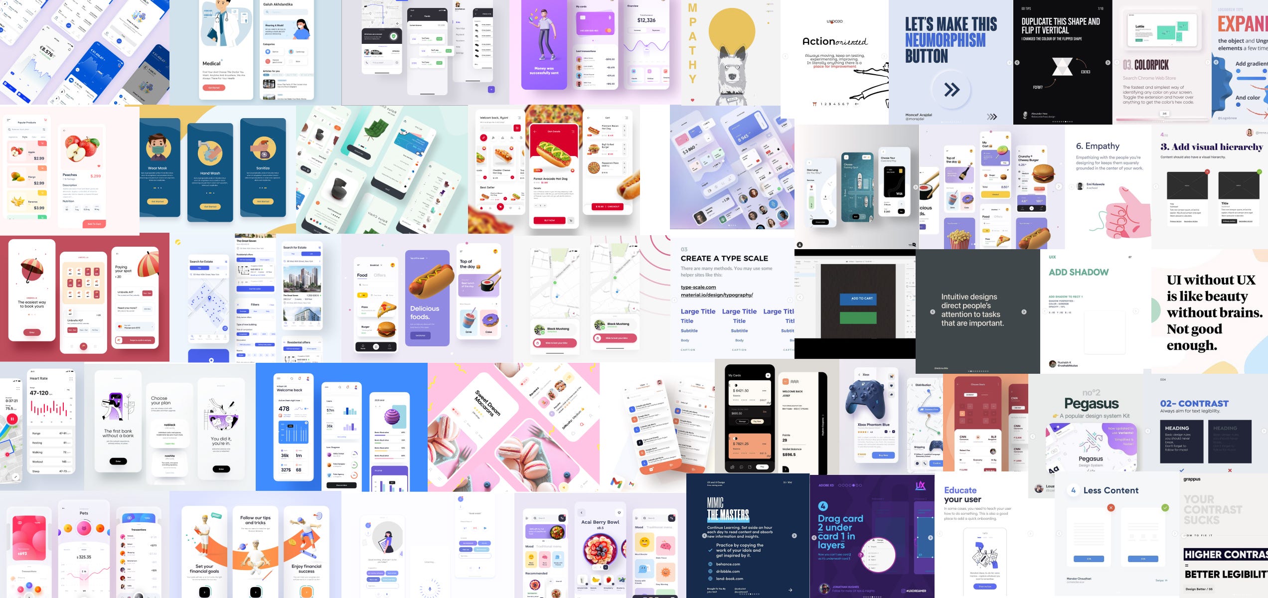
The Showcase
The most common posts are by far UI screens for mobile apps or web. These usually follow the Dribbble showcase style, with quite a lot of surrounding content, focusing on delivering a visually beautiful post. Usability was rarely the main focus.


Top of the iceberg advice
These describe generic design principles, or terminology apparently good for both new designers and the experienced ones. Dozens of posts advise on the same topics, extracting a few lines from textbook definitions, sometimes backing them up with examples from a handful of companies e.g. Apple, Airbnb, Spotify. Multiple principles are usually presented in the same post.

Middle of the iceberg advice
These are quite rare. Posts pick a single topic and describe it in greater detail, than the ones above. Instead of sticking to the simplest explanation, authors tend to go into associations, details, exceptions or real world usage.

Tutorials
Carousels are used to describe how to create trendy UI elements or how to become more efficient through shortcuts, tricks and plug-ins.

Aggregators
It took me a while to notice that some of the bigger accounts, in terms of followers, are just reposting others’ content. A bunch of people constantly tag them, hoping to get their work featured on those accounts.

Differences in post formats are clearly visible in here: some use pictures with people with exaggerated expressions, some play with text sizes only, while others try to create suspense from one carousel slide to another. Guess what, there is also meta-advice around the best performing post formats too.
The Follower — Analysing Reactions
Not being active in any social media before, the content received from 200+ active creators seemed overwhelming at first. Many were posting at least once a day, followed by several stories as well. Interestingly, most descriptions, especially those of to UI showcases asked for feedback.

Most comments are positive, expressed in one, or two short sentences including generic expressions and emojis.

Some other people were asking about the tools, fonts, colours and effects used. Very few asked about the design process, user needs or scenarios. Even fewer, provided criticism on possible improvements. Generally, authors would reply with a similar short-expression and with liking all comments. In the end, the comment section on Instagram doesn’t encourage long discussions around design choices. Having observed this, I decided to participate as well. First, I followed everyone else. Not surprisingly, I got the same reaction, happy uplifting, but generic replies. Nothing was really related to the content. Therefore, I decided to challenge the model.

I started stating facts with a ferm, but polite approach. The replies were definitely not generic, sometimes even defensive. Tearing down visually focused UIs, or generic advice, by bringing up principles and product design aspects was not welcomed. Even though those creators asked for feedback, they rejected anything out of the norm; the usual positive expressions. There seemed to be a gigantic loop of positive feedback on designs, tips and advice, marking most work as high quality.
The Creator
It was clear to me that I’d need to first follow the rules of the game before trying to change it at all. I decided to just copy what others are doing. I made a few mobile app UI screens based on the same topics: e-commerce, onboarding, profiles, lists, order tracking. I’ve even added a few tutorials and generic advice to complete the mix. Just like before, I was being “welcomed” in the community with the same generic positive comments.

After a while, I decided to break the norm again and influence the context I’m observing. Let’s compare this to a physical world research first, assuming I’d study playful interactions in train stations. An extreme change would be to start asking people waiting for their train to play chess with me. Would anybody join, or avoid me entirely ? Here, the change was to provide critical feedback by connecting Instagram posts to the real world. I decided to criticise the posts focused on visual UIs. However, instead of picking on individuals’ work, I took on the next closest thing: Dribbble ‘shots’ tagged and described as UX or even working products. (created by individuals, agencies and studios). In the end, the association, worked. Some post them on both platforms, anyway.

This was one of the first of its kind. The “analysis” included incredibly basic principles all designers read about; there are is a bunch of advice out there anyway, right ? Nothing about needs, goals, emotions or flows. This had an unexpected effect. I thought the community would hate pretty much everything about it. However, based on comments, there was a clear division:
- Beginners in the field used them as guides for their own work, sometimes asking for specific feedback in private.
- Some appreciated that design ‘shots’ are being called out as unrealistic
- Some, adhering to the community positive loop, rejected the post type and marked it as destructive, not on topic or not correct.

Remember, these comments are a reaction to posts discussing minimum contrasts, text sizes and native UI elements; not design paradigms. Here are some who appreciated the critical approach.

No matter what I said, I still got a few of happy generic comments among the longer ones, just like before. Sometimes, people were also discussing additional design principles, in comments. In general, posts received more positive comments (that is the norm anyway, isn’t it?). To ensure this isn’t just a one time reaction, I’ve continued creating them for a while, to observe any changes. To my surprise, an aggregator account started featuring most of my posts, offering them a much higher exposure.

In the course of 4 weeks my follower count increased to 1000, getting 30–50 comments per post. The mix of reactions didn’t really change, however the amount of people being defensive about the community decreased. They either got tired, or the increasingly more specific analysis stopped them. I also noticed that people were following the link back to my profile to add defensive or even negative comments. They were not posting those on the aggregator page, with a lot more visibility.
I stopped when subjectivity and emotion was taking over my observer role. When I realised that I’m spending around three to four hours a day, (weeks in a row) to create the posts, reply to comments and try to change opinions, I concluded that I collected enough data and was time to detach myself from that context.
Conclusions
Based on my observations , the initial assumption proved to be generally false.
Most people create UX design related posts on Instagram only to increase exposure, audience and potential leads.
- Exposure and leads are consequences rather than goals for most.
- The primary goal is to receive validation on their skills from the Instagram community of digital designers.
- Joining this community was straightforward as long as I followed their rules and definitions of what UX design is.
- Criticism in any amount triggered a defensive, sometimes aggressive behaviour. At the same time, it encouraged other people to speak up against this shallow definition of design. Nevertheless, real discussions are hardly possible in a format created for commenting on photography.
- Due to Instagram’s format, UX design seems to have a different meaning. It’s suddenly OK if it’s described as shiny, visual, concept pieces of work.
- The same applies to advice and tutorials. They rarely go beyond basic definitions, one-liners and references to NNg, or Steve Krug, but then maybe tiny slides don’t really afford detailed explanations of heuristics.
So what?
Well…doesn’t it bother anyone that people look at these platforms and see design as a continuously positive, happy, easy, 10-step-quick-learn discipline? How can we both argue for design requiring method, process, and investment, while not caring about the way it’s presented in communities (as the one on Instagram, described here) which will only grow? This positive loop backed by a community that can’t react to constructive criticism can only be toxic towards our field. We did what we know best, we abused a product. We took an existing channel, we saw that there are millions of people using it, and fed them with tiny pieces of information which are easy enough to grasp, but difficult enough to turn them into the pseudo-experts.
Recommend
About Joyk
Aggregate valuable and interesting links.
Joyk means Joy of geeK