

A Complete Overview of the Best Data Visualization Tools
source link: https://www.tuicool.com/articles/hit/BZFBneM
Go to the source link to view the article. You can view the picture content, updated content and better typesetting reading experience. If the link is broken, please click the button below to view the snapshot at that time.
Consuming large sets of data isn’t always straightforward. Sometimes, data sets are so large that it’s downright impossible to discern anything useful from them. That’s where data visualizations come in.
Creating data visualizations is rarely straightforward. It’s not as if designers can simply take a data set with thousands of entries and create a visualization from scratch. Sure, it’s possible, but who wants to spend dozens or hundreds of hours plotting dots on a scatter chart? That’s where data visualization tools come in.
What Are Data Visualization Tools?
Data visualization tools provide data visualization designers with an easier way to create visual representations of large data sets. When dealing with data sets that include hundreds of thousands or millions of data points, automating the process of creating a visualization , at least in part, makes a designer’s job significantly easier.
These data visualizations can then be used for a variety of purposes: dashboards, annual reports, sales and marketing materials, investor slide decks, and virtually anywhere else information needs to be interpreted immediately.
What Do the Best Data Visualization Tools Have in Common?
The best data visualization tools on the market have a few things in common. First is their ease of use. There are some incredibly complicated apps available for visualizing data. Some have excellent documentation and tutorials and are designed in ways that feel intuitive to the user. Others are lacking in those areas, eliminating them from any list of “best” tools, regardless of their other capabilities.
The best tools can also handle huge sets of data. In fact, the very best can even handle multiple sets of data in a single visualization.
The best tools also can output an array of different chart, graph, and map types. Most of the tools below can output both images and interactive graphs. There are exceptions to the variety of output criteria, though. Some data visualization tools focus on a specific type of chart or map and do it very well. Those tools also have a place among the “best” tools out there.
Finally, there are cost considerations. While a higher price tag doesn’t necessarily disqualify a tool, the higher price tag has to be justified in terms of better support, better features, and better overall value.

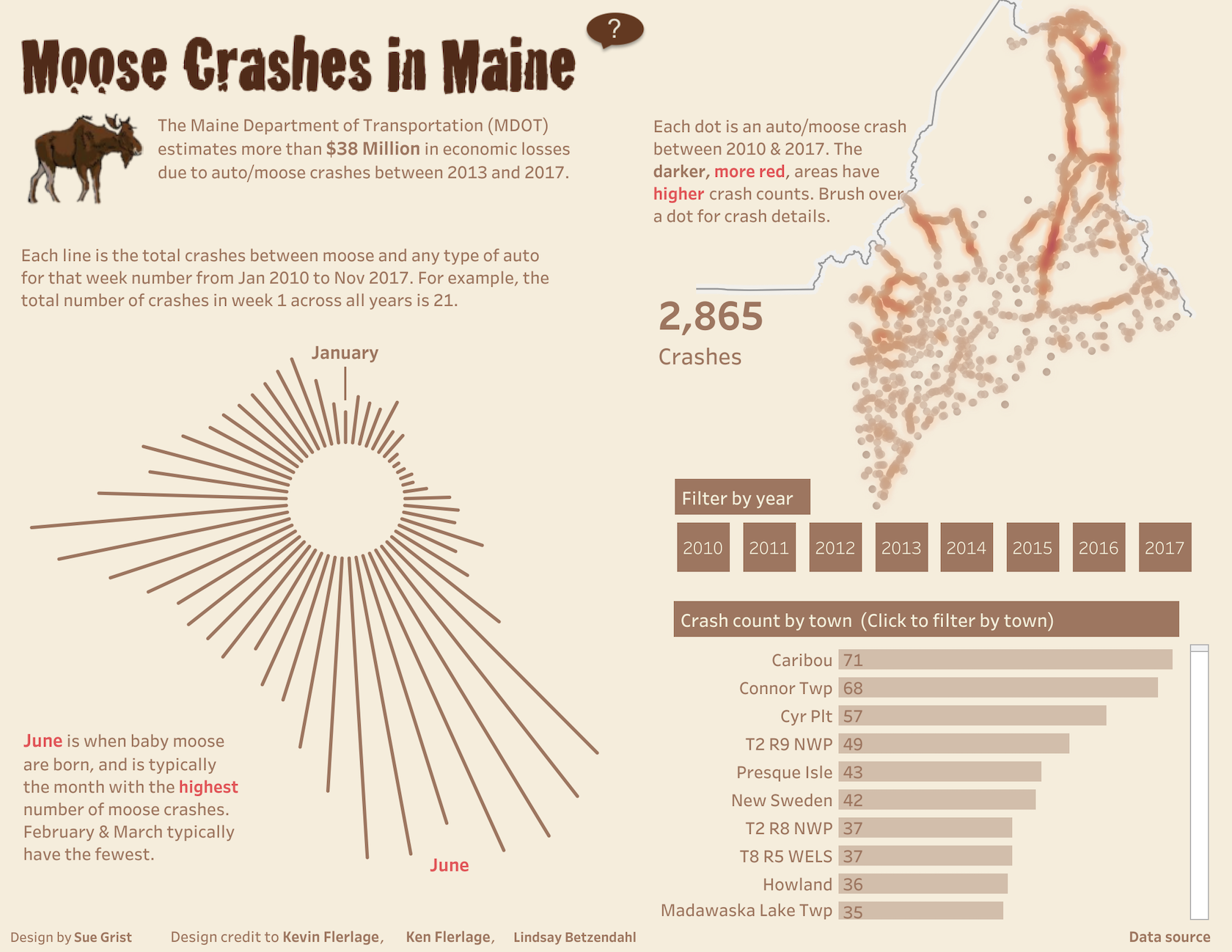
This data visualization shows the Human Rights Protection index (from 1950 to 2014) and the Human Rights Violations index (in 2014) for 50 countries. (by Federica Fragapane )
Data Visualization Tools Comparison
There are dozens, if not hundreds, of applications, tools, and scripts available to create visualizations of large data sets. Many are very basic and have a lot of overlapping features.
But there are standouts that either have more capability for the types of visualizations they can create or are significantly easier to use than the other options out there.
Tableau (and Tableau Public)
Tableau has a variety of options available, including a desktop app, server and hosted online versions, and a free public option. There are hundreds of data import options available, from CSV files to Google Ads and Analytics data to Salesforce data.
Output options include multiple chart formats as well as mapping capability. That means designers can create color-coded maps that showcase geographically important data in a format that’s much easier to digest than a table or chart could ever be.
The public version of Tableau is free to use for anyone looking for a powerful way to create data visualizations that can be used in a variety of settings. From journalists to political junkies to those who just want to quantify the data of their own lives, there are tons of potential uses for Tableau Public. They have an extensive gallery of infographics and visualizations that have been created with the public version to serve as inspiration for those who are interested in creating their own.
Pros
- Hundreds of data import options
- Mapping capability
- Free public version available
- Lots of video tutorials to walk you through how to use Tableau
Cons
- Non-free versions are expensive ($70/month/user for the Tableau Creator software)
- Public version doesn’t allow you to keep data analyses private
Data Visualization Examples

A data visualization of unique words used by three central characters in the Game of Thrones book series.
Data visualizations can make public safety data easier to digest.

An interactive visualization of the highest-grossing actors of all time
Bottom Line
Tableau is a great option for those who need to create maps in addition to other types of charts. Tableau Public is also a great option for anyone who wants to create public-facing visualizations.
Infogram
Infogram is a fully-featured drag-and-drop visualization tool that allows even non-designers to create effective visualizations of data for marketing reports, infographics, social media posts, maps, dashboards, and more.
Finished visualizations can be exported into a number of formats: .PNG, .JPG, .GIF, .PDF, and .HTML. Interactive visualizations are also possible, perfect for embedding into websites or apps. Infogram also offers a WordPress plugin that makes embedding visualizations even easier for WordPress users.
Pros
- Tiered pricing, including a free plan with basic features
- Includes 35+ chart types and 550+ map types
- Drag and drop editor
- API for importing additional data sources
Cons
- Significantly fewer built-in data sources than some other apps
Examples
Visualizations can make complex topics easy to understand.

Charts make data easier to compare, year-to-year.

Maps are an excellent way to give a snapshot of worldwide data.
Bottom Line
Infogram is a great option for non-designers as well as designers. The drag-and-drop editor makes it easy to create professional-looking designs without a lot of visual design skill.
ChartBlocks
ChartBlocks claims that data can be imported from “anywhere” using their API, including from live feeds. While they say that importing data from any source can be done in “just a few clicks,” it’s bound to be more complex than other apps that have automated modules or extensions for specific data sources.
The app allows for extensive customization of the final visualization created, and the chart building wizard helps users pick exactly the right data for their charts before importing the data.
Designers can create virtually any kind of chart, and the output is responsive—a big advantage for data visualization designers who want to embed charts into websites that are likely to be viewed on a variety of devices.
Pros
- Free and reasonably priced paid plans are available
- Easy to use wizard for importing the necessary data
Cons
- Unclear how robust their API is
- Doesn’t appear to have any mapping capability
Examples

Stacked graph charts are an effective way to compare and contrast data.

Scatter plots are a simple way to represent data trends.

Line charts are effective at showing trends and comparisons.
Bottom Line
ChartBlocks has an excellent free plan, which is a big plus. The ease of use for creating basic charts and graphs is also outstanding.
Datawrapper
Datawrapper was created specifically for adding charts and maps to news stories. The charts and maps created are interactive and made for embedding on news websites. Their data sources are limited, though, with the primary method being copying and pasting data into the tool.
Once data is imported, charts can be created with a single click. Their visualization types include column, line, and bar charts, election donuts, area charts, scatter plots, choropleth and symbol maps, and locator maps, among others. The finished visualizations are reminiscent of those seen on sites like the New York Times or Boston Globe. In fact, their charts are used by publications like Mother Jones, Fortune, and The Times.
The free plan is perfect for embedding graphics on smaller sites with limited traffic, but paid plans are on the expensive side, starting at $39/month.
Pros
- Specifically designed for newsroom data visualization
- Free plan is a good fit for smaller sites
- Tool includes a built-in color blindness checker
Cons
- Limited data sources
- Paid plans are on the expensive side
Example

Scatter plots can show a multitude of data, especially when color-coded to show more points.
Bottom Line
Datawrapper is an excellent choice for data visualizations for news sites. Despite the price tag, the features Datawrapper includes for news-specific visualization make it worth it.
D3.js
D3.js is a JavaScript library for manipulating documents using data. D3.js requires at least some JS knowledge, though there are apps out there that allow non-programming users to utilize the library.
Those apps include NVD3 , which offers reusable charts for D3.js; Plotly’s Chart Studio , which also allows designers to create WebGL and other charts; and Ember Charts , which also uses the Ember.js framework.
Pros
- Very powerful and customizable
- Huge number of chart types possible
- A focus on web standards
- Tools available to let non-programmers create visualizations
- Free and open source
Cons
- Requires programming knowledge to use alone
- Less support available than with paid tools
Examples

Chord diagrams show relationships between groups of entries.

Showing geographic data is best done with data maps.

Voronoi maps are an interesting way to show geographic data.
Bottom Line
D3.js is only suitable for those designers who either have access to a programmer for help or have programming knowledge themselves.
Google Charts
Google Charts is a powerful, free data visualization tool that is specifically for creating interactive charts for embedding online. It works with dynamic data and the outputs are based purely on HTML5 and SVG, so they work in browsers without the use of additional plugins. Data sources include Google Spreadsheets, Google Fusion Tables, Salesforce, and other SQL databases.
There are a variety of chart types, including maps, scatter charts, column and bar charts, histograms, area charts, pie charts, treemaps, timelines, gauges, and many others. These charts can be customized completely, via simple CSS editing.
Pros
- Free
- Wide variety of chart formats available
- Cross-browser compatible since it uses HTML5/SVG
- Works with dynamic data
Cons
- Beyond the tutorials and forum available, there’s limited support
Examples

Combo charts show trends and comparisons.
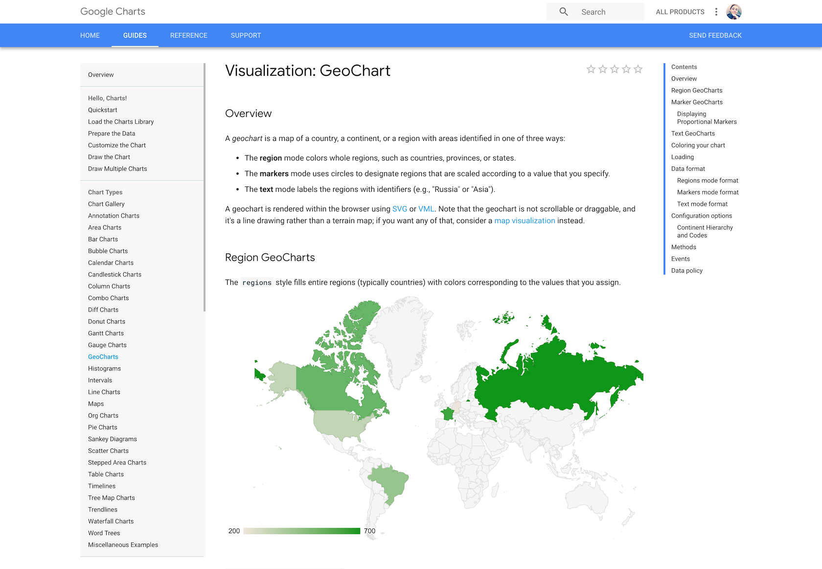
GeoCharts are just one method of visualizing data with Google Charts.

Annotations make charts and graphs easier to understand.
Bottom Line
Google Charts is a great option if a designer is somewhat comfortable with coding and wants a powerful, free solution. Being able to use any SQL database as a data source makes it a good option for large data sets, too.
FusionCharts
FusionCharts is another JavaScript-based option for creating web and mobile dashboards. It includes over 150 chart types and 1,000 map types. It can integrate with popular JS frameworks (including React, jQuery, React, Ember, and Angular) as well as with server-side programming languages (including PHP, Java, Django, and Ruby on Rails).
FusionCharts gives ready-to-use code for all of the chart and map variations, making it easier to embed in websites even for those designers with limited programming knowledge. Because FusionCharts is aimed at creating dashboards rather than just straightforward data visualizations it’s one of the most expensive options included in this article. But it’s also one of the most powerful.
Pros
- Huge number of chart and map format options
- More features than most other visualization tools
- Integrates with a number of different frameworks and programming languages
Cons
- Expensive (starts at almost $500 for one developer license)
- Overkill for simple visualizations outside of a dashboard environment
Examples
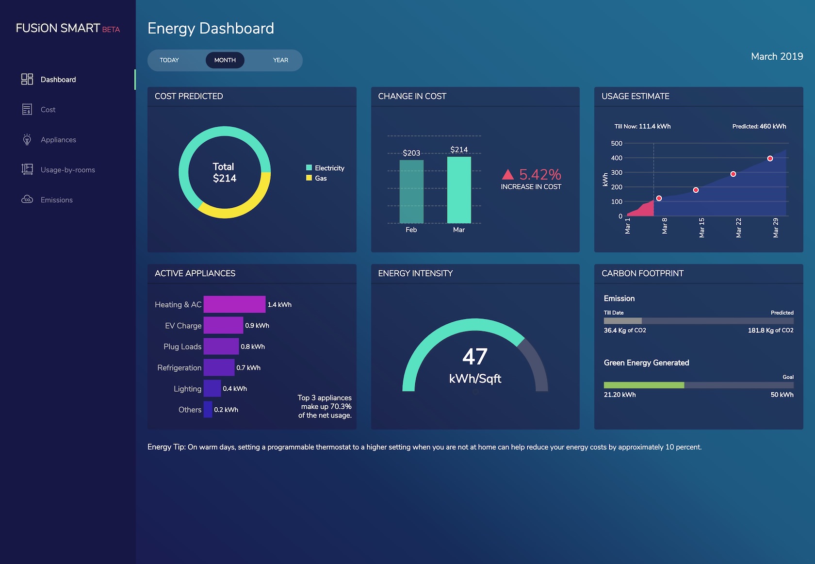
FusionCharts is designed for creating data visualization dashboards.

Dashboards can showcase numerous data visualizations side by side.
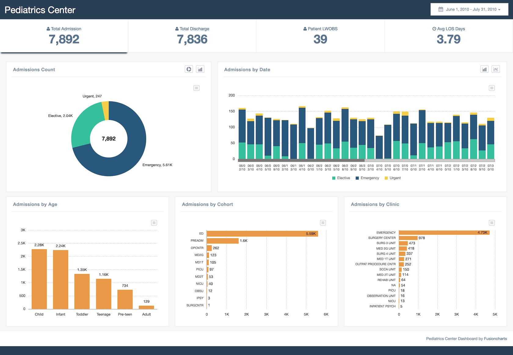
Managing business operations is done best with data visualization dashboards.
Bottom Line
For creating dashboards, nothing else in this article really compares to FusionCharts. If that’s the project at hand, this is undoubtedly the most powerful choice.
Chart.js
Chart.js is a simple but flexible JavaScript charting library. It’s open source, provides a good variety of chart types (eight total), and allows for animation and interaction.
Chart.js uses HTML5 Canvas for output, so it renders charts well across all modern browsers. Charts created are also responsive, so it’s great for creating visualizations that are mobile-friendly.
Pros
- Free and open source
- Responsive and cross-browser compatible output
Cons
- Very limited chart types compared to other tools
- Limited support outside of the official documentation
Examples

Bubble charts can showcase numerous data points simultaneously.
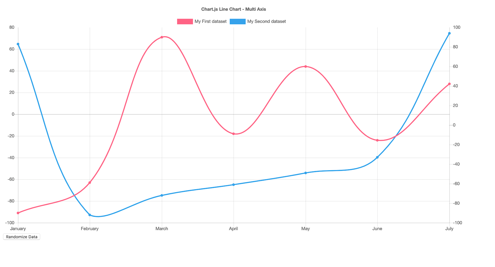
Multi-axis line charts are better when they're annotated (this one uses tooltips when hovering over points on the lines).
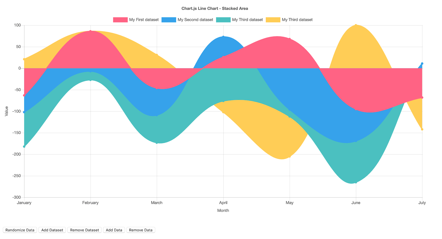
Stacked area line charts are visually striking visualizations.
Bottom Line
Chart.js is a good option for designers who need a simple, customizable, interactive visualization option. Its biggest selling points are that it’s free and open source.
Grafana
Grafana is open-source visualization software that lets users create dynamic dashboards and other visualizations. It supports mixed data sources, annotations, and customizable alert functions, and it can be extended via hundreds of available plugins. That makes it one of the most powerful visualization tools available.
Export functions allow designers to share snapshots of dashboards as well as invite other users to collaborate. Grafana supports over 50 data sources via plugins . It’s free to download, or there’s a cloud-hosted version for $49/month. (There’s also a very limited free hosted version.) The downloadable version also has support plans available, something a lot of other open-source tools don’t offer.
Pros
- Open source, with free and paid options available
- Large selection of data sources available
- Variety of chart types available
- Makes creating dynamic dashboards simple
- Can work with mixed data feeds
Cons
- Overkill for creating simple visualizations
- Doesn’t offer as many visual customization options as some other tools
- Not the best option for creating visualization images
- Not able to embed dashboards in websites, though possible for individual panels
Examples
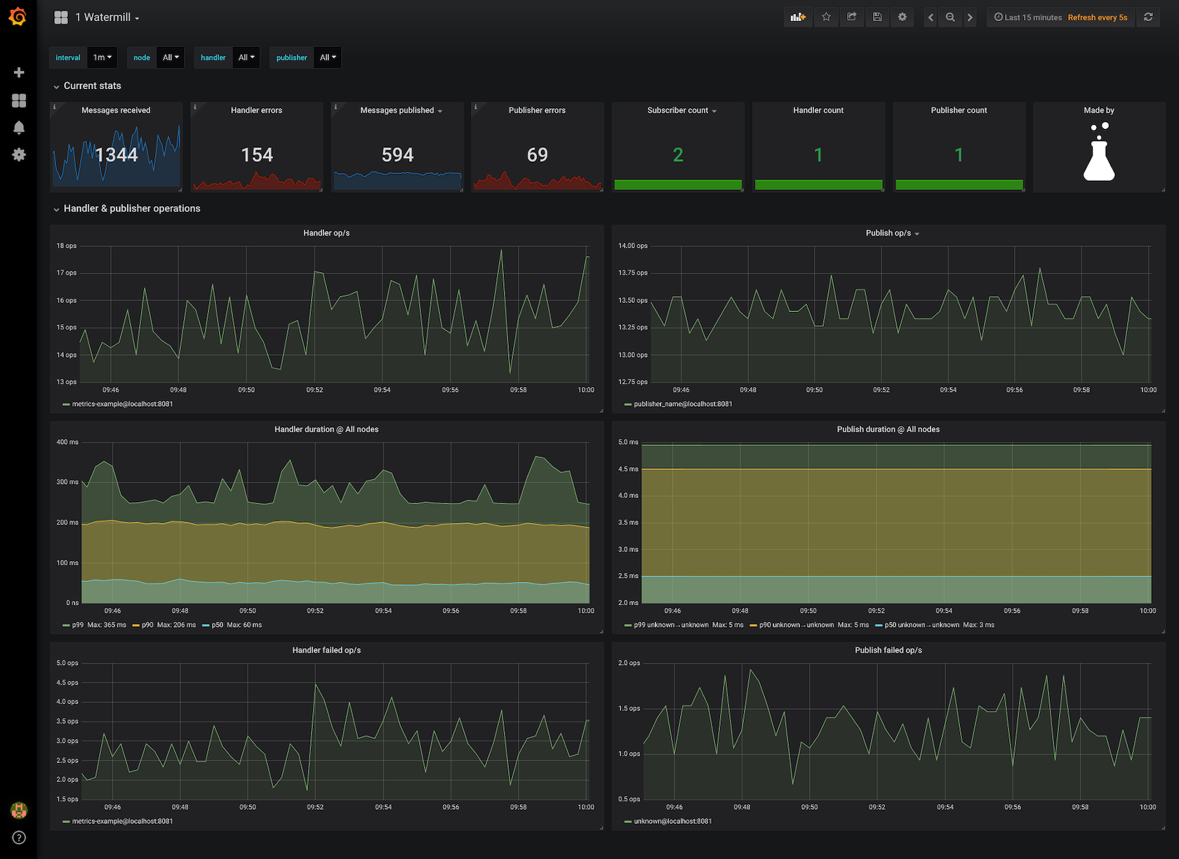
Grafana is a powerful data visualization dashboard tool.

Bottom Line
Grafana is one of the best options for creating dashboards for internal use, especially for mixed or large data sources.
Chartist.js
Chartist.js is a free, open-source JavaScript library that allows for creating simple responsive charts that are highly customizable and cross-browser compatible. The entire JavaScript library is only 10KB when GZIPped. Charts created with Chartist.js can also be animated, and plugins allow it to be extended.
Pros
- Free and open source
- Tiny file size
- Charts can be animated
Cons
- Not the widest selection of chart types available
- No mapping capabilities
- Limited support outside of developer community
Examples

Chartist.js offers a number of basic graph types.
Bottom Line
Chartist.js is a good option for designers who want simple, embeddable, responsive charts with a small file size.
Sigmajs
Sigmajs is a single-purpose visualization tool for creating network graphs. It’s highly customizable but does require some basic JavaScript knowledge in order to use. Graphs created are embeddable, interactive, and responsive.
Pros
- Highly customizable and extensible
- Free and open source
- Easy to embed graphs in websites and apps
Cons
- Only creates one type of visualization: network graphs
- Requires JS knowledge to customize and implement
Examples

Sigmajs creates network graphs exclusively.
Bottom Line
Because of its single focus, Sigmajs is a great option for creating network graphs as long as the designer is comfortable with JavaScript.
Polymaps
Polymaps is a dedicated JavaScript library for mapping. The outputs are dynamic, responsive maps in a variety of styles, from image overlays to symbol maps to density maps. It uses SVG to create the images, so designers can use CSS to customize the visuals of their maps.
Pros
- Free and open source
- Built specifically for mapping
- Easy to embed maps in websites and apps
Cons
- Only creates one type of visualization
- Requires some coding knowledge to customize and implement
Examples

In this case, the data represented is a photoset from NASA's Earth Observatory.

A representation of Flickr geotagged photos
Bottom Line
Polymaps is a good option if maps are the only type of visualization required, as long as the designer is comfortable with some basic coding.
Conclusion
There is such a huge variety of visualization tools available to designers that it can be hard to decide which one to use. Data visualization designers should keep in mind things like ease of use and whether a tool has the features they need.
Selecting the most powerful tool available isn’t always the best idea: Learning curves can be steep, requiring more resources to just get up and running, while a simpler tool might be able to create exactly what’s needed in a fraction of the time. Remember, though, that the tool is only part of the equation in creating a data visualization; designers also need to consider what else goes into making a great data visualization.
Most data visualization tools include free trials (if the entire tool isn’t free), so it’s worth taking the time to try out a few before deciding on a single solution.
• • •
Further reading on the Toptal Design Blog:
- Data Visualization – Best Practices and Foundations
- Get Inspired With These Data Visualizations
- Dashboard Design – Considerations and Best Practices
- If You’re Not Using UX Data, It’s Not UX Design
- Strength in Numbers – An Overview of Data-Driven Design
Understanding the Basics
What are the best data visualization tools?
The best data visualization tools include Google Charts, Tableau, Grafana, Chartist.js, FusionCharts, Datawrapper, Infogram, ChartBlocks, and D3.js. The best tools offer a variety of visualization styles, are easy to use, and can handle large data sets.
What are data visualization tools?
Data visualization tools provide designers with an easier way to create visual representations of large data sets. When dealing with data sets that include hundreds of thousands or millions of data points, automating the process of creating a visualization makes a designer’s job significantly easier.
What are data visualization techniques?
Data visualization techniques include charts (line, bar, or pie), plots (bubble or scatter), diagrams, maps (heat maps, geographic maps, etc.), and matrices. There are many variations on these specific techniques that designers can use to meet specific visualization needs based on the data they’re working with.
Why do we use data visualization?
Large data sets with thousands or millions of data points are almost impossible to discern usable information or draw conclusions from unless some kind of visualization is employed, whether it’s a basic graph or an interactive data visualization dashboard.
How important is data visualization?
Without data visualizations, drawing conclusions from large data sets or even discerning usable information from them is almost impossible. Using data visualization methods, designers can make information understandable for stakeholders.
Recommend
About Joyk
Aggregate valuable and interesting links.
Joyk means Joy of geeK