

Design Principles for Composable Architectures
source link: https://blog.bitsrc.io/design-principles-for-composable-architectures-2a8dcfb11998
Go to the source link to view the article. You can view the picture content, updated content and better typesetting reading experience. If the link is broken, please click the button below to view the snapshot at that time.
Design Principles for Composable Architectures
These principles will help you to design and implement robust composable architecture for your web applications.

In the ever-evolving software development landscape, the push towards building modular and flexible applications is still on the rise. Composable architectures stand at the forefront of this movement.
When creating composable architectures, several design principles and patterns, including DRY (Don’t Repeat Yourself), KISS (Keep It Simple, Stupid), YAGNI (You Aren’t Gonna Need It), and Domain-Driven Design (DDD), play crucial roles in shaping the design.
By leveraging these concepts, developers can create powerful and efficient systems that are less complex and reusable, focused on current needs, and closely aligned with business goals.
Understanding Composable Architectures
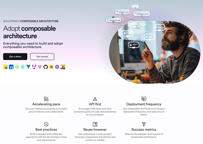
Before diving into the design patterns, it’s crucial to understand composable architectures. In essence, these architectures are made up of loosely coupled, interchangeable, and reusable components that can be selected and assembled in various combinations to meet specific application requirements.
Think of it as using Lego blocks. You can connect them to build anything from simple houses to complex castles. Each block is like a component in composable architectures, allowing for easy assembly and reassembly.
To implement these patterns to the fullest, platforms for composable software are often used. Let’s take a look at Bit and the Bit Platform as an example.
Bit Platform for composable software
Bit’s documentation site, bit.dev, implements a composable architecture with Bit components and the Bit platform. Each component on the web page is built with different components for frontend, backend, etc.
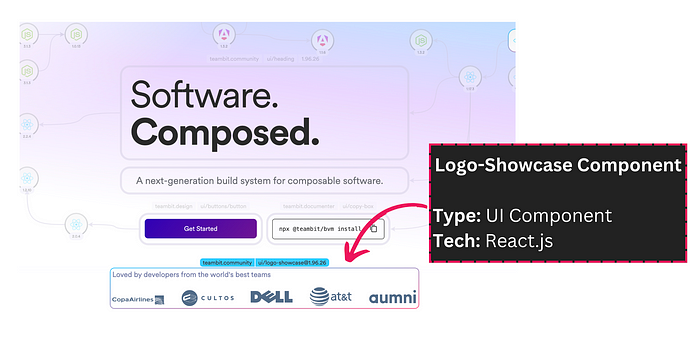
Component in https://bit.dev
We can independently view this component in bit.cloud and perform modifications, testing etc.
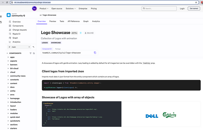
The component in a bit.cloud
The complete application is a collection of components composed together.
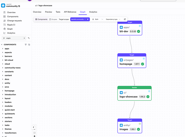
Dependency graph of logo-showcase component
Now, let’s look at several principles that help to shape your composable architecture for improved modularity and flexibility in the long run.
DRY Principle — Don’t Repeat Yourself
The DRY principle emphasises the importance of avoiding repetition. In a composable architecture, this means creating reusable components that can be shared across different parts of an application or even across projects.
By adhering to DRY, developers can reduce the overall codebase size, simplify maintenance, and ensure consistency throughout the application.
In a composable architecture, the components are built from bottom up. For instance, if we take the frontend, we start with the basic elements like buttons, text boxes, etc.
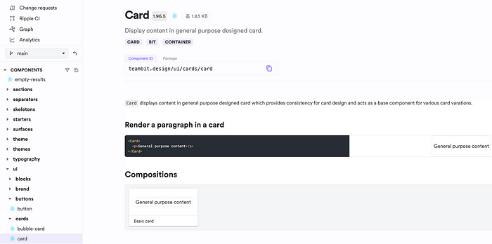
Card component
Then, we combine them to build complex reusable components and, finally, more concrete components like pages.
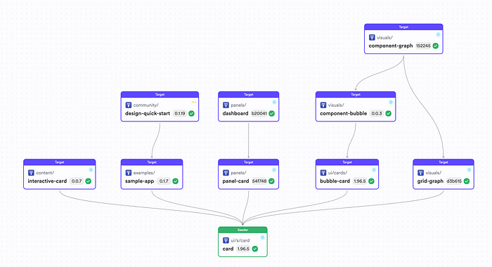
Card component dependencies
KISS-Keeping It Simple
The KISS principle advocates for simplicity in design. In the context of composable architectures, this means creating components that are straightforward to use and integrate without unnecessary complexity.
Simple components are easier to understand, test, and maintain, leading to more reliable software.
Let’s look at the card component implementation.
/* eslint-disable react/prop-types */
import React, { ReactNode, forwardRef } from 'react';
import classNames from 'classnames';
import styles from './card.module.scss';

export type CardProps = {
  /**
   * children to be rendered within the card.
   */
  children?: ReactNode;
} & React.HTMLAttributes<HTMLDivElement>;

export const Card = forwardRef<HTMLDivElement, CardProps>(function CardWithRef(props, ref) {
  return (
    <div ref={ref} className={classNames(styles.card, props.className)} {...props}>
      {props.children}
    </div>
  );
});
The logic in the component is pretty straightforward. It wraps react components; we pass to it as children.
The same concept applies to complex components, which are simply a collection of other components composed together.
import React, { ReactNode } from 'react';
import classNames from 'classnames';
import { Card, CardProps } from '@teambit/design.ui.cards.card';
import { Icon } from '@teambit/design.elements.icon';
import styles from './panel-card.module.scss';
import { Link } from '@teambit/design.ui.navigation.link';
import { PanelCardSkeleton } from './panel-card-skeleton';

export type PanelCardProps = {
  /**
   * title of the card.
   */
  title: string;

/**
   * icon to display.
   */
  icon?: string;

/**
   * heading link.
   */
  href?: string;

/**
   * approximate number of items being loaded.
   */
  loading?: number;

/**
   * contents to be rendered in the card.
   */
  children?: ReactNode;
} & CardProps;

export function PanelCard({ children, title, icon, href, loading, className }: PanelCardProps) {
  if (loading) return <PanelCardSkeleton count={loading} />;
  return (
    <Card className={classNames(styles.panelCard, className)}>
      <div className={styles.cardTitle}>
        {icon ? <Icon of={icon} className={styles.icon} /> : ''}
        {href ? <Link className={styles.link} href={href}>{title}</Link>: title}
      </div>
      {children}
    </Card>
  );
}
YAGNI and Composable Architectures
YAGNI is a principle originating from Extreme Programming (XP) that emphasizes the importance of not implementing software features or functionalities until they are absolutely necessary. The core idea is to avoid overengineering and keep the solution simple and lean.
In practice, YAGNI challenges developers to question the immediate value of every feature, enhancement, or architectural decision, encouraging a focus on what is truly essential.
In composable architectures, the YAGNI principle helps focus on the components and features that are immediately required and valued by the users. Here’s how YAGNI can be applied in the context of composable architectures:
- Simplify Component Design: When designing components, YAGNI guides developers to include only the functionalities that the current understanding of the system requires. This approach not only speeds up the development process but also ensures that components are easier to understand, test, and maintain.
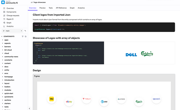
If we look at the logo showcase component, it only renders a list of logs, we provide to it. Since the only requirement is to showcase the logos in the bit.dev website, the icon doesn’t support adding a link for navigation.
A good way to find this is by looking at the optional attribute your component accepts. If there are too many optional attributes, that gives an indication that its drifting from following YAGNI principles.
- Reduce Overhead: By avoiding the premature implementation of features “just in case” they are needed in the future, teams can reduce the cognitive and technical overhead associated with managing unused or rarely used functionalities. This lean approach facilitates quicker iterations and adaptations as the project evolves.
- Enhance Agility: Composable architectures thrive on quickly adapting to changing requirements. Adhering to YAGNI enhances this agility, as the codebase remains clean and focused, devoid of unnecessary complexities that could hinder refactoring or extending the system.
- Focus on Value Delivery: YAGNI perfectly aligns with the agile methodology’s emphasis on continuous value delivery. By implementing only what is necessary, teams can ensure that every development cycle results in tangible progress and value for the stakeholders, enhancing customer satisfaction and project momentum. In a composable architecture, it also helps to modify the components that are absolutely necessary to add value.
DDD — Domain Driven Design
To effectively integrate DDD within composable architectures, it’s essential to understand how DDD’s strategic and tactical patterns can complement the design and implementation of modular components.
Strategic Design and Bounded Contexts
Strategic design in DDD emphasizes the importance of identifying distinct bounded contexts within the business domain. A bounded context defines clear boundaries around a specific domain model, ensuring that models within the context are internally consistent but can vary across different contexts.
In composable architectures, this concept is invaluable for designing modular components that are focused, coherent, and aligned with specific areas of the business domain. Each bounded context may include a collection of components to address the specific needs and rules of each context, promoting clarity and reducing complexity.
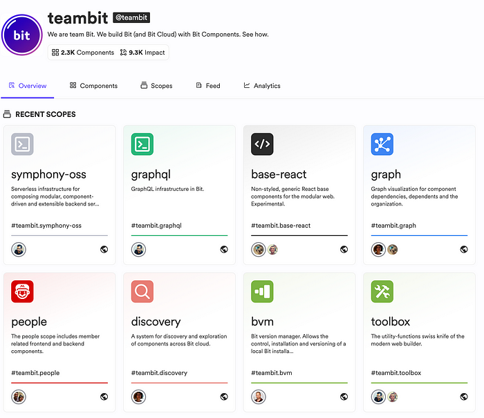
Group components into scopes that represent a bounded context
Using bit, you can create scopes in bit.cloud for each bounded context, where you can apply permissions and decide who can create, edit, and modify components. However, since bit enables collaboration at its core, you can still contribute back as change requests across bounded contexts (bit scopes) as and when required.
Tactical Design and Building Blocks
DDD’s tactical design provides a set of patterns for modelling domain concepts, including entities, value objects, aggregates, domain events, and services. These patterns can guide the development of composable components, ensuring they are designed with domain logic in mind.
- Entities and Value Objects: In composable architectures, components can be designed to represent entities (objects with a distinct identity) and value objects (objects that describe aspects of the domain with no conceptual identity). For example, a “Product” entity in an inventory system might be a reusable component across various modules of an application.
- Aggregates: DDD aggregates are clusters of domain objects that can be treated as a single unit. Designing components that encapsulate aggregates ensures that changes to the group are consistent, reducing the risk of corrupting domain invariants.
- Domain Services: These stateless services encapsulate domain logic that doesn’t naturally fit within an entity or value object. In a composable architecture, such services can be implemented as standalone components, providing reusable logic across contexts.
Recommend
About Joyk
Aggregate valuable and interesting links.
Joyk means Joy of geeK