

Single-Space Challenge: Trying to Manage My macOS Windows All in One Virtual Des...
source link: https://www.macstories.net/stories/single-space-challenge-trying-to-manage-my-macos-windows-all-in-one-virtual-desktop/
Go to the source link to view the article. You can view the picture content, updated content and better typesetting reading experience. If the link is broken, please click the button below to view the snapshot at that time.
Single-Space Challenge: Trying to Manage My macOS Windows All in One Virtual Desktop
A couple of weeks ago, in a members-only special episode of the Accidental Tech Podcast, John Siracusa went in-depth on his window management techniques on the Mac. This was absolutely fascinating to me. I strongly recommend checking the episode out if you can. One of the many reasons it captivated me is the fact that John Siracusa uses macOS in only a single space (the system’s name for virtual desktops) and lays out windows in a very specific way to take advantage of his entire display.
This is completely opposite of the way I’ve been managing and arranging windows on my Mac for the past ten years. To work on my Mac, I always heavily rely on having at least three spaces and switching between them on the fly depending on the task at hand. Moreover, I rarely keep more than two or three windows open at a time in each space.
However, since I’m always up for an experiment and shaking things up, I thought I would try going back to a single space on my Mac for a full week. I approached this by drawing inspiration from John Siracusa’s window management techniques and digging up an old Mac utility that helped me with the transition. I’ve learned a lot from this challenge; even more surprisingly, it has sparked in me a newfound interest in Stage Manager on the Mac.
Let me tell you how it went.
First, I should briefly catch you up on why I’m such a big fan of spaces on macOS.
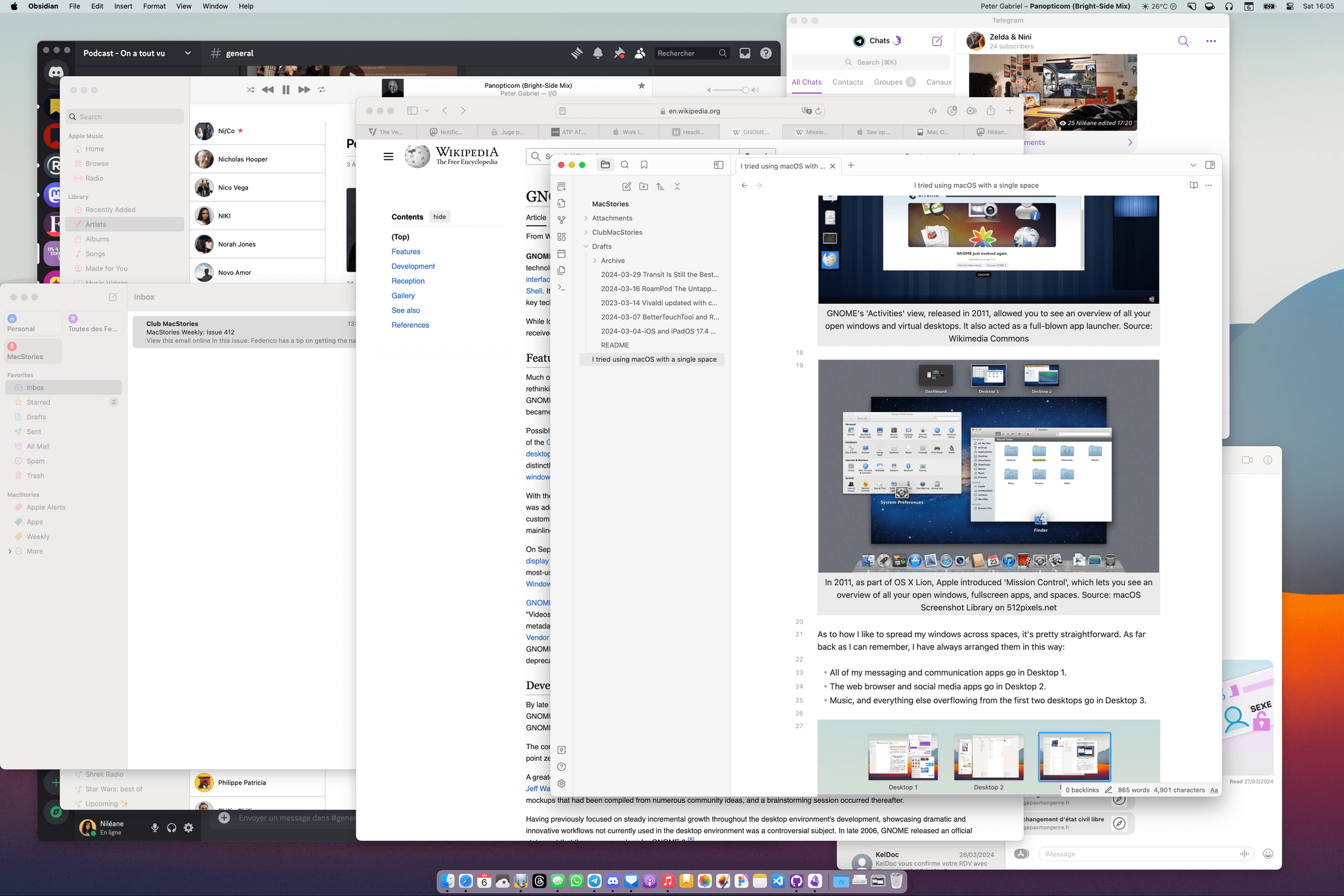
When I purchased my very first Mac about ten years ago, I was coming from many years of using Linux distributions as my main desktop operating systems. At the time, I was particularly fond of the GNOME desktop environment, which started featuring a radically-redesigned user interface in 2011 called GNOME Shell. That UI had one huge appeal for me: an overview called ‘Activities’ where you could see all your open windows and all your virtual desktops laid out in a bird’s-eye view. Sound familiar? That same year, as part of Mac OS X 10.7 Lion, Apple also introduced a similar UI paradigm called ‘Mission Control’, which lets you see all your open windows, fullscreen apps, and active spaces in a single interactive overview.
So suffice it to say, after switching to a Mac, I was feeling right at home. GNOME had already engraved in my brain this habit of spreading my open windows across virtual desktops and constantly moving between them thanks to its intuitive UI. On the Mac, Mission Control allowed me to keep working this way, and that has been the case for the past ten years now. The Mac even has a special advantage to bring this workflow together: an amazing trackpad experience. To this day, nothing beats macOS’s fast and fluid three-finger swipe gesture to flick between spaces on the fly.
](https://cdn.macstories.net/gnome_3-2_shell-1712422342482.png)
GNOME’s ‘Activities’ view, released in 2011, allowed you to see an overview of all your open windows and virtual desktops. It also acted as a full-blown app launcher. Source: Wikimedia Commons
](https://cdn.macstories.net/10-7-lion-mission-control-2-1712422347369.png)
In 2011, as part of OS X Lion, Apple introduced ‘Mission Control’, which lets you see an overview of all your open windows, fullscreen apps, and spaces. Source: 512 Pixels macOS Screenshot Library
As for how I like to spread my windows across spaces, it’s pretty straightforward. As far back as I can remember, I have always arranged them in this way:
- All of my messaging and communication apps go in Desktop 1.
- The web browser goes in Desktop 2.
- Music, plus everything else overflowing from the first two desktops, goes in Desktop 3.
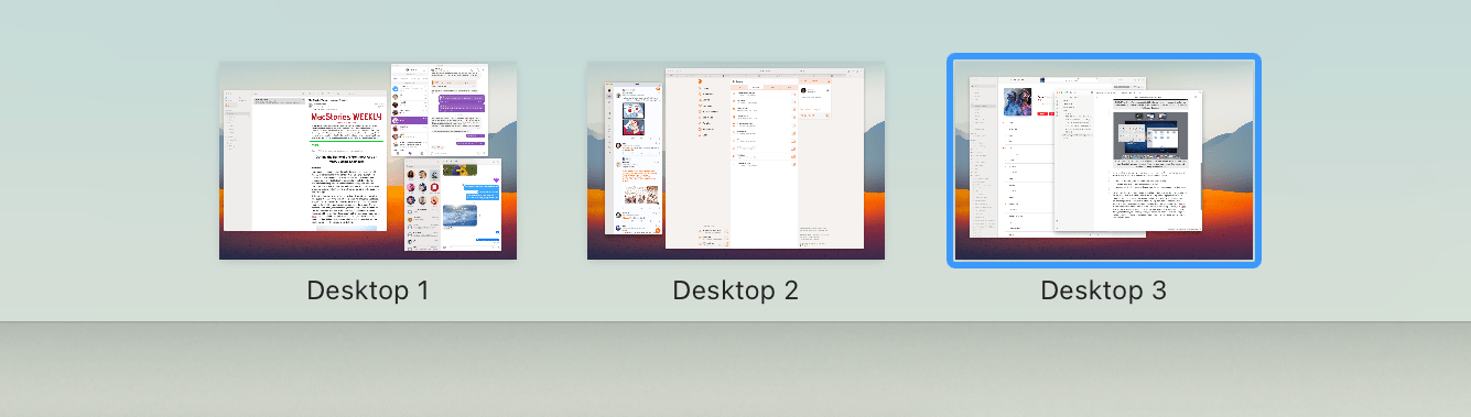
My usual three-space setup. Communication apps live in Desktop 1, Safari in Desktop 2, and everything else in Desktop 3.
While this is flexible and can change to fit specific tasks, the main constant is to always keep Safari in Desktop 2, and always keep my messaging apps in Desktop 1. They’re my anchor windows. The only exception is when I’m on a call, in which case I usually bring Discord or Zoom to Desktop 2 to keep them side by side with Safari.
Otherwise, when I’m working on a document or researching something, I like to add Notes or Obsidian to Desktop 2, next to Safari. Similarly, if I’m working on a design in Figma or a project in VS Code, that’s going to happen in Desktop 2 where the browser is. And if, during any of those tasks, I need to reply to a message, I can just swipe on the trackpad with three fingers to switch to Desktop 1 where all my communication apps live, then swipe back to Desktop 2 or 3 when I’m done.
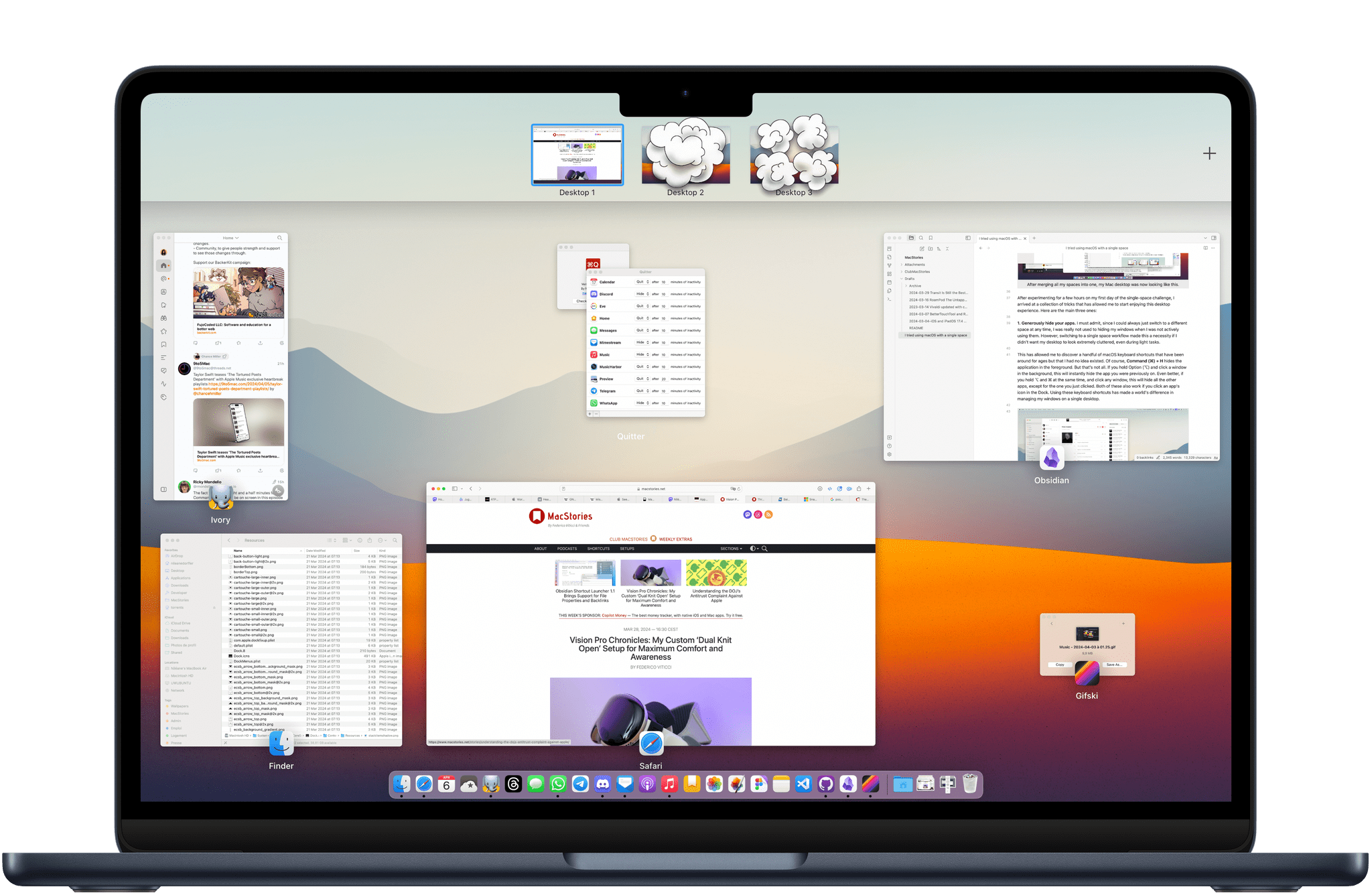
Now you can probably see why getting rid of my spaces and using only one instead might be a considerable challenge for someone like me.
Still, I went ahead and deleted my two extra spaces. Now, with all my windows stacked in a single space, I had to experiment with ways to make this work – and make sense of the apparent mess.
After merging all of my spaces into one, my Mac desktop looked like this.
After experimenting for the first couple days of my single-space challenge, I put together a collection of tricks that have allowed me to start enjoying this experience. Here are the main three:
1. Generously hide your apps. I must admit, since I could always just switch to a different space at any time, I was really not used to hiding windows when I wasn’t actively using them. However, switching to a single-space workflow made this a necessity if I didn’t want my desktop to look extremely cluttered, even during light tasks. This led me to discover a handful of macOS keyboard shortcuts that have been around for ages but that I had no idea existed.
Of course, Command (⌘) + H hides the application in the foreground. But that’s not all. If you hold Option (⌥) and click a window in the background, this will instantly hide the app you were previously on. Even better, if you hold ⌥ and ⌘ at the same time and click any window, this will hide all apps except for the one you just clicked. Both of these also work if you click an app’s icon in the Dock. Using these keyboard shortcuts has made a world of a difference in managing my windows on a single desktop.
Cleaning up my desktop in a few seconds by holding ⌥ or ⌥ + ⌘ when clicking on windows.
Despite these useful shortcuts, I was still finding myself drowning in windows at times. This was mainly due to the fact that I frequently need to reopen Discord and other messaging apps like WhatsApp and Telegram, and I tend to leave those visible in the background even when I’m done with them. To solve this, I dug up a tiny utility that I hadn’t launched in a long time: Quitter by Marco Arment.
Quitter is a fantastic free Mac app that automatically hides or quits apps after a set amount of time. I’ve set it to hide all my messaging apps automatically after 10 minutes of inactivity. The result is that they’re still open and active in the background if I need them, but their windows will go away even I forget to hide them manually.
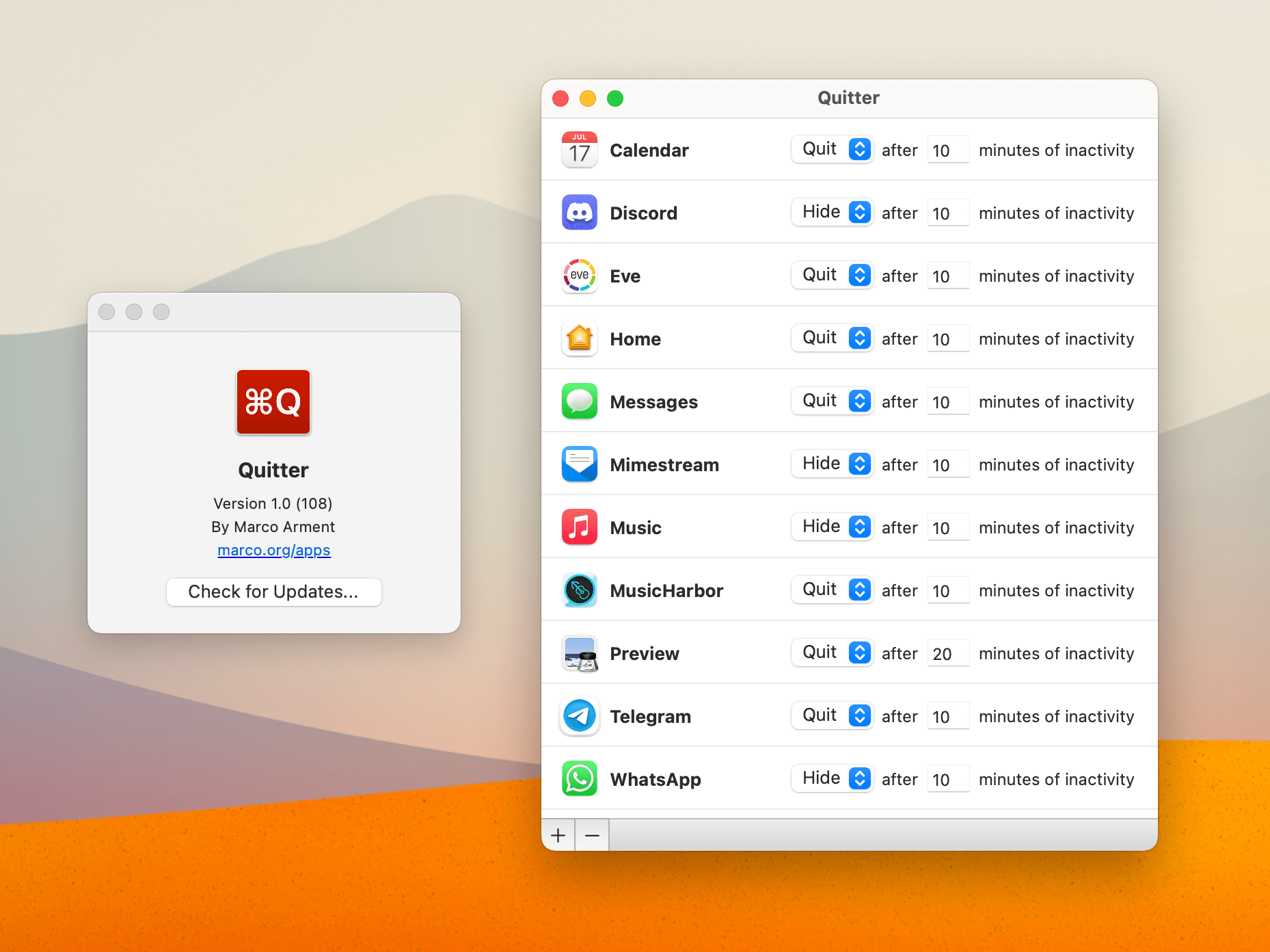
My Quitter rules include most of my messaging apps.
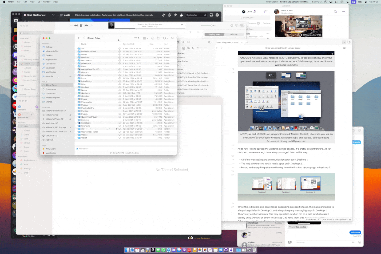
2. Find a pattern to arrange your windows onscreen. If this experiment has taught me one thing, it’s that you can make your life a lot easier if you place and resize every window with intention, instead of just letting them pile up wherever they spawn. Let me explain.
In my case, since the web browser is central to most, if not all, of my workflows, I came up with a general way of organizing my windows onscreen that makes a lot of sense to my brain: Now, I always keep the Safari window in the center of the screen, with every other window around Safari along the edges of the display, as if they’re only poking out from under the Safari window. I like to think of it as an imperfect planetary system. Safari is Saturn, and all the other apps are its orbiting moons. Moon windows can move around Safari freely, but Safari always remains in the center.
And if, at any point, I need to focus on a single application, I can just ⌥ + ⌘ + click it to make it the only visible window, then temporarily move it to the center of the screen.
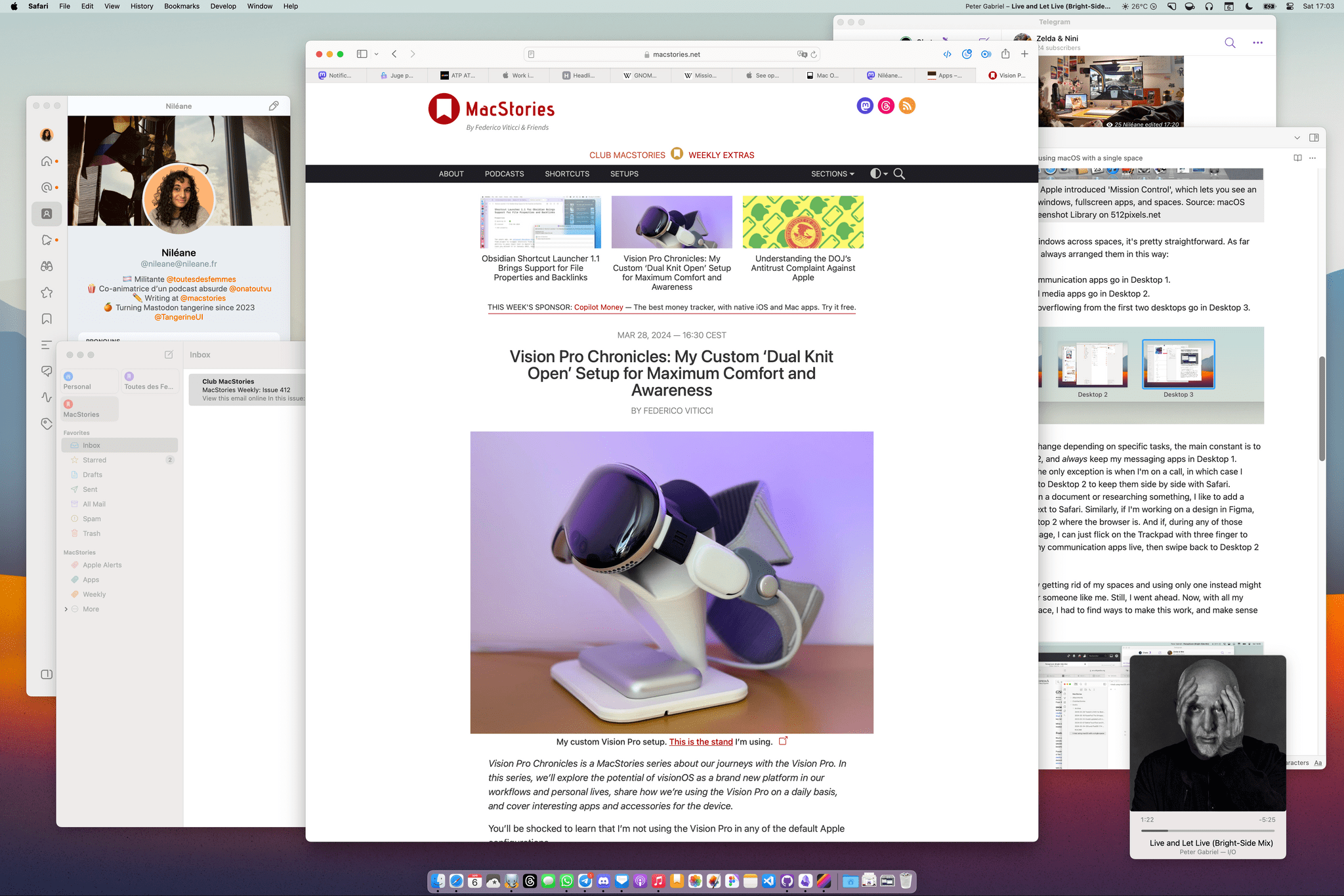
Making sense of my single-space desktop: I keep Safari in the center and all the other apps “in orbit” around it. To the left of Safari are Ivory and Mimestream. Telegram is in the top right corner, Obsidian on the right side of the screen, and Music in the bottom right.
A key part of making this work is not being afraid to make your windows smaller. Apps don’t have to fill the entire screen to be useful. Some apps can even be super tiny and still be fully usable in a corner of the display. This is especially true for Safari and other web browsers. In a world where most people access the web on their phones, most sites will work just fine in a narrow window.
This has also led me to rediscover the Music app’s MiniPlayer window, which you can activate by clicking on the album art of the currently playing track. (You can also ⌥ + click the album art to open the MiniPlayer while keeping the main window open.) The MiniPlayer is super easy to tuck in a corner of the screen so you can keep an eye on your current queue at all times. This has been a nice way to curb my habit of always keeping the main Music window open.
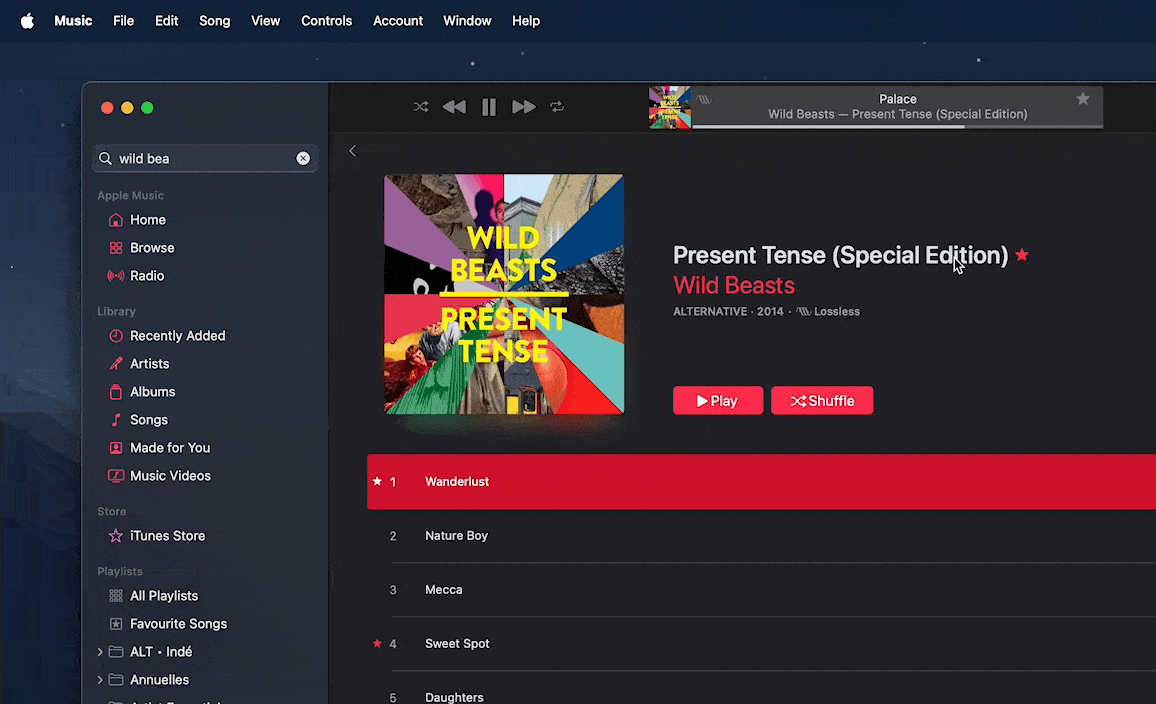
In the Music app, click the currently playing album art to switch to the MiniPlayer, or ⌥ + click the album art to open the MiniPlayer above the main Music window.
My Safari-focused “planetary system” arrangement is obviously very personal, and it may or may not work for you. If you want to try this approach, I recommend first thinking about which app would work best as your centered window.
3. Give Stage Manager a try. Alright, this may be a controversial one. As you know, Stage Manager, first introduced in macOS Ventura, is Apple’s newest mode for managing windows on your Mac’s desktop. It lets you group windows together and lists your recently active apps on the left edge of the screen. To be honest, despite loving some aspects of working with Stage Manager on the Mac, I think it still has many flaws I can’t quite get over.
Stage Manager has felt superfluous to me since its release. After all, I was already used to grouping my windows together; I was just doing it using macOS’s spaces. However, during my single-space challenge, I was inexorably drawn back to it.
Stage Manager is an amazing way of eliminating clutter on your desktop with a single click in Control Center, and I found myself turning it on sporadically instead of relying on my above two tricks for managing windows. In many cases, it was just simpler to use Stage Manager instead of thinking about where and how I should place my apps. And I must admit, the way it positions your active app in the center of the screen while still letting you keep an eye on all the other apps that are running to the side – it clicks for me.
One other reason that I was drawn to Stage Manager during the single-space challenge is that I had a really hard time kicking the habit of swiping with three fingers to switch between spaces. I often found myself reflexively swiping with three fingers to no effect. To address this, I re-enabled one of my BetterTouchTool triggers, which allows me to three-finger swipe between app groups in Stage Manager.
With the addition of this gesture, Stage Manager is so close to being perfect. If it had a setting to open new windows in the current stage instead of spawning a new one every time, and the ability to reorder the app groups in the strip by dragging them, I would keep it on permanently. But for now, I just like to toggle it on and off depending on the state of my desktop.
Now that my single-space challenge is over, I find myself at a crossroads. To my surprise, this experiment has been quite enjoyable, and now I honestly can’t decide whether I want to continue this way or revert to my ten-year-old three-space setup. The answer is that I’m probably going to land somewhere in-between. I will keep using a three-space setup, but I will upgrade Desktop 2 (the center space) to the Safari-focused “planetary system” arrangement. Similarly, I will consider turning on Stage Manager when one of my of spaces gets too crowded.
Overall, this past week has made me realize how amazing macOS can be when it comes to window management. While it is severely lacking in some areas, especially when it comes to tiling and snapping windows, the fact that you can pick and choose which layers of Apple’s window management tools you want to leverage means that, in just a week, you can get used to a workflow that would have felt completely alien before. There is a certain beauty to this. My only hope is that Apple finally iterates on Stage Manager this year.
Recommend
About Joyk
Aggregate valuable and interesting links.
Joyk means Joy of geeK