

Creating Extensible React UI Components
source link: https://blog.bitsrc.io/how-to-create-extensible-react-ui-components-88d722bc6e68
Go to the source link to view the article. You can view the picture content, updated content and better typesetting reading experience. If the link is broken, please click the button below to view the snapshot at that time.
Creating Extensible React UI Components
Build extendable and scalable React components in 2024!

If you’re building a design system, or a set of UI components it’s important to make sure that they’re extensible. Simply put, you need to treat your UI components as “base components” with little to no dependencies, but with many dependents.
But, what does this mean?
For instance, consider the component tree below:
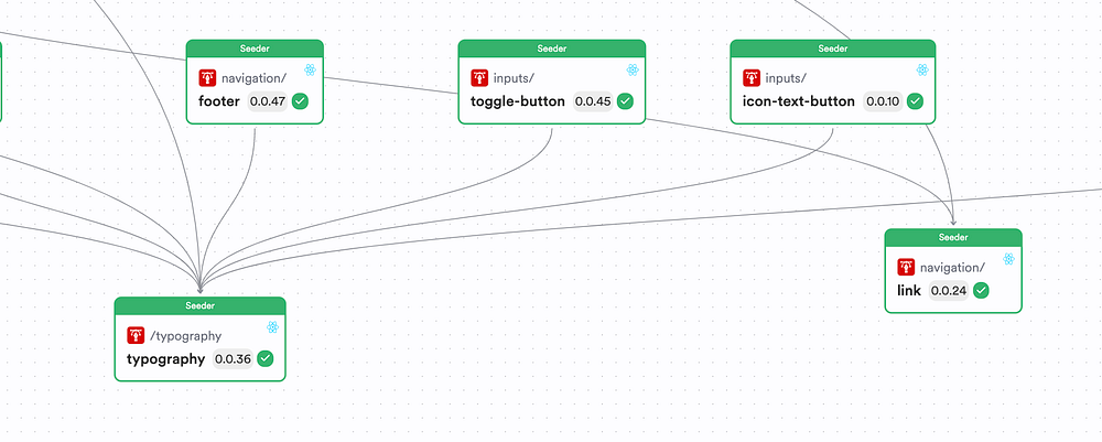
If you look at the Typography and the Link components, you can see that:
- These React components are being used as foundational blocks to build the rest of the design system.
- These components have no dependencies with components. Instead, these components have dependents, where every other component in the UI library/ design system uses these two components to create other components.
But, sometimes, you can make your base components depend on certain libraries. For example, if you were building your base components with Material UI, you’d likely have your base components depending on MUI.
But apart from that, you wouldn’t have your base components depend on other components as this looses its extendibility.
Pst, if you wish to check out the code to creating an extendible component, check out my Bit Scope.
How To Design an Extendible Component?
To make a component extendible, you need to make sure that it has three properties:
- A component API
- A theme
- A customizable nature
Let’s take a look at each property in detail to understand how it truly makes your components extendible. To do so, let’s create a React component with Bit.
“Why Bit?” — You might wonder.
Well, think of it like this. If you’re building a UI Library, you’d likely want to manage your components independently right?
For instance, different users might want to update components that are part of your library and propagate the changes to all of its usages right?
And, that’s exactly where Bit shines.

Bit is a next-generation build system for composable software. It lets you design, develop, build and version components in an isolated space while it’s CI Server — Ripple CI propagates changes that you make to a single component across the component tree.
With this, you’d be able to create independent React components for your UI library and maintain them in isolation. So, let’s create a React component with Bit and see how we can make it extendible.
Step 01 — Pre-requisites
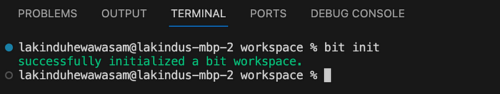
To create a React component with Bit, let’s first install Bit. Use Bit’s version manager (BVMM) to install Bit globally and then initialize a workspace.
The workspace will let us build our components.
# install bit
npx @teambit/bvm install

# initialize workspace
bit init
Note, workspaces aren’t tied to a language. You can build different components like Node.js, Angular, Next.js and React in a single workspace using Bit Environments.
Once you’ve done this, you should see the output:
Step 02 — Creating a React Component
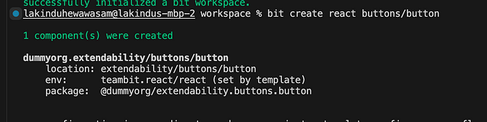
Next, let’s create a React component. To do so, run the command:
bit create react buttons/button
This will create a component named Button, and will generate the output:
Next, run bit start to launch your Bit server. All changes you make to components will be visible here in real time.
Now, let’s see how we can make this extendible.
Step 03 — Making Components Extendible
Now, as a recap, an extendible component has three properties:
A Component API
You need to ensure that your component has an API that’s available for other components to use. This can be done by creating an index.ts file for your component and exporting all of its Type definitions and Component definition.
With Bit, this is already achieved when you create a component. For instance, inspect the Button component:
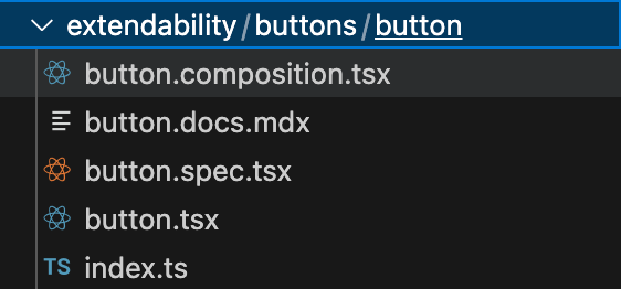
It has an index.ts file that once observed will show the following:
export { Button } from './button';
export type { ButtonProps } from './button';
As you can see, the Props and the Component definition has been exported for consumers to use. So, by doing so, consumers can create their extended Props that combines the Props of the Button onto their implementation.
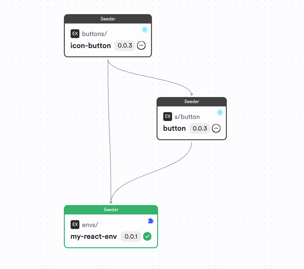
For example, if you had a second React component named IconButton that used the Button, you'd need to ensure that your IconButton can accept ButtonProps. This can achieved by doing the following:
import React, { ReactNode } from 'react';
import { Button, ButtonProps } from '@dummyorg/extendability.buttons.button';

export type IconButtonProps = {
  children?: ReactNode;
} & ButtonProps;

export function IconButton({ children, ...rest }: IconButtonProps) {
  return (
    <div>
      {children}
      <Button
        {...rest}
      />
    </div>
  );
}
As you can see, we’ve imported the ButtonProps to the IconButton component and we’ve combined the Prop types together with the IconButtonProps to ensure that the IconButton can accept the ButtonProps.
So, by making sure that your components have an exposed API, you allow other components to use the base components to its fullest potential.
Therefore, your implementation would look something like this:
By using the Button component API, we make our component add extendible behavior depending on the context it’s being used.
To view the full implementation of the IconButton, check out this Bit Component.
A Theme
Base components need to be themeable to maintain consistency in style, across compositions.
You need to style your component using JS variables or CSS custom props that correspond to your theme schema. Additionally, you can provide each prop with a fallback value.
For instance, if you were using an MUI Button, you’d have an implementation like this in your Button component:
import React from 'react';
import { Button as MUIButton, ButtonProps as MUIButtonProps } from '@mui/material';

export type ButtonProps = {
} & MUIButtonProps;

export function Button({ children, variant = 'contained', ...rest }: ButtonProps) {
  return (
    <MUIButton
      variant={variant}
      {...rest}
    >
      {children}
    </MUIButton>
  );
}
If you look closely, there’s a variant prop that I'm initializing with a default value of contained. By doing so, I'm enforcing that any consumer that uses the Button component with its default behavior render a contained button, as follows:
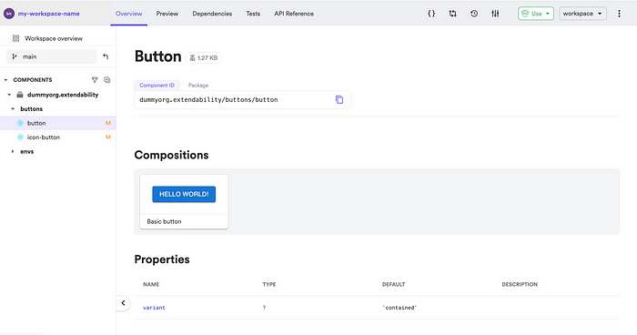
As you can see, the Button component now launches on contained state as a default.
By doing so, you make sure that your component usages remain consistent when used with no custom implementation by the consumer.
To checkout the full implementation, check out this Bit Component.
A Customizable Nature
If you have a component that’s customizable, there’s a higher chance of people using your component to make new ones.
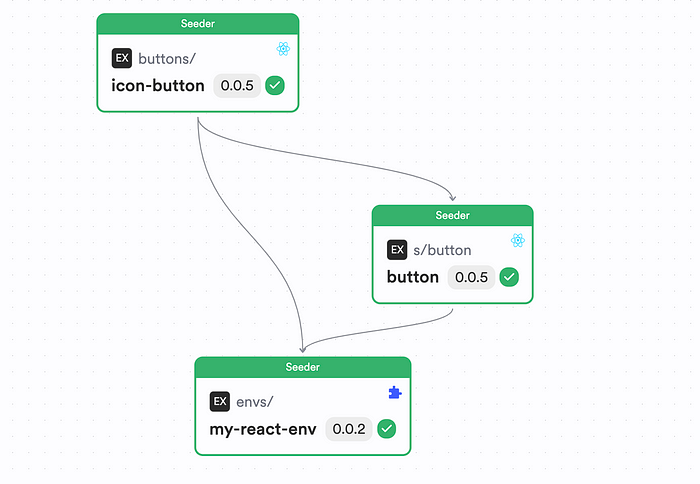
For instance, check out this component tree:
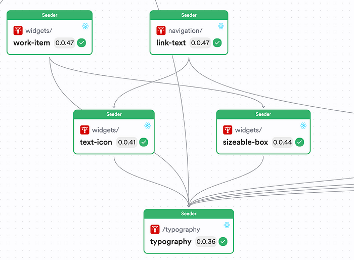
The Typography component has been used by all of these components for different implementations.
But, how is this possible?
Well, you have to design your component in a way where it can be extended for others to use. This can be done in two ways:
- Style Overrides
- Attribute Overrides
I’ve touched these two topics towards the start of the article, however, let’s explore this further in this section.
Style Overrides
You need to design your component in such a way that it should be able to accept “style” overrides.
To achieve this, have an optional className or style prop included in the component API as shown below:
export type ButtonProps = {
  /**
   * custom style object for style overrides
   */
  style?: React.CSSProperties
} & MUIButtonProps;
You can update the prop definition as shown above. By doing so, you let your consumers pass an optional style prop that they can use to customize the CSS of the component. Afterward, use the component as shown below:
export function Button({ children, style, variant = 'contained', ...rest }: ButtonProps) {
  return (
    <MUIButton
      variant={variant}
      style={style} // apply the style
      {...rest}
    >
      {children}
    </MUIButton>
  );
}
Pass the style prop to the original component as shown above for the custom styles to be applied.
Attribute Overrides
We’ve already done this, but you can include a ...rest (spread) prop in your component's API to make it extendable by additional attributes.
You can use this to target native HTML prop attributes such as aria attributes that might be difficult to remember. A component that leverages this would look as below:
import React, { JSX } from 'react';
import { Button as MUIButton, ButtonProps as MUIButtonProps } from '@mui/material';

export type ButtonProps = {
  /**
   * custom style object for style overrides
   */
  style?: React.CSSProperties
} & MUIButtonProps & JSX.IntrinsicElements['button'];

export function Button({ children, style, variant = 'contained', ...rest }: ButtonProps) {
  return (
    <MUIButton
      variant={variant}
      style={style}
      {...rest}
    >
      {children}
    </MUIButton>
  );
}
As shown above, I’ve leveraged the JSX.IntrinsicElements['button'] definition to apply all native HTML Button props to this Button. Next, with the use of the ...rest being applied on MUIButton applies all of the props passed from the parent.
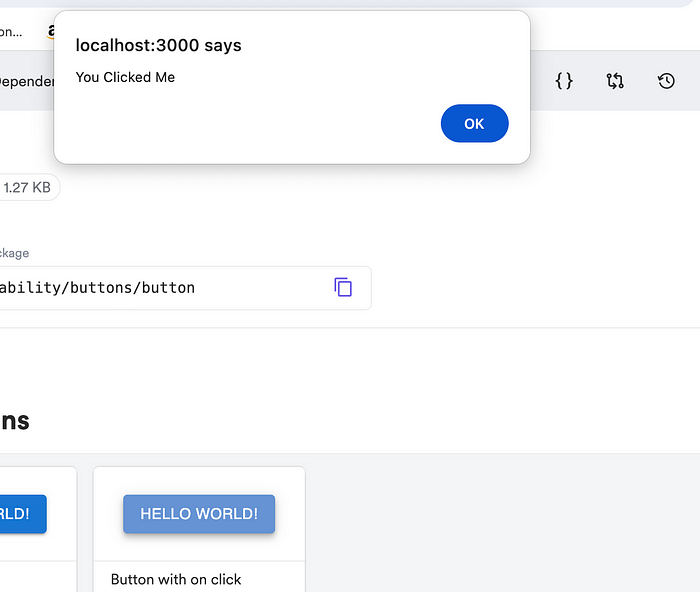
For instance, consider this composition:
export const ButtonWithOnClick = () => {
  return (
    <Button
      onClick={() => alert('You Clicked Me')}
    >hello world!</Button>
  );
}
We did not define an onClick prop for the Button. However, our component API still allows this. This is because we've leveraged type aggregating the applied all of the styles using spreading, that creates the following output:
Wrapping Up
And there we have it! It’s that easy to create extendible React components in 2024.
All you have to remember are three things — A Component API, A Theme and a Customizable Nature
If your component has these properties, your component is extendible by nature.
If you wish to check out the full implementation of this article, check out my Bit Scope.
Recommend
About Joyk
Aggregate valuable and interesting links.
Joyk means Joy of geeK