

Top 5 Principles for Building Effective Design Systems
source link: https://blog.bitsrc.io/5-principles-for-building-design-systems-0e2c23726dc8
Go to the source link to view the article. You can view the picture content, updated content and better typesetting reading experience. If the link is broken, please click the button below to view the snapshot at that time.
Top 5 Principles for Building Effective Design Systems
Explore Consistency, Scalability, Accessibility, Flexibility and Collaboration
If you are a designer, or a developer who is slowly stepping into designing systems, then this article is for you.
Consistency, Efficiency, User Experience are crucial when it comes to designing. To achieve these, designers and developers rely on a tool called Design Systems. So let’s get to know more about design systems.
What is a Design System?
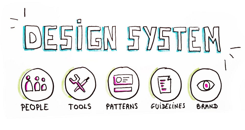
A design system is the process of designing the the solution we will build. It contains all the components and modules and how they interact, how data is processed, and the interface that will be used.
To effectively build design systems, certain rules and guidelines need to be considered. Therefore, this article dives into the top five principles for building effective design systems.
1. Consistency
What is Consistency in Design Systems?
Consistency is one of the crucial elements that need to be considered while building design systems. All the elements in the design system need to be consistent.
Consistency is not all about making everything look the same, it is about creating a cohesive user experience that feels familiar across different screens, devices, and interactions.
There are 4 types of consistency in design systems.
- Visual Consistency- Maintaining consistency in visual elements such as colors, typography, icons, spacing, and layout. Let’s consider the below example, newly updated Google icons follow the same color scheme.

- Functional Consistency- Maintaining consistency in user flows, and behavior across different parts of the product or platform.
- Content Consistency- Maintaining consistency in the tone of voice, language, and messaging throughout the product. For example, error messages need to follow the same pattern.
- Platform Consistency- Maintaining consistency across all platforms. Eg- iOS, Android.
Need for Consistency in Design Systems
By having a consistent design, it introduces the following benefits:
- It makes the interfaces more predictable and easier to navigate. Users can quickly learn how to interact with the product and find what they need.
- Consistent visual elements help maintain brand identity and make the product recognizable across different platforms.
- Design consistency streamlines the design and development process by providing reusable components and patterns. As a result, their work becomes more efficient.
- With a consistent design system in place, maintaining and updating the product becomes more manageable. Changes can be applied easily across the entire system.
Tools and Strategies For Maintaining Consistency
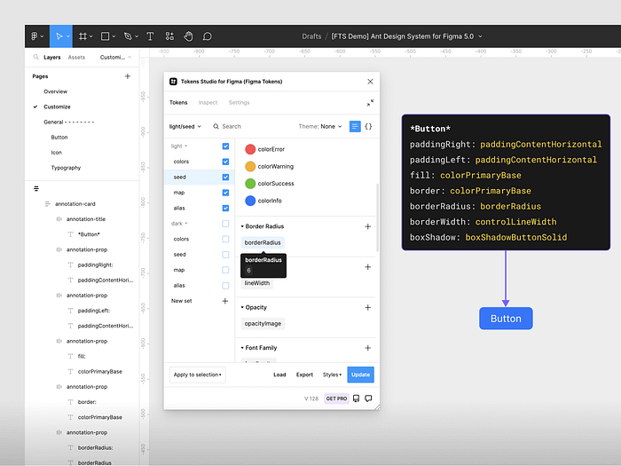
1. Design Tokens
These are variables that represent design properties like colors, typography, and spacing. Using design tokens ensures consistency. Let’s look at the below example.
2. Component Libraries
Building a library of reusable UI components and patterns allows designers and developers to maintain consistency across different parts of the product.
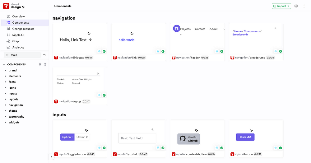
As you can see, if you build a set of reusable components that everyone can use, you ensure consistency in your design system as everyone uses the same version. For example, consider this usage tree:
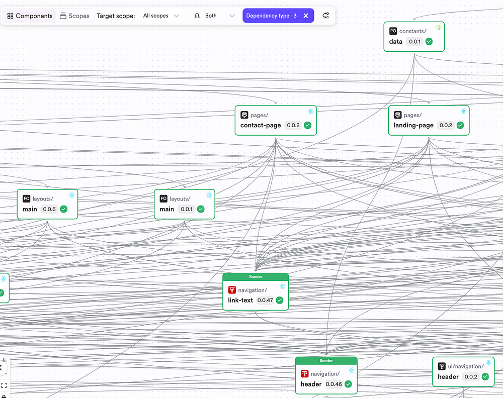
The usage of “header” traverses to different public consumers:
Everyone uses the same building block, and therefore has utmost consistency across apps while using it.
Additionally, the component usages across different trees remain up to date due to Modern Frontend CI Servers like Ripple CI.
Ripple CI detects changes in component trees and build all changes and propagates changes up the component tree:
As you can see, once a change at the bottom level is identified, all of its usages are identified, ensuring consistency of the design system.
3. Design Guidelines
It is important to document design principles, rules, and best practices to help ensure consistency by guiding designers and developers.
You can do this by leveraging Custom Development Environments for your Design Systems that teams must use as a starting point for their design component.
By doing so, you can bundle different configurations like:
- Linting Standards
- Component Naming Conventions
- Test Definitions
- Style Definitions
- Third Party Libraries
This ensures that a team member has all the information they need to start building a new design component.
4. Design Reviews
Regular design reviews and critiques help identify and address inconsistencies early in the design process.
2. Scalability
What is Scalability in Design Systems?
Scalability in design systems refers to the ability of components, patterns, and guidelines to grow as the product or platform evolves. To enable scalability in design systems, components should be designed in a way that can accommodate future changes, expansions, and variations without sacrificing consistency or usability.
So, let’s look at how we can effectively build scalable components.
1. Modular Design
The design system needs to be created with modular components that can be combined and reused in various contexts. Each component should have a clear purpose and functionality.
2. Clear Hierarchy
It is essential to have a clear hierarchy of components and patterns, with reusable elements forming the foundation and more complex structures built upon them.
This hierarchy helps maintain consistency while allowing for flexibility and customization as needed.
3. Responsive Design
To enable scalability, responsive design is a must. By having a responsive design, it enables you to use the same application on different screen sizes and devices. This flexibility is essential for scalability, as it allows the system to accommodate a wide range of devices.
To know more about creating a responsive design in Figma, check out this article.
How to turn your Figma designs into responsive prototypes
Designing for different screen sizes is essential for creating the best user experience. In this article, I will show…
4. Designing for Variations
Plan for different languages and different content lengths and edge cases. Furthermore, all the error states need to be handled.
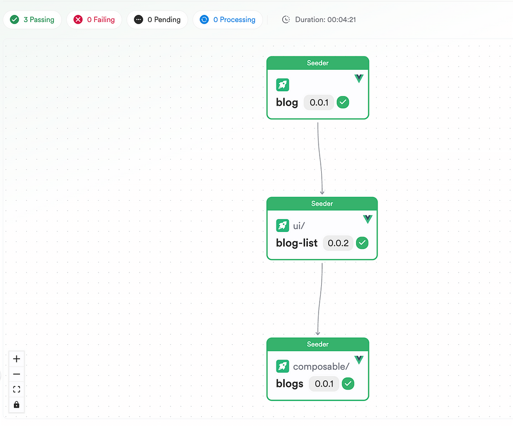
5. Versioning and Documentation
Maintaining versioning and documentation for the design system is crucial. It is important to document how components and patterns should be used and updated over time.
Ideally, this should be maintained as indendently where every component of yours should have its own version and documentation. For instance, check out this component:
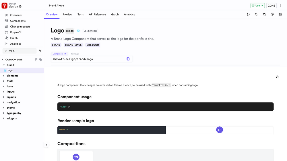
As you can see, every component in this Bit Scope has its own documentation and has its own version. This is because these are treated as independent Bit components and can be designed, developed, built and versioned in an isolated space, making it the perfect candidate for building distributed design systems.
How Distributing Your Design System Can Save You Time and Money
Over the past several years, we have continuously embraced design systems when building production-ready applications…
3. Accessibility
What is accessibility in Design Systems?
Accessibility in design systems is the practice of designing products and interfaces that will include all kinds of people. It involves creating inclusive experiences that will consider the diverse needs and abilities of all users, despite their disabilities. Having accessibility can be considered a plus point of an effective design system.
Let’s dive into some of the guidelines for creating accessible components.
Guidelines for creating accessible components
1. Keyboard Accessibility
It is essential to ensure that all interactive elements can be operated using a keyboard alone, without requiring a mouse or touch input. As a result, it will provide visible focus indicators, allowing users to navigate and interact with elements using keyboard shortcuts.
2. Color Contrast
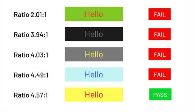
It is important to consider color contrast while building your design system. We must use sufficient color contrast between text and background to ensure readability for users with low vision or color blindness. Based on the Web Content Accessibility Guidelines (WCAG), the minimum contrast ratio is 4.5:1 for normal text and 3:1 for large text. The below image shows how different content with different contrast ratios fails/passes based on WCAG guidelines.
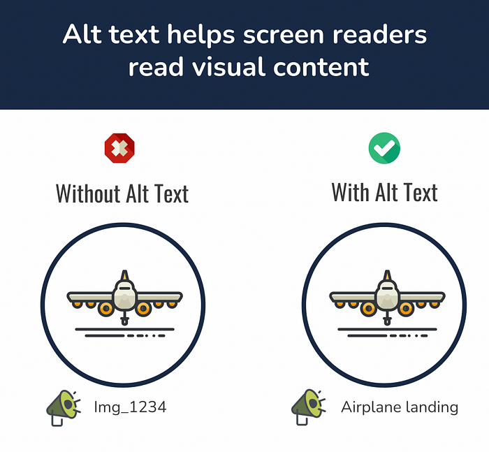
3. Alternative Text
It is better to provide descriptive text for images, icons, and other non-text content. Alt text will help those who have a visual impairment or because they have disabled images in their browsers.
4. ARIA Roles and Attributes
We can use Accessible Rich Internet Applications Roles and Attributes to enhance the accessibility of components, such as menus, sliders, and tabs. ARIA can help provide additional context and information to assistive technologies, making complex interfaces more navigable for users with disabilities.
5. Testing and User Feedback
It is essential to regularly test the accessibility of components and patterns using automated testing tools, as well as manual testing with real users with disabilities. Feedback from those users can improve the accessibility of the design system.
6. Accessibility Standards and Regulations
The rules and regulations below need to be considered while building the design system.
- WCAG
- Section 508 in the United States
- Accessibility for Ontarians with Disabilities Act (AODA)
By following these guidelines and ensuring compliance with accessibility standards, designers and developers can create design systems that are usable and accessible to all users, regardless of their abilities or disabilities.
4. Flexibility
What is Flexibility in Design Systems?
Flexibility in design systems is the ability of the system to adapt and accommodate various needs, requirements, and contexts while maintaining consistency.
Consistency & Flexibility
It is essential to maintain a balance between consistency and flexibility when building design systems. The below aspects need to be considered while achieving flexibility along with consistency.
1. Modular Design
Having a modular design enables flexibility along with consistency. Each created component should be adaptable, allowing it to be used in various contexts without losing consistency.
2. Flexible Layouts
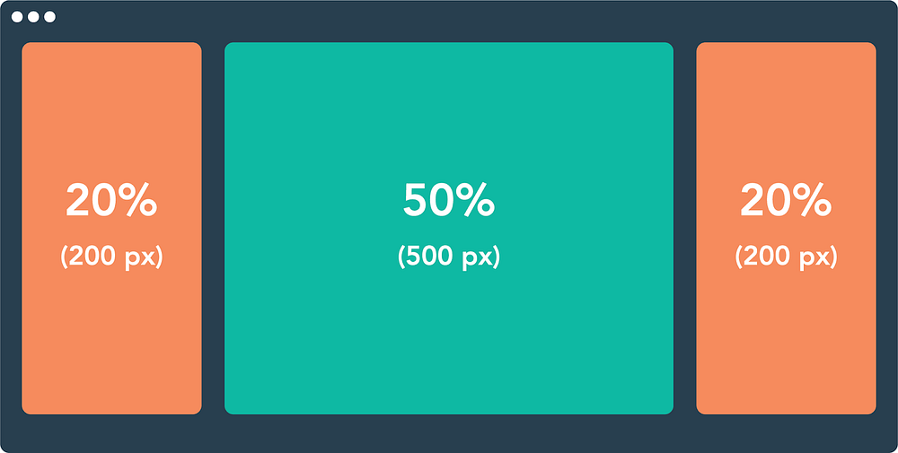
There should be flexible layouts that can accommodate different content lengths, screen sizes, and device orientations. We can use techniques such as responsive design and fluid layouts to ensure that components adapt gracefully to different environments without breaking the overall design. Based on the below image, rather than defining a specific width, it is better to create fluid layouts with percentages.
3. Parameterized Components
To make it flexible, we can create components with parameters or options that allow them to be customized and configured based on specific use cases. This will help the designers and developers to create variations of components without having to create entirely new ones while maintaining consistency.
4. Conditional Rendering
It is better to implement conditional rendering logic to handle variations and edge cases within components. This allows components to adapt their appearance or behavior based on contextual factors such as user preferences, device capabilities, or environmental conditions.
5. Adaptable Components and Edge Cases
As explained, it is better to create adaptable components to achieve flexibility and to handle edge cases. Developers can use modular design, parameterized components, and conditional rendering to achieve adaptable components.
5. Collaboration
What is Collaboration in Design Systems?
Collaboration in design systems means the process of working together across different teams to create and maintain an effective design system. It involves collaboration between designers, developers, product managers, stakeholders, and other relevant parties to define, implement, and evolve the design system over time.
To have effective collaboration, it is essential to have clear communication channels in design and development.
How To Implement Effective Collaboration Between Teams?
1. Regular Meetings and Check-Ins
It is essential to schedule regular meetings, such as design reviews, stand-ups, and sprint retrospectives, to keep team members aligned and informed about project progress, challenges, and goals. These meetings provide opportunities for designers, developers, and stakeholders to share updates, discuss priorities, and address any issues that arise.
2. Cross-Functional Teams
We must encourage cross-functional collaboration by forming teams that include designers, developers, product managers, and other stakeholders. As a result, developers will provide technical feedback when building the design system.
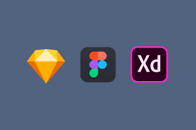
3. Prototyping and User Testing
We should involve designers and developers in the prototyping and user testing process to gather feedback early and iterate on designs iteratively. We can use tools like Figma, Adobe XD, and InVision to enable collaborative prototyping and user testing, allowing team members to share designs, gather feedback, and iterate on solutions in real time.
4. Design Handoff and Collaboration Tools
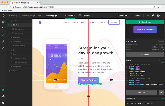
When the designers are done with the design, we can use design handoffs and collaboration tools, such as Zeplin, Avocode, and Abstract, to streamline communication between designers and developers. These tools generate code snippets, style guides, and design specs automatically from design files, which makes it easier to develop the build UI.
As visible in the below image, design handoff tools provide code snippets.
5. Project Management Tools
We should use project management tools, such as Jira, Asana, and Trello to track tasks, assign responsibilities, and monitor project progress. These tools help keep teams organized, focused, and accountable by providing visibility into project timelines, milestones, and dependencies.

Wrapping Up
In conclusion, building effective design systems requires careful consideration of the mentioned five principles which are consistency, scalability, accessibility, flexibility, and collaboration. By adhering to these principles, organizations can create design systems that drive efficiency, innovation, and alignment across teams and products.
I hope you have found this article helpful.
Thank you for reading!
Learn More
Recommend
About Joyk
Aggregate valuable and interesting links.
Joyk means Joy of geeK