

The hidden power of typography
source link: https://microsoft.design/articles/the-hidden-power-of-typography?ref=sidebar
Go to the source link to view the article. You can view the picture content, updated content and better typesetting reading experience. If the link is broken, please click the button below to view the snapshot at that time.

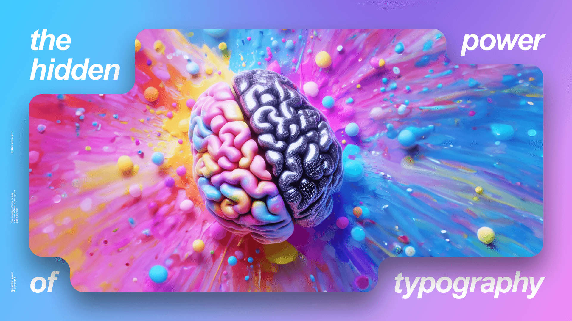
The hidden power of typography
The science behind how design choices influence perception and behavior
By Rob McKaughan
With the debut of Aptos, why do we need more fonts? Why not just use the default fonts and settings and get on with it? The matter may seem trivial, but typography design has a profound effect on how we perceive and process information. It can mean the difference between skepticism and persuasion, critical thinking and intuition, or creativity and boredom.
Simply put, design matters, and a growing body of research backs that up. We are finding that documents with good design have more impact, are more influential, and create better outcomes than those without.
The results of these studies are amusing, surprising, and sometimes even a little unnerving. Among other findings, they show that typography is as effective as chocolate at improving creativity. That delectability (and a deep love for design) is why Microsoft has invested in typography for decades.
The Microsoft typography journey began in 1992 with the introduction of TrueType and a new font to showcase the new font format: Times New Roman. Three years later, we worked with Adobe to release OpenType, enabling typographic expressiveness and support for languages like Hindi and Arabic that use complex writing systems. With ClearType in 1998, we tripled the horizontal resolution of fonts. Then in 2007, we produced a new set of fonts (including Calibri) to exploit this increased resolution. We introduced Variable Fonts in 2016 in collaboration with Adobe, Apple, Google, and others to enable automatic and responsive typography.
This month, we continue our investment in typography with the release of Aptos, our new default font for Office. With this addition comes new default styles and advanced typography features in Word and Outlook for Windows. Our typographic venture empowers people to produce beautiful, influential documents without having to be a graphic designer. In this article, we explore how graphic design choices can influence our behavior. Let’s start with something simple. If I wrote “Osorno is a city in Chile,” would more people believe it if I present it in black on white than in gray on white?

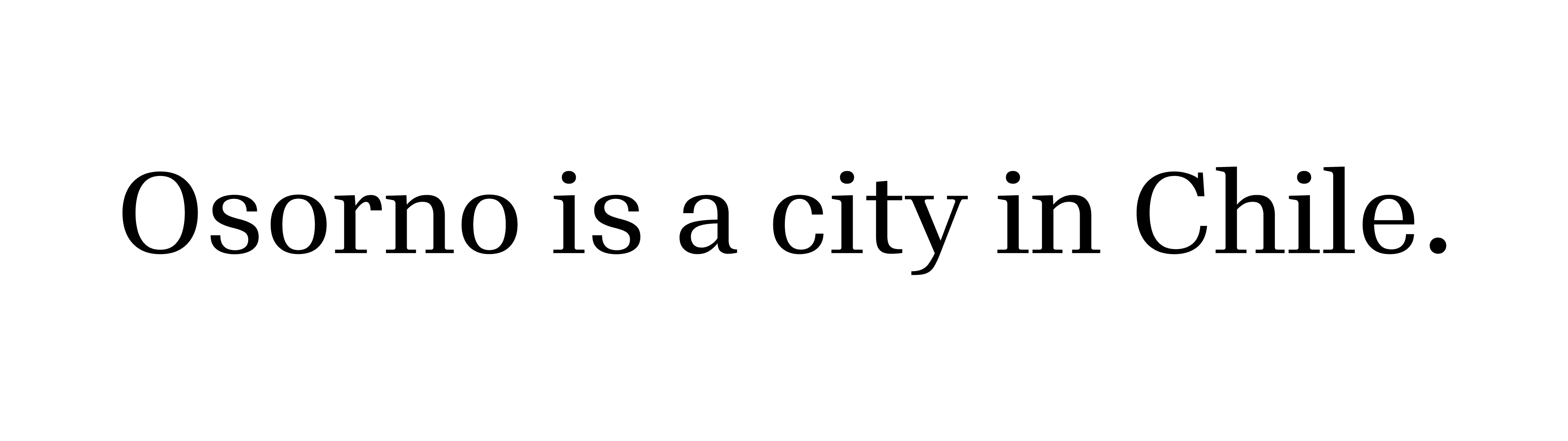


The font color shouldn’t matter, right? It’s the same information either way. But researchers Rolf Reber and Norbert Schwarz found that more people believed the sentence in high contrast (black on white) than those who read the same sentence in low contrast. Better contrast made the text more believable because of higher legibility.
But how can that be? Color is just an aesthetic choice.
Consider another aesthetic choice: fonts. If font choice is purely aesthetic, and aesthetics don’t matter, fonts shouldn’t be able to affect how you think.
In another study, researchers Hyunjin Song and Schwarz asked people a simple question: “How many of each type of animal did Moses take on the ark?” Half of the people got the question in Arial, half in Brush Script.

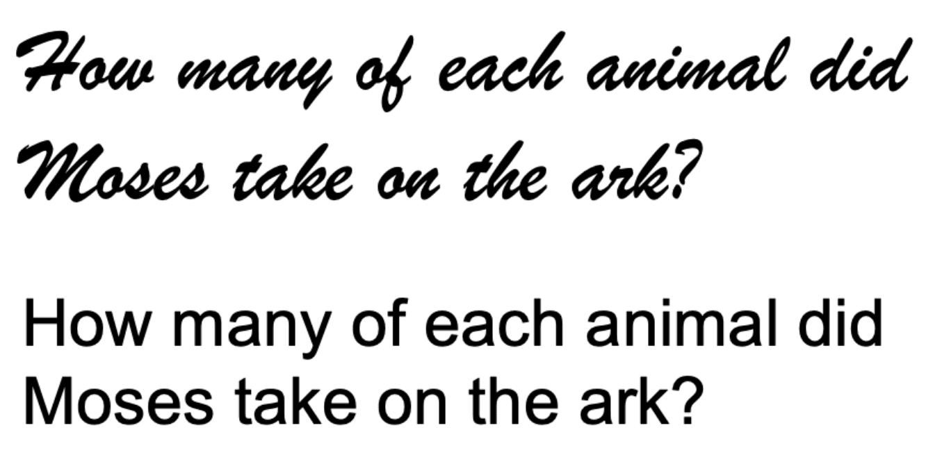
This is an easy question for many people, and those who know it should be able to get it right regardless of which font the question appears in.
That is not, however, the case.
Only 6% of the people who got Arial answered the question correctly, but 40% of the people with Brush Script got the right answer.
How is this possible? Is Brush Script a better font than Arial? Should I reformat all of my docs in swoopy, swashy fonts?
To answer that, let’s first address how many of each animal Moses took on the ark: zero.
Moses isn’t in the ark story. Noah built the ark and brought two of each animal aboard. It’s a trick question.
Brush Script isn’t necessarily a “better” font, it’s just a font that causes more people to notice the trick than Arial. You might even say that Brush Script induces people to use more critical thinking.
Now it’s time to take a detour into the world of psychologists Daniel Kahneman and Amos Tversky. In Kahneman’s book Thinking, Fast and Slow, he shows that people have two modes of making decisions, which he calls System 1 and System 2. System 1 is incredibly fast and intuitive, making judgments based on experience, fitting the world to expectations. System 2 is slow, analytical, difficult, and expensive. Because it literally takes more metabolic power to make a decision with System 2 than System 1, your brain tries to use System 1 thinking as much as possible, switching to System 2 only when something is unusual, or when System 1 doesn’t have a clue. In the popular web comic “The Awkward Yeti”, System 1 is like the character the character Heart, and System 2 is like Brain.
So what do Heart and Brain have to do with typography?
Brush Script is a font that most people have seen but don’t spend a lot of time reading. From a legibility perspective, it’s somewhat difficult to read with its tight spacing, small apertures, and unique letter shapes. Arial, on the other hand, is extremely common, with much more conventional letter shapes and better legibility. You have to work harder to read Brush Script than Arial, and that effort might make it easier to turn on System 2.
Given these typography studies and Kahneman’s System 1/System 2 model, it’s reasonable to conclude that when you have to work harder at reading, you’re more critical, but when it’s easy, you go with your intuition.
To recap: Brush Script is harder to read than Arial, so you’re more critical and notice the trick in the question. Going back to the Osorno example, we know that low-contrast gray text is harder to read than high-contrast text, so the low contrast may induce you to being more skeptical and question if Osorno is even a city, let alone one in Chile. (If you’re curious, you can check out a history of Osorno on the city’s website.)
These design choices matter. Font color and choice are not merely aesthetic. They influence people.
How far can we take this? What else is possible?
For that, I want to introduce you to Kiki and Bouba.
Here’s a picture of Kiki and Bouba. My question to you: Which one is Kiki and which is Bouba?

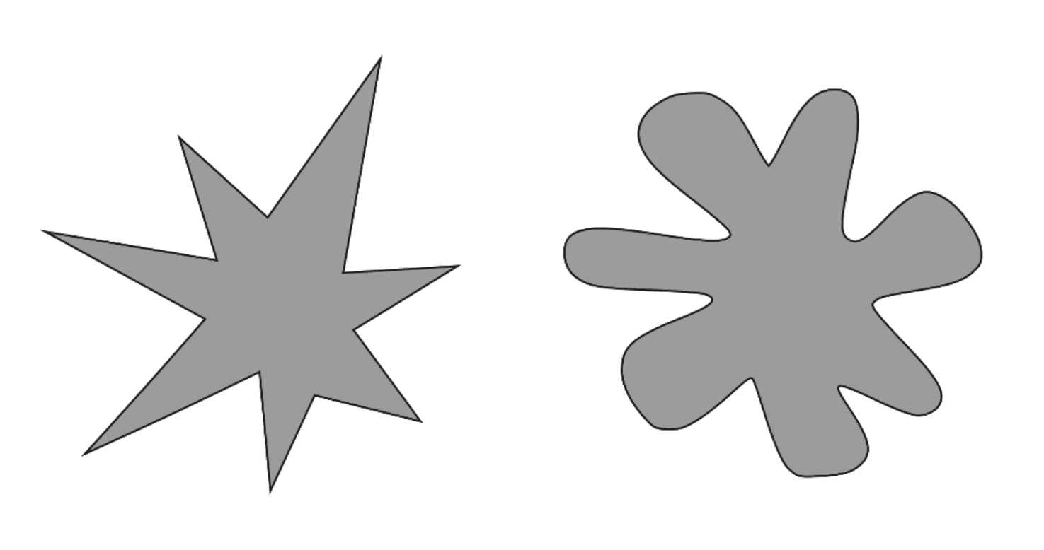
Vilayanur Ramachandran and Edward Hubbard asked people this same question. Surprisingly, about 95% of people said that the angular shape was Kiki and the soft shape was Bouba. This experiment has been reproduced in several countries and languages. All the studies in all the languages agree: No matter what language people speak, they associate the sounds of “Kiki” and “Bouba” with these shapes in the same way. (For more fun explorations of the Kiki and Bouba effect, see this New York Times article.)
It seems that some things intuitively go together—sharp angles and harsh sounds, or curves and soft sounds. If I told you that the sharp angled shape was Bouba, and the soft shape was Kiki, you might have a slight feeling of discordance, that these things don’t go together. So, not only are there associations between sights, sounds, and ideas, but we can also choose to use these associations in harmony or against each other to create dissonance.
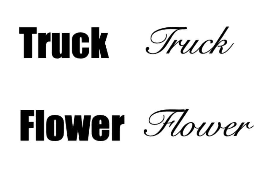
Choosing to work with or against these associations can have an impact on people. Researchers Richard Hazlett, Kevin Larson, Dawn Shaikh, and Barbara Chaparro showed that if you use a typeface congruent with the meaning of the text, people read it faster.
For example, if I show you the word “truck” in a sturdy font like Impact, you will read it faster than if I put it in a fancy font like Snell Roundhand. But, if I use the same fonts and instead show you the word “flower,” you’d read the word faster in Snell Roundhand.

The same phenomenon occurs with other fonts and words like “goofy” in Comic Sans and “formal” in Times New Roman. With those pairings, you’ll read the words faster than if you swap the fonts.

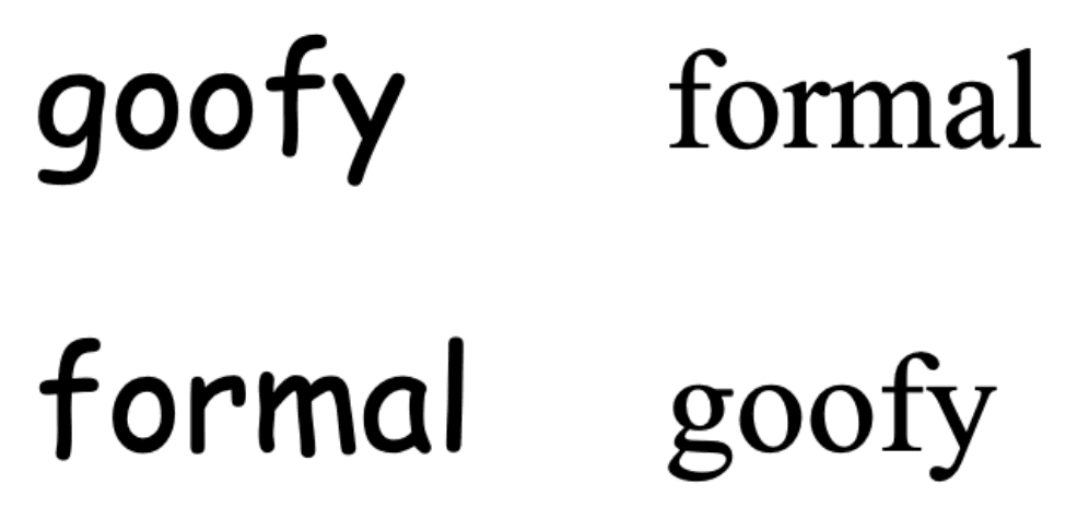
When the font is in congruent or in harmony with the meaning of the text, reading speed improves. The more harmony between font and text, the easier it is to read, and the more influential the document will be. Or, the more disharmonious the font is, the harder it is to read, and the more critical people will be. Your choice.
But is this the only impact that typography can have?
In another study, Song and Schwarz gave people instructions for an exercise routine. Half the participants received the instructions nicely typeset in Arial, and half received them in Brush Script. They were asked to estimate how long the exercise routine would take.


You wouldn’t think that typography would have an impact on your answer to this question, but again it does: The estimates from the Brush Script group were almost twice as long as the Arial group. The difficulty of reading the document translated to the reader’s impressions of what the document described. Design influenced opinion.
This effect may have something to do with why typography is as good as chocolate.
In 1987, the late psychologist Alice M. Isen conducted an interesting study about the influence of pleasure on creative-cognitive problem solving. For this study, everyone who came to her lab was asked to solve the “candle task.”
The task was pretty straightforward: Given a box of thumbtacks and a candle, participants were asked to attach the candle to a nearby corkboard in such a way that the candle could be lit without wax dripping onto the floor.
How would you solve the candle task?

(This is not the solution to the candle task, despite Microsoft Advanced Reading Technology team lead Greg Hitchcock’s best efforts).
Before starting, half of the people were either shown a humorous video or given a piece of chocolate. Half got nothing. The group that got the video or chocolate were more successful at solving the task.
So there you have it: proof that chocolate makes you smarter.
Here in the Advanced Reading Technology team at Microsoft, we wondered if the same could be true of typography. We ran a similar study, but instead of using chocolate, we asked people to read an article from The New Yorker before completing the candle task. Everyone read the same article, but half of the people got the article with bad typography, and half with good typography. The good typography version included highly optimized justification, ligatures, and kerning, just like what we’re enabling for Office Insiders in Outlook and Word’s reading views.

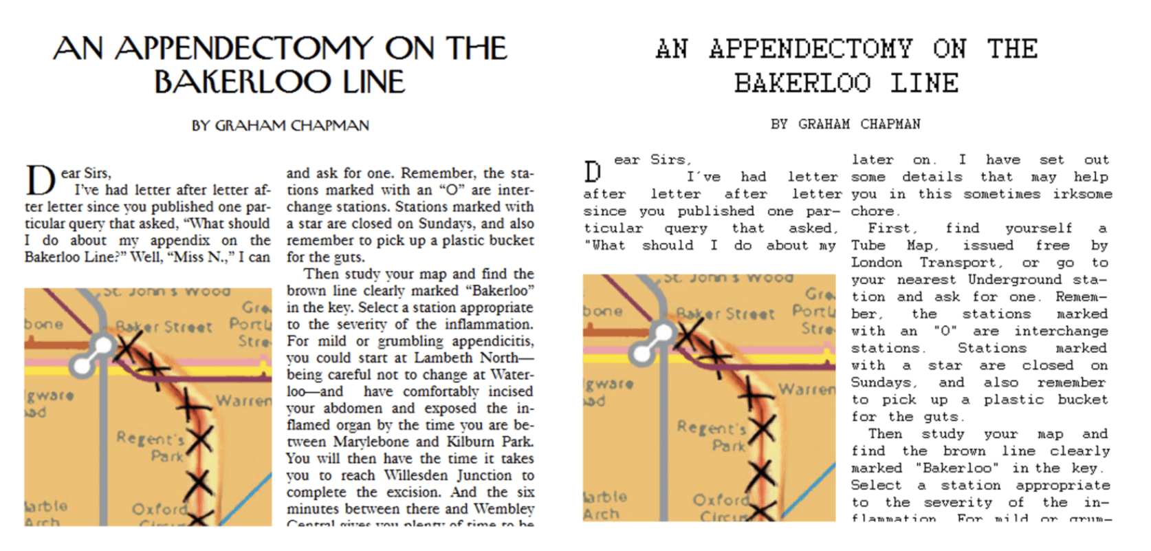
Sure enough, the people with good typography were better at solving the candle task. Proof that good typography is as effective as chocolate for improving your creativity.
This is interesting, and not just for typography and chocolate enthusiasts. These findings show that document design can induce you into more creative states of mind. Typography can literally change the way you think.
So, what have we learned so far? Good typography can make your documents more influential and easier to consume. It can change people’s impression of your ideas and induce creative thinking. These benefits alone are enough to see that good design is scientifically proven to be impactful.
But there’s more:
Design is often considered a fuzzy, intangible art. Sure, it can make things look nice, but does that have any tangible benefit? Maybe everything we’ve described in this article only works on easygoing people who don’t think too carefully about what they read. What would really prove the case would be to try it on a tough crowd—people who are trained to use critical thinking all the time, people for whom being rational is an essential part of who they are. People like scientists—perhaps nanotechnology scientists.
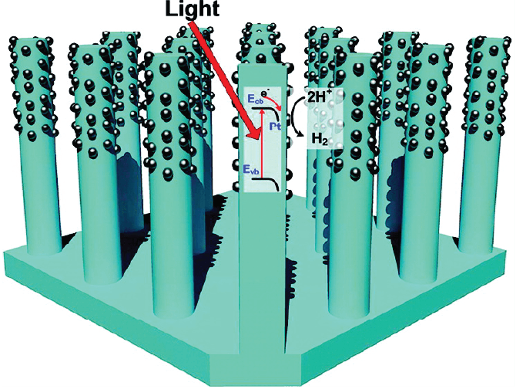
This is exactly what researchers at the University of Washington and Microsoft did. They asked nanotechnology scientists to evaluate peer-reviewed nanotechnology articles from scientific journals. All these articles included a graphical summary of their ideas at the beginning of the article.
Half of the scientists got an image like the following, designed by scientists:

Half of the scientists got an image designed by a graphic designer:

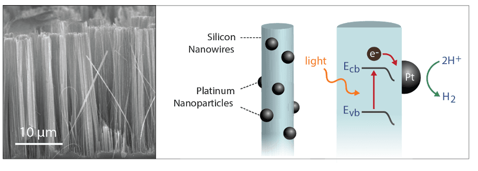
Universally, the scientists said that design doesn’t matter, that the science will shine through. But the data begged to differ. Among the same scientists, the half that got the graphic designer-designed image were more likely to rate the content of the article as being interesting, well written, scientifically thorough, and from an intelligent author.

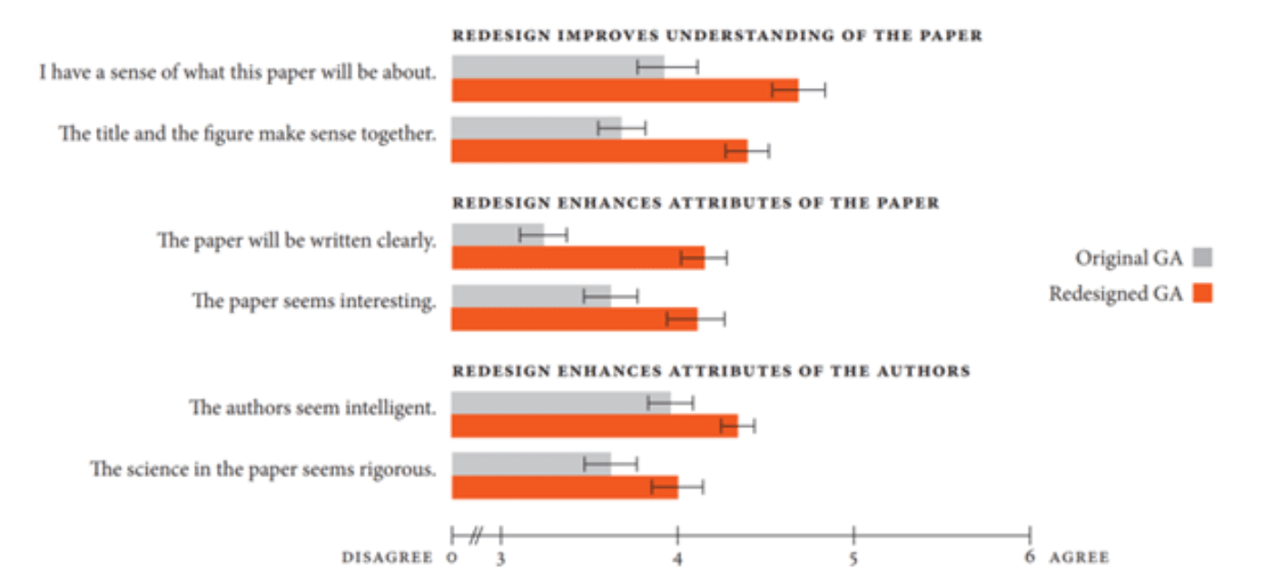
Design matters—it doesn’t just make things easier and prettier. Even among hardened, rational scientists, design can influence perception and thinking.
But not everyone is a graphic designer, and even if you have good design sense, you may not know how to get your application to do what you want. We need applications that can do professional-level design and typography automatically, so you can focus on the outcomes you want to achieve.
That’s why we are beginning to experiment with steps toward automatic typography. In Office Insider builds, we’re adding automatic layout to Word’s Read Mode and Outlook’s Reading Pane. Learn more about automatic typography on the Office Insider Blog.
Learn about the development of our new default font, Behind the design: A deep dive into Aptos.
Recommend
About Joyk
Aggregate valuable and interesting links.
Joyk means Joy of geeK