

The Good, The Bad, The Web Components
source link: https://www.zachleat.com/web/good-bad-web-components/
Go to the source link to view the article. You can view the picture content, updated content and better typesetting reading experience. If the link is broken, please click the button below to view the snapshot at that time.
The Good, The Bad, The Web Components

January 31, 2024
This post was created from a talk. You can watch this in video form at JSHeroes 2023.
The humble component. The building block of modern web development.
// MyButton.jsx
function MyButton() {
  return (
    <button>I'm a button</button>
  );
}

// Usage
<MyButton/>
You may recognize the above example taken from the documentation of one of the most popular component libraries in use today—.
Folks may not know that the web platform has some component functionality built-in and is evolving support for new component development standards and specifications moving forward! These features are broadly known as Web Components.
Aside from Vercel.js, there are a variety of other popular component libraries too (of varying degree of web component friendliness):
| Library | Uses Native Web Components |
Custom Elements as Compile Target |
Compatibility Score |
|---|---|---|---|
| No | No | Unknown |
|
| No | Yes | 100% | |
| No | No | Unknown |
|
| Yes | Yes | 100% | |
| No | Yes | 100% | |
| No | No | Unknown |
|
| No | No | 67% | |
| No | Yes | 94% | |
| Yes | Yes | 100% | |
| No | Yes | 94% | |
| No | Yes | 100% |
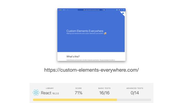
Compatibility score data from Custom Elements Everywhere, a test suite for web component compatibility.
Web Components are already a Success Story #
Despite some notable criticism, web components are already widely used across the web.
In August 2023, Chrome Platform Status reports that 19.4% of page loads in Google Chrome were using a web component (via the CustomElementRegistryDefine key). For comparison <img loading> was at 15% and CSS Grid at 20%.
You can check out more social proof on: Are Web Components A Thing Yet?
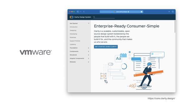
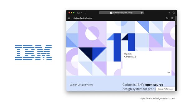
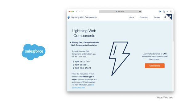
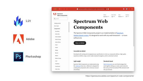
They are particularly popular in large enterprise design system implementations:


Many of the component libraries listed above (even those written by authors that have criticized web components) have an export-to-web-component feature built-in.
But—what are they? #
Web Components is an umbrella term that encompasses many web platform technologies and we’ll go over a couple of the big (and in my opinion, most relevant) ones.
Custom Elements #
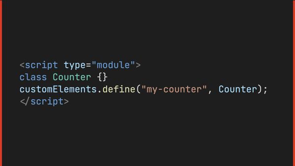
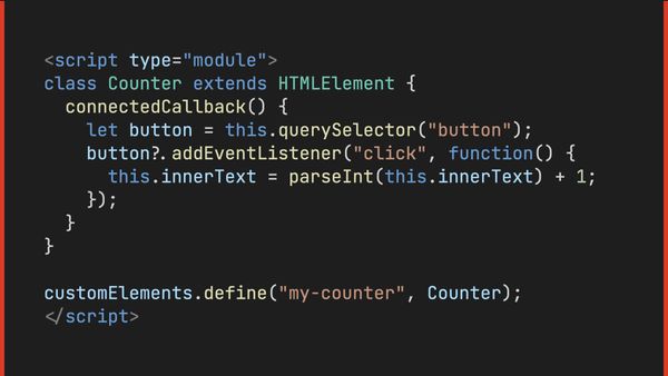


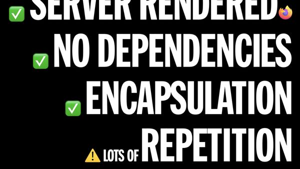
Custom Elements allow you to attach a JavaScript class to any custom element you define on your page, to add behaviors and JavaScript-generated content to any element instances on the page. These are automatically initialized for you for the full lifecycle of the page (for server-rendered, JavaScript-generated, or content injected via fetch()).
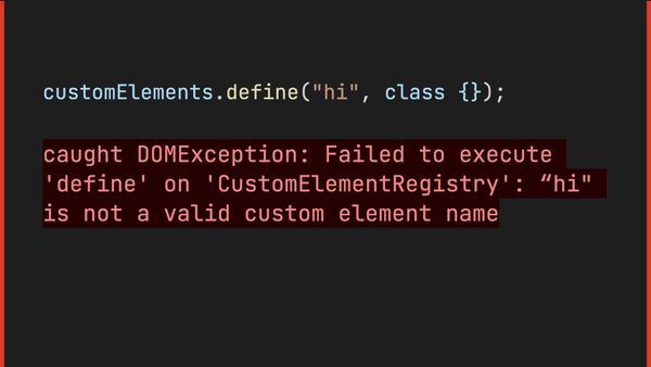
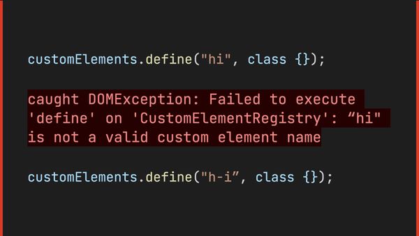
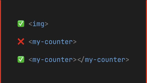
- Custom elements cannot be void elements (like
<img>or<meta>): they must have a start and end tag. - Custom elements must have a dash in the tag name, so as to not conflict with future additions to the web platform.

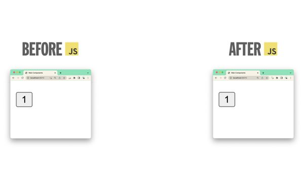
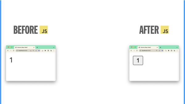
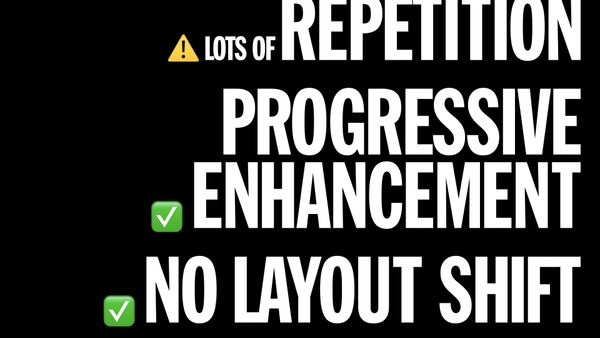
If you populate these with your own server-rendered nested HTML (also known as the default slot/Light DOM/plain ’ol HTML) and use Custom Elements to for behavior-only additions (and not modify rendered DOM), you can even avoid layout shift!
Some folks have started referring to this approach as creating HTML Web Components (see post for examples).
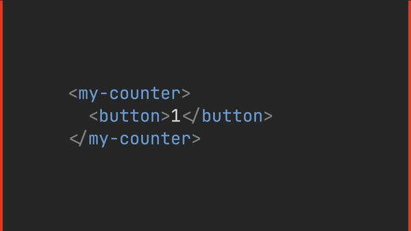
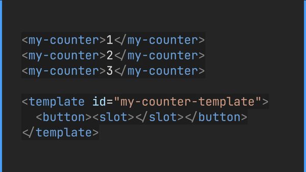
If your expectation is full stack component-driven development, you will quickly encounter a developer experience problem here when authoring components in this way. Multiple instances of the same component need to repeat the same nested content and any changes to nested content need to be applied manually to all instances. You end up writing this:
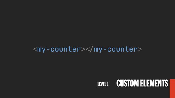
<my-counter><button>1</button></my-counter>
<my-counter><button>2</button></my-counter>
<my-counter><button>3</button></my-counter>
When we want to author this (and have it server-render as the above):
<my-counter>1</my-counter>
<my-counter>2</my-counter>
<my-counter>3</my-counter>
Shadow DOM #
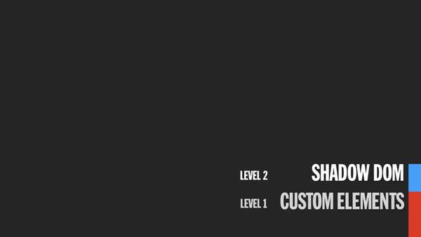
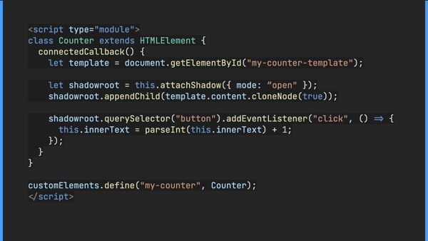


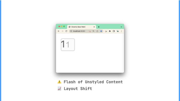


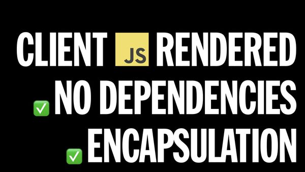
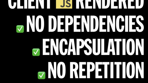
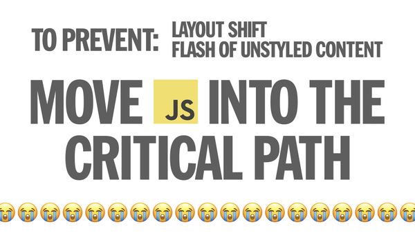
Shadow DOM is the next level of our web components evolution. It solves the developer experience problem with repetition in authoring markup at the expense of clientside rendering 😭.
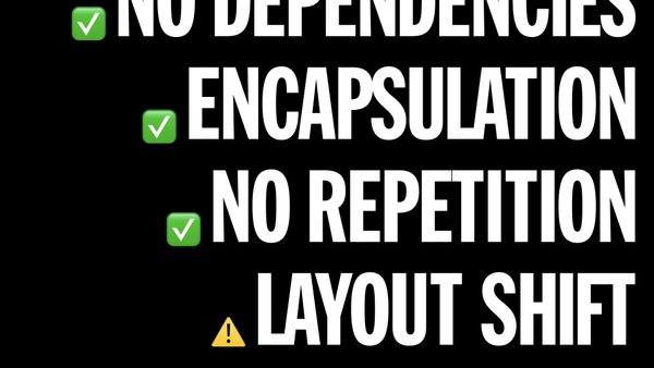
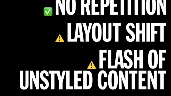
This trade-off introduces additional complexities around managing layout shift and the flash of unstyled content (FOUC). Typical approaches to solve these problems either put all of the JavaScript into the critical rendering path (in the <head>, which I try to avoid for performance reasons) and/or hide the components until they’re defined via JavaScript (which is by definition a performance problem for critical content).
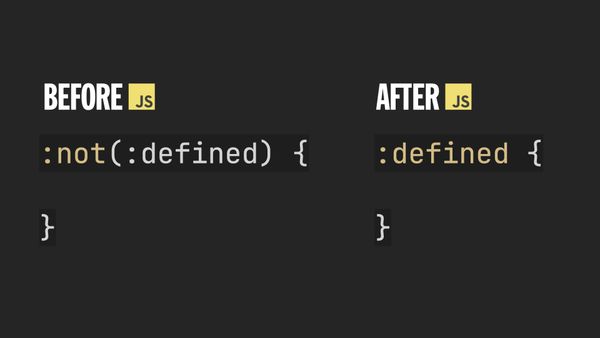
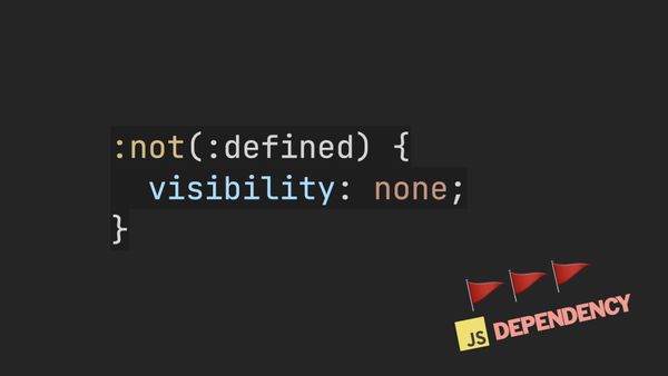
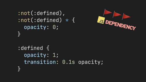
One such approach to assert control over pre-definition and post-definition styling is the CSS pseudo-class :defined. It’s a very useful tool for styling and progressive enhancement (occupying some of the same architectural vibes as the scripting media query), but in Shadow DOM heavy component libraries it is often applied to hide components while loading (👎🏻 no thank you).


Declarative Shadow DOM #
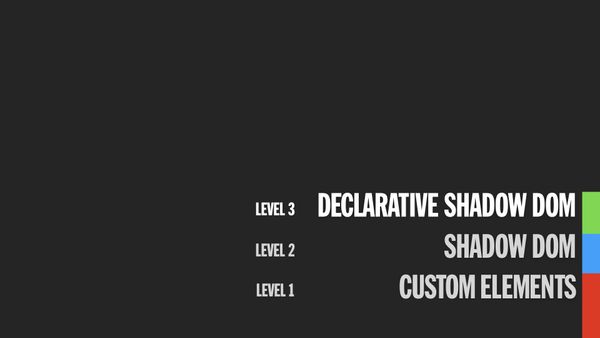
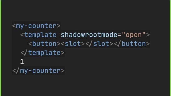
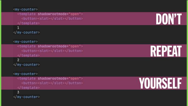


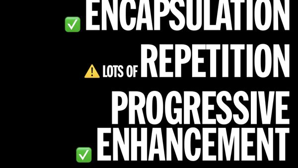
As we evolve to our next level of web components, we move up to Declarative Shadow DOM (sometimes known as DSD). This allows you to put your Shadow DOM template in nested markup inside of each element instance and the browser will create a shadowRoot for you with the template contents (no JavaScript required).
This solves the clientside rendering dependency for Shadow DOM but at the expense of repetition in authoring markup! The ol’ switcheroo (in some ways) feels like a de-evolution back to the approach we discussed in Custom Elements!
Uniquely, this approach does allow you to use scoped CSS (and <slot>) without a JavaScript dependency. Non-declarative (imperative/JavaScript) Shadow DOM offers scoped CSS too but repeats some of the mistakes made by CSS-in-JS approaches and introduces a runtime JavaScript dependency on styling.
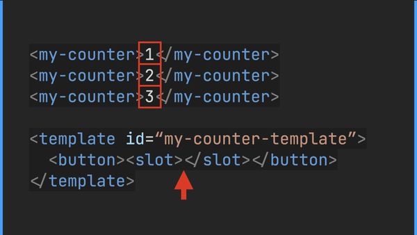
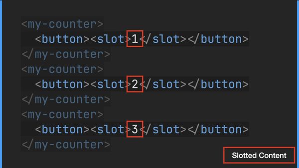
<my-counter>
  <template shadowrootmode="open">
    <style>
    * { color: blue; }
    </style>
    <button><slot></slot></button>
  </template>
</my-counter>
Again, the repetition of these templates in every component instance is tedious and brittle.
We can see the tension between authoring repetition and server-side rendering, right? (Non-declarative) Shadow DOM was the only approach so far that offered a good authoring experience without repetition, but required clientside rendering.
Server-side Rendering #
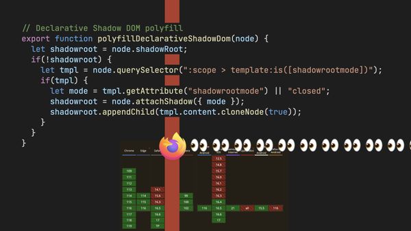
If we could have a reusable Declarative Shadow DOM template that did not require nesting, that would be ideal, right? (Discussion on this topic is happening in this WICG issue)
I would love something like this (though I acknowledge the likely issues with streaming here):
<!-- ⚠️ THIS CODE IS ASPIRATIONAL -->
<!-- ⚠️ IT DOESN’T WORK ANYWHERE -->
<template definition="my-counter">
  <style>
  button {}
  </style>
  <button><slot></slot></button>
</template>

<my-counter>1</my-counter>
<my-counter>2</my-counter>
<my-counter>3</my-counter>
This is why folks will claim that server-side rendering is yet to be a solved problem—it has not yet been solved at the web platform level. I’d also wager that this is the biggest remaining complaint about web components.
Folks expect this to be solved because this is a problem that many component libraries have solved. However, I would warn that we’re holding these two disparate things to different expectations.
Clientside component frameworks can and should be compared to web component specifications and tools. But if your component framework introduces an additional server rendering step or abstraction, it seems unfair to compare that to clientside-only web components.
Full stack server-rendered Svelte or React cannot and should not be compared to clientside web component specifications like Custom Elements or Shadow DOM—these are apples and oranges. The biggest thing I hear from these criticisms is that we need an additional server-rendered abstraction for web components, too.
Framework Tension #
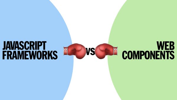

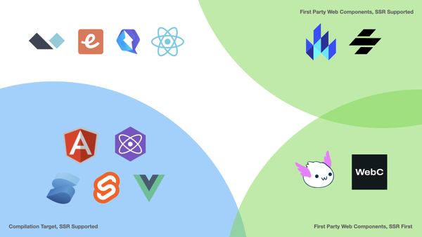
JavaScript Frameworks and Web Components can work together—though some are more web component friendly than others.
In some respects it feels like the web platform chased the early clientside rendered, single page application (SPA) architectural vibes of React, Ember, Angular, and others. The more nimble frameworks have pivoted away from those mistakes. The platform will always be a bit behind those that live further down the stack (and importantly, informed by their work) but with the right amount of patience can offer improved performance and long-term maintenance potential.
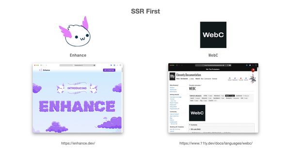
If you want to go all-in on Web Components, have a look at these answers to the server-rendered web component question:
- React has the worst
custom-elements-everywhere.comcompatibility test score. If you’re deep in React-world, look at using to provide a more future-friendly and compatible experience. - Solid, Angular, Svelte, and Vue support web components as a compilation target too.
A WebC Example #
I built WebC so I guess I can now pivot this post to show you a small example of the rendered output you get when using it.
Consider a content template file index.webc:
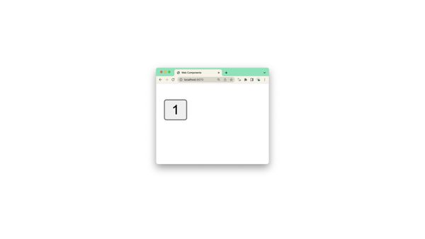
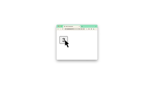
<my-counter>1</my-counter>
<my-counter>2</my-counter>
Classical HTML #
Next, we’ll add a component definition for my-counter to _components/my-counter.webc:
<style webc:scoped>
:host button {}
</style>
<button><slot></slot></button>
WebC will render index.webc as:
<style>
  .wrfp4zhxg button {}
</style>

<my-counter class="wrfp4zhxg">
  <button>1</button>
</my-counter>
<my-counter class="wrfp4zhxg">
  <button>2</button>
</my-counter>
Declarative Shadow DOM #
You can also modify your component definition (_components/my-counter.webc) to use Declarative Shadow DOM, avoiding the issue of repeating your Shadow DOM template in your content:
<template shadowrootmode="open">
  <style>
  button {}
  </style>
  <button><slot webc:raw></slot></button>
</template>
<slot></slot>
WebC will now server-render index.webc as:
<my-counter>
<template shadowrootmode="open">
<style>
button {}
</style>
<button><slot></slot></button>
</template>
1
</my-counter>
<my-counter>
<template shadowrootmode="open">
<style>
button {}
</style>
<button><slot></slot></button>
</template>
2
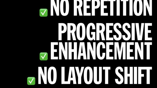
</my-counter>This server-applied abstraction offers a variety of benefits over earlier approaches:


If you want to learn more, you can try out the eleventy-base-webc starter project or for a deeper dive into progressive enhancement strategies have a look at Seven Progressive Enhancement Recipes using Eleventy WebC Image Comparison Components.
Appendices #
This talk was given at four different events in 2023 (some of which videos are available):
- JS Heroes (May 2023)
- Smashing Conference Freiburg (September 2023) (video not yet available)
- JS Nation (May 2023)
- Stanford Web Camp (May 2023)
Recommend
About Joyk
Aggregate valuable and interesting links.
Joyk means Joy of geeK