

七个常用的 Vue 3 UI 组件
source link: https://www.51cto.com/article/777006.html
Go to the source link to view the article. You can view the picture content, updated content and better typesetting reading experience. If the link is broken, please click the button below to view the snapshot at that time.
由于我在工作的公司中角色和职责的变化,作为后端开发人员的我在去年年底选择了 Vue.js。当我深入研究时,我发现 Vue.js 非常有趣。它不像 Angular 那样有很高的学习曲线,而且比 React 更轻量和灵活。

Vue.js 绝对是一个用于构建用户界面的强大 JavaScript 框架。为了创建具有视觉吸引力的交互式用户界面,合并 UI 组件非常重要。
在这篇文章中,我将介绍我在工作中经常使用的 7 个 UI 组件。我还将介绍它们的目的、实施示例和现实生活中的用例。
UI 组件的重要性
UI 组件在 Vue.js 开发中发挥着重要作用。通过将复杂的接口分解为模块化、可重用的组件,开发人员可以创建可扩展且高效的代码,更易于维护和故障排除。
此外,合并 UI 组件还可以改善用户体验和界面一致性,因为用户将在不同的页面或应用程序中获得熟悉的体验。
Vue.js 7 个最常用的 UI 组件
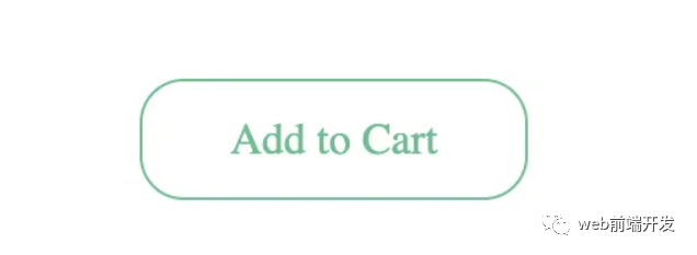
1. 按钮组件
按钮使用户能够与应用程序交互。在网站上看不到按钮几乎是不可能的。它可能是最简单的组件之一,但其用途却并非如此。这是网站的号召性用语。因此,请仔细思考如何使其脱颖而出,如何处理不同的状态以及如何使用它来验证某些操作。
现实项目中的示例:注册表单的提交按钮、电子商务网站上的“添加到购物车”按钮。
这是一个简单的例子:
<template>
    <button>{{props.title || 'Add To Cart'}}</button>
</template>
<script setup>
  const props = defineProps(['title']);
</script>
<style>
button {
  color: #4fc08d;
}
button {
  background: none;
  border: solid 1px;
  border-radius: 1em;
  font: inherit;
  padding: 0.65em 2em;
}
</style>
演示:https://codepen.io/terawuth/pen/poqRJvZ
2. 表单组件
表单用于收集 Web 应用程序中的用户输入,并且可以针对不同的输入类型(文本、电子邮件、密码等)进行自定义。 在网站上很难不看到表单。 验证、步骤或指南等元素对于改善表单填写体验大有帮助。
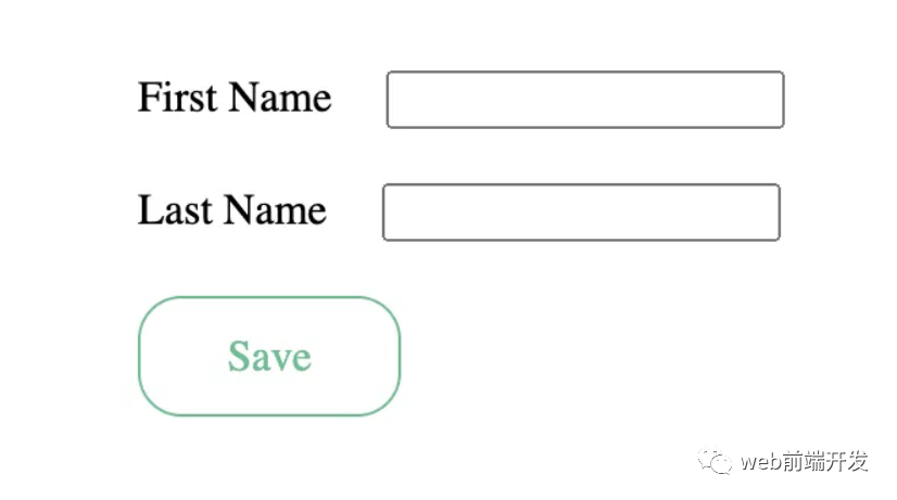
现实项目中的示例:用于注册、联系或登录的用户输入表单。
<template>
  <div class="form-main">
    <form>
      <div class="form-item">
        <label>First Name</label>
        <input type="text" name="first_name" v-model="firstName" />
      </div>
      <div class="form-item">
        <label>Last Name</label>
        <input type="text" name="last_name" v-model="lastName" />
      </div>
      <div class="form-item">
        <Button @click="onSave" title="Save" />
      </div>
    </form>
  </div>
</template>
<script setup>
import { ref } from "vue";
import Button from "https://codepen.io/terawuthth/pen/poqRJvZ.js";
const firstName = ref("");
const lastName = ref("");
const onSave = () => alert("Save !!");
</script>
<style>
form {
  display: flex;
  flex-direction: column;
}
.form-item input {
  margin-left: 20px
}
.form-item {
  margin-top: 20px;
}
</style>
演示:https://codepen.io/terawuth/pen/KKbzLzK
3.卡片组件
卡片用于以视觉上吸引人的方式组织和显示信息。如今,卡片组件非常常见,尤其是在社交媒体网站上。尽管卡片组件以一种美观且干净的方式呈现信息,但必须小心不要在卡片上放置太多数据。
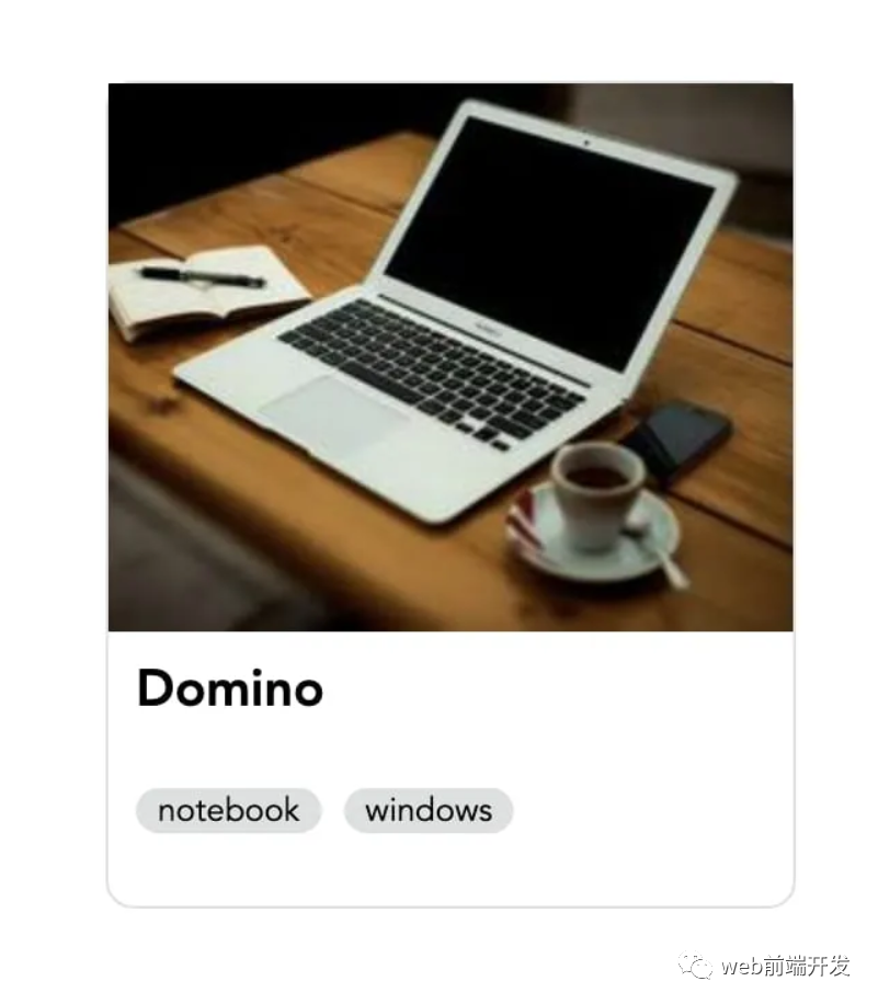
现实项目中的示例:网站上的新闻文章卡、社交媒体资料卡。
<template>
  <div class="card">
    <div class="img-product">
      <img :src="product.image" alt="Product" />
    </div>
    <div class="detail">
      <div class="title">
        <h3>
          <a :href="product.link">{{ product.name }}</a>
        </h3>
      </div>
      <div class="tag">
        <a v-for="tag in tags" :href="tag.link">
          <span>{{ tag.name }}</span>
        </a>
      </div>
    </div>
  </div>
</template>
<script setup>
import { ref, reactive } from "vue";
const tags = ref([
  {
    link: "#",
    name: "notebook"
  },
  {
    link: "#",
    name: "windows"
  }
]);
const product = reactive({
  name: "Domino",
  image:
    "https://picsum.photos/id/2/250/200",
  link: "#"
});
</script>
<style>
.card {
  width: 250px;
  height: 300px;
  border: 1px solid #dedfdf;
  border-radius: 10px;
}
.card:hover {
  border: 2px solid #adaeae;
  box-shadow: 2px 2px #adaeae;
}
.card .img-product {
  height: 60%;
  margin: 0;
}
.card .img-product img {
  height: 200px;
  width: 100%;
}
.detail {
  height: 40%;
  padding: 10px;
  display: flex;
  flex-direction: column;
  justify-content: start;
  align-items: start;
}
.tag a {
  font-size: 12px;
  color: black;
  background-color: #dedfdf;
  padding: 0 8px 0 8px;
  border-radius: 20px;
  text-decoration: none;
}
.tag a:not(:first-child) {
  margin-left: 8px;
}
.detail a {
  color: black;
  text-decoration: none;
}
.detail .tag a:hover {
  color: #fff;
  background-color: #fc6969;
}
.detail .title h3:hover {
  color: #fc6969;
}
</style>
演示:https://codepen.io/terawuth/pen/XWogWqW
4. 导航组件
导航允许用户导航到应用程序内的不同部分或页面。大多数网站至少有 1 个菜单。菜单对于引导用户非常重要,但太多菜单或不正确的菜单分组可能会导致混乱。
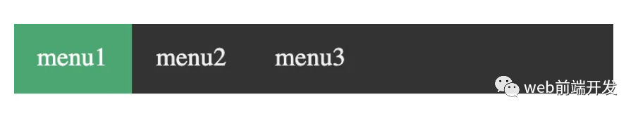
现实项目中的示例:公司网站的导航栏、餐厅网站的菜单。
<template>
  <div class="nav">
    <a
      v-for="menu in menuList"
      :class="{ active: menu.name === activeMenu }"
      :href="menu.link"
    >
      {{ menu.name }}
    </a>
  </div>
</template>
<script setup>
import { ref } from "vue";
const activeMenu = ref("menu1");
const menuList = ref([
  {
    link: "#",
    name: "menu1"
  },
  {
    link: "#",
    name: "menu2"
  },
  {
    link: "#",
    name: "menu3"
  }
]);
</script>
<style>
body {
  margin: 0;
  padding: 0;
}
.nav {
  overflow: hidden;
  background-color: #333;
}


.nav a {
  float: left;
  color: #f2f2f2;
  text-align: center;
  padding: 14px 16px;
  text-decoration: none;
  font-size: 17px;
}


.nav a:hover {
  background-color: #ddd;
  color: black;
}


.nav a.active {
  background-color: #04aa6d;
  color: white;
}
</style>
演示:https://codepen.io/terawuth/pen/bGOwJvo
5. 模态组件
模态框用于在主要内容之上的弹出窗口中显示内容。它非常适合在不进入新页面的情况下显示有意义的信息。虽然它可以让用户专注于特定的地方,但它可能会让人厌烦。一个例子是广告模式。
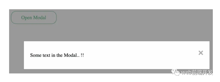
现实项目中的示例:登录或注册弹出窗口、确认消息。
<template>
  <div>
    <Button @click="showModal" title="Open Modal" />
    <!-- The Modal -->
    <div id="myModal" class="modal" :style="{ display: modalDisplay }">
      <div class="modal-content">
        <span class="close" @click="closeModal">×</span>
        <p>{{ content }}</p>
      </div>
    </div>
  </div>
</template>
<script setup>
import { ref } from "vue";
import Button from "https://codepen.io/terawuthth/pen/poqRJvZ.js";
const modalDisplay = ref("none");
const content = ref("Some text in the Modal.. !!");
const showModal = () => {
  modalDisplay.value = "block";
};
const closeModal = () => (modalDisplay.value = "none");
</script>
<style>
.modal {
  position: fixed;
  z-index: 1;
  left: 0;
  top: 0;
  width: 100%;
  height: 100%;
  overflow: auto;
  background-color: rgb(0, 0, 0);
  background-color: rgba(0, 0, 0, 0.4);
}
.modal-content {
  background-color: #fefefe;
  margin: 15% auto;
  padding: 20px;
  border: 1px solid #888;
  width: 80%;
}
.close {
  color: #aaa;
  float: right;
  font-size: 28px;
  font-weight: bold;
}
.close:hover,
.close:focus {
  color: black;
  text-decoration: none;
  cursor: pointer;
}
</style>
演示:https://codepen.io/terawuth/pen/gOZRRdo
6. 警报组件
警报提供反馈并通知用户有关应用程序中的重要信息或事件。警报是一种非常有用的方式来反馈用户而不打扰他们。但我们应该考虑何时使用一段时间后消失的警报或何时需要用户关闭警报。
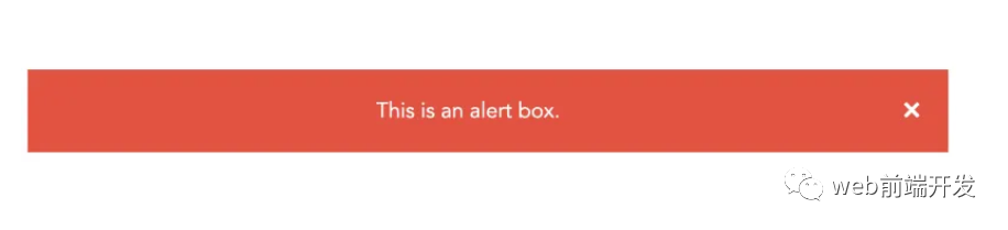
现实项目中的示例:付款或交易的成功或错误消息、站点维护通知。
<template>
  <div class="alert" :style="{ display: alertDisplay }">
    <span
      class="closebtn"
      @click="closeAlert"
      onclick="this.parentElement.style.display='none';"
    >
      ×
    </span>
    This is an alert box.
  </div>
</template>
<script setup>
import { ref } from "vue";
const isAlert = ref(true);
const alertDisplay = ref("block");
const closeAlert = () => (alertDisplay.value = "none");
</script>
<style>
.alert {
  padding: 20px;
  background-color: #f44336;
  color: white;
  margin-bottom: 15px;
}
.closebtn {
  margin-left: 15px;
  color: white;
  font-weight: bold;
  float: right;
  font-size: 22px;
  line-height: 20px;
  cursor: pointer;
  transition: 0.3s;
}
.closebtn:hover {
  color: black;
}
</style>
演示:https://codepen.io/terawuth/pen/WNLOyOo
7.头像组件
头像是代表应用程序中用户的图标或图像。它们使用户帐户更加个性化并且易于用户识别。
但是,并非所有系统都需要用户帐户具有图标或图像。如果用户不上传它们,我们应该提供默认图像或使用他们名字的首字母以提供更好的用户体验。
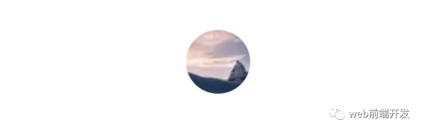
现实项目中的示例:社交媒体网站或聊天应用程序上的用户个人资料。
<template>
  <div class="avatar">
    <img :src="imgPath" id="img-avatar" alt="Avatar" />
  </div>
</template>
<script setup>
import { ref } from "vue";
const imgPath = ref(
  "https://picsum.photos/id/866/50/50"
);
</script>
<style scoped>
.avatar {
  vertical-align: middle;
  width: 50px;
  height: 50px;
}
#img-avatar {
  border-radius: 50%;
}
</style>
演示:https://codepen.io/terawuth/pen/PoXJeqK
注意:您可以在此地址:https://codepen.io/collection/bNmVjq中找到 7 个 UI 组件集合的代码。
优点和注意事项
在 Vue.js 开发中使用这些 UI 组件的好处包括:
- 提高代码的可重用性和可维护性
- 改进了界面一致性和用户体验
- 使用预构建组件缩短开发时间
然而,考虑一些限制或缺点也很重要,例如,由于页面上有大量组件而导致的潜在性能问题,或者需要超出预构建组件提供范围的自定义。 因此,在使用预构建组件和定制代码之间取得平衡非常重要。
我对后端开发的看法
就我而言,我来自使用 Node.js(基于 Javascript)的后端开发。 我不必同时学习新语言和新框架。
此外,Vue.js 文档鼓励新手使用函数式编程原则(例如 Composition API)进行开发。 同样,鼓励后端开发人员尽可能使用这个概念,从而使向前端开发的过渡变得更容易。
Vue.js 是一个用于开发引人入胜的用户界面的强大工具,合并 UI 组件可以将您的项目提升到一个新的水平。 这些只是我个人对 7 个最常用 UI 组件的看法,开发人员可以创建用户喜欢的可扩展、高效且具有视觉吸引力的界面。
作为一个刚接触 Vue.js 的后端开发人员,我还有很多东西需要学习。 希望通过分享我的经验旅程,可以鼓励任何有兴趣学习和扩展对 Vue.js 中 UI 组件开发的理解的人。
Recommend
About Joyk
Aggregate valuable and interesting links.
Joyk means Joy of geeK