

How to Create a Sankey Diagram in Tableau Public
source link: https://datavis.blog/2023/04/29/how-to-create-a-sankey-diagram-in-tableau-public/
Go to the source link to view the article. You can view the picture content, updated content and better typesetting reading experience. If the link is broken, please click the button below to view the snapshot at that time.

How to Create a Sankey Diagram in Tableau Public
It’s now possible to create this more advanced chart type with just a few clicks in Tableau Public – at least up until the end of June, 2023. The restricted window of availability is because Tableau is running a pre-beta pilot programme, meaning this functionality is not even in the most recent (2023.2) beta release and also that, at least based on current information, this feature will go away at the end of June to allow for more development based on pilot feedback.
So, if you want to try out these exciting new features, now’s the time!

Follow the steps below to create a Sankey diagram in Tableau Public.
Open Web Authoring
Go to public.tableau.com and select Web Authoring from the Create menu. If you don’t already have a Tableau account you’ll be prompted to create one or login with your existing account.

Upload Data
A new workbook will open in edit mode and you will be prompted to connect to data. Drag and drop a file with your data into the central area to upload it. I’ll use the Sample – Superstore.xls that comes with Tableau Desktop as an example

Tableau will show the upload progress:

Select Table to Use
If you’re using a spreadsheet with multiple worksheets (tabs) of data, drag the one with your data to the right-hand pane. Here I’m using the Orders sheet:

Tableau will then create an extract automatically

Select Mark Type
Click Sheet 1, then click the Marks drop-down and select Sankey

Notice the marks now has two new shelves – Level and Link

The below message will show, which you can dismiss:

Add Dimensions to Level
Either drag the Category dimension onto the Level shelf or you can double click the Category field to achieve the same effect.
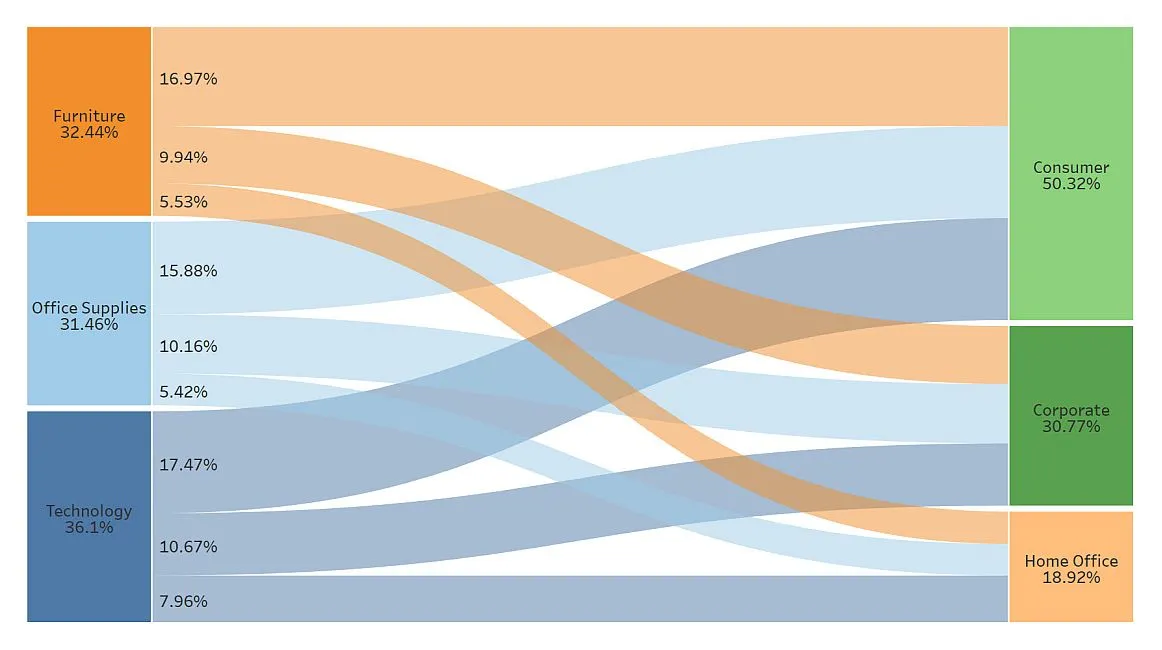
Do the same with Segment and you can see the Sankey chart start to form:

Add Measure to Link
Drag the Sales measure to the Link shelf or, again, simply double click the field and the Sankey is created. It’s that simple!

Adjust Sankey Formatting
You can now adjust the formatting usign the sliders accessed by clicking on the Level shelf

- Level Width adjusts the width of the bars on the left and right side of the Sankey
- Level Padding adjusts the spacing between each dimension member within the levels
Multi-Level Sankey Diagrams
It’s also possible to add another dimension to the Level shelf to create more complex diagrams. Here I’ve added Region as a third Level and increased the padding so there is space between each level member:

With Great Power…
It’s great to see these more complex chart types becoming much easier to create in Tableau as it will unlock their use for so many people for the first time. That said, it’s important to note that Sankey’s have quite a specific role in data visualisation and to use them in circumstances that don’t align with their strengths will likely result in confusion.
For guidance on best practice on using Sankey diagrams (and radial charts) and to learn more about this pilot programme, see this article by Sarah Bartlett on Tableau’s blog.
Now you know how to create them and how best to use them, head over to public.tableau.com to give it a go yourself!
Thanks for reading,
Marc
Latest YouTube video
This video tutorial steps through how to create a dot plot in Tableau.
</div
Recommend
About Joyk
Aggregate valuable and interesting links.
Joyk means Joy of geeK