

Tableau Image Role + Cloudinary
source link: https://datavis.blog/2023/01/23/tableau-image-role-and-cloudinary/
Go to the source link to view the article. You can view the picture content, updated content and better typesetting reading experience. If the link is broken, please click the button below to view the snapshot at that time.
What is an Image Role?
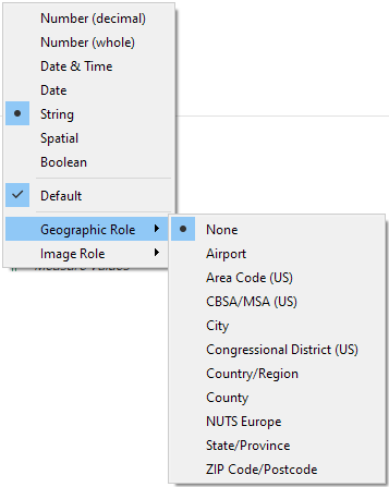
For some years now, it’s been possible to assign a Geographic Role to a field in your data, such as an Airport, City, or Zip Code:
In version 2022.4, Tableau introduced the new Image Role, which can be assigned to a string field that contains a URL for an image:
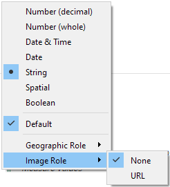
Note the distinction between data type and role. Data types are mandatory and are assigned in the top half of the menu above (Number, String etc.); Geographic and Image Roles are additional and optional properties of a field that instruct Tableau to treat those fields in a certain way.
When a string field that is assigned an image role is brought into the view as a header, instead of displaying the URL as text, Tableau will fetch the image and display that in its place.
What is Cloudinary?
One of Cloudinary’s products is programmable media, which means it can dynamically deliver variations of images based on API calls or parameters in URLs. Have a look at their website to learn more.
Image Role + Cloudinary
Combining Tableau’s image role feature with the ability to dynamically generate images based on URL strings with Cloudinary opens up some interesting possibilities and Tableau Visionary, Tim Ngwena, explored these in this in-depth video, which I highly recommend. Inspired by Tim’s work, the following explores a possible use case.
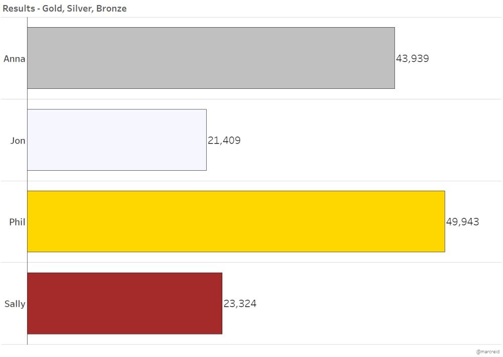
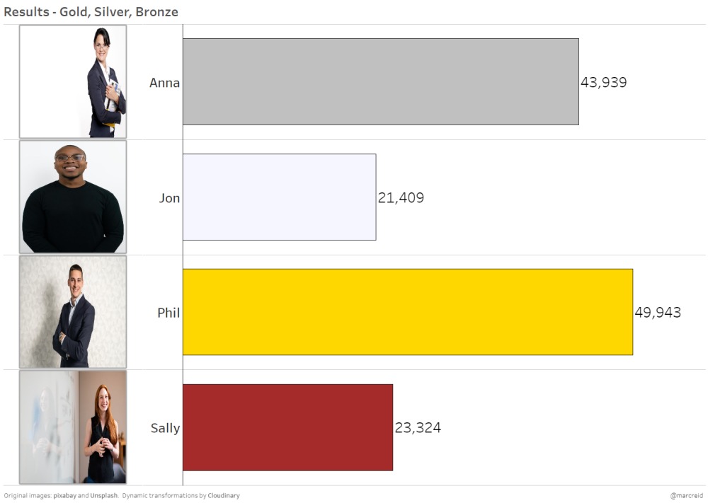
Sales by Person – No Image
We start with a standard bar graph, colour-coded – gold, silver, bronze (and no colour) – based on a sales figure.
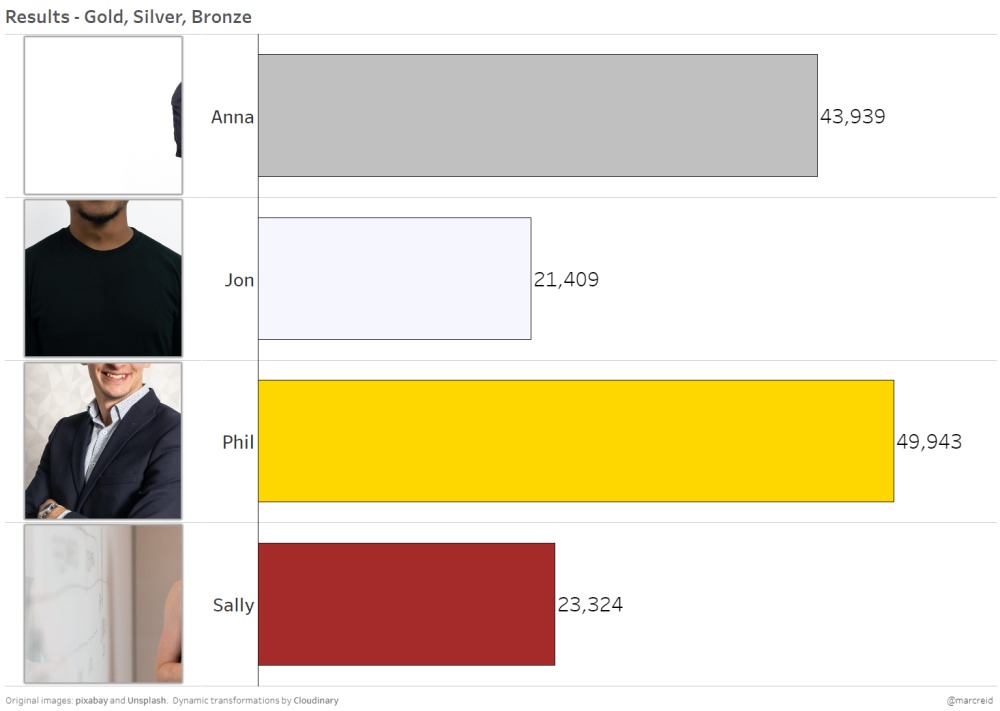
Adding Image Role
An image of each sales person is now shown in the header using a standard image role, with all images hosted on Cloudinary.
(Note, the original images were sourced from pixabay and Unsplash)
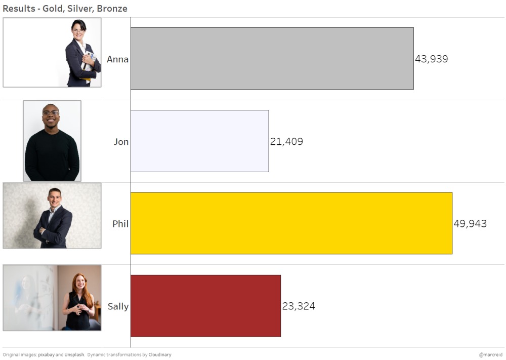
Things we could improve:
- The images are different formats – portrait and landscape
- The images are not centred within each row due to the column width
- The different photo styles and backgrounds give an inconsistent look so don’t blend in well with the chart
- No analytical information is conveyed with the images
Change the image by changing the URL
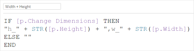
By changing parameters in the dashboard, we can update the URL, which will then result in a new image (with those specified adjustments) being returned.
For example, in the calculation below, if the user has specified they want to change the image dimensions (p.Change Dimensions = TRUE) then a string with those dimensions is returned, which is then added into the image URL (in a different calculation). If not, then an empty string is returned so the URL is not altered.
Six image iterations
The following set of images make the following changes (click/tap the right arrow to see the next image):
- Resizes the images – this doesn’t really work as the images become distorted in this case
- Cropping the image – this makes all the images the same size and they fill the space, which is good, but we lose the subject
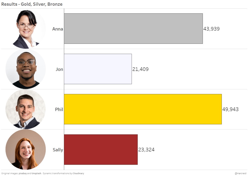
- Cropping to the face – using face detection, we can crop all the images to same dimension focussed on the face
- Circular shape – making the images circular gives them a more profile look
- Add a blue border – gives all the images a similar (and possibly branded/company) style
- Stylise the images with a cartoon effect – I’ve seen similar with some company photos, again to give a common style


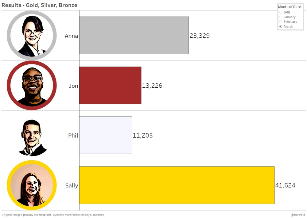
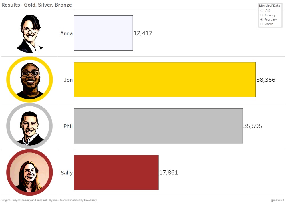
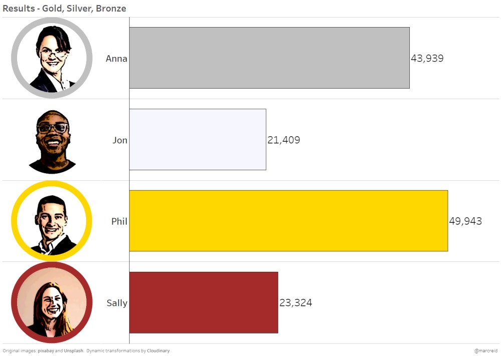
Make the images data-driven
This is where things get a little more analytical. Instead of a fixed colour border for all images, what if we determined the colour based on the sales metric (or the sports score, or last month’s profit per item etc…)?
With a simple RANK() calculation, based on the sales measure, I was able to assign a dynamic border to each image based on sales in that month.
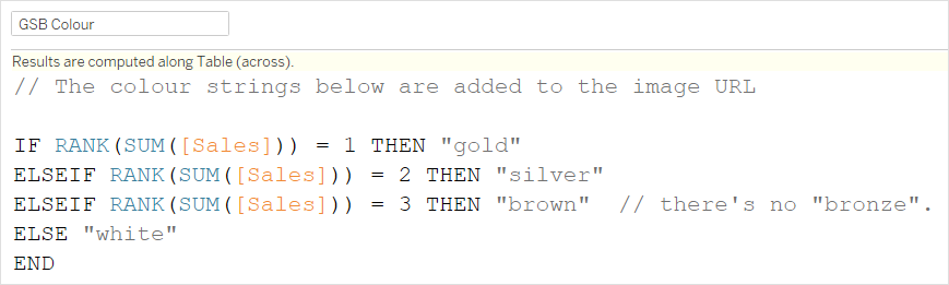
Adding a filter month on the dashboard, we can then change the month and see the image borders update based on monthly sales to match the bar colour. Scroll through the images below for Jan, Feb, March:

Start and end states
Compare the two images below showing the unmodified images versus the final dynamic, stylised profile images – all created by changing the URL!
It’s unlikely you will want images to be the primary visual display for your data but they could make a nice compliment to existing charts and graphs in the right situation and I could definitely see some use cases for sports visualisations.
Video Tutorial
See the video below for a walkthrough of the dashboard used in the above examples and to see new images be dynamically generated based on parameter changes along with some other image options.
More image role examples
More examples from the Tableau community:
- Blog post on using image roles with sports team logos from CJ Mayes
- Workbook with URLs for all country flags from LM-7
- Workbook using image role in a colour palette generator from Brittany Rosenau
- This challenge from the WorkoutWednesday team
- Video one and two from Tim Ngwena on Cloudinary and image roles
Thanks for reading!
Latest YouTube video
Tutorial walking through two examples of the new INTERSECTS() spatial function in Tableau 2022.4
Recommend
About Joyk
Aggregate valuable and interesting links.
Joyk means Joy of geeK