

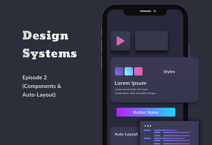
Design System from Scratch (Episode 2)- Components
source link: https://uxplanet.org/design-system-from-scratch-episode-2-components-ea1f32984f39
Go to the source link to view the article. You can view the picture content, updated content and better typesetting reading experience. If the link is broken, please click the button below to view the snapshot at that time.

Design System from Scratch (Episode 2)- Components
Fundamentals of Components & Auto-Layout
I was playing around a little with Figma lately & realised making components has become easier than ever was. In my previous episode I wrote about changing the frame name in order to create components but now with latest upgrade making components has become so much easier.
In this episode we will discuss how to create buttons, create components and further use them in your app. Currently I am designing for Vah Vah! App, so I will be focusing on mobile dimensions.
Why am I Creating assets for my app first compared to website or any other platform?
Most of our students use the app on a daily basis. There is more complexity in the app and it is customer facing. This will have the highest impact and hence we went ahead and started with the app.
For our reference of learning I am going to try and limit this to Primary, Secondary & Tertiary buttons
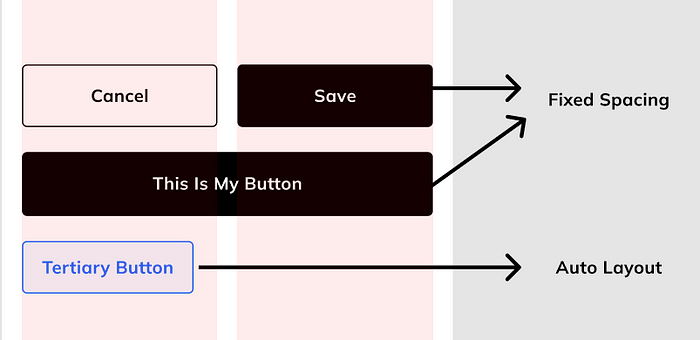
My simple buttons
Auto Layout
In order to Maintain Perfect consistency it is useful that you define how you want your button to look like on your device
First way is to define the exact width and height and adding text in which I have done with my Primary and secondary buttons
Other way is by adding auto-layout, which is my favourite thing when things are dynamic in nature. I will show how this works using a real life example from our current app.
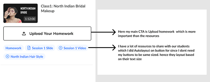
real time example from our appHow to Auto-Layout
Auto-layout makes things quite simple. You can also use this for creating Auto-layouts between Multiple components, and define spacing between components eg: spacing between Heading → subheading → paragraph, or even buttons. Once you Auto Layout, Any changes made will automatically adjust your frame according to your space definition
Figma Auto Layout for Multiple components
Now that we perfected the Auto-Layout between items let’s dive into how to create these components.
How to Easily Create Component variants
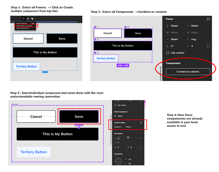
Creating variants of button
- First start by creating all your button types — your primary, secondary and tertiary, You can even add buttons with icons.
- Select All Frames → Click Component Options on top nav → Select Create Multiple components
With this you will have defined your button components you want to use. - Now you want to make sure they are grouped to one family,
Select all the components → Click on combine as variants
eg: Primary, secondary & tertiary are variants of button.
Thats it define names according to your naming convention and tadaa you have your Buttons for your app.
Now to test out your button you can go to your assets and drag and drop a button and choose the variant you want.
I have similarly made some of my icons, video components for my App.
I further used these components to make multiple other components to use in my video segment which will be easy to maintain since I made components
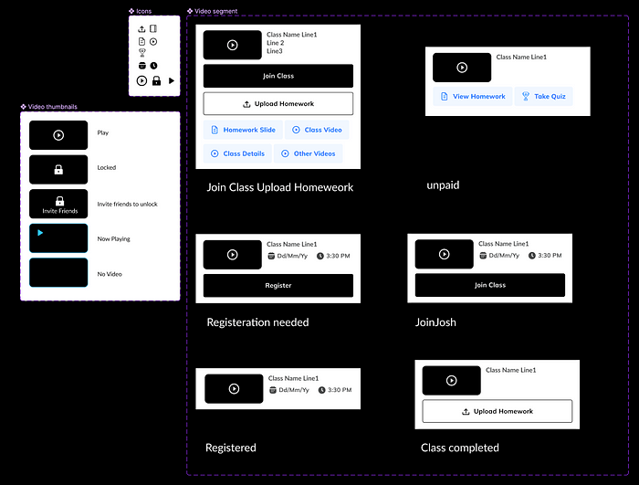
Once making these components make sure of the changes being made, since any changes made to these original components will be reflected in all the copies you make as well. Hence try and copy paste these components and then make changes you need to it. so your Source of truth remains intact.
Finally I will publish and use them in my app. Which we will go ahead and do in the next episode.
Hope you enjoyed this. Have fun making your very own design system.
However If you are just starting off though don’t limit yourself worrying about a design system just yet.
TIP: There are several design system components already out there in the community so go ahead and check them out as well.
If you missed the episode 1 you can check it out by clicking here
Recommend
-
10
Kor — Building a Design System from scratchIn 2020 I planned to spend some of my free time in personal projects for learning new techniques and skills especially related to designing and building digital tools. H...
-
13
Unite UX If your apps are coded as designed, close this page now Still here? Meet Unite UX: The collaborative design-to-development UI components builder....
-
10
Where do you put spacing on design system components? I work on design systems now. It scratches a lot of itches I have, most importantly organizing and standardizing things, as well as baking accessibility in at both...
-
6
In “Having Fun with the Lightning Design System for React”, I created a React application using the
-
10
Design system versioning: single library or individual components?
-
11
Design System from Scratch (Episode 1)
-
8
-
4
-
11
RSC From Scratch. Part 1: Server Components In this technical deep dive, we'll implement a very simplified version of React Server Componen...
-
4
Working Code Podcast - Episode 131: Starting From Scratch By Ben Nadel on June 14, 2023 Tags:
About Joyk
Aggregate valuable and interesting links.
Joyk means Joy of geeK