

Kor — Building a Design System from scratch
source link: https://uxplanet.org/kor-building-a-design-system-from-scratch-f3fbde354a87
Go to the source link to view the article. You can view the picture content, updated content and better typesetting reading experience. If the link is broken, please click the button below to view the snapshot at that time.
Kor — Building a Design System from scratch
In 2020 I planned to spend some of my free time in personal projects for learning new techniques and skills especially related to designing and building digital tools. Having worked on design systems professionally for some years, the logical first step to me was to have a component library that I could reuse across my projects, which would be:
- Lightweight by only including the very ‘core’ components and functionalities
- Customizable for allowing brand expression in different applications
- Agnostic of framework for use on any application stack
Searching for existing solutions out there, I could not find one that met all these requirements. Some had too many features I wouldn’t need, some did not allow style customization and most of them were based on a specific framework such as React, Vue or Angular.
I started building Kor on November 21, 2019 and the first version was published 4 days after. As of today, it has 7,000+ downloads on npm, 92 stars on GitHub and 300 average monthly users of the documentation.
1. Defining the base rules
Design systems are built on top of principles that are shared across UI components. Having a solid foundation helps ensuring the final solution is coherent and provides a basis for easy customization.
Dimensions
Consistent dimensions have a high influence on the perceived harmony of the UI, and the best way to achieve it is by defining a base unit. In the case of Kor, this unit was defined as 8px, a convention followed by most design systems which fits the most common screen resolutions. Usually units are defined as follows:
- 8px: Space between elements of a component
- 16px: Outer component margins
- 24px: Size of icons and line height
In rare cases such as in information-dense user interfaces, the 8px grid can be divided once more, resulting in increments of 4 such as 4, 12 or 20.
Colors
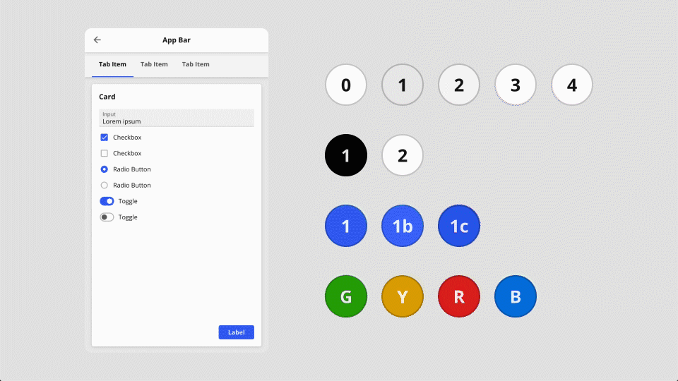
Colors are used to convey hierarchy, highlight states and draw attention to certain UI components. To reduce complexity and make themes easy to modify, in Kor I have focused on reducing the number of colors to a bare minimum, and a total of 4 categories have been defined:
- Base: Container backgrounds (such as app bar, cards, page)
- Neutral: Positive and negative content colors (such as text, divider lines and transparent highlights)
- Accent: Active state highlight and call to action colors
- Functional: Confirmation, alert, error and neutral state colors
Default light and dark color schemes were defined and users are encouraged to design new themes by modifying as many color variables as desired.
Typography
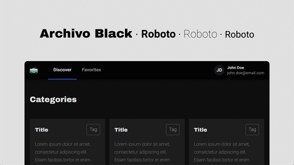
Font styles combine aspects such as typeface, size, line height and color and are used to convey hierarchy, ensure readability and express brand identity. Keeping the amount of styles concise, 4 font styles have been defined and made customizable through variables:
- Header 1: App bar label and content headings
- Header 2: Component headings (e.g. tabs, cards)
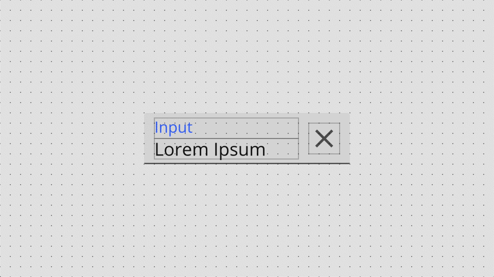
- Body 1: Component labels (e.g. tags, checkboxes)
- Body 2: Component secondary text (e.g. avatar)
Elevation
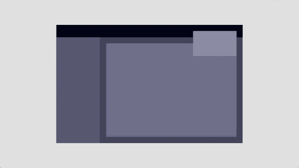
Another useful way to keep the UI organized and convey hierarchy of content is through the use of elevations. In Kor I have defined 4 layers which are set through the use of colors and shadows.
The color values for each layer are defined based on the natural effect of light on surfaces, which means that layers closer to the viewer are brighter than the ones further in both light and dark themes.
Depending on the visual language of the app, shadows and colors can be redefined or removed in case a flat appearance is preferred.
- Layer 1: The background of the page
- Layer 2: Side content (panes, nav bars)
- Layer 3: Content containers (cards, accordions)
- Layer 4: Overlaid content (notifications, modals)
Iconography
Icons help create visual rhythm and convey information in a quick way. In Kor I have opted to use the Material Design icons as they are open source, fit the 8px grid and covers most of the common use cases. In addition, users can include their own icon libraries as assets to replace or complement the standard set.
2. Building components
Components are UI units which are generic (can be used in various use cases) and customizable through the use of properties, slots and events. Apps are usually composed of 80% common components such as buttons or inputs and 20% unique ones, such as maps or calendars. In Kor I have focused on the common ones to keep it concise and lightweight.
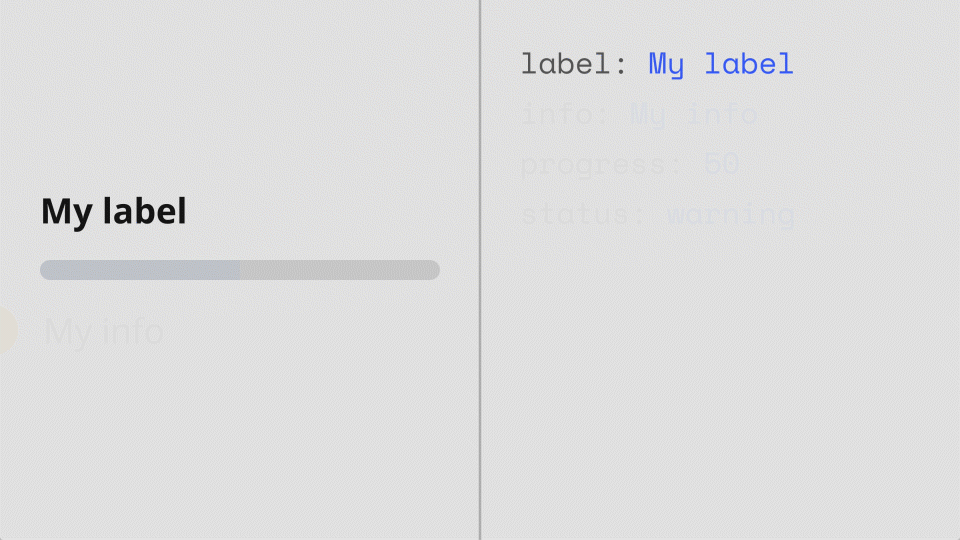
- Properties are knobs through which components can be customized (e.g. labels of buttons)
- Events are triggered by components to the app (e.g. button click)
- Slots are containers in which custom content can be inserted (e.g. text inside a card)
3. A drag & drop sandbox
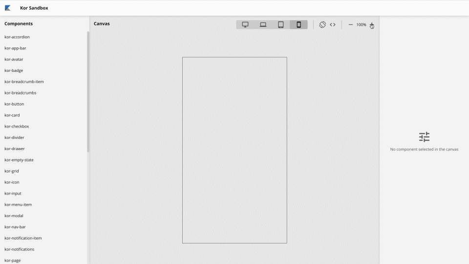
To help developers who are not so proficient with visual design and designers that are not into coding, I decided to create a sandbox where user interfaces can be created and customized by dragging and dropping components into a canvas.
While there are plenty of prototyping tools available, their outcome can usually serve only as a reference for implementation, and most of the designer’s efforts needs to be repeated again by the developer, so with this sandbox I experimented with narrowing this gap by generating production-level (or almost) HTML pages in a visual manner.
This project earned me my very first platinum award 💎 on Reddit, of which I am very proud 😎.
4. Documentation, guidance and support
In parallel to designing and developing the design system, I have worked on the main documentation page for explaining how to set up, consume and contribute to Kor. The entire web app was made with the component library itself.
To request new features, ask for support or contribute to Kor directly, users currently use the GitHub repository and issue boards.
Recommend
About Joyk
Aggregate valuable and interesting links.
Joyk means Joy of geeK