

The appeal of complex components in user interface design systems
source link: https://uxdesign.cc/the-appeal-of-complex-components-in-user-interface-design-systems-6514de1edff5
Go to the source link to view the article. You can view the picture content, updated content and better typesetting reading experience. If the link is broken, please click the button below to view the snapshot at that time.
The appeal of complex components in user interface design systems
Using the new exposed nested properties and the preferred instance properties in Figma to build configurable UI kits.
Are configurable systems the next step towards design automation?
Previously, I wrote about the factory model of designing interfaces which proposed that design systems built with configuration as their underlying principle can improve the efficiency of the design process. Since then, Figma has released the updated component properties (beta), which allow for setting preferred instances and exposing the properties of nested components.
What excites me the most is that these updates also open up the possibility of creating complex configurable component systems packaged together as entities for easy consumption across the same or multiple projects. Such systems can also lead to new ways of thinking and planning through the design systems and open avenues for a new breed of designers focused on robust strategies for scaling such design systems using configurable UI kits.
An Overview of the updates
Primarily, we are looking at more configuration capabilities for component instances. Configurable components are desirable since they can reduce the effort involved in ensuring consistency across the product. Once set up, it can potentially enable designers who are less acquainted with a particular design system and its underlying principles and guidelines to create quick mockups.
Preferred Instances
Preferred instances allow for cherry-picking component instances that can be associated with a particular component. Previously, one had to maintain a naming convention or group components together to achieve this. Preferred instance property negates this requirement and enables setting them up in the global scope.
Setting certain icons as a preferred instance for a nav component
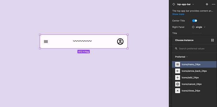
Exposing Nested Instances
This update enables you to expose the properties of a nested component, which means there would no longer be a need to dig into component instances to configure instance properties (Shoutout to the Figma team for the creativity, strategy and direction shown in pushing these product updates)
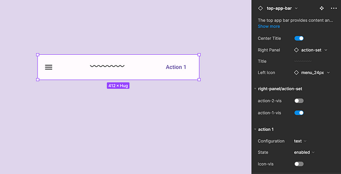
Exposing the properties of the right panel and further the action buttons in the right panel
Creating Configurable UI Kits
Previously, I described the making of factory components in Figma. The recent Figma updates have extended the capabilities of such factory components by making it much easier to create and consume complex them. Further, we can push the envelope for such component systems by creating UI kits built entirely on such a configuration model. Here is an overview of the system:
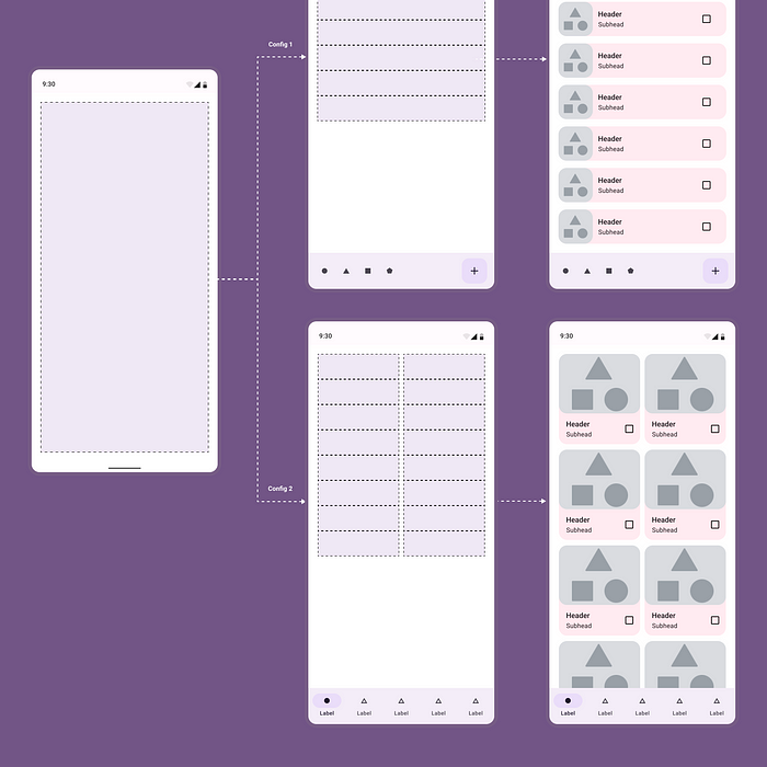
1. The Shell: Shells are independent and universal entities that can be attached to any other component. For this setup, I have created two types of such shells, one with a custom spacing configuration between the slots and the other with a fixed spacing between them. The part components are accessed through these shell slots. The number of parts is limited only by the number of such slots created in a shell.
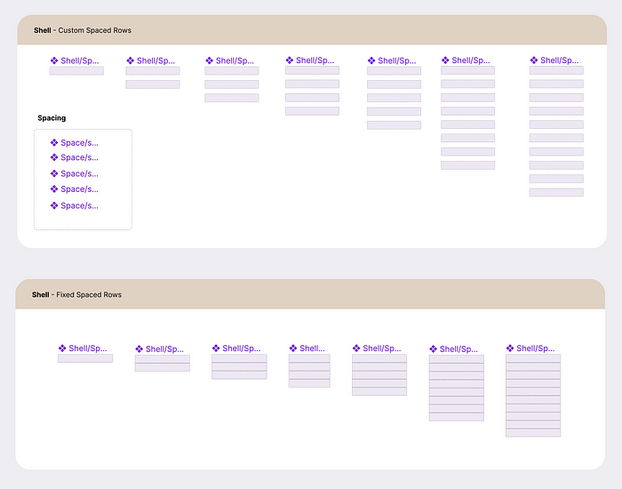
Shells have custom and fixed spacing elements
2. Parts and raw materials: Raw materials are any components created at the fundamental level. Parts are components that are a packaging of various raw materials. This setup uses raw materials from the Material Design 3.0 Design System and parts created using these raw materials.
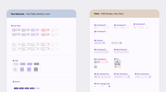
Raw materials and Parts
3. Template Component: We then package the shells into a template. In this case, I am using a phone mockup. Setting up the template component also involves exposing the properties of nested components and ensuring that the naming conventions of all the parts and shells align with this component to make them accessible at this level. Note that there is a need for some due diligence and thinking through the hygiene of such a setup since the context panel can easily get overwhelmed with unnecessary properties if not thoroughly considered.
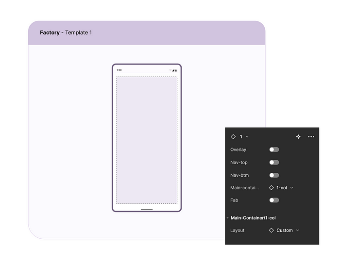
The template exposes only the necessary properties at the top level.
Using the system
Such configurable kits can significantly reduce the time to design. Wireframing kits that use such components could make it easier for non-designers to start their app or web product interface design for early-stage testing.
While there is an overhead associated with such systems in that there is a need for robust naming conventions and planning, such overheads are one-time only. On the upside, once created, such UI kits could act as the base or starter for any new projects.
Here are some screen grabs on how the setup can speed up your interface design process.
Setting up rows: The snippet below shows how you can quickly switch between various row and column configurations of slots and populate them with Parts.
A universal way for configuring rows and columns setup
Low to high-fidelity switch: You have efficient control over the content details at low and high fidelity. As a designer, you get to define an appropriate level for a low-fidelity or high-fidelity design and set that up as your base components.
Applying content via Content Reel and Switching layouts
Starting with frequently used components: A pop-up modal overlay is one of the most used features in any product. Such pop-ups and dialog boxes as configurable settings can significantly improve the interface design speed.
Configuring the default material 3 dialog pop-up and applying content
Standardised UI patterns like input forms can easily be converted to such a templatized system with plenty of room for customization while at the same time keeping them consistent.
Input forms as a configuration pattern
The future of configurable user interfaces
Such configurable UI systems can open up new ways of thinking through the product design process, employing new ways of engaging with the designers. On speculation, we may well move towards:
1. A marketplace for component designers
In the future, popular design kits like the Material Design Kit may have such configuration capabilities built into them, which may well mean that your next android design project is just a few configurations away.
Designers can create new component patterns for existing and new design kits and publish them as prefabricated components to a shared repository, making them available to all other designers. As long as a designer subscribes to a particular design kit, they could potentially use such modular prefabs across their projects seamlessly, thus saving time and improving efficiency for everyone involved.
2. User interface design automation
When we achieve efficient modularisation, machine learning systems should be able to leverage the modularity and configurability of the design system to create interfaces that respond to the product’s needs.
While current design tools offer the flexibility of patterns and approaches in design, the flexibility also results in the diverse implementation of interface components. Such components can be hard for software systems to streamline into reusable code. If design systems align with the dev implementation through standard naming conventions and patterns, there is also a potential for the design-to-code transition to be automated.
The contextual panel in Figma is sensibly heading in that direction, promoting the idea of designers spending less time on pixel creation but more on decision-making. By creating design systems with standard configurable patterns that align with developer implementation and opening it up to a shared consumer and creator base, such a reality is not too far away. As makers of products, we should then be able to spend more time solving complex problems and less time creating and maintaining systems.
Note: The setup described in this article is experimental and is not tested for use in a commercial project. However, I can recommend trying such a system for creating quick wireframes.
Recommend
About Joyk
Aggregate valuable and interesting links.
Joyk means Joy of geeK