

SwiftUI gradients and shadow styles
source link: https://useyourloaf.com/blog/swiftui-gradients-and-shadow-styles/
Go to the source link to view the article. You can view the picture content, updated content and better typesetting reading experience. If the link is broken, please click the button below to view the snapshot at that time.
Want to add some gradients and drop shadows to your flat design? Starting with iOS 16, SwiftUI adds a gradient property to Color and some convenient modifiers to ShapeStyle to add drop and inner shadows to views.
Color Gradients
The gradient property of Color returns a color gradient of type AnyGradient which you can use as a ShapeStyle:
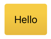
Text("Hello")
.padding()
.background(.yellow.gradient,
  in: RoundedRectangle(cornerRadius: 4))
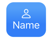
Or when setting the background style for views:
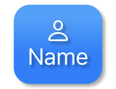
VStack {
  Image(systemName: "person")
  Text("Name")
}
.background(in: RoundedRectangle(cornerRadius: 2)
  .inset(by: -10))
.backgroundStyle(.blue.gradient)
.foregroundStyle(.white)
Shadow Styles
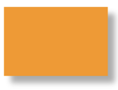
The ShadowStyle gives us some convenient modifiers to add drop and inner shadows to colors. The drop shadow takes a radius for the shadow’s size and optional horizontal (x) and vertical (y) offsets:
Rectangle()
.fill(.orange
      .shadow(.drop(radius: 2, x: 5, y: 5)))
.frame(width: 75, height: 50)
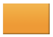
The inner shadow modifier follows the same format. This time I’ve used it with a gradient:
Rectangle()
.fill(.orange
      .gradient
      .shadow(.inner(radius: 1, x: -1, y: -1)))
.frame(width: 75, height: 50)
The shadow style works well with SF symbols. For example, applying a shadow to both the foreground and background styles:
VStack {
  Image(systemName: "person")
  Text("Name")
}
.background(in: RoundedRectangle(cornerRadius: 2).inset(by: -10))
.backgroundStyle(.blue.gradient
  .shadow(.drop(radius: 1, x: 2, y: 2)))
.foregroundStyle(.white
  .shadow(.drop(radius: 1, x: 2, y: 2)))
Animating Changes
The gradient and shadow effects are animatable when changed. Let’s build an “On Air” indicator that switches between off/on states:
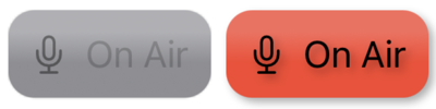
I built the view with an HStack in a rounded rectangle:
struct OnAirView: View {
  @Binding var onAir: Bool

  var body: some View {
    HStack {
      Image(systemName: "mic")
      Text("On Air")
    }
    .background(in: RoundedRectangle(cornerRadius: 2)
      .inset(by: -10))
    .backgroundStyle(onAir ? onBackground : offBackground)
    .foregroundStyle(onAir ? onForeground : offForeground)
  }
}
I switch the background and foreground styles depending on the onAir state. I find it easiest to define those styles as separate properties. First the background styles:
private let offBackground: AnyShapeStyle = AnyShapeStyle(
  .gray.gradient
  .shadow(.drop(radius: 0)))

private let onBackground: AnyShapeStyle = AnyShapeStyle(
  .red.gradient
  .shadow(.drop(radius: 2, x: 2, y: 2)))
This switches between a gray gradient with no drop shadow (radius 0) and a red gradient with a drop shadow. It’s better to remove the shadow by applying a zero radius rather than omit it to avoid a harsh animation.
The foreground styles used for the text and symbol follow a similar pattern:
private let offForeground: AnyShapeStyle = AnyShapeStyle(
  .black.opacity(0.4)
  .shadow(.drop(radius: 0)))

private let onForeground: AnyShapeStyle = AnyShapeStyle(
  .black.opacity(1)
  .shadow(.drop(radius: 2, x: 2, y: 2)))
Learn More
Recommend
About Joyk
Aggregate valuable and interesting links.
Joyk means Joy of geeK