

使用纯Css实现网站换肤和焦点图切换动画
source link: https://www.fly63.com/article/detial/12110
Go to the source link to view the article. You can view the picture content, updated content and better typesetting reading experience. If the link is broken, please click the button below to view the snapshot at that time.
扫一扫分享
1.网站换肤
通常我们实现网站换肤都基于如下方式实现:
- 方案一: 使用OOCSS模式,通过js动态切换公共类名来达到换肤效果
- 方案二: 点击不同的按钮切换不同的样式表,如下:•theme-green.css•theme-red.css•theme-black.css
- 方案三: localStorage存储主题,js动态获取本地存储换肤
- 方案四: element和antd的动态换肤,需要实时编译style样式表
以上几个方案都可以实现一定程度上的换肤效果,但是如果是一些基础性的换肤,比如网站的背景样式,某个按钮的样式,某块内容区域的样式等等这种局部的换肤,我们能不能直接用css来实现呢?答案是可以的,接下来我们就来看纯看css如何实现网站换肤。
在实现换肤之前,我们需要了解一个知识点,那就是a标签的:target伪类。
:target伪类
为了辅助标识那些指向文档特定部分链接的目标, CSS3 选择器 引入了 :target 伪类. :target 伪类用来指定那些包含片段标识符的 URI 的目标元素样式。
例如, http://xuxi#home , 这个 URI 包含了 #home 片段标识符。在html中, 标识符是元素的id或者name属性,。由于这两者位于相同的命名空间,因此,这个示例 URI 指向的是文档顶层的 "home" 。
假设你想修改 URI 指向的任何 div 元素,但是又不想把样式应用到任何其它同类型的元素,那么我们可以这么写:
<style>
    div:target {
        background: #06c;
    }
</style>
<a href="#home" >蓝</a>
<div id="bg1"></div>
此时当我们点击a标签时,会命中:target的元素,这个时候会将div的背景色设置为蓝色,即#06c。
了解这个伪类之后,我们的网站换肤就很容易实现了,比如说我们要实现网站背景色的换肤,我们可以预先准备几个背景色的容器, 然后用a标签的href锚点分别对应相应的背景元素id,然后当点击背景色的时候调整背景容器的层级,这样就可以实现换肤了,实际效果可以看文章开头的效果展示。具体代码如下:
<style>
    .bg {
      position: absolute;
      left: 0;
      top: 0;
      bottom: 0;
      right: 0;
    }
    .bg1 {
      z-index: 10;
      background-color: #000;
    }
    .bg2 {
      background-color: #06c;
    }
    .bg3 {
      background-color: #f0c;
    }
    .skin-btn-wrap {
      position: absolute;
      padding: 4px 10px;
      border-radius: 20px;
      line-height: 20px;
      background-color: #fff;
      z-index: 11;
      right: 20px;
      top: 20px;
    }
    .skin-btn-wrap a {
      display: inline-block;
      width: 20px;
      height: 20px;
      border-radius: 10px;
    }
    #one {
      background-color: #000;
    }
    #two {
      background-color: #06c;
    }
    #three {
      background-color: #f0c;
    }
    .bg:target {
      z-index: 10;
    }
    .bg:not(:target) {
      z-index: 0;
    }
  </style>


  <!-- css背景换肤 -->
  <div class="bg1 bg" id="bg1"></div>
  <div class="bg2 bg" id="bg2"></div>
  <div class="bg3 bg" id="bg3"></div>
  <div class="skin-btn-wrap">
    <a href="#bg1" id="one"></a>
    <a href="#bg2" id="two"></a>
    <a href="#bg3" id="three"></a>
  </div>
2.焦点图动画
焦点图动画主要来自我们司空见惯的轮播图,我们点击轮播图的某个指示点时,可以切换会对应的图片,焦点轮播图常用的方案主要是用javascript和css共同实现,方案有大致以下几种:
- bootstrap的轮播图插件
- jquery市场的丰富的轮播图插件•swiper.js(丰富而强大,小程序也内置了swiper组件)•antd/element内置轮播图组件
- slick•unslider 最简单的轮播图组件•fancyBox 可以为页面上的图片、html 内容和多媒体添加缩放功能
- sly 导航式、可单向滚动
- Sequence 可以创建响应式幻灯片、演示、旗帜广告和以步骤为基础的CSS 动画框架
- PhotoSwipe 适用于移动设备和桌面电脑,基于原生JavaScript的模块组件
以上介绍的方案都很成熟,我们可以直接拿来使用,但是为了追求简洁和代码量最低,我们有办法用纯css实现一个简单的焦点图切换动画吗?
实现思路如下:
1.建立焦点图和控制点的对应关系
2.初始化页面时只让第一个焦点图有宽度,其他宽度都设置为零,当控制点激活时,然控制点对应的目标对象的宽度设置为正常值,其他的非目标对象都设置为零
3.给焦点图添加transition过渡动画4.优化焦点图和控制点样式
具体代码如下:
<style>
.swiper {
position: relative;
margin: 0 auto;
display: flex;
width:80vw;
height: 250px;
padding: 18px;
border-radius: 8px;
background: #fff;
box-shadow: 0 0 20px rgba(0,0,0, .2);
}
.swiper .img {
height: 250px;
width: 0;
overflow: hidden;
display: flex;
align-items: center;
justify-content: center;
transition: width .6s;
background-color: #06c;
color: #fff;
}
.swiper .img:first-child {
width: 100%;
}
.swiperControl {
position: absolute;
left: 50%;
transform: translateX(-50%);
bottom: 30px;
padding: 3px 10px;
border-radius: 20px;
font-size: 0;
background-color: rgba(0,0,0, .3);
}
.swiperControl .dot {
display: inline-block;
margin: 0 6px;
width: 8px;
height: 8px;
border-radius: 6px;
background-color: rgba(255,255,255, .6);
}
.swiperControl .dot:hover {
background-color: rgba(255,255,255, 1);
}
.swiper .img:target {
width: 100%;
}
.swiper .img:not(:target) {
width: 0;
}
</style>
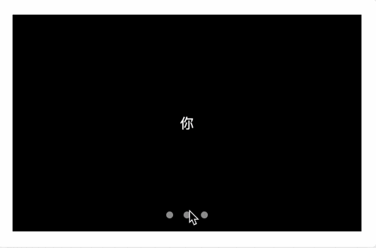
<div class="swiper">
<div class="img" id="img1" style='background: #06c'>我</div>
<div class="img" id="img2" style='background: #f0c'>爱</div>
<div class="img" id="img3" style='background: #000'>你</div>
<div class="swiperControl">
<a class="dot" href="#img1"></a>
<a class="dot" href="#img2"></a>
<a class="dot" href="#img3"></a>
</div>
</div>通过上面介绍的纯css实现网站换肤以及焦点图切换动画,是不是对css有更多的新奇的想法了呢?后面我会继续介绍更多纯css3实现的不可思议的动画,比如3D掷色子,VR图等,敬请期待吧~
来源: 趣谈前端
Recommend
About Joyk
Aggregate valuable and interesting links.
Joyk means Joy of geeK