
4

OpenHarmony - ArkUI(TS)声明式开发之故障轮播-开源基础软件社区-51CTO.COM
source link: https://ost.51cto.com/posts/16560
Go to the source link to view the article. You can view the picture content, updated content and better typesetting reading experience. If the link is broken, please click the button below to view the snapshot at that time.
OpenHarmony - ArkUI(TS)声明式开发之故障轮播 原创 精华
作者:钟娟
最近刚接触基于openHarmony开源框架的应用开发,特别是基于TS扩展的声明式开发。本文主要结合Harmony官网上的ETS相关组件及API实现日常开发中常见的故障循播效果,以此熟悉ETS下的一些基础组件的应用。
UI开发模式
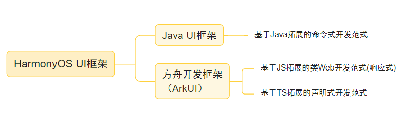
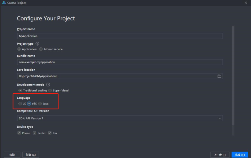
1. 新建项目
2. 页面布局
创建弹性Flex布局,使用Swiper容器组件,Text、Image基础组件。
  build() {
    Flex() { //弹性布局
      Swiper() { //滑动容器,提供切换子组件显示的能力
          Flex() {
            Image($r('app.media.ic_warn'))//图片组件,用来渲染展示图片。
            Text() //文本,用于呈现一段信息。
            Image($r('app.media.ic_arrow'))//图片资源放于resource文件夹下的media文件夹下
          }
      }
    }
  }
3. 以“.”链式调用的方式配置UI结构及其属性、事件等
build() {
Flex({ direction: FlexDirection.Row, alignItems: ItemAlign.Center }) { //弹性布局
Swiper() { //滑动容器,提供切换子组件显示的能力
Flex({ direction: FlexDirection.Row, alignItems: ItemAlign.Center }) {
//图片组件,用来渲染展示图片
Image($r('app.media.ic_warn'))
.width(24)
.height(24)
.margin({ top: 12, left: 12, bottom: 12 })
.objectFit(ImageFit.Fill)
//文本,用于呈现一段信息
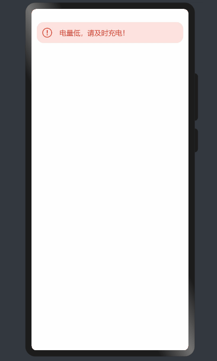
Text('电量低,请及时充电!')
.width('75%')
.textOverflow({ overflow: TextOverflow.None })
.fontSize(16)
.fontColor(0xd94838)
.fontWeight(FontWeight.Medium)
.margin({ top: 14, left: 16, })
.padding({ bottom: 15 })
//图片资源放于resource文件夹下的media文件夹下
Image($r('app.media.ic_arrow')).width(12)
.height(24)
.margin({ top: 12, right: 12, bottom: 12 })
.objectFit(ImageFit.Fill)
}
}
.margin({ top: 30, right: 12, left: 12, })
.height(48)
.borderRadius(16)
.backgroundColor(0xfce3df)
.index(1)
.autoPlay(true)
.interval(1000)
.indicator(false)
.loop(true)
.duration(1500)
.vertical(true)
.disableSwipe(true)
}
}
Swiper相关属性
| 名称 | 参数类型 | 默认值 | 描述 |
|---|---|---|---|
| index | number | 0 | 设置当前在容器中显示的子组件的索引值。 |
| autoPlay | boolean | false | 子组件是否自动播放,自动播放状态下,导航点不可操作。 |
| interval | number | 3000 | 使用自动播放时播放的时间间隔,单位为毫秒。 |
| indicator | boolean | true | 是否启用导航点指示器。 |
| loop | boolean | true | 是否开启循环。 |
| duration | number | 400 | 子组件切换的动画时长,单位为毫秒。 |
| vertical | boolean | false | 是否为纵向滑动。 |
| itemSpace | Length | 0 | 设置子组件与子组件之间间隙。 |
| cachedCount | number | 1 | 设置预加载子组件个数。 |
| disableSwipe | boolean | boolean | 禁用组件滑动切换功能。 |
| curve | Curve | Curve.Ease | 设置Swiper的动画曲线,默认为淡入淡出曲线。 |
| indicatorStyle | 设置indicator样式 |
Image相关参数和属性
| 参数名 | 参数类型 | 必填 | 默认值 | 参数描述 |
|---|---|---|---|---|
| src | string| PixelMap|Resource | 是 | - | 图片的数据源,支持本地图片和网络图片,建议使用$r方式来管理需全局使用的图片资源。 |
| alt | string | 否 | - | 加载时显示的占位图。支持本地图片和网络路径。 |
| objectFit | ImageFit | 否 | Cover | 图片的缩放类型。 |
| objectRepeat | ImageRepeat | 否 | NoRepeat | 图片的重复样式,SVG类型图源不支持该属性。 |
| interpolation | ImageInterpolation | 否 | None | 设置图片的插值效果,仅针对图片放大插值。SVG类型图源和PixelMap资源不支持该属性。 |
| renderMode | ImageRenderMode | 否 | Original | 图片渲染的模式,SVG类型图源不支持该属性。 |
| sourceSize | {width: number,height: number} | 否 | - | 图片解码尺寸,将原始图片解码成指定尺寸的图片,number类型单位为px。PixelMap资源不支持该属性。 |
| syncLoad | boolean | 否 | false | 是否同步加载图片,默认是异步加载。同步加载时阻塞UI线程,不会显示占位图。 |
4. 赋初始值,完善逻辑,实现循环播放
使用ForEach循环遍历所有故障数据,结合if和弹窗组件,实现部分故障有相应解决方案提示框的需求。
@Entry
@Component
struct SwiperExample {
 @State arr: any[] = [{
                          id: 0,
                          tipText: "设备缺水,请检查设备",
                          showMoreIcon: true,
                        }, {
                          id: 1,
                          tipText: "设备电流过大,请检查设备",
                          showMoreIcon: true,
                        }, {
                          id: 2,
                          tipText: "电量低,请及时充电!",
                          showMoreIcon: false,
                        }]
  @State solutionArray: any[] = ["请检查进出水接头是否存在松动,如果排查确认接头未松动,请咨询官方售后服务电话:“400-6008878”。", "如果首次出现该故障提醒,请重新插拔电池包;如果还显示该故障,请联系商家售后。"]

  build() {
    Flex({ direction: FlexDirection.Row, alignItems: ItemAlign.Center }) {
      Swiper() {
        ForEach(this.arr, (item) => {
          Flex({ direction: FlexDirection.Row, alignItems: ItemAlign.Center }) {
            Image($r('app.media.ic_warn'))
               .width(24)
               .height(24)
               .margin({ top: 12, left: 12, bottom: 12 })
              .objectFit(ImageFit.Fill)
            Text(item.tipText)
              .width('75%')
              .textOverflow({ overflow: TextOverflow.None })
              .fontSize(16)
              .fontColor(0xd94838)
              .fontWeight(FontWeight.Medium)
              .margin({ top: 14, left: 16, })
              .padding({ bottom: 15 })
            if (item.showMoreIcon) {
              Image($r('app.media.ic_arrow'))
                .width(12)
                .height(24)
                .margin({ top: 12, right: 12, bottom: 12 })
                .objectFit(ImageFit.Fill)
                .onClick(() => {
                  //弹窗
                  AlertDialog.show(
                    {
                      title: '解决方案',
                      message: this.solutionArray[item.id],
                      confirm: {
                        value: '知道了',
                        action: () => {
                          console.info('Button-clicking callback')
                        }
                      },
                      cancel: () => {
                        console.info('Closed callbacks')
                      }
                    }
                  )
                })
            }
          }
        })
      }
      .margin({ top: 30, right: 12, left: 12, })
      .height(48)
      .borderRadius(16)
      .backgroundColor(0xfce3df)
      .index(1)
      .autoPlay(true)
      .interval(1000)
      .indicator(false)
      .loop(true)
      .duration(1500)
      .vertical(true)
      .disableSwipe(true)
    }
  }
}
此例就基于ETS组件的基本使用,旨在熟悉ETS规范和对组件的初体验。
更多原创内容请关注:中软国际 HarmonyOS 技术团队
入门到精通、技巧到案例,系统化分享HarmonyOS开发技术,欢迎投稿和订阅,让我们一起携手前行共建鸿蒙生态。
©著作权归作者所有,如需转载,请注明出处,否则将追究法律责任
已于2022-8-31 10:46:44修改
Recommend
About Joyk
Aggregate valuable and interesting links.
Joyk means Joy of geeK