

Zoning in on grayscale for data visualization
source link: https://uxdesign.cc/zoning-in-on-grayscale-for-data-visualization-b1c7da77580d
Go to the source link to view the article. You can view the picture content, updated content and better typesetting reading experience. If the link is broken, please click the button below to view the snapshot at that time.
Zoning in on grayscale for data visualization
Getting it Right in Black & White before Colorizing
A Grayscale is an achromatic color harmony that ranges from pure White on the lightest end to pure Black on the darkest end, its opposite. Depending on how the shades and tones are combined, a sequential or a diverging color scheme can result. In this writing, I discuss how to work with Grayscale as a preliminary test to colorize your data visualizations. I cover how to build anachromatic Gray sequence and convert it into a diverging color scheme with Adobe Color, a free Web app. The concept of color Hex codes and how to find them is introduced as well as a general overview of color deficiency issues. I also briefly note my process of colorizing a data visualization. Finally, I share with you my eleven step Grayscale achromatic color scheme that I find useful in my own efforts. This writing was inspired by Curran Kelleher’s YouTube series on “Get it Right in Black & White”.
A few examples from my prior Medium publications are shown. Here, the emphasis is on the initial Grayscale visualization. A Web link to the original writing is provided should you desire more specifics on the noted project. All the final colorized examples shown here were tested with color deficiency simulators and modified to be considered color-blind safe. Let’s begin by examining the concept of an achromatic color scheme.
What is an Achromatic Color Scheme?
As Jacob Olesennotes in his writing on “What Are Chromatic and Achromatic Colors”, an achromatic color scheme possesses no hue, only Black, White, and Gray combinations. It is considered “without” color. I like to use an achromatic color scheme to help conceptualize initial aspects of a visualization and go on to build the desired color scheme. Below, I show two stages of a scientific visualization effort to examine computational model simulations of a hurricane. The image on the left is the initial achromatic color scheme and the image on the right is the finalized Purple-Blue-Orange color scheme. The achromatic color scheme focused on the relationship between the geographic coordinates of the computational model and the eye of the hurricane. The full colorized version facilitated exploring the behavior of the computational model with corresponding wind directions.
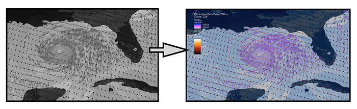
Visualization of a computational modeled hurricane with the image on the left in the original achromatic color scheme and the image on the right in the finalized Purple-Blue-Orange color scheme.
This example is from my prior days at the Renaissance Computing Institute at North Carolina State University. The work was done as part of research with the United States Department of Energy (US DOE). I discuss the details of colorizing this visualization in a previous Medium writing.
Now that I have described the concept of achromatic color schemes, let’s figure out how to build a Grayscale to support data visualization efforts.
Locating the Color Hex Codes to start my Achromatic Color Scheme:
A first step in creating an achromatic color scheme is to locate the Hex codes for Gray, White and Black. A color Hex code is a hexadecimal way to represent a color in RGB format by combining amounts of Red, Green, and Blue to note that specific color. The World Wide Web Consortium (W3C) provides recommendations for specifying color Hex codes. Below, I show my illustration of basic color Hex codes noted by the W3C.
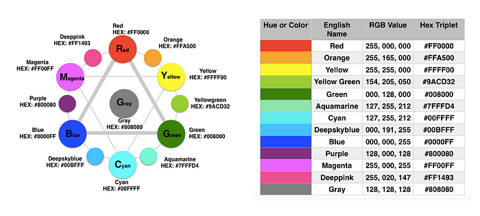
My Color Wheel illustration and table of basic color hex codes noted by the World Wide Web Consortium (W3C).
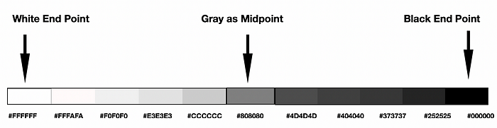
The central color of the Color Wheel diagram on the left and the last color in the table on the right is Gray with Hex code (#808080). To build a basic achromatic color scheme, I need to specify at least White (#FFFFFF), Gray (#808080) and Black (#000000). This allows me to move from pure White on the lightest end to pure Black on the opposing end with a Gray midpoint.
Building an Achromatic Sequential Color Scheme with Adobe Color:
In data visualization, sequential color schemes are designed for ordering numeric information where colors progress from low to high (or vice versa). Cynthia Brewer initiated this concept with the color advice system, ColorBrewer, and diagramed various Color Scheme types in her “Color Guidelines for Mapping and Visualization” writing. Later on, I will cover another one of the concepts she also noted, diverging color schemes.
I can start building a Grayscale sequence by accessing the online Adobe Color tool and selecting the Monochromatic option under Apply Color Harmony Rule. I show this below.
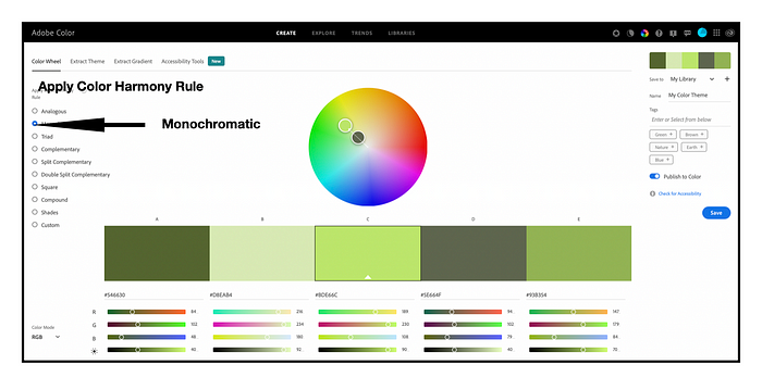
Selecting the Monochromatic Color Harmony option to begin building a Grayscale sequence in Adobe Color.
A monochromatic color harmony is created by using one hue with various tints, tones, and shades of that hue. To build a Gray achromatic color scheme, I will consider Gray as my key hue and enter its Hex code (#808080) as the central color into Adobe Color. The results are shown below. Adobe Color provides additional Light Gray (#CCCCCC) and Darker Gray (#4D4D4D) colors.
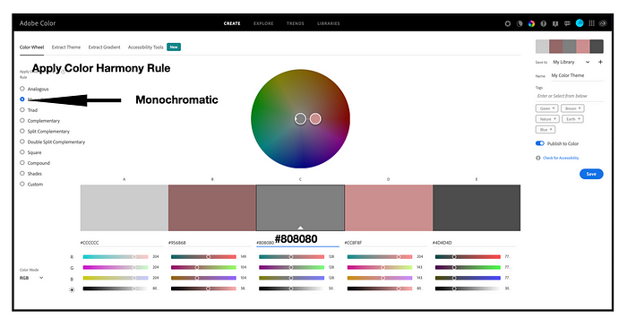
Entering Gray (#808080) as the middle (key) hue into Adobe Color with the Monochromatic color harmony selected.
Next, I select the Custom option under Apply Color Harmony Rule so that I can reposition the Light Gray (#CCCCCC), Gray #808080) and a Darker Gray (#4D4D4D) next to each other. I show these results below.
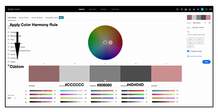
Selecting the Custom option to reposition the Light Gray (#CCCCCC), Gray #808080) and a Darker Gray (#4D4D4D) next to each other.
The next step is to enter White (#FFFFFF) on the far left and Black (#000000) on the far right to complete the five step Grayscale sequential color scheme. I also save this color palette in Adobe Color as “Grayscale Sequence-5”. A free Adobe ID is required to save color schemes. I show these results below.
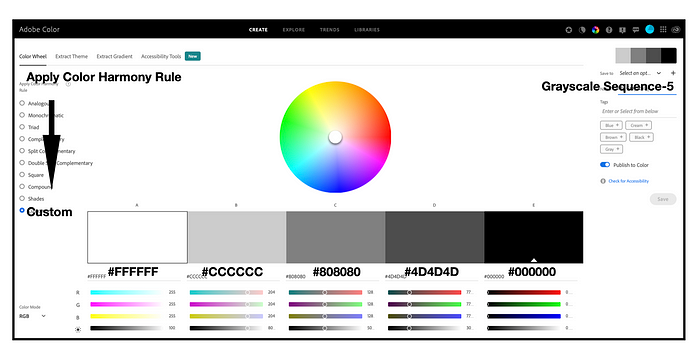
Entering White (#FFFFFF) on the far left and Black (#000000) on the far right to complete the five step Grayscale sequential color scheme.
Applying my Achromatic Grayscale Sequence to a Visualization Example:
I can now test the Grayscale Sequence-5 color scheme with a visualization example. Let’s use my “Process of Colorizing a Data Visualization” ring diagram that I have discussed in an earlier UX Collective writing on “Using color detection to find inspiration in everyday objects”. Below, I show this diagram with an initial Gray #808080 for each of the five steps on the left and the Grayscale Sequence-5 applied to the five steps in the ring on the right.
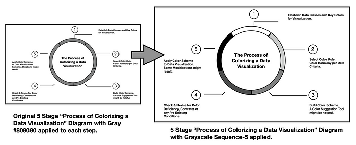
Testing Grayscale Sequence-5 color scheme with the “Process of Colorizing a Data Visualization” diagram. The image on the left shows an initial Gray #808080 for each step. The image on the right shows the Grayscale Sequence-5 applied to the five stages noted in the ring.
The five steps depicted in the ring are: (1) Establish data classes for visualization and key color for visualization; (2) Select color rule, color harmony per criteria of your data: (3) Build color scheme. A color suggestion tool might be helpful. (4) Check and revise due to color deficiency, contrasts, or any pre-existing conditions, and (5) Apply color scheme to data visualization. Some modifications might result.
The Grayscale visualization indicates that steps (4) and (5) might be difficult to distinguish completely by color. I resolve this difficulty by adding a unique number and text description for each of the five stages. Below, I show two colorization possibilities: (1) using a single hue (the Red option) and (2) using a multi hue (the Green Blue) color scheme.. These options and others are available from the ColorBrewer color suggestion system. It becomes a matter of preference as to which one to choose. I prefer the multi hue Green Blue option.
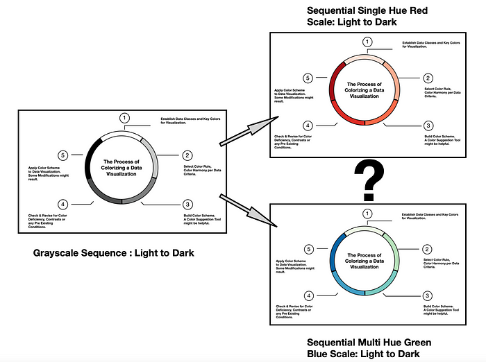
Progressing from the Grayscale Sequence-5 to either a Single Hue Red scale or a Multi Hue Green Blue scale.
Addressing Color Deficiencies:
As my five-stage Process for Colorizing a Data Visualization indicates, checking for color deficiencies, step #4, is one of the critical steps in building a successful color scheme that can be universally used to explore data. In humans there are three types of photoreceptors or cones where each is sensitive to different parts of the visual spectrum of light to facilitate rich color vision. If one or more of the set of cones does not perform properly, a color deficiency results. A red cone deficiency is classified as Protanopia. A green cone deficiency is classified as Deuteranopia. A blue cone deficiency is classified as Tritanopia. The Color Blindness Simulator (Coblis) tool is a freely available online app that simulates color deficiencies. A more through treatment of color deficiences and human color perception can be found in the writing “The misuse of colour in science communication” by Fabio Crameri, Grace E. Shephard, and Philip J. Heron.
Although I am working in Black and White, let’s use Coblis to explore color deficiencies of the Grayscale Sequence-5 version of the “Process of Colorizing a Data Visualization” diagram. I show these results below.
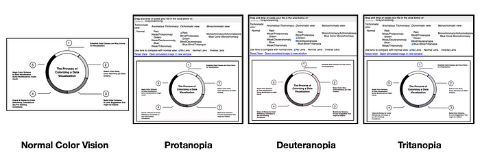
Using the Color Blindness Simulator (Coblis) for a color deficiency check on the Grayscale Sequence-5 version of the “Process of Colorizing a Data Visualization” diagram. The visualization passes these checks since individuals with Protanopia, Deuteranopia of Tritanopia can distinguish the five different data elements.
The tests indicate that individuals with Protanopia, Deuteranopia or Tritanopia are likely to view the Grayscale Sequence-5 color scheme in a similar manner to someone with Normal Color Vision. The simulations for Deuteranopia do indicate that individuals with this color deficiency might view some lighter Gray colors as having slight Pinkish tints. For the case of the “Process of Colorizing a Data Visualization” diagram, these Pinkish tints are not a concern in regard to comprehending the visualization.
Creating a Diverging Color Scheme in Grayscale:
A diverging color scheme supports quantitative data that progresses outward from a central neutral midpoint to two different color extremes. The color scheme is formed by fusing two different color sequences together with a neutral midpoint. I have developed a test Grayscale diverging color scheme that I will discuss here.
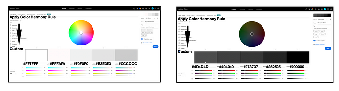
Using Adobe Color, I can reposition the achromatic colors of Grayscale Sequence-5 to create a diverging color scheme for five data classes. To do this, I reposition White (#FFFFFF) as the center color and move Gray (#808080) to be the color on the far left. The result is Grayscale Diverge-5. I show this swap between achromatic colors below.
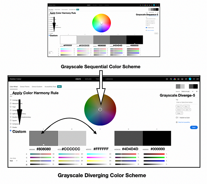
Creating a five class Grayscale Diverging color scheme by moving White (#FFFFFF) to the center and Gray (#808080) to the far left in Adobe Color.
Testing the Diverging Grayscale for Color Deficiency:
Adobe Color provides “Color Blindness” accessibility checks for evaluating their five color themes. If the color theme does not pass color deficiency checks, the colors in the theme can be repositioned to pass the checks. I use these functions for Grayscale Diverge-5. To find the “Color Blindness” checks, I select the “Accessibility” option and locate the “Color Blind Safe” function. These results are shown below.
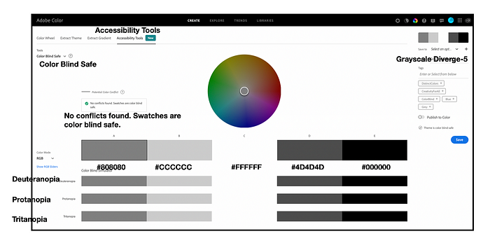
Testing the Grayscale Diverge-5 color scheme for color deficiency using Adobe Color’s Color Blindness checks. Adobe Color indicates “No conflicts found” for Protanopia, Deuteranopia of Tritanopia. Grayscale Diverge-5 passes the tests.
Adobe Color indicates that “No conflicts found. Swatches are color blind safe”. Grayscale Diverge-5 passes the tests for Protanopia, Deuteranopia, and Tritanopia. Now, let’s apply Grayscale Diverge-5 to a data visualization example.
Applying Grayscale Diverge to a Visualization Example:
For my example, I have sales data for four regions over a six-month period. Regions 1 and 4 have comparable products while Regions 2 and 3 have comparable products. To emphasize this relationship, I want to create an area chart with Regions 1 and 4 having negative values below the X-axis and Regions 2 and 3 having positive values above the X-axis. I show this data below.
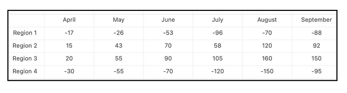
The sales data for four regions over a six-month period. Regions 1 and 4 have comparable products while Regions 2 and 3 have comparable products. To emphasize this relationship, Regions 1 and 4 having negative values below the X-axis and Regions 2 and 3 having positive values above the X-axis.
Since I only need four achromatic colors to represent the four regions, I eliminate the middle White (#FFFFFF) color and apply Grayscale Diverge-4to the area chart of the sales data. I show these results below.
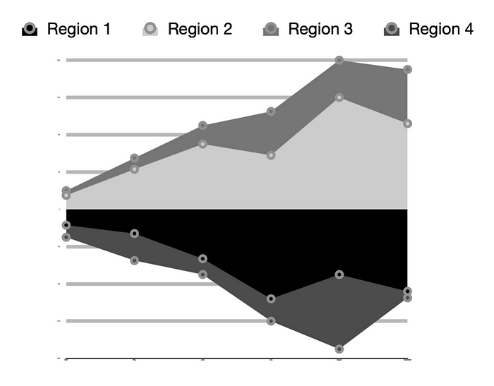
Area chart data visualization using the achromatic Grayscale Diverge-4 color scheme.
I used this Grayscale example as a guide for colorizing with a diverging color scheme composed of Very Peri 17–3938, Pantone’s 2022 Color of the Year, and Shamrock 15–6432. I covered this in an earlier UX Collective writing. I show the process of moving from Grayscale to Very Peri — Shamrock below.
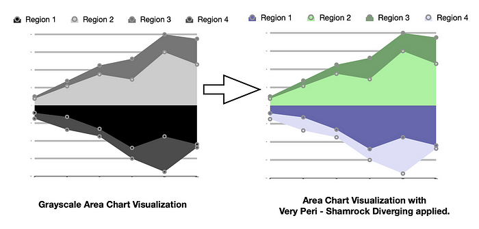
Moving from Grayscale to Applying the Very Peri-Shamrock Diverging Color Scheme.
Building an Eleven Step Sequential Color Scheme:
In my practice of building color schemes for data visualizations, I have created an eleven-step sequential Grayscale color scheme. I share it with you, here. It took some searching for color Hex codes to find various tints (Gray with White added) and Shades (Gray with Black added) to develop this result. Using Adobe Color, I assembled a White (#FFFFFF) to Gray (#808080) sequence of five colors and a Gray (#808080) to Black (#000000) sequence of five colors. I show these results below.
Building an Eleven Step Diverging Grayscale color scheme with Adobe Color. A White (#FFFFFF) to Gray (#CCCCCC) sequence of five colors and a Gray (#4D4D4D) to Black (#000000) sequence of colors are initially created.
Using Gray (#808080) as my midpoint color, I created the final Grayscale Sequence-11. I show these results below.
The Final Eleven Step Grayscale Sequence assembled, Grayscale Sequence-11.
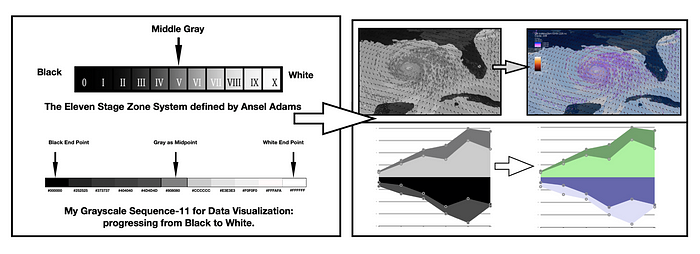
One of the challenges of Grayscale Sequence-11 is that it becomes difficult to differentiate the darker Gray colors as the achromatic color scheme progresses to Black. It is clear there is a transition but seeing the detailed darker Grays is not easy. I was somewhat disappointed to discover this. I decided to further explore this concern by looking at the achromatic work of others that came before me. I examined Ansel Adams’ Zone System for photography as noted by Adams in his 1981 book The Negative, The New Ansel Adams Basic Photography Series/Book 2. To my relief, the darker Grays of Zones I, II and III of the Zone System are as difficult to discern as the darker Grays of (#404040,) (#373737) and (#252525) in my Grayscale Sequence-11. I found comfort in learning that Adams had discovered this same dilemma and progressed forward. I show a comparison between my Grayscale sequence and the Zone System below. To provide a good comparison with Adams’ Zone System, I have flipped my Grayscale Sequence-11 to progress from Black to White.
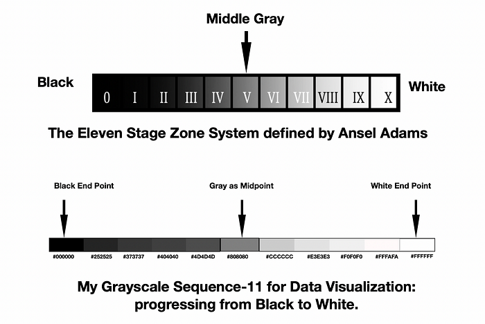
Comparison of the difficulties in discerning the darker Grays of Zones I, II and III of the Zone System compared to the darker Grays of (#404040,) (#373737) and (#252525) in my Grayscale Sequence-11. In both cases, it is difficult to visually distinguish the darker Grays although it is clear there is a systematic progression to Black (#000000).
Grayscale Sequence-11 is the achromatic color scheme I use most frequently to “Get it Right I Black and White” in my data visualization efforts. Please feel free to use this Grayscale sequence if it will be helpful to you. Nando Harmsen provides a through discussion on “How to Use the Ansel Adams Zone System in the Digital World” if the Zone System approach might be of further interest to you.
Recommend
About Joyk
Aggregate valuable and interesting links.
Joyk means Joy of geeK