

Essential Elements of a Design System
source link: https://blog.prototypr.io/essential-elements-of-a-design-system-6fa7f5711480
Go to the source link to view the article. You can view the picture content, updated content and better typesetting reading experience. If the link is broken, please click the button below to view the snapshot at that time.

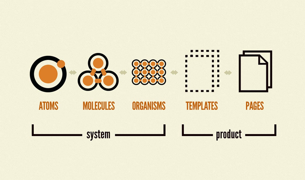
Various parts of a design system from Brad Frost’s Atomic Design book
Essential Elements of a Design System
Getting started with building your first design system library
The dream of having a living document was made possible by enabling the easy creation of the design systems library within Figma. But since design systems are more than just a UI Kit, they are also quite confusing to start building. Both fresh and experienced designers can often be seen struggling with 0-to-1 projects like setting up a design system.
I recommend reading Brad Frost’s book Atomic Design for anyone starting with design systems. Here is also an article you can read if you want a brief on the Atomic Design book. I will present some basic concepts here as standard definitions and then discuss some essential elements designers can consider adding to their design systems when starting from scratch.
Atomic Design | Atomic Design by Brad Frost
This book is a work in progress. You can read more about the project here; sign up for the newsletter to receive project…
What is a design system?
It is a collection of patterns and guidelines for designing and developing digital products. Design systems allow designers and developers to deliver consistent experiences depending on the users' core platform or device.
Most prominent, as well as startup companies, utilize design systems as a valuable design tool. That is because it allows companies to build various complex, set up a shared language across pages/screens, and help products carve out their own identities for the product. Furthermore, design systems help keep this identity consistent across various companies' communication channels.
Should I adopt design systems early on?
Likely. With a simple design system, your team can benefit by reducing the development time and working agilely. As the time taken by the teams to deliver a product reduces drastically, so does the cost of shipping a stellar user experience.
As a product designer at any stage of your career, it can be helpful to learn how to create a sound design system of usable patterns to create engaging products later.
Ok, let's get started with it.

Wingardium Leviosa!
We will discuss some of the essential things you should put into your design systems. So, if your cup is already full, you can skip this part. Next, we will break down everything into three pieces — Foundations, Components, and Patterns.
Foundations
Lego Animation 🤹♂️ by Jhojann Rodriguez on Dribbble
Foundations are the basic lego blocks of your design system. If you get them wrong, you are doomed in the later stages. Get them right, and you’ll probably never touch them again. But since they provide the base of your design system establishment, you’ll end up editing/changing everything if the foundation blocks need changing in the future.
Colors
Colors determine the emotional and characteristic tone of a UI Design and are an effective means of establishing uniformity. To satisfy accessibility criteria, each hue, as well as the palette as a whole, has specific usage restrictions and role descriptions.
Don’t go overboard with colors. Consider limiting yourselves to only three shades for each color you choose. Although colors are essential, the more you have initially, the more difficult it will get to manage or trim them down later. Here are some tokens you can consider —
- Primary // palette.primary.light // palette.primary.main // palette.primary.dark
- Secondary // palette.secondary.light // palette.secondary.main // palette.secondary.dark
- Error // palette.error.light // palette.error.main // palette.error.dark
- Warning // palette.warning.light // palette.warning.main // palette.warning.dark
- Info // palette.info.light // palette.info.main // palette.info.dark
- Success // palette.success.light // palette.success.main // palette.success.dark
Content Density
It is essential to tackle content density in your interfaces. For example, various screens like dashboards might need a compact content density. In contrast, pages/screens where a user reads a lot rather than absorbing information thru’ visuals require comfortable content density.
Comfortable: This density mode is used for pages with less data-intensive views. It is often used as a default way of viewing and presenting data. Most interfaces will need to have this as the bare minimum start.
Compact: This is an optimized view for large amounts of data. It is used to maximize space between cards/elements and to increase the visibility of large amounts of data.
Design Tokens
Design token converts an optical property into a variable for easy handoff and use between various pages. It removes the need for hard-coded values and increases the reusability of design decisions in the form of a variable value. For example, imagine changing the color and typography values of the entire system by changing just a handful of code lines.
Consider configuring a design token for —
- Color,
- Typography,
- Spacing, and
- Motion
Iconography
Aim to build a compact yet powerful icons library that follows a grid structure and some light guidelines that allows flexibility. The icons library will support product features, functionality, and content streams. However, keep them simple and recognizable immediately. Iconography is a visual language used to represent features, functionality, or content. Icons are intended to be simple visual elements that are recognized and understood immediately.
Refer the Material Design Icon System for references and use it as a shortcut to get started 👇.
Material Symbols and Icons — Google Fonts
Material Symbols are our newest icons consolidating over 2,500 glyphs in a single font file with a wide range of designs…
Layout
A grid system for your layouts will silently allow the design and product teams to organize information for key elements and content. It is a silent partner that increases the practicability of your screens and provides a beautiful structure that people can rely on. My favorite layout reference is and will always be Airbnb 👇.
Motion
Using motion, you can draw users' attention to critical elements and interactions on a page without interrupting their focus. In addition, motion helps prevent abrupt changes in the user interface (UI) by showing how elements move or change between states. Pair motion with other feedback mechanisms to improve the reliability of your interfaces.
Spacing
A spacing scale can help define the UI design's padding and margins. It is known to increase predictability and promote a clear hierarchy. You can use a 4px spacing scale to build the visual foundations and later apply the same base unit of 4px on icons and types. It will make your designs stand out, make them beautiful, and increase consistency across the pages.
You can use the following spacing parameters to start with —
- Horizontal Spacing — 64/48/32/16
- Column Gaps (Gutters) — 32/24/16/8
- Row Gaps — 32/24/16/8
Typography
Use typography as a way to organize and style your information. With intentional typography scales, you can enhance the hierarchy and structure and create solid guidance principles to impact the user experience positively.
I would recommend using an Open Sans or DM Sans font with the following scales —
- 32px — Heading Xtra-large — 800 Weight
- 24px — Heading large — 800 Weight
- 20px — Heading medium — 800 Weight
- 22px— Body medium — 400 Weight
- 16px — Heading small — 800 Weight
- 16px — Body small — 400 Weight
- 14px — Heading x-small — 800 Weight
Visual Modes
Visual modes are increasingly becoming famous because consumer apps are increasingly implementing them. If you have data to support your design decisions, then dark and light modes can help optimize the UI designs. These can keep users’ preferences and go well with the environmental conditions. Take care of color palettes, and contrast, and keep in check the flexibility to allow users to complete their tasks in the most efficient way possible.
Additional Styles
Consider adding the following to support your user interfaces further —
- Shadows/Elevation
- Borders and dividers
- Outlines and fills
- Predictable states for all components
Shadow/Elevation
Using shadows, you can get the same visual hierarchy as layering elements on a page by elevating them in elevation.
Borders & Dividers
Borders enable easy grouping of visual elements. Borders also enhance the page’s hierarchy of information. Use a crisp border of 1px or maximum 2px on mobile interfaces. 2px dividers should only be used for hard stops. At the same time, 1px borders are used repeatedly to provide breaks within a list view.
Outlines and fills
Outlines and fills provide a component's focus, hover, and pressed states. A consistent behavior for all actionable (buttons) elements and input-based elements (text fields) will improve the predictability of the design system.
States
Use a variety of states for all your components to increase usability. Consider covering all your bases by using the following states —
- Default
- Focus/Hover
- Selected
- Error
- Disabled
👉 Next time in PART II, we’ll discuss Design System Components in detail.
Recommend
About Joyk
Aggregate valuable and interesting links.
Joyk means Joy of geeK