

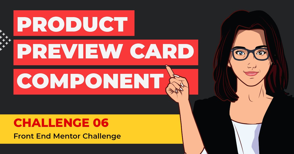
Challenge 006–Product Preview Card Component🚀
source link: https://uxplanet.org/challenge-006-product-preview-card-component-2de1d66fb4f6
Go to the source link to view the article. You can view the picture content, updated content and better typesetting reading experience. If the link is broken, please click the button below to view the snapshot at that time.
Challenge 006–Product Preview Card Component🚀
CSS Grid Exercise No 02
Welcome back !! We have already reached the second challenge using a grid.
If you are a first-time visitor Welcome! 🤩 First and foremost, let’s begin this with a small introduction to today’s article.👇
As some of you might know, I pivoted to UI development a few weeks back and started to do challenges using HTML and CSS. Therefore we started, Challenge No 001 with a challenge called NFT Card Component, then move to Challenge No 002 with a challenge called Single Price Grid Component, then we did Challenge No 003 with a challenge called Huddle Landing Page with a single introductory section. And last but least we have completed Challenge No 004, Clipboard Landing Page.
Afterwards, as promised we started from Challenge 005 called the 3-column preview card componentusing CSS Grid. Now that being said, we have reached to our today’s challenge which again mainly focuses on CSS Grid🤩
As for today’s challenge, we will be doing another very beginner-level challenge from Front End Mentor. 👉 Challenge 006– Product Preview Card Component.
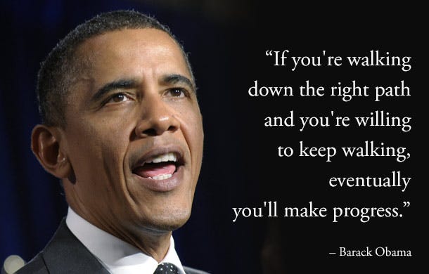
As always, let’s begin the challenge with a motivational quote.👇 (This is one of the quotes that helps me to keep moving, I am sharing this with you with the hope that it’ll help you all as well to keep on moving forward)
If you’re walking down the right path and you’re willing to keep walking, eventually you’ll make progress
— Barack Obama
With that head start, let us move to our second challenge in the CSS grid. 💪
Before beginning, let me highlight a small note (as always):-
For some of you, this might be a challenge that you can do with your eyes closed, for some of you this might be a challenge that you learn a new thing and for some of you this might be the beginner step for CSS Grid. So this article is for anyone from pro to beginner who loves to learn and sharpen their skills.🤓 With that…..
LET US LAY OUR NEXT BRICK ON CSS GRID💣
🔸 Challenge Name:-
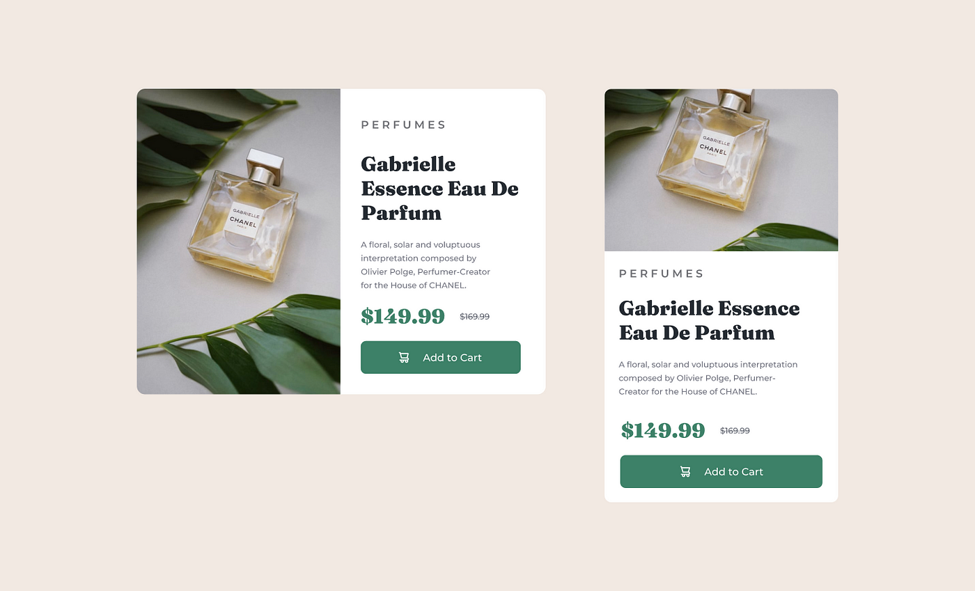
Product Preview Card Component
Frontend Mentor | Product preview card component coding challenge
Your challenge is to build out this product preview card component and get it looking as close to the design as…
🔸 Description:-
Your challenge is to build out this landing page from the designs provided in the starter code. Your users should be able to:
- View the optimal layout for the page depending on their device’s screen size
🔸 Tools:-
HTML, CSS & Figma
STEP 01 — Begin With the blueprint (HTML)🚀
First and Foremost, we will do a sketch/blueprint of the card component using HTML. Afterwards, we’ll make the look and feel of the Product Preview Card Component according to the Design.
🔴 STEP 1.1 ➡ Basic structure of HTML
<!DOCTYPE html>
<html lang="en">  <!-- Head Section-->
    <head>
      <meta charset="UTF-8">
      <meta http-equiv="X-UA-Compatible" content="IE=edge">
      <meta name="viewport" content="width=device-width, initial-
       scale=1.0">
      <title> Product Preview Card Component </title>
    </head>   <!-- Body Section-->
    <body>
    </body>
</html>
🔴 STEP 1.2 ➡ Create the main structure of the Product Preview Card Component
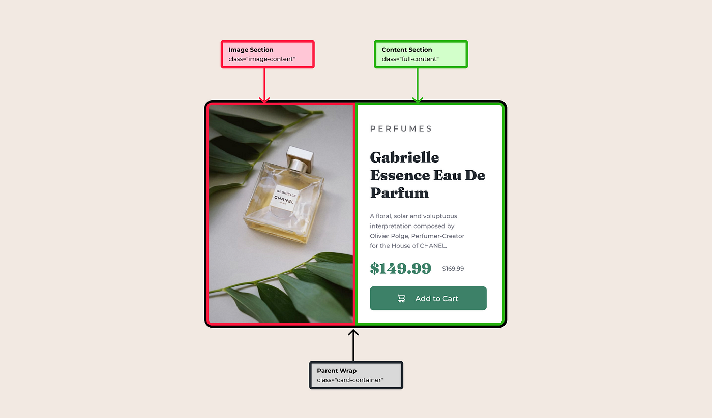
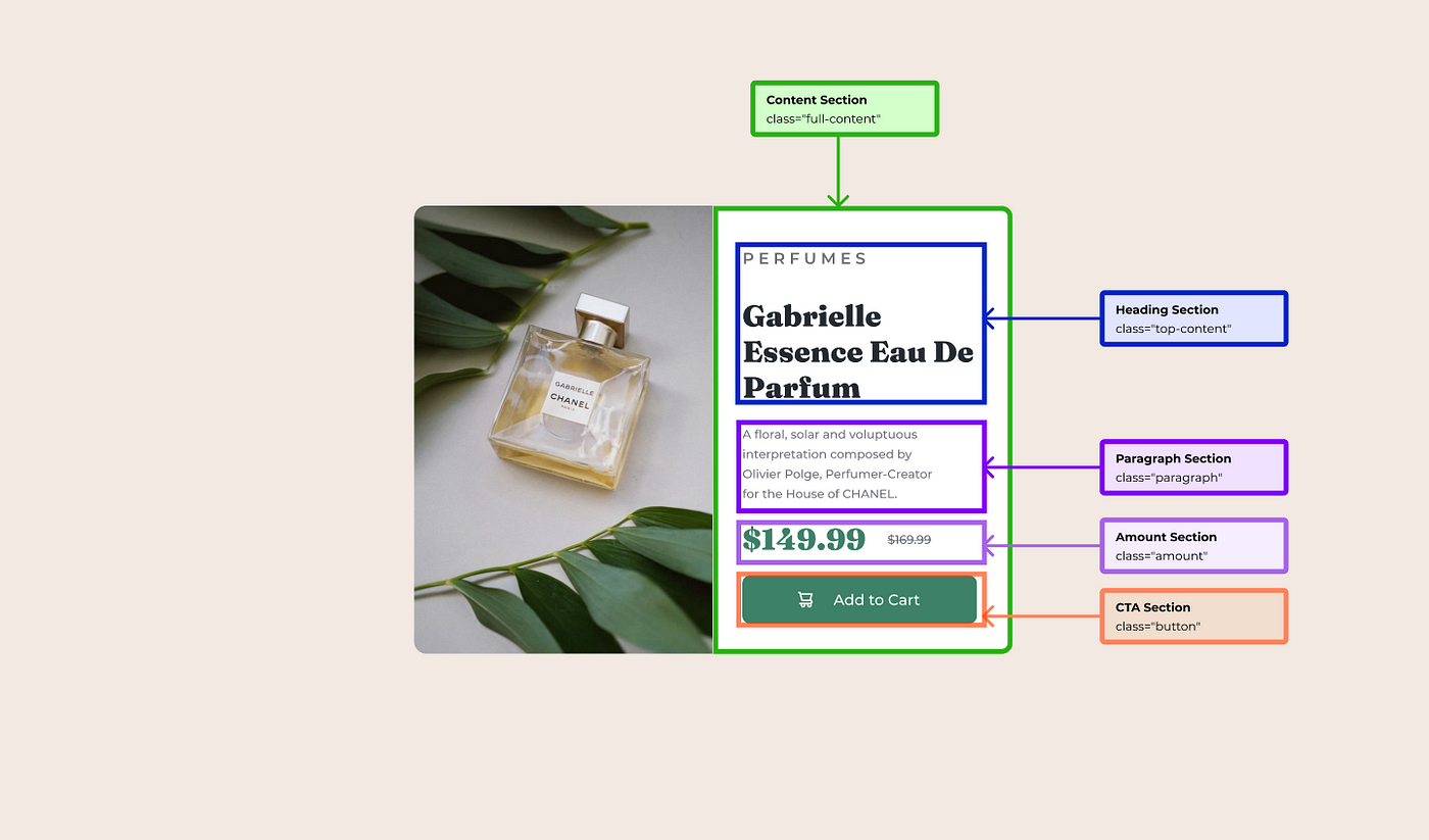
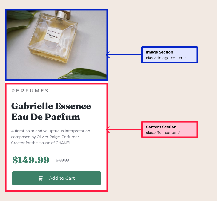
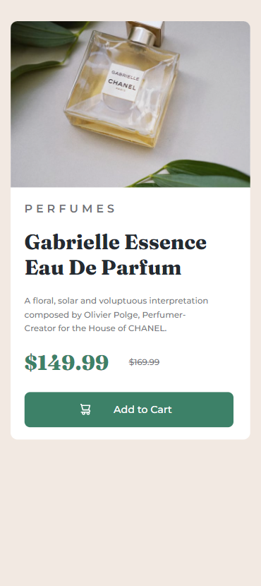
As you can see in the design there are main two sections, isn’t it? One section has the image and the other section which has the content. So what we do is
- First, we divided the two sections as image-content for the image section and full-content for the content section.
- Then we wrap those two sections inside a parent container called card-container
<!-- Parent Wrap-->
<div class="card-container">   <!-- Image Section-->
   <div class="image-content">
   </div>   <!-- Content Section-->
   <div class="full-content">
   </div></div>
🔴 STEP 1.3 ➡ Let’s get into each section
Now we are done with the developing main structure for the product preview card component. It is time for us to dig deep into each section.
- As you can see, the image has taken the full container. Therefore what we do is instead of using it as an image we use a background image to fully cover the image-content. ⬅ We won’t be talking about this in the blueprint section since we will walk through this in the styling section
- When we move to the content section, there is a heading and a subheading, then we have the paragraph and underneath we have a CTA button called Add to cart.
- For our ease of use, we will divide the content section into another four sections. One section for headings, then the next section for the paragraph, the third section would be the amount and the last section for the button.
<div class="full-content"> <!-- Heading Section -->
   <div class="top-content">
     <h2>
       PERFUMES
     </h2>
     <h1>
       Gabrielle Essence Eau De Parfum
     </h1>
   </div> <!-- Paragraph Section -->
  <div class="paragraph">
   <p>
     A floral, solar and voluptuous interpretation composed by
     Olivier Polge, Perfumer-Creator for the House of CHANEL.
   </p>
  </div> <!-- Amount Section -->
 <div class="amount">
   <div class="correct-val">
     <p>
      $149.99
     </p>
   </div>
   <div class="strikethrough-val">
    <p>
     $169.99
    </p>
   </div>
 </div> <!-- CTA Button-->
  <button class="button">
     <a href="">
       <div class="button-pd">
          <img src="./images/icon-cart.svg" alt="cart image">
          <p> Add to Cart </p>
       </div>
     </a>
  </button></div>
— — And with that, we have done with the blueprint. It’s time for us to check the output of our blueprint.👀👇 — —
— — HMMM, I am not a fan of this. It looks ugly.🤮 But rather than wasting our time on complaining, shall we get into work and make it more appealing — —
STEP 02 — Time to make it more appealing (CSS)🚀
Alrighty! Now we have reached the best part. It is time to get our hands dirty by doing the styling. So same as we have done in our Challenge No 002, we are doing this challenge in the mobile-first approach.
This means we start the styling for the mobile view first, and then we’ll adjust the styling for the larger screens using media queries.
🔴 Step 2.1 ➡ First and foremost let us start by Linking The External Style Sheet to the HTML file
<head>    <meta charset="UTF-8">
  <meta http-equiv="X-UA-Compatible" content="IE=edge">
  <meta name="viewport" content="width=device-width, initial
  scale=1.0">

<link rel="stylesheet" href="styles.css">

<title>Product Preview Card Component</title></head>
🔴Step 2.2 ➡ Import fonts to the external style sheet
So as you can see in the Design we have used two font styles. Such as, ‘Fraunces’ & ‘Montserrat’. Therefore what we can first do is, go to google font, search for ‘Fraunces’ & ‘Montserrat’ font, click on the relevant font weights we needed, and then get the import link.
@import url('https://fonts.googleapis.com/css2?family=Fraunces:opsz,[email protected],700;9..144,800;9..144,900&family=Montserrat:wght@500;600;700;800;900&display=swap');🔴Step 2.3 ➡ Use root: to declare the colours we are using
:root {   --white: #ffffff;
   --darkgrey: #747682;
   --mediumlightgrey: #707176;
   --darkgreen: #3D8168;
   --black: #000000;
   --bluishblack: #242A31;
   --cream: #F2E9E2;}
For a thorough explanation of :root check out Challenge No 002, where I descriptively walked you through why and what we use :root.
🔴Step 2.4 ➡ Include the Styling for the Universal Selector
Now let me begin with a small note🔊:- Since I have descriptively walked you through the universal selector in previous challenges (001, 002, 003, 004,005) as well as in the CSS article, I won’t be explaining the universal selector, and why we use it again.
*, a{
   color:var(--black);
  cursor: pointer;
  font-family: 'Montserrat', sans-serif;
  font-size: 12px;
  font-weight: 500;
  margin: 0px 0px 0px 0px;
  text-decoration: none;
}
🔴Step 2.5 ➡ Include the Styling for the body
As you can see in the design there is a cream colour background around the card.
- Therefore, we include the cream colour in the main body section to affect the whole page
body {
  background-color: var(--cream);
}
🔴Step 2.6 ➡ Include the Styling for the Main Card Layout
Before doing the styling for the card as you can see in the design in the desktop view two-section stays parallel to each other, while in the mobile view the two sections stay one under the other.
.card-container {  background-color: var(--white);
  border-radius: 10px;
  display: grid;
  grid-template-rows: repeat(2, 1fr);
  width: 344px;
  height: 600px;
  margin:30px 15px;}
So as per the above code snippet👆, you can see we have defined the grid. So according to the mobile view design, the content is below the image-content section.
- Therefore, we include grid-template-rows to define there are two rows in the container.
display: grid;<!-- Due to the two containers are in the same size we use repeat function and the fractional unit-->
grid-template-rows: repeat(2, 1fr);
🔴Step 2.7 ➡ Include the Image to the Image Content
So as we promised at the top, it’s time for us to style the image section
.image-content {  height: 239px;
  border-top-left-radius: 10px;
  border-bottom-left-radius:0px;
  border-top-right-radius: 10px;
  border-bottom-right-radius: 0px;
background-image: url("./images/image-product-mobile.jpg");
  background-position: top center;
  background-repeat: no-repeat;
  background-size: cover;}
Let’s dig deep into the above code snippet👆
<!-- As the design add the border radius to the image container-->
border-top-left-radius: 10px;
  border-bottom-left-radius:0px;
  border-top-right-radius: 10px;
  border-bottom-right-radius: 0px;
<!-- As the design add the background image to the container-->
background-image: url("./images/image-product-mobile.jpg");
  background-position: top center;
  background-repeat: no-repeat;
  background-size: cover;
🔴Step 2.8 ➡ Include the Styling for the Bottom Content
Now we have done with one section, now only the content section is left for use
01) Give the common margin for the whole bottom section
.full-content {
   margin: 20px;
}
02) Styling the top section of the bottom content (heading section)
.top-content h2 {
  color: var(--mediumlightgrey);
  font-size: 1.35em;
  font-weight: 600;
  text-transform: uppercase;
  letter-spacing: 5px;
  margin-bottom: 20px;
}.top-content h1 {
  color: var(--bluishblack);
  font-size: 2.5em;
  font-weight: 800;
  font-family: 'Fraunces', serif;
  line-height: 36px;
  margin-top: 10px;
  margin-bottom: 10px;
}<!-- Include the gap between letters in the word perfume-->
<!-- letter-spacing: 5px; -->
03) Styling the paragraph section of the bottom content
.paragraph p {
  color: var(--darkgrey);
  font-size: 1em;
  font-weight: 500;
  line-height: 20px;
  margin-top: 20px;
  margin-bottom: 5px;
  margin-right: 30px;
}
04) Styling the amount section of the bottom content
.amount {
  align-items: center;
  display: grid;
  grid-template-columns: repeat(2, 150px);
  justify-content: start;
  margin-top: 20px;
  margin-bottom: 8px
}.amount .correct-val p{
  color: var(--darkgreen);
  font-size: 2.5em;
  font-weight: 800;
  font-family: 'Fraunces', serif;
}.amount .strikethrough-val p {
  color: var(--mediumlightgrey);
  text-decoration: line-through;
}
Let us dig deep into the highlighted styles in the above code snippet👆

- grid-template-columns: repeat(2, 150px); ➡ Used to define two columns of 150px width size
- text-decoration: line-through;➡ Used to define the strikethrough in the amount
05) Styling the CTA button section of the bottom content
.button {
  align-items: center;
  background-color: var(--darkgreen);
  border-radius: 8px;
  border: none;
  height: 50px;
  margin-top: 16px;
  padding-left: 80px;
  padding-right: 80px;
  width: 300px;
}.button .button-pd {
  display: grid;
  grid-template-columns: repeat(2,1fr);
}.button  .img {
  height: 16px;
  width: 15px;
}.button  p {
  min-width: 100px;
  font-size: 1.2em;
  color: var(--white);
  font-weight: 500;
}
Let us dig deep into the highlighted styles in the above code snippet👆
- grid-template-columns: repeat(2, 1fr); ➡ Used to define that the image and the text should be on the same line
— — With that, we are done with styling the mobile view. Now let us see the outcome — —
— — The outcome looks amazing, isn’t it?🤩 — —
STEP 03 — Time to make responsive for all the screens (Media Query)🚀
Since we have done in a mobile-first approach, we have done our basic styling for the mobile view. Now it’s time to use the media query and make it responsive for the larger size screens.
Once you include the styles for the media query, those styles will override the basic style accordingly for larger screens.
🟡Step 3.1 ➡ let us Complete the challenge by adjusting the styles for screens which are more than or equal to 768px
@media screen and (min-width: 768px){   .card-container {
     grid-template-rows:0;
     grid-template-columns: repeat(2, 1fr);
     width: 600px;
     height: 450px;
     margin-left: auto;
     margin-right: auto;
     margin-top: 150px;
     margin-bottom: auto;
  }  .image-content {
     width: 300px;
     height: 450px;
     border-top-left-radius: 10px;
     border-bottom-left-radius:0px;
     border-top-right-radius: 0px;
     border-bottom-right-radius: 0px;
     background-image: url("./images/image-product-desktop.jpg");
  }  .full-content {
     margin: 40px 30px;
     max-width: 250px;
  }  .paragraph p {
     margin-right: 40px;
  }  .button {
     width: 240px;
     margin-top: 20px;
     padding-left: 60px;
     padding-right: 60px;
  }}
— — Let Us see the Final Outcome🤩 — —
Final Thought
As we have done with the challenge, I’ll end this article with the hope that you have gained and learned something. Thank You for checking this out.
Now your time has arrived to give a try to this challenge. Trust me you would love the process.
If you are interested in gaining more knowledge, sharpening your skillset or need a small reminder, check out the following articles.👇🧠
🟡Vessel of Knowledge in CSS Grid ➡https://medium.com/@nknuranathunga/vessel-of-knowledge-in-grid-1272764725a2
🟡Understanding flexbox to make things easy ➡ https://levelup.gitconnected.com/understanding-flexbox-to-make-things-easy-adf90891ff25
🟡Learn the fundamentals of CSS within a few minutes ➡ https://bootcamp.uxdesign.cc/beginners-guide-to-css-9bc8298985c0
🟡Beginner’s guide to HTML ➡ https://uxplanet.org/beginners-guide-to-html-and-css-letss-start-off-with-html-3d7ffd035182
If you like this give one or more claps and feel free to leave your thoughts and feedback in the comment section.
Thank you for checking this out and feel free to checkout my other articles by clicking the following link 👇
Nathasha - Medium
Read writing from Nathasha on Medium. UI/UX Engineer 👩💻 Technical Writer ✍️. Every day, Nathasha and thousands of…
🔸Follow me on Twitter👀: @NathashaR97🔸
🔴BE READY FOR THE NEXT CHALLENGE🔴
Do not hesitate to check the previous Challenge in grid and flexbox as well👇
Grid ➡ Challenge 005
Click on the challenge to check the Challenges 01- 04, which are done using flexbox
Recommend
About Joyk
Aggregate valuable and interesting links.
Joyk means Joy of geeK