

How to Design the Best UX Table [+ 6 Great Examples]
source link: https://www.uxpin.com/studio/blog/table-ux/
Go to the source link to view the article. You can view the picture content, updated content and better typesetting reading experience. If the link is broken, please click the button below to view the snapshot at that time.
Table UX Best Practices – What Makes a Good Data Table?
Data tables are essential components for many enterprise UX projects. UX designers must find the best UX table design solution to visualize and sort data according to user needs.
This article explores table UI design best practices with examples to solve common content and usability issues. We also provide links to resources to help research specific topics further.
Data table UX design and prototyping are challenging for designers using image-based design tools. These tools lack features to create basic table functionality like sorting, search, scrolling, actions, etc.
With UXPin Merge, designers can sync a fully functioning data table or use a component library like MUI to design, prototype, and test table UX. Sign up for a free trial and start designing better UX table prototypes with UXPin today!
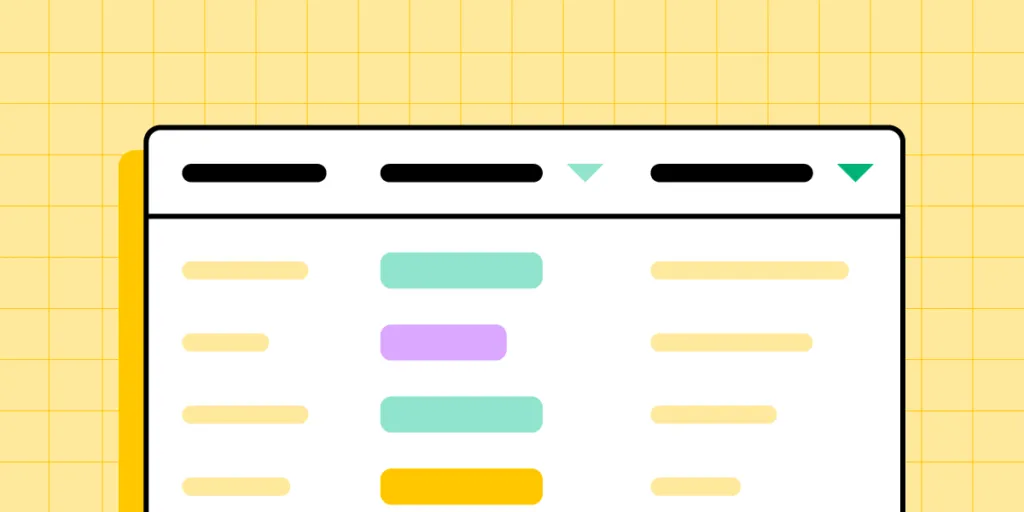
Data Table Design
First, let’s break down the data table anatomy and how these elements fit together so users can visualize information.
- Table Header: The labels for each column in the data table
- Rows: Each entry from the database
- Toolbar: Tools to work with the data (search, edit, delete, settings, etc.)
- Pagination: A UI pattern for displaying multiple pages of data
- Row checkbox: Used to select one or more rows to complete tasks, i.e., delete, copy, process, etc.
- Sorting: Allows users to sort a specific column, i.e., ascending or descending
- Horizontal rule: A horizontal line (the <hr> HTML element) separating each row
What Makes a Good Data Table?
There are four primary ingredients to designing good data tables:
- Use the correct data table UI for the content you want to display
- Prioritize table layout and content correctly
- Make content legible
- The data table provides users with the functionality to complete tasks
First and foremost, your table must be sufficient to display all the data users need. UX designers must also prioritize data correctly, with the most crucial information starting from the left.
A good data table has a clear header and description, so users know what they’re viewing. Designers must also use legible typography and adequate spacing between columns and rows to make it easy for users to read and absorb content.
Lastly (and most importantly), your data table must be user-friendly. It must solve users’ needs and be intuitive to use. There should be little or no learning curve, so users can focus on analyzing data rather than learning how to use the data table.
How to Design User-Friendly Data Tables?
Here are some best practices for designing user-friendly data tables.
Data Table Readability
Readability is crucial for data table UX. Designers must assess several elements to make data tables readable, including:
- Reduce visual noise: Only display content and UI elements necessary for users to read and manipulate data.
- Use legible fonts: The data table’s typeface, sizing, white space, and letter spacing must be adequate for users to read content–even if this means using a different font from the rest of your application.
- Create separation: Padding, spacing, alignment, and lines can help create separation so users can differentiate and absorb data easily.
- Consistency: Using fonts, spacing, sizing, etc., creates consistency and familiarity so users can scan tables faster to find what they need.
- Fixed headers: Keeps headers visible even when users scroll so they always have context.
Create Visual Hierarchy
Linked to readability is creating a visual hierarchy–where designers use typography, sizing, spacing, and other elements to differentiate data and make tables scannable.
- Use bold and slightly larger font sizes for column and row headers
- Use shading to differentiate between headers and table content
- “Zebra stripes” help create divisions between rows, making them easier to read
- Use a contrasting color for links, so users know what content is clickable
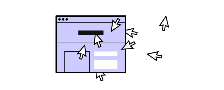
Data Tables Must be Responsive
UX designers must understand how users use these tables while completing day-to-day tasks to create a consistent and cohesive user experience across the organization.
Data tables must be responsive so users can analyze data anywhere in the business. The sales team might want to access the data from their mobile device on the go, while warehouse employees primarily use tablets.
Order Columns According to Data Relevance
An article from the NN Group recommends, “The default order of the columns should reflect the importance of the data to the user and related columns should be adjacent.”
UX designers must arrange and group columns according to their relevance. For example, location details like address, city, country, and zip code must be together. Placing these apart would create more work for users as they scroll or scan the table to compare columns.
Data Table Accessibility

WebAIM offers several tips for Creating Accessible Tables, including:
- Table Captions: An HTML element <caption> placed after the opening table element provides context for screen readers. While HTML falls on engineers, UX designers must provide the appropriate caption description based on user research and testing.
- Identify Row and Column Headers: UX designers must use appropriate row and column headers so screen readers can identify content correctly.
- Associate the Data Cells with the Appropriate Headers: The scope attribute tells screen readers whether a header belongs to a row or column. For example, <th scope=”col”>Name</th> and <th scope=”row”>Jackie</th>. The scope attribute makes it easy for screen readers to jump around the table like a user would scanning it visually.
- Use Proportional Sizing, Rather than Absolute Sizing: Using percentages rather than fixed pixel cell sizing allows tables to automatically adjust to a screen’s dimensions, making it easier to read for visually impaired users.
More resources for data table accessibility:
Atomic Design for Complex Data Tables
Smashing Magazine outlines an atomic design approach to designing complex data tables. Atomic design is a technique for designing from the smallest UI element and progressively building to create more complex components, patterns, and entire user interfaces.
Smashing Magazine breaks down data tables using this methodology as follows:
- Atoms: Fonts, colors, icons
- Molecules: Cells, headers, and accessories
- Organisms: Rows, columns, pagination, toolbar
- Templates: The entire table
6 Great UX Tables Examples
Here are six examples of UX tables and the problems they solve for users.
Horizontal Scrolling for Large Datasets
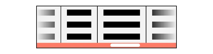
Large datasets require horizontal scrolling to accommodate many columns. UX designers must decide which content is most important to users to prioritize what is always visible and what users must scroll to view.
This preference may change across an organization, so allowing users to personalize what’s visible by rearranging the columns is crucial for creating a good user experience.
It’s advisable to place identifiers in the first column and fix it so users always have a reference as they scroll. Allowing users to fix multiple columns can help when comparing different data.
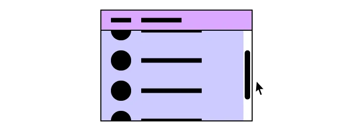
Expandable Rows and Columns
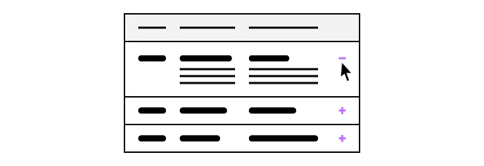
Expandable or resizable columns serve two purposes for users:
- Allow users to view cells with exessive content
- Allow users to minimize cell widths for the content they deem less important
UX designers might also consider making rows and columns “hideable” to reduce visual noise and make it easier to read the content that matters most for the task at hand.
Expandable rows allow UX designers to include detailed information only visible when users need it. This example from CodePen shows a series of job cards with a brief description and status. Users can open the accordion to display additional notes and job costs.
Row Focus Data Table

This hover effect allows users to focus on a single row at a time. If you have multiple columns and data points, this effect enables users to highlight a row, making it easier to read.
UX designers could also blur the other rows, making picking out a single row easier.
In a similar example, this data table highlights a specific cell with a raised hover effect.
Infinite Scroll Data Table
Infinite scroll is helpful for tables with lots of data. It’s an excellent alternative to pagination, where instead of having to click, users only have to scroll to see more content.
Column Sorting

Column sorting is essential for users to reorder data according to their preferences. For example, a warehouse manager can sort orders from the earliest first to monitor progress and address issues early. They can also sort by shipping preference and ensure that same-day orders are on track to leave before the deadline.
Inline Filters
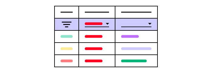
Data table filters help users narrow their preferences to only display relevant entries. This data table example allows users to apply multiple filters to find exactly what they need. These inline filters are especially helpful for large datasets where users can eliminate irrelevant content.
Design Better Data Tables With UXPin Merge
UXPin Merge allows you to sync your company’s design system or an open-source component library so designers can use code components to build prototypes that look and function like the final product.
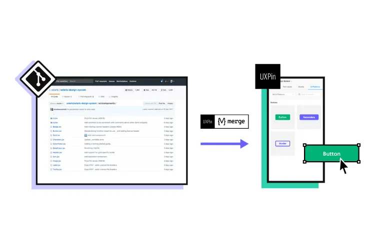
Traditionally, UX designers would need programming skills or have to rely on engineers using HTML, CSS, and Javascript to build functioning data tables. Merge puts UX designers in control, and they don’t need to write a single line of code to use components. They can also make changes and iterate without input from engineering teams.
Recommend
About Joyk
Aggregate valuable and interesting links.
Joyk means Joy of geeK