

Customizing AnimatedContent in Jetpack Compose 🌟
source link: https://medium.com/androiddevelopers/customizing-animatedcontent-in-jetpack-compose-629c67b45894
Go to the source link to view the article. You can view the picture content, updated content and better typesetting reading experience. If the link is broken, please click the button below to view the snapshot at that time.

Customizing AnimatedContent in Jetpack Compose 🌟
Learn how to use AnimatedContent for more custom transitions between different types of content
Are you switching between different composables and worried about the jarring effect when users instantly see changes on screen, without having a graceful transition between the two? Well look no further! AnimatedContent (currently experimental) is a composable that allows you to transition between different composables with a smoother and more custom transition effect. By default, wrapping your changing composables in AnimatedContent, will fade and scale your content in and out. This can make a big difference to the look and feel of your app, without much effort.
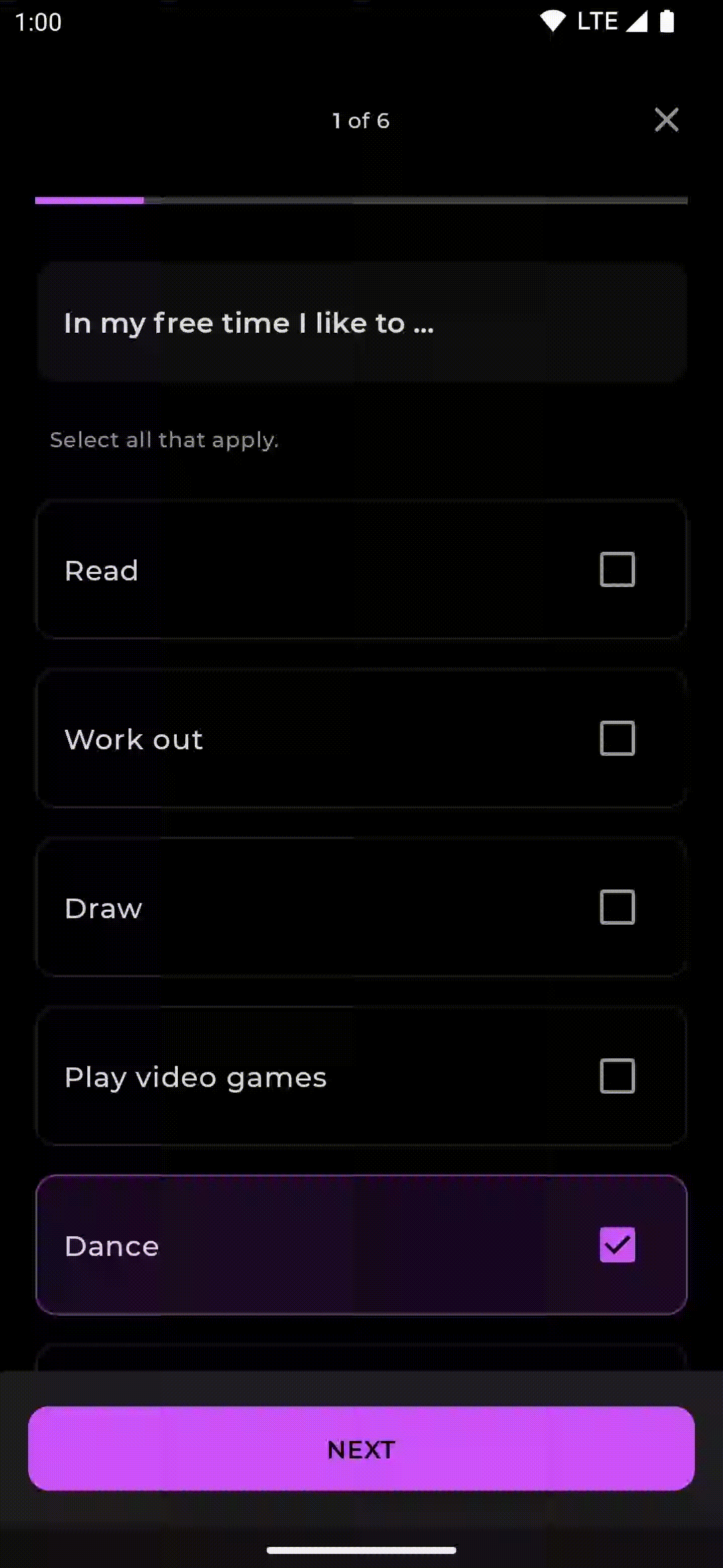
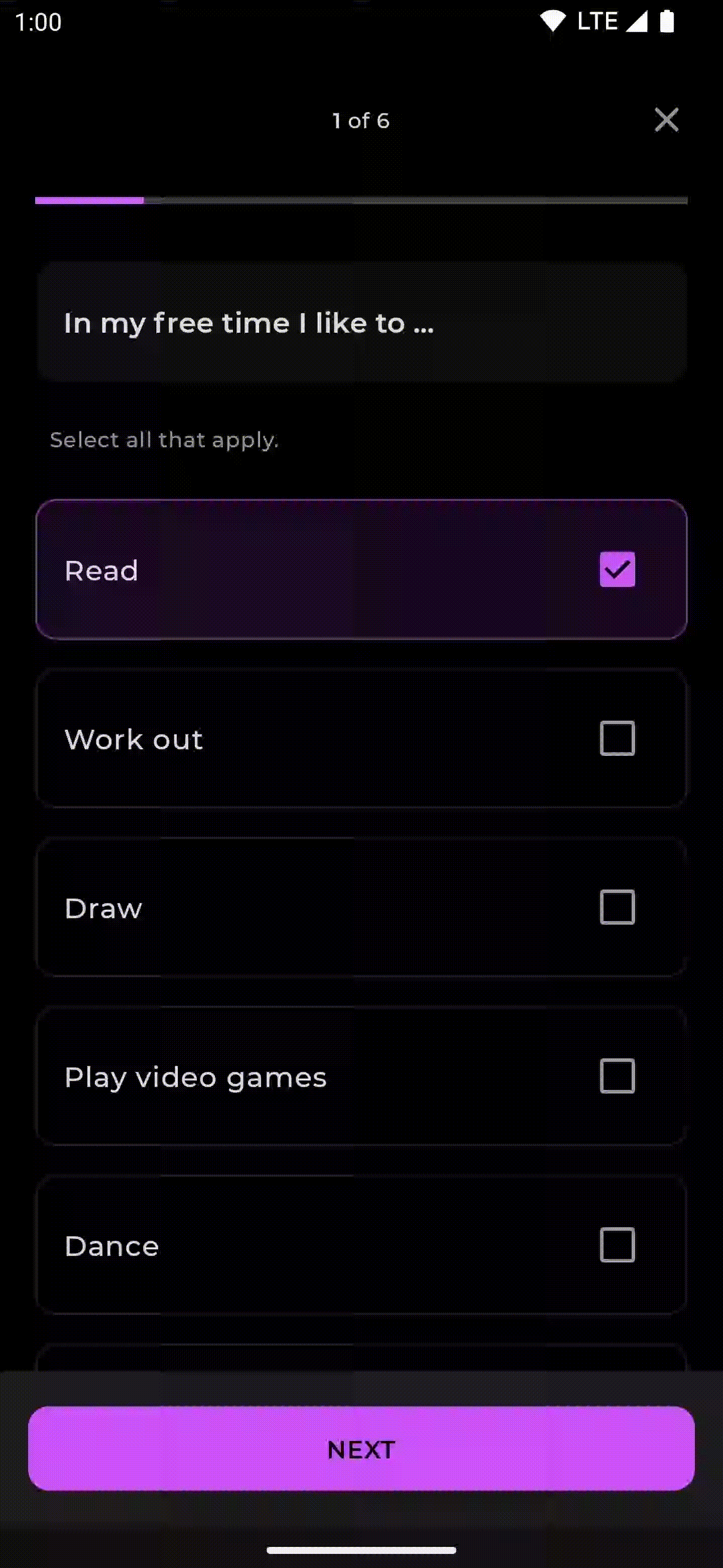
Let’s take a look at a simple example, in the Jetsurvey app, we have a conditional that switches between either the results of the survey, or the questions inside the survey itself:
Running this, we can observe the state change transition isn’t as smooth as we would like it to be:
Instant transition between questions and result
If we wrap the when statement in AnimatedContent, passing in the new state as targetState, we can get a much better transition between these two screens quite easily:
Inside the AnimatedContent lambda, it’s important to use targetState parameter and not the state parameter, as this will ensure the animation runs smoothly when it needs to quickly switch between different states. Running this, we can see there is a vast improvement in the transition between the two composables (slowed to 0.25x):
Using custom transitionSpec with AnimatedContent
Let’s customize this transition a bit more, by using the optional transitionSpec parameter that can be found on the AnimatedContent composable. By default, the transitionSpec will perform a customized fade and scale of the content for the enter and exit transitions. To make it a bit more custom, let’s change the new content to slideInVertically from the bottom and fadeOut previous content.
The slideInVertically function takes in an initialOffsetY function. This is a function that will decide the position where to start the animation from. In this case, we return an initialOffsetY of fullHeight of the content. This means the animation will start with an offset set at the bottom of the screen (at the fullHeight). It might seem a bit confusing, but the coordinate system when drawing in Android, starts with the [0,0] point at the top left corner of the content, so the coordinate [0, fullHeight] is at the bottom of the content. We can also specify the animationSpec (tween, spring etc.) on these transition functions to customize the duration or type of animation. Let’s see what this now looks like:

That looks a lot better! The content slides in from the bottom, and the outgoing content fades out. To see what other options are available for customizing the transition, see the EnterTransition and ExitTransition documentation.
Animating question changes
Another example implementation of using AnimatedContent is when transitioning between different questions in the set. Previously the content would change without animation as follows:
By wrapping the Question composable in AnimatedContent, we will get the default transition on the question transition:
To make this transition even better, we can slide the previous questions out to the left of the screen and new questions in from the right. Let’s specify the transitionSpec as shown earlier:
This is great for going forwards in our survey, the content slides in as expected. But you may notice, if we click the previous button the animation doesn’t make much sense as it exits the screen from the incorrect direction:
We need it to invert the animation and slide the “new” content from the left in, and the old content out to the right. To do this, we can expand on how we’re using transitionSpec. This has AnimatedContentScope as a receiver, giving us the ability to observe or access the initialState and the targetState. This allows us to conditionally change our logic based on the different states:
We can check the targetState.questionIndex and compare it with the initialState.questionIndex, if the target.questionIndex is greater, we know we are moving forward in the survey. We then set the animation to slideInHorizontally with a start offset of the width of the content and slideOutHorizontally to the negative width of the content. If the targetState.questionIndex is less, we know we are moving backwards in the survey. We can then set the opposite of what going forward used: -fullWidth for sliding in, and fullWidth for sliding out:
We now have a much better animation for going forward and backwards:
There is a helper method, slideIntoContainer, that can also be used to achieve sliding animations from certain directions, without needing to figure out the initial offset required. slideIntoContainer(towards = AnimatedContentScope.SlideDirection.Up) can replace our usages of slideInHorizontally and slideOutHorizontally. The difference between the slideIntoContainer and slideIn/OutHorizontally/Vertically is that slideIntoContainer/slideOutOfContainer use the container size as the initial/target offset. This is particularly useful when the size of the container changes due to SizeTransform as it slides in or out.
Changing zIndex
Another property that can be customized is the targetContentZIndex on AnimatedContent. The targetContentZIndex specifies how composables will stack on top of one another. The higher the zIndex, the further to the top of the stack the composable will appear. Using the same example above, we could customize the animation to make it look like a paper stacking effect:
We set the targetContentZIndex to the questionIndex as this number will be higher the further along in the survey we go. This would produce the following animation:
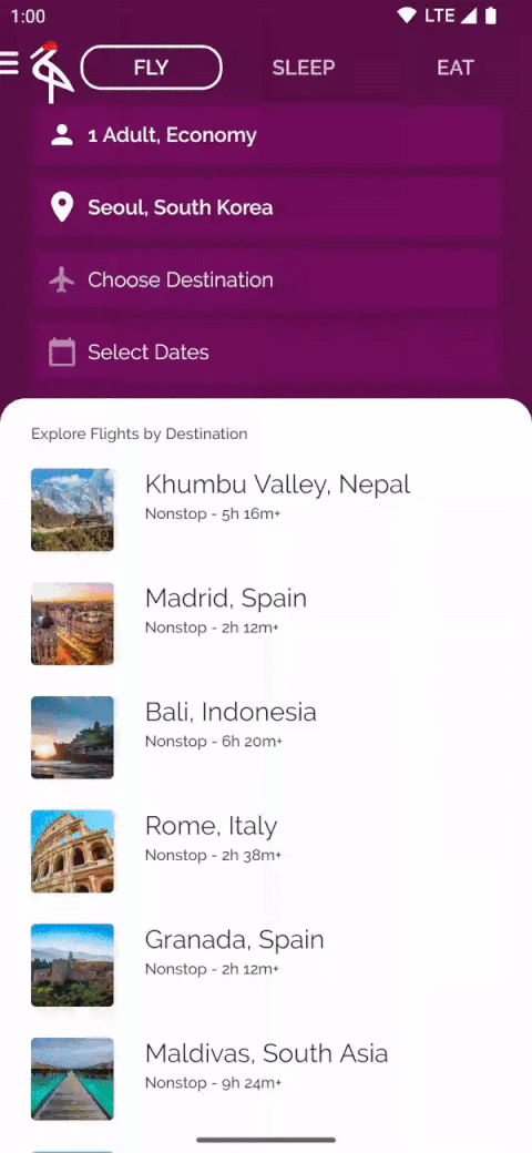
Customizing SizeTransform
AnimatedContent also provides the ability to customize the animation for the container size change, by specifying a SizeTransform, we can adjust how the size change will be animated. For example, looking at the Crane sample app:
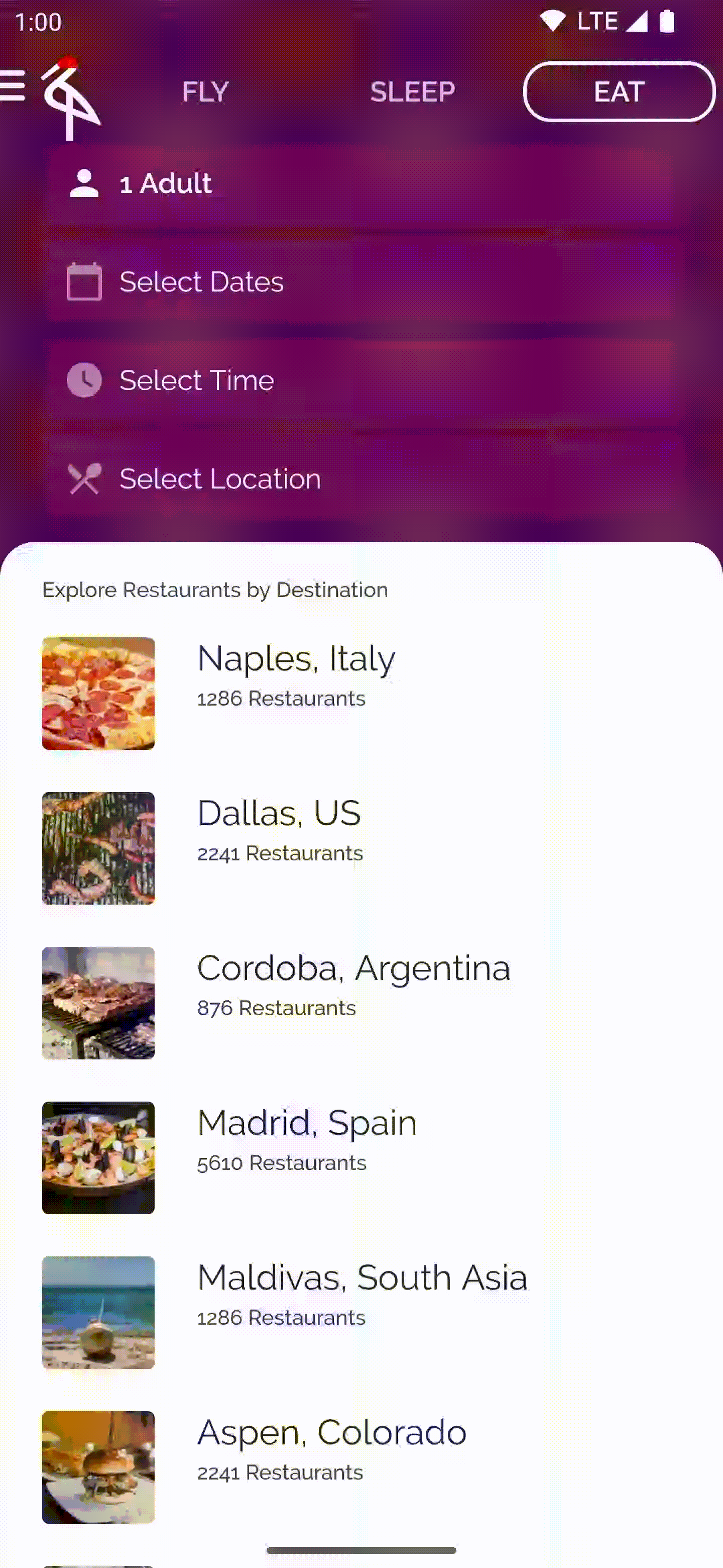
If we add AnimatedContent around the fly/sleep/eat tabs at the top of our screen, we can customize how the size change happens over time. In this example, we use tween as the sizeAnimationSpec, to change the size of the container at different frames in our animation:
We could just as well provide it with any of the other animationSpec options, for example, we could also use keyframes and use the initialSize and targetSize provided to determine different keyframes we may want in this animation. For now though a simple tween looks good. This would produce the following animation:
Summary
AnimatedContent is a simple API that makes transitions between composables more delightful. To see the full code sample, take a look at this Jetsurvey pull request that introduces this change and the Crane pull request which introduces AnimatedContent too.
It is worth mentioning that this API is experimental and we are actively looking for any feedback you may have on it, check out the AnimatedContent documentation for more information.
If you have any questions, feel free to reach out to me on Twitter @riggaroo, alternatively if you have any feedback or bugs to report — please report it on the Compose Animation Issue Tracker.
Happy transitioning! 💫
Recommend
About Joyk
Aggregate valuable and interesting links.
Joyk means Joy of geeK