

How to Design a List that Users Will Love?
source link: https://www.uxpin.com/studio/blog/list-design/
Go to the source link to view the article. You can view the picture content, updated content and better typesetting reading experience. If the link is broken, please click the button below to view the snapshot at that time.
List Design 101 – A Short Guide for Beginners
We see lists in just about every application we use daily. The contacts in your phone, CRMs, email inbox, tasks apps, and social media apps all contain lists.
List design is a crucial part of mobile app and web design projects, where designers must research and test the best ways to display content to users.
Design list prototypes with code-like interactions using UXPin’s code-based design tool. Sign up for a free trial to discover how code-based design can enhance your prototyping and testing process.
What is List Design?
List design is the process of designing, prototyping, and testing lists to display multiple items of similar content. These list items could include a single line of text or a card component with an image thumbnail, text, and icon.
Designers must decide on the best list item design based on the content they want to display.
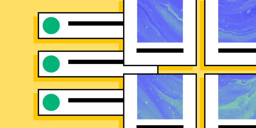
UX designers have three primary ways to structure content lists: horizontally, vertically, and grid layouts. An excellent example of these lists in action is Instagram:
- Main feed = vertical list
- Story feed = horizontal list
- Search feed = masonry grid list
UX designers have seemingly endless options and variations within these three list structures.
What is the Difference Between a List and a Table?
Designers use tables to display a dataset to users. Tables have a specific structure, including a header, rows, and columns with sorting and filters to find and manipulate data.
Lists don’t have a fixed structure. Each list item is independent rather than part of a structured dataset with rows and columns. The list item could feature a single line of text in a menu dropdown or a complex card component with lots of data.
In summary, the most significant difference between lists and tables is the data structure. Tables have a specific design, while lists can exist in many formats.
Anatomy of a List Design
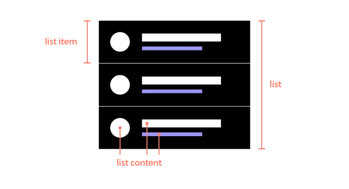
There are three components to a list design:
- The list: All list items together
- List item: An individual item in the list
- List content: The content that makes a list item–image, text, metadata, title, subtitles, and other user interface elements
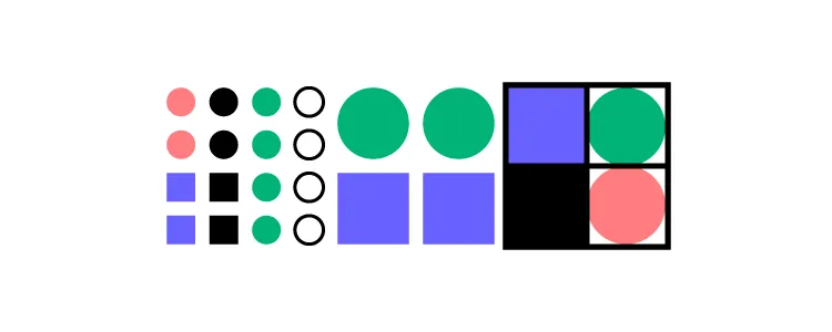
It’s helpful to use an atomic design approach when deciding how to put these pieces together.
- Atoms: The content within each list item–individual images and text
- Molecules: The components within each item–a profile image component
- Organisms: Each list item
- Templates: The entire list with a search field, filters, etc.
What Makes a Great List UI Design?
Good list UI design follows design thinking and user-centered design principles. The list design must match user needs while providing appropriate fields for the content. UX designers must pay attention to responsiveness and how the list will look across multiple devices and screen sizes.
Material Design UI’s Principles of List Design
Google’s Material Design UI defines three principles for designing lists:
- Logical: Lists should be sorted in logical ways that make content easy to scan, such as alphabetical, numerical, chronological, or by user preference.
- Actionable: Lists present content in a way that makes it easy to identify a specific item in a collection and act on it.
- Consistent: Lists should present icons, text, and actions in a consistent format.
Make Lists Scannable
One of the keys to designing a great list UI is making it easy for users to scan content to find what they need. The quicker someone can find what they need, the better the user experience and the more likely they are to use and recommend your product.
Hierarchy
Hierarchy plays a vital role in making lists scannable and easier to read. UX designers have several ways to create this visual hierarchy, including typography, color, spacing, images, etc.
For example, this eCommerce list uses color, size, and typography to separate content and create a visual hierarchy:
- Product name: bold black and white typography top center
- Product description: smaller grey text
- Price: Large dark text
- Reviews: Small text with bright star icons
- Image: Large circular product image
This product list is an excellent example of a visual hierarchy that makes it easy for customers to scan products by the content that matters most to them–i.e., by product name, description, price, etc.
In a more simplified example, Spotify uses font size and color to create a visual hierarchy between the song title and the artist. The different size and color make it easy for users to scan a playlist accordingly.

Accessibility
Lists can cause problems for screen readers, creating a poor user experience for visually impaired users. For example, screen readers can’t decipher nested lists correctly. So, designers should use a heading with an unordered or ordered list instead.
Further reading on list accessibility:
Types of List Designs
There are three types of list designs:
- Text lists
- Image lists
- Card lists
Text List Design
There are three types of text lists. These lists typically include text and an image, icon, and other UI elements like a checkbox or radio.
- Single-line lists
- Two-line lists
- Three-line lists
Image Lists
Designers use image lists when visuals are the primary content–like an image or video gallery. Sometimes a single line of text will accompany the image to provide detail or context.
Where image lists don’t include text, designers must ensure to use descriptive alt attributes so screen readers can navigate the content accordingly.
Card Lists
Card lists typically include visual content and text and may also include a CTA. We often see these card lists in eCommerce store product lists that feature an image, title, short description, category tags, price, and “Add to cart” button.
List Design Patterns and Interactions

Here are some common list design patterns and interactions that you can apply to website and mobile app design projects.
Checkboxes & Radiobuttons
Checkboxes and radiobuttons are essential UI elements to allow users to make selections and actions on list items. As a general rule, designers use checkboxes for selecting multiple list items and radios for a single selection.
Scrolling & Swiping
Scrolling and swiping allow users to perform multiple actions. For example, many apps allow users to swipe list items left or right–one way to delete the other to archive.
Designers must also create scrolling interactions and lazy loading to optimize performance.
Select Lists
Select lists or dropdown menus allow users to select from several options–like choosing which shipping method they want at checkout. UX designers might also include a search feature for long dropdown menus, a feature we often see for state/province or country lists.
Collapsing & Expanding
Designers can use collapsable lists to hide and show details. Reducing the amount of content that’s always visible is crucial for usability and minimizing cognitive load. Collapsable interactions are also useful for nested lists or submenus.
Reordering & Sorting
Reordering list items gives users control over how they prioritize and experience data. Depending on their preference, they can move items manually up or down the list, usually by dragging and dropping. This customization creates a positive user experience because users can arrange content to suit their needs.
Sorting works similar to reordering, except users choose from predefined categories rather than reorder list items manually. For example, Spotify allows users to sort a playlist by title, artist, album, or recently added.
Filtering
Filtering helps users find what they need much faster. Accommodation booking platforms like Airbnb and Booking.com allow users to apply multiple filters to list properties that suit their needs and preferences.
Dividers
Dividers help create separation between content; however, they can add unnecessary “visual noise.” If your lists get too busy, try testing white space as an alternative content separator.
List Design in UXPin
With UXPin’s code-based design tool, UX designers can build list prototypes that accurately resemble the final product. Our Multilevel Dropdown Navigation example demonstrates how designers can use States and Interactions to build a functioning dropdown list–using only a single frame.
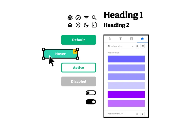
Increase Fidelity and Functionality with UXPin Merge
Take your prototypes to the next level using UXPin’s proprietary Merge technology. Sync your product’s design system or an open-source component library from a repository to UXPin’s editor so designers can build prototypes using fully functioning code components.
You can see Merge in action with our MUI library integration. Using MUI’s React library, designers can build fully functioning list prototypes. MUI’s React components come complete with states and interactions, so designers only have to focus on product design rather than building everything from scratch. Everything you see in MUI’s documentation, designers can replicate in UXPin without writing a single line of code.
Recommend
About Joyk
Aggregate valuable and interesting links.
Joyk means Joy of geeK