

Visualizing Gas Prices: AAA.com, GasBuddy.com, and FoxNews.com
source link: https://epiren.medium.com/visualizing-gas-prices-aaa-com-gasbuddy-com-and-foxnews-com-8c50396e1917
Go to the source link to view the article. You can view the picture content, updated content and better typesetting reading experience. If the link is broken, please click the button below to view the snapshot at that time.
Visualizing Gas Prices: AAA.com, GasBuddy.com, and FoxNews.com
How do you give unbiased, actionable information in map form?
I woke up this morning needing to fill-up the fuel tank in my vehicle, so I jumped online to look up gas prices. I was met with a graphic from Fox News that seemed interesting to me. Here it is:
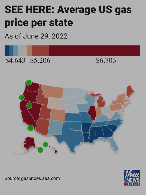
The color bar seemed weird to me, along with the range. Given Fox News’ reputation for skewing data to fit a narrative, I looked at their source, AAA.com. (Please note: Fox News are not the only news outlet on either end of the political spectrum to manipulate data.) Here is AAA.com’s map:
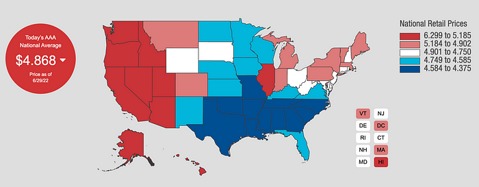
Note that the range of colors is different. Where Fox News has eight categories of colors, AAA.com has five, with a neat white color for prices in the middle. Then there is Gas Buddy (dot com) and their map, which I find the best of them all:
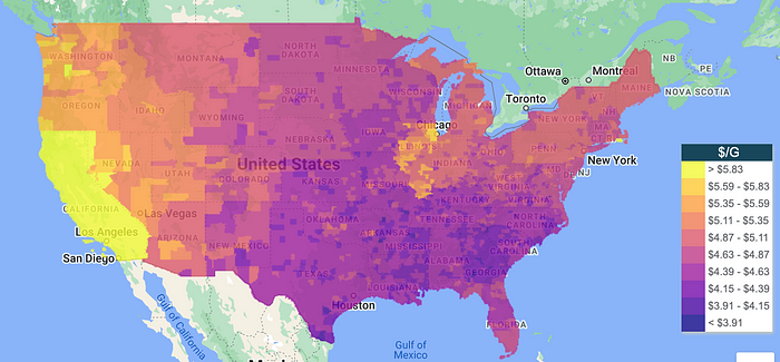
Here, the color scale is inverted, compared to the others. The darker the color, the cheaper the gasoline price per gallon. I find this map the best, because it shows prices per county. Along with the ten categories, the map is very granular, giving me hyper-local gas prices and actionable information. I can even zoom in and find specific gas stations near me.
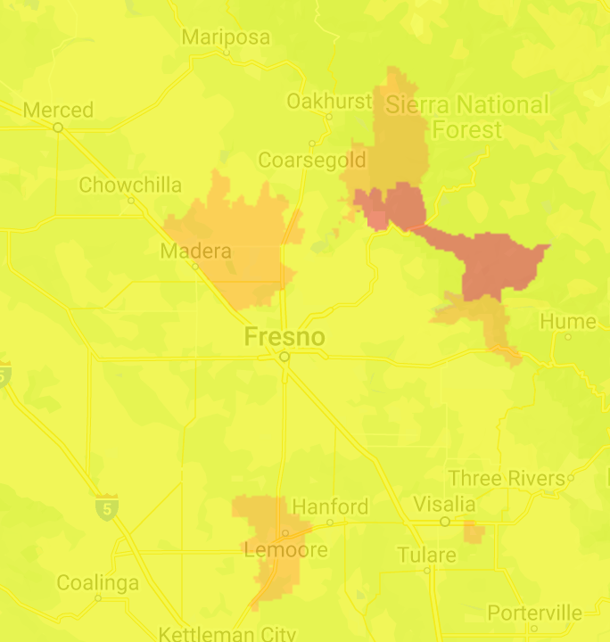
The Gas Buddy map also tells a better story. Let’s look at California, where the prices are highest. Zooming in around Fresno, I found that there were some spots where prices were almost a dollar cheaper than the rest of the state:
If you look at Fox News and AAA, you would think the South has some of the cheapest prices, but then look at the variation between Montgomery, Alabama, and Charleston, Georgia:
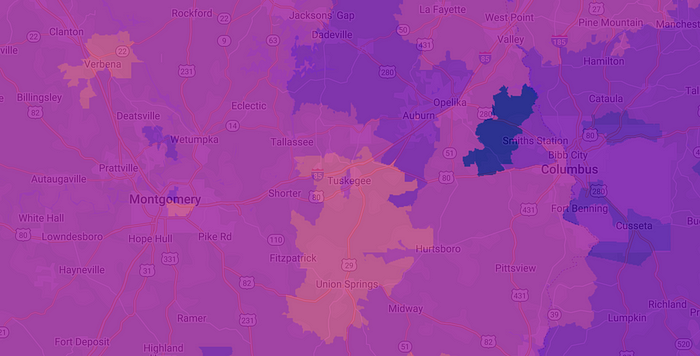
Just west of Columbus is some of the cheapest gasoline you’ll find, while gas around Union Springs is as expensive as other parts of the country.
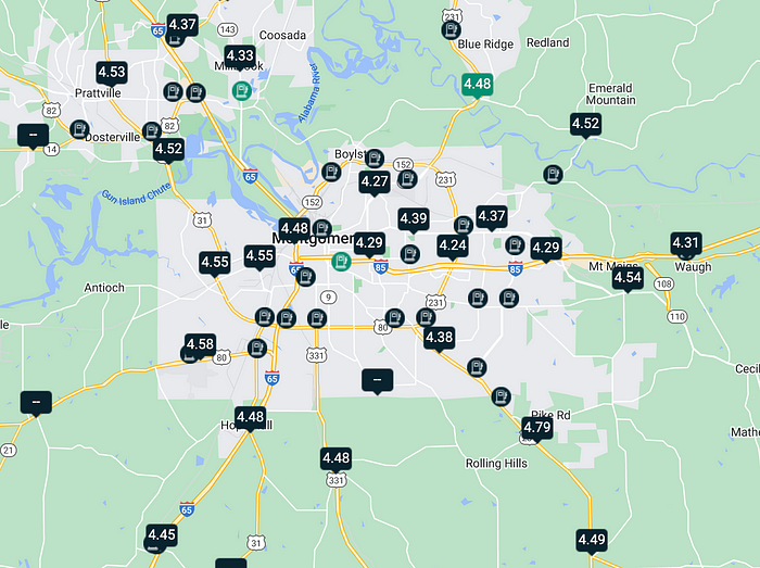
While the Fox News and AAA maps give you the national picture state-by-state, Gas Buddy gives the same information, but then adds county-by-county breakdowns. Zoom in further on Gas Buddy’s map in Montgomery, and you’ll see prices at different stations:
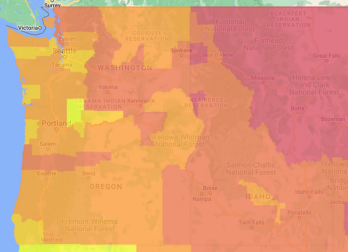
Of course, we could play the politics game and say that states led by Liberal executive and legislative branches have higher prices on average, while states with Conservative governments have lower prices. But that is not the whole story. Look at Idaho, a state with a Republican Governor, a Republican majority in its legislature, and represented in the US Congress by two Republican Senators:
Or look at Minnesota, with a Democratic Governor, a Democratic majority in its legislature, and represented by Democratic Senators:
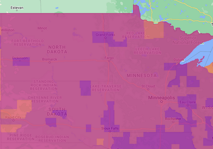
No, the issue is not as simple as Blue versus Red states. The issue is a mix of state gasoline taxes, with California taxing at 62 cents per gallon, while Mississippi taxes at almost 19 cents per gallon. Then there is population density and commuting habits in and out of major metropolitan areas. And, of course, the old law of supply and demand. Holding supply steady, places with more people, more car commuters, and more industry will have higher prices. Holding prices steady, places with more people, more car commuters, and more industry will have higher demand.
Smash low supply from global conflicts and an economic downturn with high demand in those places with more car commuters, people, and industry, along with lower unemployment (meaning more commuting and more industry), and you get the inflationary pressure we see in gasoline.
The main takeaway is that you need to know what the map is presenting you, and how the data are processed. Don’t just go with the map and reach a quick assumption on what is going on. (And don’t get me started on using average price versus median price.) Look for more context and granularity, and look at different sources of information, not just the ones who make you feel good… or angry.
Hey, if you liked what you read just now, and what you read on Medium in general, why not get a membership and support our work? Click here for more information: https://epiren.medium.com/membership
Thanks!
René F. Najera, MPH, DrPH, is a doctor of public health, an epidemiologist, amateur photographer, running/cycling/swimming enthusiast, husband, father, and “all-around great guy.” You can find him working as an epidemiologist at a local health department in Virginia, grabbing tacos at your local taquería, teaching at a university in northern Virginia where he is an adjunct in the Department of Global and Community Health, or teaching at the best school of public health in the world where he is an associate in the Department of Epidemiology. All opinions in this blog post are those of Dr. Najera, and do not necessarily represent the opinions of his employers, friends, family, or acquaintances.
Recommend
About Joyk
Aggregate valuable and interesting links.
Joyk means Joy of geeK