
1

HarmonyOS - 自定义组件之消息弹窗-51CTO.COM
source link: https://os.51cto.com/article/712832.html
Go to the source link to view the article. You can view the picture content, updated content and better typesetting reading experience. If the link is broken, please click the button below to view the snapshot at that time.
HarmonyOS - 自定义组件之消息弹窗-51CTO.COM
HarmonyOS - 自定义组件之消息弹窗
作者:潘宏熙 2022-06-30 14:02:07
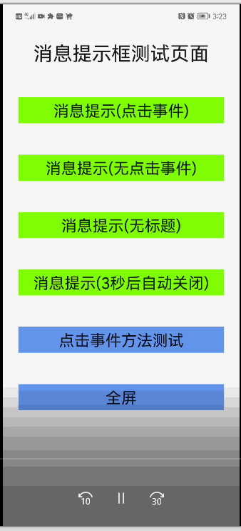
刚接触鸿蒙开发不久,在最近接触的一个项目中,发现有很多类似的消息提示弹窗。对项目所有弹窗进行分析,开发一个公共的消息弹窗组件。

刚接触鸿蒙开发不久,在最近接触的一个项目中,发现有很多类似的消息提示弹窗。对项目所有弹窗进行分析,开发一个公共的消息弹窗组件。
组件属性定义
组件属性:
visible | object | {show: false} | 控制弹窗显示状态,由于现在的组件属性没有双向绑定功能。所以采用对象格式,确保每次改变visible值的时候,组件都可以监听到 | |
options | object | 弹窗显示属性,包括标题,内容,按钮等,具体格式参考下面options属性说明 |
组件options属性:
title | string | |||
content | string|string | 弹窗文本内容,当content为字符串类型显示为单行文本,为字符串数组显示为多行文本,单行文本会自动居中展示 | ||
buttons | (string|button) | 弹窗标题,底部按钮,具体属性 最多显示2个按钮,如果超过2个后面部分自动舍去。具体格式参考下面button属性说明 |
组件options属性中的button属性:
string | 按钮显示文本,当button为string时,即为该属性 | |||
handle | function | 按钮点击触发事件,会在弹窗关闭后调用此事件 |
组件实现代码
htm代码:
<!-- index.hml -->
<dialog ref="messageBoxDialog">
    <div class="box">
        <div class="header {{!title?'no-title':''}}">
            <text class="header-text color-text">{{title}}</text>
        </div>
        <div class="content {{isTextCenter?'content-center':''}}">
            <text for="item in content" class="content-text color-text">{{item}}</text>
        </div>
        <div class="btn-bar {{!firstBtn.show?'no-btn':''}}">
            <button if="{{firstBtn.show}}" class="btn" type="text" @click="firstBtnClick">{{firstBtn.text}}</button>
            <divider if="{{secondBtn.show}}" vertical="true" class="btn-divider"></divider>
            <button if="{{secondBtn.show}}" class="btn" type="text" @click="secondBtnClick">{{secondBtn.text}}</button>
        </div>
    </div>
</dialog>
样式代码:
/* index.css */
.box{
    flex-direction: column;
    width: 100%;
}
.header {
    height: 56px;
    align-items: center;
    padding: 0px 24px;
    width: 100%;
}
.header-text {
    font-size: 20px;
}
.content {
    width: 100%;
    flex-direction: column;
    padding: 0px 24px;
}
.content-center {
    align-items: center;
}
.content-text {
    font-size: 16px;
    line-height: 20px;
}
.btn-bar{
    height: 56px;
    margin-top: 8px;
    padding: 0px 16px;
    justify-content: center;
}
.btn{
    height: 40px;
    background-color: #fff;
    width: 100%;
    border-radius: 0px;
}
.btn-divider {
    height: 40px;
    padding: 8px 0px;
    flex: 0 0 40px;
}
.no-title {
    height: 24px;
}
.no-btn {
    margin-top: 0px;
    height: 24px;
}
.color-text{
    color: rgba(0,0,0,0.9);
}
js代码:
// index.js
export default {
    props: {
        // 属性visible控制弹窗是否显示
        visible:{
            default(){
                return {
                    show:false
                }
            }
        },
        // 属性options弹窗显示内容控制
        options: {
            default(){
                return {
                    content:''
                }
            }
        }
    },
    data : {
        // 组件内部记录当前打开或关闭状态
        isShow:false
    },
    // 对传入的各种属性进行逻辑处理
    computed:{
        title(){
            return this.options.title || ''
        },
        content(){
            const content = this.options.content
            if(Array.isArray(content)){
                return content
            }
            if(typeof content === 'string'){
                return [content]
            }
            return []
        },
        // 处理文本居中显示逻辑
        isTextCenter(){
            const content = this.options.content
            if(Array.isArray(content)){
                return false
            }
            if(typeof content === 'string'){
                return  true
            }
            return false
        },
        firstBtn(){
            const buttons = this.options.buttons || [];
            const button = buttons[0];
            const butOpt = { show:true }
            if(button){
                if(typeof button === 'string'){
                    butOpt.text = button
                } else if(typeof button === 'object') {
                    butOpt.text = button.text
                    butOpt.handle = button.handle
                }else {
                    butOpt.show = false
                }
            }else{
                butOpt.show = false
            }
            return butOpt
        },
        secondBtn(){
            const buttons = this.options.buttons || [];
            const button = buttons[1];
            const butOpt = { show:true }
            console.log('secondBtn: ' + JSON.stringify(button))
            if(button){
                if(typeof button === 'string'){
                    butOpt.text = button
                } else if(typeof button === 'object') {
                    butOpt.text = button.text
                    butOpt.handle = button.handle
                }else {
                    butOpt.show = false
                }
            }else{
                butOpt.show = false
            }
            return butOpt
        }
    },
    onInit() {
        // 监听visible属性,控制弹窗打开或关闭
        this.$watch('visible', 'onVisibleChange');
    },
    onVisibleChange(val){
        if(val.show){
            if(!this.isShow){
                this.$refs.messageBoxDialog.show();
                this.isShow = true;
            }
        }else{
            if(this.isShow){
                this.$refs.messageBoxDialog.close();
                this.isShow = false;
            }
        }
    },
    firstBtnClick(){
        if(this.isShow){
            this.$refs.messageBoxDialog.close();
            this.isShow = false;
        }
        if(typeof this.firstBtn.handle === 'function'){
            this.firstBtn.handle()
        }
    },
    secondBtnClick(){
        if(this.isShow){
            this.$refs.messageBoxDialog.close();
            this.isShow = false;
        }
        if(typeof this.secondBtn.handle === 'function'){
            this.secondBtn.handle()
        }
    }
};
在其他组件或页面hml引入组件:
<element name="message-box" src="../../component/message-box/index.hml"></element>
<div class="container">
    ...
    <message-box id="message-box-dialog" visible="{{visible}}" options="{{message}}"></message-box>
</div>
在其他组件或页面js中如下使用。
// 在data中定义组件属性,具体属性格式可以参考组件属性定义
    data: {
        ...
        visible: {
            show:false
        },
        message:{
            content:''
        }
    },
    ...
    // 重新连接方法
    connect(){
        console.log('connect is called')
    }
    // 调用此方法可以在页面打开弹窗
    openDialog(){
        this.message = {
            title:'连接失败',
            content:[
                "1.请确认设备电量充足,并处开机状态请确认设备电量充足,并处开机状态",
                "2.将设备靠近要连接的手机(10米以内)"
            ],
            buttons:['稍后再试',{text:'重新连接',handle:this.connect}]
        };
        this.visible = { show:true };
    },
    // 其他参数调用,只有一个按钮
    openDialog2(){
        this.message = {
            title:'配网失败',
            content:[
                "1.检查设备是否接通电源",
                "2.请按开关键至ON",
                "3.再次碰一碰",
                "4.听到“嘀”一声提示音表示设置成功"
            ],
            buttons:['我知道了']
        }
        this.visible = {show:true};
    },
    // 无标题
    openDialog3(){
        this.message = {content:'检查设备是否接通电源检',buttons:['我知道了']}
        this.visible = {show:true};
    },
    // 无按钮,3秒后自动关闭
    openDialog4(){
        this.message = {title:'温馨提示',content:'检查设备是否接通电源检'}
        this.visible = {show:true};
        setTimeout(()=>{
            this.visible = {show:false};
        },3000)
    },
以上就是消息弹窗组件开发以及使用的全部内容。此组件可以更加灵活的控制打开或关闭。也可以动态的显示弹窗内容。
Recommend
About Joyk
Aggregate valuable and interesting links.
Joyk means Joy of geeK