

How I built a dark mode toggle
source link: https://hidde.blog/dark-light/
Go to the source link to view the article. You can view the picture content, updated content and better typesetting reading experience. If the link is broken, please click the button below to view the snapshot at that time.
How I built a dark mode toggle
Published 6 days ago ・ category: tutorial
This site has had dark and light modes for a while, but it never offered any choice. If your system preference was “dark”, that's what you would get (unless you used fancy browser flags). Yesterday, I implemented a dark mode toggle, so that you can override that at your leisure. In this post I will talk about some of the choices I made along the way. Basically, it's a long winded way of saying why it took me so long.
This is fun to fiddle around with, but really, it seems to me that all websites have this requirement, so why isn't this built into browsers? In other words, I agree with Bramus Van Damme, dark mode toggles should be a browser feature. His post has more reasons: however you support light and dark modes, you will likely end up with code duplication somewhere, and toggles that live in developer land require JavaScript.
The choices#heading-1
There are a lot of HTML elements that you can use to give users a choice between one out of many options. Radio buttons and <select>s come to mind. A checbox could be an option too… if there is only one option, checkboxes too allow just the one option.
I started out with radio buttons as I thought that was clever, and even ended up building the control all the way from coding a form a fieldset, legend and options. I went ahead to visually hide the control itself and then use the :checked pseudo class to only display the option that wasn't picked. In other words, when dark mode was on, the light mode option was visible and vice versa.
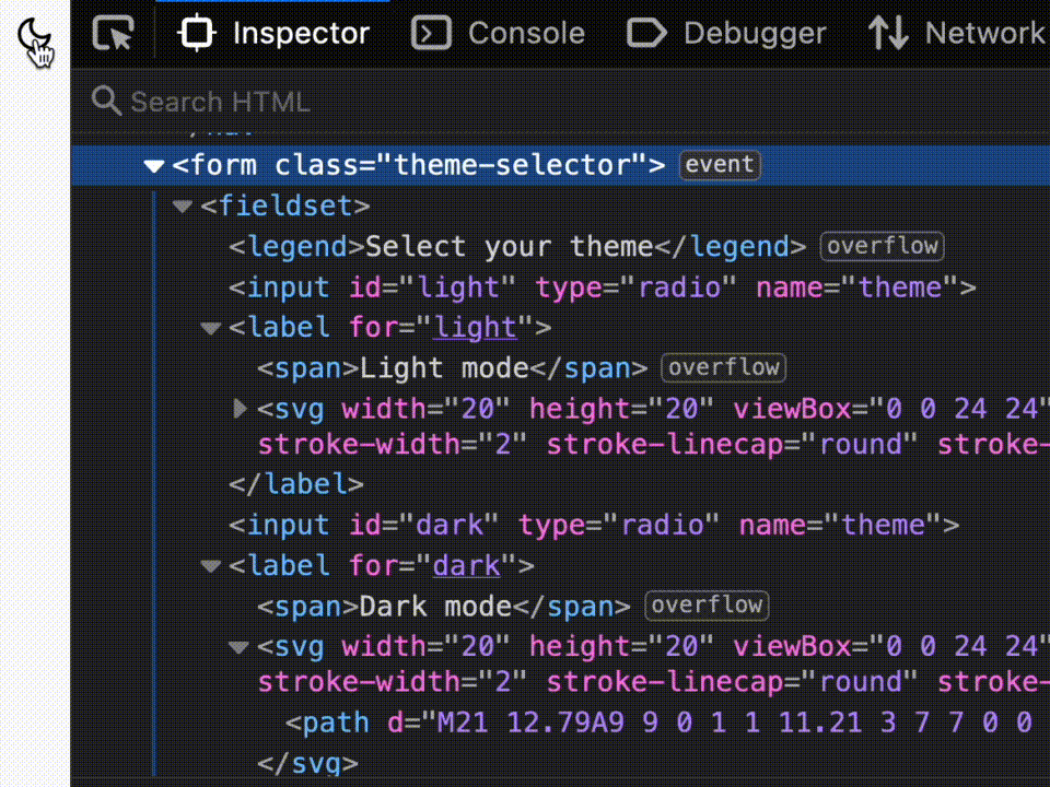
It's a whole form!
It must have been late, because only when I started testing this with keyboard, a sanity check I do with all controls, I realised it didn't feel right. With a keyboard, you would need arrow keys to pick the other option and that feels weird, especially for a control that is styled to not look like radio buttons. I guess the lesson is: never style elements too far from their original purpose.
I ended up going for just the one button element. To switch styles, I would need JavaScript either way, so I would not benefit from having a checkbox in this case. In Underengineered Toggles Too, Adrian Roselli explains that the button makes sense if the control only works with JavaScript (check; we need to toggle a class or attribute to apply the CSS), if it only has true or false states, not mixed (check; we allow either light or dark) and if flipping the control immediately performs an action (check; the color scheme changes straightaway). The great thing about a button element, just for the record, is that it comes with keyboard support built-in. No extra cost.
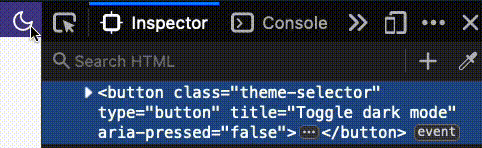
It's a button!
One button, like mine, does mean that users can't explicitly choose that they want my site to follow their browser or OS setting. In his post Your dark mode toggle is broken, Kilian Valkhof makes the case for including a “system” setting that would solve this very problem.
With CSS, I made the button look like not a button. I visually hid the text inside of it. I also added an SVG icon that I applied pointer-events: none to, so that clicks on the SVG would be registered as clicks on the button.
JavaScript
In script, I wanted a couple of cases to be covered. Let's walk through the various parts of the implementation.
First, I stored the button and the query to find out if a dark color scheme is preffered, and created an empty variable for the current theme:
var button = document.querySelector('.theme-selector');
var prefersDark =  window.matchMedia('(prefers-color-scheme: dark)');
var currentTheme;
I also added a function to set a theme, which adds an attribute to the html element and stores the preference in localStorage:
function setTheme(currentTheme) {
  var pressed = currentTheme === 'dark' ? 'true' : 'false';

  document.documentElement.setAttribute('data-theme-preference', currentTheme);
  localStorage.setItem('theme-preference', currentTheme);
}
Then I figured out what the theme should be. First I checked if there is something in localStorage, if not if there is a preference for dark mode, and if not, I set it to default to light mode:
if (localStorage.getItem('theme-preference')) {
  currentTheme = localStorage.getItem('theme-preference');
} else if (prefersDark.matches) {
  currentTheme = 'dark';
} else {
  // default
  currentTheme = 'light';
}
We also want ways to change the theme. First off, when the user clicks the button:
button.addEventListener('click', function(event) {
  currentTheme =  document.documentElement.getAttribute('data-theme-preference') === "dark" ? "light" : "dark";
		setTheme(currentTheme);
  });
Secondly, when the user changes their theme preference:
prefersDark.addEventListener('change', function(event) {
  currentTheme = event.matches ? 'dark' : 'light';
  setTheme(currentTheme);
});
(This listens to changes in the browser's MediaQueryList, which could change when the setting is changed in the browser or the OS).
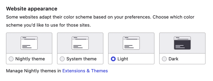
In Firefox, you can pick light or dark mode, if you don't want it to just follow the system or your choice of Firefox theme. There is no per website setting at the time of writing.
In my book, it's ideal to only use ARIA when it is for something that:
- doesn't exist in HTML
- brings a known benefit to end users
In this case, we're using a standard button element, which exists in HTML. But there is one detail about it that doesn't exist in HTML, which is that this is the type of button that toggles. We can add this by setting the aria-pressed with a "true" or "false" value.
This brings a known benefit to end users, specifically to users of screenreaders, who will now hear this is a toggle button. For toggle buttons, it is important that the content doesn't change. As the button text, I have used “Toggle dark mode”.
If we would update the label of the button from “Turn on light” to “Turn on dark”, we kind of have a toggle (as MDN suggests), but that way, it wouldn't be recognised by the browser and set in the accessibility tree to be a toggle, and, because of that, not announced as a toggle by screenreaders.
Compromises#heading-2
Code duplication
In his post, Bramus explains that when you want to build a dark mode toggle, you will end up with duplicated CSS. That is, if you both want to see color changes support the prefers-color-mode media query, and the class or attribute that you're toggling with your toggle. I went for not supporting that media query directly in CSS. Instead, I rely on my script to set the right data attribute. This means that without JavaScript, users will only see the light mode, even if their system or browser setting is to use dark mode.
Honouring the system preference
As mentioned above, my toggle doesn't have a “do whatever the system does” setting. However, when you change the system setting, it will notice and use that system setting. That is, until you change your preference again, either via the toggle or the system setting.
Many themes
The toggle I ended up with can only swap between two states. Initially I had wanted it to work for any number of states, I mean, why not have lots of different themes between light and dark? It's tricky, because how do those two settings, that the media query currently supports checks for, map to my many themes? This may be something for future iterations, probably with some way to map two specific themes to be the browser's “light” and ”dark”.
Summing up#heading-3
To build a dark mode toggle is an exercise full of compromises. There are many ways that, proverbially, lead to Rome, as you can read above. I was happy enough with the current result to ship it for now, but am more than open to feedback.
Recommend
About Joyk
Aggregate valuable and interesting links.
Joyk means Joy of geeK